

Advance excel score meter scale





Try Before you Buy Download Free Sample Product
 Impress Your
 Audience
 100%
100% Editable
 Save Hours
 of Time


Set up the data in a well-arranged format with this Advance Excel Score Meter Scale PowerPoint Presentation Slide. Showcase the performance range of the employees by taking the aid of this PPT slide. Mark the evaluation of a product, employee, or any element based on fair, good, excellent, and poor parameters with the assistance of this PPT template. You can use this performance assessment PPT layout to appraise the highest-scoring worker and provide guidance to the lowest-scoring. Improve the input and output level in your enterprise by taking the aid of this PPT design. This scorecard PPT theme allows you to establish a transparent and accountable environment in the workplace. Rating scale PPT visual will help you to engage in development discussions with your personnel. Improve productivity and overall organizational profitability with the help of this PPT graphic. Click the download button and utilize this well-curated PowerPoint template for human resource development in your company.
People who downloaded this PowerPoint presentation also viewed the following :
Content of this Powerpoint Presentation
Description:
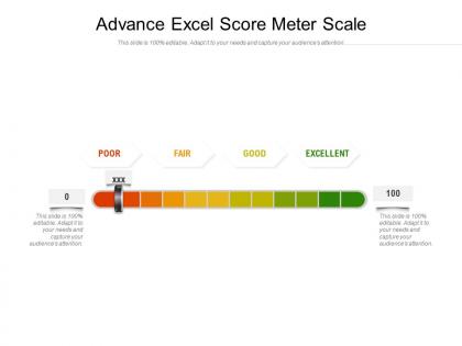
The image depicts a PowerPoint slide titled "Advance Excel Score Meter Scale," which features a horizontal meter scale ranging from 0 to 100, segmented into four qualitative performance categories: Poor, Fair, Good, and Excellent. The scale is color-coded from red to green, indicating a progression from lower to higher scores. A marker appears to be set at a point on the scale, marked with "XXX," presumably indicating a score that has been achieved or is being evaluated. The slide includes two editable text boxes on each end of the scale, with one stating "0" and the other "100," and a note below each text box stating "This slide is 100% editable. Adapt it to your needs and capture your audience's attention."
Use Cases:
This visual tool is applicable across various industries for performance tracking, evaluation, and presentations:
1. Education:
Use: Grading student performance or institutional effectiveness
Presenter: Educator or Administrator
Audience: Students, faculty, or educational boards
2. Human Resources:
Use: Evaluating employee performance reviews
Presenter: HR Manager
Audience: Management team, employees
3. Sales:
Use: Measuring sales targets and achievements
Presenter: Sales Director
Audience: Sales team, company executives
4. Healthcare:
Use: Assessing healthcare service quality or patient satisfaction
Presenter: Healthcare Administrator
Audience: Medical staff, hospital management
5. Finance:
Use: Rating financial performance or investment returns
Presenter: Financial Analyst
Audience: Investors, corporate management
6. Customer Service:
Use: Rating customer satisfaction levels or service quality
Presenter: Service Manager
Audience: Customer service agents, management
7. Manufacturing:
Use: Measuring production quality or process efficiency
Presenter: Quality Assurance Manager
Audience: Production team, operational staff
Advance excel score meter scale with all 2 slides:
Use our Advance Excel Score Meter Scale to effectively help you save your valuable time. They are readymade to fit into any presentation structure.
FAQs for Advance excel
So first thing - put your main KPIs right at the top where people can't miss them. Interactive filters are clutch because everyone wants to slice the data their own way. Charts should be clean and actually tell a story, not just exist. Oh and please stick to a consistent color scheme - I've seen too many dashboards that look like a crayon explosion lol. Add some data tables for the people who love digging into details. White space is your friend here. Honestly though, the biggest thing is knowing your audience and what decisions they're trying to make.
Dude, charts and graphs are so much better than staring at endless spreadsheet rows. You'll spot trends and weird outliers instantly instead of hunting through numbers like some kind of data detective. Honestly, I used to think charts were just for making things look pretty, but they actually save tons of time. Plus your boss or whoever will actually pay attention to your findings instead of glazing over. Try swapping out one boring data table for a simple chart first. You'll see what I mean right away.
Dude, first thing - don't make it a rainbow explosion. I swear, some dashboards hurt to look at. Stick with consistent colors and fonts so people aren't confused. Put your biggest metrics front and center where they can't miss them. Group stuff that goes together, add clear labels (seems obvious but you'd be surprised). Simple charts beat fancy ones every time. Oh, and make sure it updates automatically - nobody wants to work with yesterday's numbers. Test it with real users before you launch. They'll catch the weird stuff you totally missed.
INDEX/MATCH or XLOOKUP are your best friends here - XLOOKUP especially if you've got a newer Excel version. Way better than VLOOKUP, trust me. Set up your charts to reference these dynamic formulas instead of hardcoded ranges. Excel tables (Ctrl+T) are clutch too since they automatically expand when you add data. Conditional formatting helps highlight trends without extra work. The whole point is making everything pull from your source data dynamically. Then when you update stuff, your dashboard refreshes itself. Oh, and pivot tables work great for this too if that's more your style.
Honestly, stick with bar and column charts - they're boring but they work. Line charts are solid for trends over time. I'd avoid pie charts unless you have like 3 categories max, otherwise they're just confusing. Gauge charts and those KPI card things are actually pretty good for showing your main numbers upfront. The whole point is people should get it immediately, not spend forever figuring out what they're looking at. Maybe start with just 2-3 chart types? You can always add more fancy stuff later once you nail the basics.
Dude, pivot tables are seriously a lifesaver for dashboards. They'll summarize huge amounts of data instantly, plus users can actually interact with them instead of just staring at static charts. You can break things down by different categories, get totals and averages without writing crazy formulas. When your source data updates? The pivot table updates too - no manual work. I'm pretty sure I throw them into every dashboard now. Users love the filtering options because they can dig deeper without making the main view look messy. Try a basic sales-by-region one first and you'll get hooked.
So dashboards are like the fun, interactive version - you get charts and visuals that update automatically, plus you can click around and filter stuff. Reports? Those are the boring static documents with all the details (honestly, who has time to read through pages of data anymore). With dashboards, executives can actually explore and find their own insights instead of just staring at fixed info. If you want people to engage with your data, dashboards win every time. They're just way more visual and give you that quick overview you need.
Conditional formatting is perfect for this - seriously makes dashboards so much better. Color scales are clutch for showing performance (green = good, red = bad). Data bars let you compare sizes instantly without doing mental math. Traffic light icons work well for trends too. But honestly? Less is more here. I've seen people go nuts with every color imaginable and it just looks messy. Stick to highlighting your main KPIs and anything that's way off. Your eyes will thank you later when you're not squinting at a neon nightmare trying to find actual insights.
Keep your formatting consistent - same fonts, colors, spacing throughout. Conditional formatting is your friend for making important stuff stand out. Clean up those tables with alternating row colors and decent headers, they get ugly quick otherwise. Avoid hardcoded cell references if you can help it. Dynamic ranges and Excel tables are way better since everything updates automatically when your data changes. Oh, and definitely test it on different screen sizes if other people will see it. Honestly, I've seen too many dashboards that look like a rainbow exploded on them. Stick to 3-4 colors max.
First thing - make sure your slicers and timelines are actually connected to pivot tables or charts, otherwise they're pretty useless. Go to the PivotTable Analyze tab to insert them. Timelines are perfect for dates, slicers handle everything else like regions or product categories. Here's something cool I learned recently: you can link one slicer to multiple pivot tables through "Report Connections." Total game-changer when you want everything filtered the same way. Put them somewhere obvious on your dashboard. And honestly? Don't just slap them anywhere - format them so they actually look decent.
Colors make or break Excel dashboards, trust me on this one. Red for bad stuff, green for good - people get that instantly. Light to dark gradients work great for showing progression too. Rainbow charts? Skip them, they're visual chaos. Three colors tops, and honestly I sometimes think that's still pushing it. Make sure there's solid contrast so everyone can actually read your data, including colorblind folks. Here's what I always do: convert the whole thing to grayscale first. If it still tells the story clearly, you're set.
So Data > Get Data is your friend here - tons of connectors for databases, web stuff, cloud services, whatever. Power Query editor is where the magic happens though, lets you clean everything up first. Oh and you can set auto-refresh so it updates itself, which is clutch. Web APIs can be kinda finicky with auth settings but worth the hassle. Honestly I'd start with something basic like a CSV from Google Sheets just to mess around with it first. Once you get one working, the rest clicks pretty fast.
First thing - check your source data against what's showing up on the dashboard. Make sure your data ranges update automatically when you add new stuff (learned this the hard way when my chart was stuck on March data). Test weird scenarios too, like what happens with blank cells or zeros. Your formulas might break in ways you didn't expect. Honestly, having someone else look at it helps a ton since you get tunnel vision with your own work. Also set up some data validation rules if you can - stops garbage data from messing everything up before it even hits your dashboard.
Think of it like telling a story - set up the problem first, then reveal your key insights bit by bit. I'm obsessed with those detective shows where they drop clues one at a time, and data presentations work the same way! Put your biggest chart where people look first (usually top left), then guide them through the supporting stuff. Each visual should flow logically to the next one. Don't just dump everything at once. End with the "so what" moment - what should they actually DO with this info? The whole thing needs to feel like you're walking them somewhere specific, not just showing off your Excel skills.
Honestly, the worst thing you can do is cram everything onto one screen - it just looks messy. Also those neon color schemes that burn your retinas? Hard pass. I learned this the hard way, but always use absolute references in your formulas or you'll get those annoying
No Reviews