

 0 Comment
 Customer Reviews

The deck's already built. Someone just asked for a dashboard slide.
Not a full report. Not a strategy document. Just one slide that shows whether the business is up or down, ahead or behind, and what's actually moving. Simple enough request. Except it never is.
The problem isn't finding data. Most teams have too much of it. The problem is deciding what belongs on the screen when a CFO or a COO has maybe 90 seconds of genuine attention before they've already formed an opinion. Too many numbers and it looks like a spreadsheet. Too few and someone's going to ask why a particular KPI is missing—loudly, in a room full of people.
And then there's the design part. Which most people aren't trained for. A bar chart that looked fine in Excel looks completely different projected in a conference room at 8 a.m. Colors clash. Labels truncate. The slide that was supposed to communicate confidence communicates chaos instead.
What makes it worse is that dashboards tend to live permanently. Unlike a one-time pitch deck, a business management dashboard gets opened every week, sometimes every day. Every flaw gets noticed twice—once when you build it, then again every time someone pulls it up for a status review. The stakes aren't just presentational. They're reputational.
So the templates exist because this problem is genuinely common. Every business eventually needs to show performance data in a form that humans can read in real time—without a statistics degree, without squinting. That's why people build frameworks for it instead of starting from scratch each time.
SlideTeam's business management dashboard templates were built for exactly this gap. Pre-designed, content-ready, and structured to handle the hard part—deciding what goes where so you don't have to figure it out under deadline pressure.
Here's what's available across revenue tracking, KPI monitoring, operational overviews, and more.
Template 1: Sales Pipeline Management Dashboard for Business
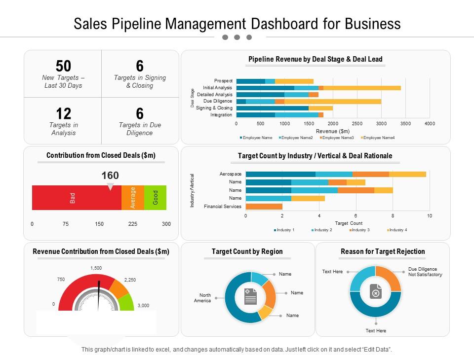
Drive revenue accountability with a pipeline dashboard built for precision and speed. This slide merges revenue tracking, target benchmarking, and diligence metrics into a single commanding view. Color-coded visual cues deliver instant clarity on where deals stand versus goals. Structured layouts eliminate guesswork, letting your sales team focus on closing rather than reporting. You can build compelling Sales Pipeline Management reviews that turn raw data into decisive action. Transform your sales pipeline presentations today. Download this dynamic template now and unlock top-tier business management dashboard resources.
Download this PowerPoint Template
Template 2: Dashboard for Digital Agriculture Business Management
Capture the full performance picture of an agricultural operation in one powerful visual. This template integrates total area, crop yield, revenue, weather forecasts, and task schedules into a unified KPI dashboard. Intuitive layout sections deliver at-a-glance awareness of environmental and operational conditions simultaneously. An extensive visual structure gives agri-business managers the clarity to act fast on real-time data. You can build compelling Digital Agriculture Business Management reviews with professional credibility. Transform your agriculture performance presentations today. Download this dynamic template now and elevate operational oversight.

Download this PowerPoint Template
Template 3: Dashboard for Business Financial Performance Management
Sharpen your financial oversight with a dashboard built for rigorous business performance management. This slide integrates accounts receivable, accounts payable, equity ratio, debt ratio, and current ratio into one coherent view. Clear visual segmentation drives instant comprehension of your company's fiscal health. Every metric is structured to help finance teams present complex data without losing stakeholder attention. You can build compelling Financial Performance Dashboard reviews that guide confident decisions. Transform your financial presentations today. Download this dynamic template now and command every budget conversation.

Download this PowerPoint Template
Template 4: KPI Dashboard for Retail Business Efficient Management Retail Store Operations
Retail performance is easier to act on when the numbers are clear and immediate. This PPT template is built for retail managers who need to track KPIs like average shopping time, shop visitors, basket spend, and customer retention in one view. It works well for weekly store operations reviews or month-end performance briefings with area managers. The slide keeps the focus on shopper behavior and retention without clutter. The template is 100% editable and customizable.

Download this PowerPoint Template
Template 5: Dashboard for Business Operational Activities Management
Operational visibility across departments is genuinely hard to present in a single slide. This PPT preset helps operations leads show marketing, product, HR, sales, finance, and services KPIs together—without losing the thread. For context on broader business management frameworks, this resource is worth a read. It fits naturally into weekly leadership reviews or cross-functional performance check-ins. The template is 100% editable and customizable.

Download this PowerPoint Template
Template 6: Sales Dashboard for Online Business Management
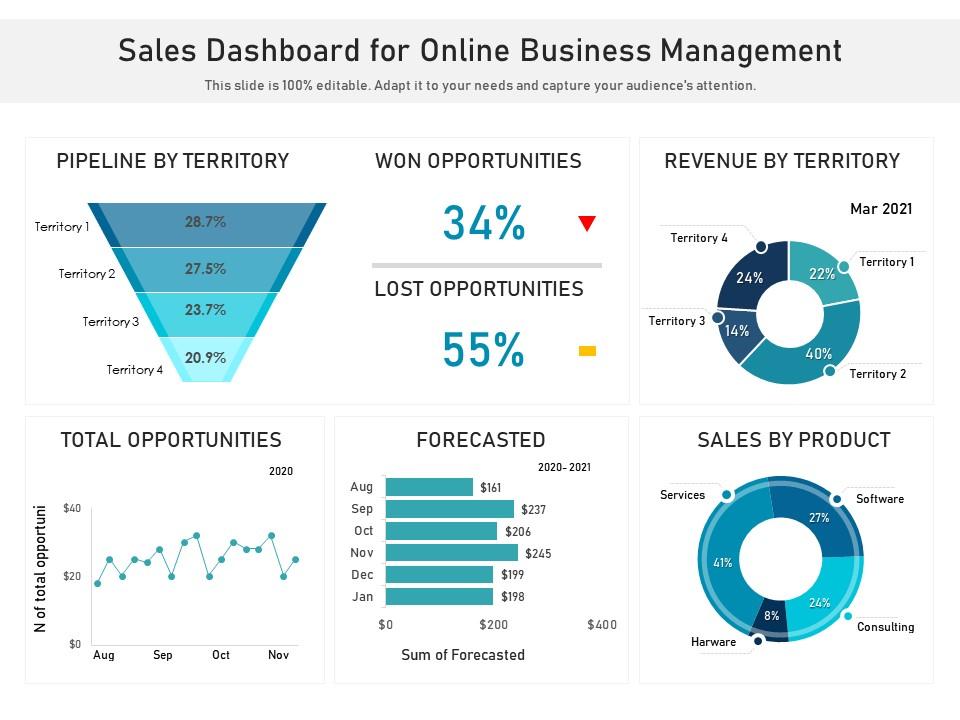
Sales performance across geographies rarely tells a clean story without the right structure. This PPT slide helps sales managers present pipeline by territory, won opportunities, revenue by territory, sales by product, and forecasted numbers in one place. It suits quarterly business reviews or regional Sales Management Dashboard briefings where territory comparisons matter. The layout keeps the data readable without crowding the slide. The template is 100% editable and customizable.
Download this PowerPoint Template
Template 7: Dashboard to Track Client Onboarding Operations Business Process Management
Accelerate client onboarding visibility with a dashboard designed to track every stage with precision. This slide delivers employee-wise reporting on customer sign-ups, paying customers, package details, and key onboarding analytics in a single structured view. Striking visual segmentation ensures leadership teams immediately grasp pipeline status without digging through reports. A comprehensive layout drives accountability across onboarding teams and eliminates blind spots in customer acquisition tracking. You can build compelling Business Process Management presentations that keep your onboarding operations transparent. Transform your client onboarding reviews today. Download this dynamic template now and strengthen customer conversion tracking.

Download this PowerPoint Template
Template 8: Warehouse KPI Dashboard for Business Management
Supply chain teams need to see warehouse performance without wading through multiple reports. This PowerPoint slide is built for logistics and operations managers tracking today's orders, monthly order volumes, processing status, and returns in one dashboard. It supports daily operations stand-ups or weekly supply chain review meetings where speed and accuracy matter. For a broader set of business management templates, this collection is a practical starting point. The template is 100% editable and customizable.
[product_image id=969164]
Template 9: Business Demand Management KPI Dashboard
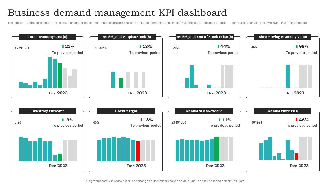
Demand planning decisions get sharper when inventory KPIs are visible in one place. This deck is built for supply chain planners and operations managers who need to track total inventory cost, anticipated surplus, out-of-stock value, slow-moving inventory, and gross margin together. It fits sales and operations planning reviews where finance and procurement teams align on purchasing decisions. So, it covers the KPIs that actually drive manufacturing and sourcing calls. The template is 100% editable and customizable.
Download this PowerPoint Template
Template 10: Dynamic Inventory Dashboard Template for Effective Business Management
Simplify inventory oversight with a dynamic dashboard built for operational excellence. This deck delivers a real-time visual command center for tracking stock levels, movement, and inventory health across your business. Intuitive design elements allow instant identification of gaps, surpluses, and critical reorder points without manual analysis. Flexible color themes let you align the dashboard with your brand or team preferences effortlessly. You can build compelling Inventory Management presentations that drive smarter restocking and procurement decisions. Transform your inventory oversight today. Download this dynamic template now and gain complete stock visibility.
[product_image id=1435372]
Template 11: Business Statistics Dashboard of Sales Management
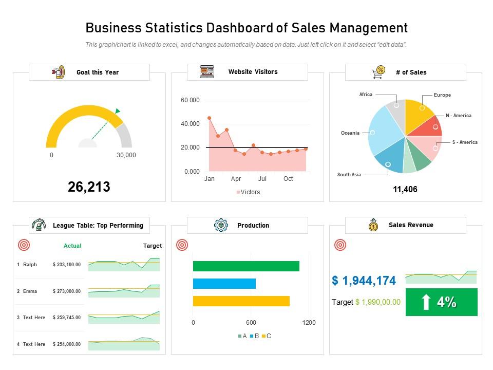
Understanding production output and sales revenue together gives managers a clearer picture of business health. This slide helps sales and operations leads present performing products, production data, and revenue metrics side by side. It works well in monthly business reviews or executive briefings where output-to-revenue alignment is the central question. Btw, the layout keeps comparisons sharp without unnecessary visual noise. The template is 100% editable and customizable.
Download this PowerPoint Template
Template 12: Dashboard for Digital Agriculture Business Management PPT
Present digital agriculture performance with a visually rich dashboard built for modern agri-business teams. This deck combines crop analytics, task tracking, and environmental data into a compelling single-view presentation. Creative layout structures ensure your audience absorbs complex agricultural metrics without losing focus or interest. Flexible design elements allow you to tailor every section to specific farm operations or regional requirements. You can build compelling Digital Agriculture Business Management pitches for investors, operations heads, and field managers. Transform your agri-business presentations today. Download this dynamic template now and showcase your agricultural performance with confidence.
[product_image id=1469362]
Template 13: Engaging Inventory Management Dashboard Template for Business
Inventory visibility matters most when teams are making restocking and procurement calls quickly. This PPT template is built for operations managers and supply chain leads who need a clean inventory dashboard for internal reviews. It handles stock level summaries and inventory performance tracking in a format that non-finance stakeholders can follow. For related Business Intelligence Dashboard options, this curated list is a useful reference. The template is 100% editable and customizable.
[product_image id=1463381]
Template 14: Business Statistics Dashboard for Sales Management PPT
Elevate sales reporting credibility with a statistics dashboard built to command executive attention. This deck transforms raw sales data—production output, performing categories, and revenue figures—into a structured, visually engaging business narrative. Adaptable color schemes allow you to align every slide with your brand identity effortlessly. You can build compelling Sales Management Dashboard reviews that turn data into confident strategic direction. Transform your sales statistics presentations today. Download this dynamic template now and make every number count.
[product_image id=1585302]
Template 15: Effective Dashboard for Business Decision Making PPT Summary
Good decision-making in leadership meetings depends on having the right data, clearly laid out. This PPT preset is designed for executives and senior managers who need to present business decision data in a format that drives action rather than debate. It works across boardroom settings and client pitches, where the visual quality of a deck directly affects credibility. For context, clean design here isn't decoration—it's how the argument lands. The template is 100% editable and customizable.
[product_image id=1678970]
Template 16: Sales Dashboard for Online Business Management PPT Graphics
Online sales performance is easier to act on when pipeline, territory, and product data share one screen. This PowerPoint slide is built for e-commerce and digital sales managers presenting won opportunities, revenue by territory, and forecasted numbers to leadership teams. It suits monthly online business reviews or sales planning sessions where territory-level detail matters. The layout keeps multiple data points readable without overwhelming the audience. The template is 100% editable and customizable.
[product_image id=1579973]
Template 17: Annual Operating Plan Dashboard for Administrative Department PPT Presentation
Annual operating plans for administrative departments rarely get the visual clarity they deserve. This PPT template is built for department heads and operations managers presenting budget allocation, activity timelines, and performance targets for the year ahead. It works well in annual planning cycles or board-level operational reviews where structure and clarity signal competence. For Project Management Dashboard templates that complement operational planning, this resource covers the essentials. The template is 100% editable and customizable.
[product_image id=1777267]
Template 18: Financial Dashboard Essentials for Business Success PPT Information
Financial dashboards lose their impact when the design fights the data for attention. This deck is built for CFOs, finance managers, and business analysts who need to present financial health KPIs—revenue, margins, and cost structures—in a format that holds a mixed audience's attention. It suits quarterly earnings reviews, investor briefings, and internal finance stand-ups equally well. The blend of creativity and structure keeps numbers accessible without dumbing them down. The template is 100% editable and customizable.
[product_image id=1787430]
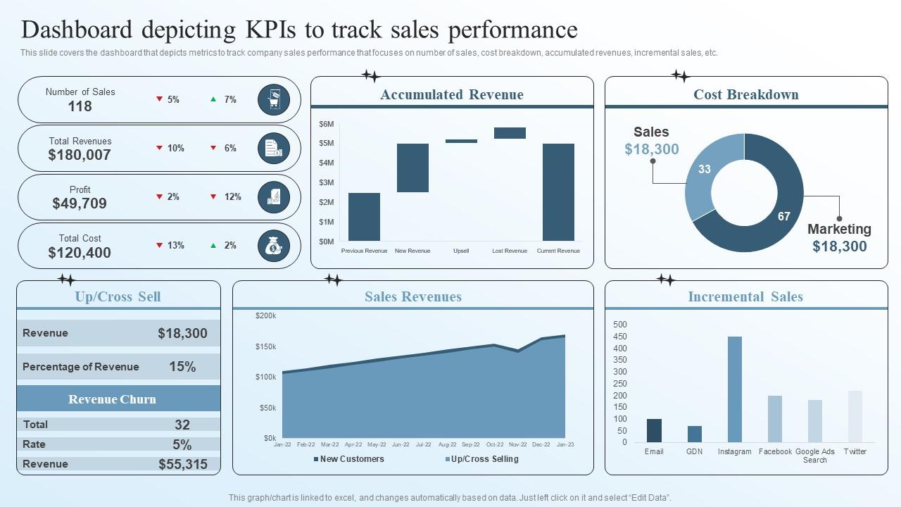
Template 19: Dashboard Depicting KPIs to Track Sales Performance
Track every dimension of sales performance with a dashboard engineered for strategic business transformation. This slide captures number of sales, cost breakdown, accumulated revenue, and incremental sales in one high-impact visual framework. Structured metric groupings ensure executives immediately identify performance trends requiring attention. Precise data visualizations drive clear conversations about revenue gaps and growth acceleration opportunities. You can build compelling Business Transformation Management Plan reviews that align sales strategy with financial targets. Transform your sales performance tracking today. Download this dynamic template now and accelerate revenue decision-making.
Download this PowerPoint Template
Template 20: Daily Schedule Time Management Templates PPT Summary
Time management visibility matters when teams are juggling multiple priorities across a busy schedule. This PPT slide is built for managers and team leads who need to present daily schedules, task allocation, and time blocks in a clear, structured format. It suits team briefings, planning sessions, and productivity reviews where showing time distribution makes the workload tangible. The design keeps daily schedule information clean and easy to scan at a glance. The template is 100% editable and customizable.
[product_image id=1701537]
Elevate Every Business Decision with SlideTeam
SlideTeam's PowerPoint templates are the best in the industry for business management dashboards. These content-ready slides give you professional structure for tracking KPIs, financial performance, and operational metrics—without building from scratch. Use these ready-made PowerPoint slides to present data with clarity and authority in every leadership meeting. Deploy these custom-made templates to drive faster decisions, stronger alignment, and measurable business outcomes.
FAQs on Business Management Dashboard
What are the most critical KPIs that every business management dashboard should track to drive strategic decision-making?
Focus on four categories: financial health (revenue, profit margin, cash flow), customer metrics (retention, acquisition cost), operational efficiency (cycle time, utilization), and sales performance (pipeline value, conversion rate). These cover the decisions most leadership teams make weekly. Track only KPIs tied to a specific business goal. If a metric doesn't change a decision, it doesn't belong on the dashboard.
How can executives balance data density with visual clarity when designing a business management dashboard?
Start with a maximum of seven to ten KPIs per view. Group related metrics visually using consistent color coding. Use charts only when trend or comparison matters—use single numbers for status. Test the slide at a distance: if you can't read the key figures in three seconds, there's too much on the screen.
What is the difference between operational dashboards and strategic management dashboards, and when should each be used?
Operational dashboards track daily or hourly activity—orders processed, tickets resolved, units produced. Strategic dashboards track progress against quarterly or annual goals—revenue growth, market share, ROI. Use operational dashboards for front-line managers making same-day calls. Use strategic dashboards for executives reviewing direction and resource allocation monthly.
How do real-time data feeds change the way managers respond to business performance metrics?
Real-time data shortens the response window from days to hours. Managers can catch a sales dip on Tuesday instead of discovering it at Friday's review. The main shift is behavioral: teams move from reporting what happened to acting on what's happening now. This only works if alert thresholds are set in advance—otherwise, real-time data just creates noise.
What role does data hierarchy play in structuring a business management dashboard for C-suite executives?
C-suite dashboards should show summary metrics at the top, with drill-down detail available one level below. Put the three or four numbers that answer "are we on track?" immediately visible. Supporting context—segment breakdowns, regional splits—sits beneath. This prevents executives from getting lost in detail before they've seen the headline.
How can businesses avoid the common pitfall of vanity metrics when selecting dashboard indicators?
Ask one question for every metric: "What decision does this number change?" Page views, follower counts, and email open rates rarely change a strategic call. Revenue per customer, churn rate, and gross margin do. If the honest answer is "it looks good in a report," remove it. Dashboard space is finite—every vanity metric displaces a real one.
What techniques can be used to visualize financial performance data without overwhelming non-finance stakeholders?
Use waterfall charts for cash flow movement and variance bars for budget versus actuals—both are readable without finance training. Label the insight, not just the number: write "margin down 3%" not just "31%." Avoid pie charts for financial data—bar charts compare more clearly. Keep color use minimal: one highlight color for items needing attention is enough.
How does a well-designed business management dashboard reduce the time executives spend in status update meetings?
Status meetings exist because people don't know the current numbers. A live dashboard eliminates that gap—anyone can check project status, sales figures, or operational health before the meeting starts. Agenda time shifts from "what is the number" to "what do we do about it." Most teams find weekly status meetings shrink from 60 minutes to 20 once a shared dashboard is in place.