

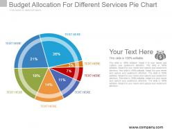
Budget allocation for different services pie chart example of ppt





Try Before you Buy Download Free Sample Product
 Impress Your
 Audience
 100%
100% Editable
 Save Hours
 of Time


Counter intolerance with our Budget Allocation For Different Services Pie Chart Example Of Ppt. Bring about acceptance of different beliefs.
People who downloaded this PowerPoint presentation also viewed the following :
Budget allocation for different services pie chart example of ppt with all 5 slides:
Do the demolition act with our Budget Allocation For Different Services Pie Chart Example Of Ppt. Break down imaginary barriers.
FAQs for Budget allocation for different services pie chart
Hey! Budget pie charts are actually pretty straightforward once you get the hang of it. Make your categories super clear with no overlap between slices. Stick to maybe 5-7 categories tops - anything more looks like a rainbow exploded. Percentages work way better than dollar amounts for quick comparisons. I always mess up the colors but red for must-haves and cooler shades for flexible stuff makes sense. Oh and obviously check that everything adds to 100% because that's embarrassing when it doesn't. Start with your biggest chunks first, then lump the tiny ones into "Other."
Honestly, pie charts are perfect for this because people can instantly see where their money's going without squinting at spreadsheet rows. Your biggest expenses jump out right away compared to the smaller stuff. Plus, most people just zone out when you throw numbers at them - the visual thing actually works. I always use different colors for each slice and throw the percentages right on there with labels. Saves me from explaining the same thing five times later. Non-finance people especially love them since they don't have to do math in their heads to figure out what's what.
Honestly, Excel's probably your best starting point - it's already there and handles basic pie charts fine. Google Sheets works too if you need to share it around. I'll be real though, Excel charts can look pretty rough sometimes, but they do the trick for getting your numbers sorted. Canva's actually not bad if you want something that looks decent for presentations. Power BI or Tableau are way nicer but only if your work pays for them (expensive otherwise). My move is usually Excel first to mess with the data, then switch to something prettier if I'm showing it to important people. Oh and don't overthink it - most budget pie charts end up looking similar anyway.
Oh yeah, colors totally mess with how people read your budget data. Red makes everything look like a crisis - I made that mistake once with an IT budget and got grilled for weeks over normal expenses just because I picked crimson. Blues and greens feel way more chill and "reasonable" to most people. Green especially reads as positive, like savings or growth. Here's what I'd do: stick with neutral blues or grays for your regular stuff, then throw in bold colors only for the categories you actually want them to focus on. Pastels make things seem less important too, if that helps.
Honestly, keep it under 7 slices or it gets crazy confusing. I learned this the hard way lol. Make sure your percentages actually add to 100% - sounds obvious but you'd be surprised. Skip the 3D stuff, it just makes everything look wonky. Use colors that actually look different from each other. Oh, and start your biggest slice at the top and go clockwise biggest to smallest. Try labeling right on the slices instead of doing a legend on the side. If you've got like 10 budget categories, just throw the tiny ones into "Other."
Bright colors are your best friend here - go with red or orange for the underfunded stuff and keep everything else pretty muted. Trust me, stakeholders' eyes will go straight to those problem areas. Also throw in percentage labels because those tiny slices might look small but represent huge budget gaps. One thing that works really well is clustering all the underfunded segments together at the top - creates this obvious "oh shit" moment. Way better than writing out some long explanation that nobody's gonna read anyway. The visual basically does the talking for you.
So it really comes down to who's looking at your chart. Finance people? Go ahead and throw in budget codes and "CAPEX" - they'll totally get it. But board members or regular staff need way simpler labels, maybe even some quick explanations. I learned this the hard way once when half my audience looked completely lost. The smarter your crowd, the more detailed categories you can use. Honestly, just picture them staring at it - would they understand in like 10 seconds or be scratching their heads? That's your answer right there.
Yeah totally! Just don't try cramming everything into one messy chart. Make separate pie charts for each year - like one for 2023, another for 2024. That way people can actually see how your spending shifted between categories. Keep your colors the same across all charts though, or it'll look like a rainbow exploded. Works really well for showing percentage changes in your priorities. Oh, and don't forget to mention the total budget amounts somewhere since pies only show proportions. I learned that the hard way when my boss asked about actual dollars!
Honestly, pie charts are your best bet for budget stuff. They show the whole picture at once - like you'll instantly see marketing is hogging 30% while IT gets a measly 8%. That visual punch hits different than bar graphs, which are fine for comparing numbers but don't give you the "holy crap, we spend HOW much on that?" moment. Bar graphs feel more... clinical? With pie charts, people immediately get the proportions without doing mental math. Perfect when you want to talk strategy and percentages rather than getting bogged down in actual dollar amounts. Trust me on this one.
Honestly, just lump the smaller stuff together into categories like "Operations" or "Other." Trust me, nobody wants to squint at a pie chart with 15 tiny slices - it's basically unreadable. Stick to maybe 5-7 chunks max. You can always throw in a table or legend afterward if people want the nitty-gritty details. Think about who's looking at this too. Your boss probably just wants the big picture, but if you're presenting to department heads, they'll definitely ask for more specifics. So yeah, keep it simple upfront but have that detailed breakdown ready to go.
Skip the separate legend if you can - just put labels right on each slice with the category name and percentage. Way cleaner. Start your biggest slice at the top and go clockwise by size. Honestly, this makes such a difference for how professional it looks. If you've got tiny slivers that won't fit labels, use those little connecting lines. Or better yet, just lump the small stuff into "Other" because nobody wants to squint at a dozen microscopic pieces. Keep the text short but clear enough that your audience gets it immediately.
So basically you just swap out the categories to match what actually matters in your industry. Healthcare? Focus on patient care, medical equipment, regulatory stuff. Tech companies need R&D, hiring costs, infrastructure. Manufacturing is more about raw materials and equipment maintenance - totally different beast. Retail's all inventory and marketing focused. Pick your 5-7 biggest expense drivers and make those your main slices. I'd start by googling typical expense breakdowns for your sector, honestly that'll give you a good baseline to work from.
Think about how your org actually handles money, not just accounting buckets. Group things into 5-7 big categories - personnel, operations, capital stuff like that. But here's the thing: if your boss always harps about tech costs, pull those out separately even if they're scattered across departments. I've sat through way too many presentations with these ridiculous pie charts that have like 12 microscopic slices. Nobody can read that mess. Toss smaller items into "Other" and focus on what actually helps people decide things. Each slice should matter.
Yeah, this stuff actually matters more than you'd think. People in Western countries scan clockwise from the top, so put your biggest budget chunks there. Right-to-left readers might process it totally backwards though. Colors are tricky too - red means danger here but luck in other places, which is kinda wild when you're showing deficits. I'd honestly just use boring neutral colors and slap percentages on everything. Way easier than trying to guess how someone's culture affects how they read charts.
Definitely include the actual dollar amounts and time period - percentages by themselves are pretty useless. Is this a $5K budget or $500K? Also throw in some comparison data if you have it, like last year's numbers or planned vs actual spending. Brief explanations for any weird spikes or changes will save you from a million follow-up questions later. Honestly, pie charts with just percentages drive me nuts because you have no clue about the scale we're dealing with. Context is everything here. Your audience needs enough info to actually understand what they're looking at, not just a colorful circle.
-
Very unique and reliable designs.
-
Presentation Design is very nice, good work with the content as well.