

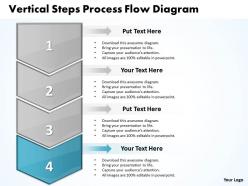
Business powerpoint templates vertical steps process flow diagram sales ppt slides


Try Before you Buy Download Free Sample Product
 Impress Your
 Audience
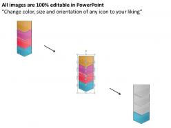
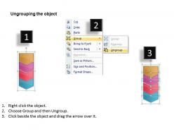
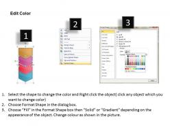
Editable
of Time


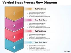
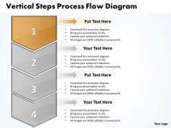
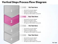
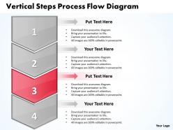
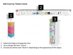
Inspire your team with our Business PowerPoint Templates vertical steps process flow diagram Sales PPT Slides. Let the force of your ideas flow into their minds.
People who downloaded this PowerPoint presentation also viewed the following :
Business powerpoint templates vertical steps process flow diagram sales ppt slides with all 9 slides:
Affordable high quality Business PowerPoint Templates vertical steps process flow diagram Sales PPT Slides are available in thousands of styles. Suited for every presentation need.
FAQs for Business powerpoint templates vertical steps process flow diagram
So basically you're mapping out how work actually moves through your company - who does what and when. Super helpful for catching bottlenecks and those random handoffs that make zero sense but everyone just accepts. Honestly, some processes are wild when you see them on paper. You'll spot redundancies fast and figure out why stuff gets stuck. Plus it makes training new people way easier since everything's laid out clearly. I'd start with whatever process is driving you nuts right now - trust me, you'll immediately see where things go sideways.
Honestly, these diagrams are game-changers for figuring out where your processes are broken. Map out your workflow and suddenly you'll see all the stupid bottlenecks and redundant steps that've been driving everyone crazy. Teams finally understand who's supposed to do what (and when), so there's way less confusion. The visual aspect makes it super obvious where you could automate stuff too. Oh, and start with whatever process pisses people off the most - that's where you'll find the easiest fixes. It's kinda like having X-ray vision but for boring business stuff.
So you'll need the basic shapes first - ovals for start/end, rectangles for process steps, diamonds for decisions. Arrows show the flow obviously. If different departments are involved, add swimlanes (those are just sections showing who does what). Honestly, I always mess up the connector parts where processes split and merge - but you'll figure it out. Keep it simple enough that anyone can follow from A to Z. Start with mapping your current process, then you can spot where things get stuck. That's where the magic happens for improvements.
Honestly, flow diagrams are like getting X-ray vision for your messy processes. You'll spot bottlenecks instantly - places where everything dumps onto one poor person or where approvals just sit there forever. I always time each step first (sounds boring but trust me). Then you can see which handoffs are actually pointless and where things back up. Multiple inputs hitting one department? That's your problem right there. The cool part is once you map it out, fixes become obvious - add more people to that step, cut the redundant stuff, or create alternate paths so everything doesn't funnel through the same spot.
Honestly, I'd go with Draw.io first since it's completely free and works great with Google Drive. Lucidchart is another solid choice - their templates are pretty slick and the collaboration stuff actually works well. If your company's already paying for Microsoft everything, Visio does the job but feels kind of outdated now? For basic diagrams, those three should cover you. Bizagi and ProcessMaker have tons of features but they're probably way more than you need unless you're doing serious process mapping. I'd mess around with Draw.io first, then maybe try Lucidchart's free trial if you need fancier features.
So basically, high-level diagrams are for the big picture stuff - like 5-10 boxes max that executives can glance at and get it. Detailed ones break everything down into actual tasks and decision points. I always start high-level first to get people on board, then go granular. The detailed version needs to be specific enough that someone could literally follow it step by step without asking questions. Think of it this way - high-level is the 30,000-foot view for stakeholders, detailed is for the people actually doing the work who need every little subprocess mapped out.
Oh man, you definitely need those process flow diagrams for BPR. Map out your current mess first - seriously, you'll be shocked at how convoluted things actually are. All those bottlenecks and redundant steps become super obvious when you see them visually. Then design your ideal future state flows. It's like having a roadmap instead of wandering around lost, you know? Your team will actually understand what you're trying to change too. I learned this the hard way on my last project - tried skipping the documentation phase and it was a disaster. Start with documenting what exists now, then sketch where you want to go.
Oh totally! Process flow diagrams are clutch for compliance stuff. You can literally see every step mapped out, so it's obvious where you need checkpoints or if something's missing. Auditors eat this up too - way better than making them dig through boring policy docs. When new regs drop, you'll know exactly what processes to tweak instead of playing guesswork. I'd start with whatever's most heavily regulated in your business first. That's honestly where you'll get the most bang for your buck. Makes the whole compliance thing feel less overwhelming.
Honestly, most people just cram way too much stuff into one diagram and it becomes a total mess. Skip the tiny details - nobody needs to see every single micro-step. The other huge mistake? Not talking to the actual people doing the work. I can't tell you how many times I've seen these perfect-looking flowcharts that have nothing to do with reality because someone just made assumptions. Walk through it with your team first. Use the same symbols consistently (seems obvious but...), mark your start and endpoints clearly, and definitely test it by having someone random try to follow along. They'll catch the confusing parts you missed.
Don't just show them the diagram - get them involved in building it. Seriously, people will fight you on stuff they didn't help create. Ask for their input at each step and use their actual words, not some fancy business terms. I've watched so many process maps crash and burn because they were too technical. Show them how this fixes their daily headaches, not just looks pretty on paper. Oh, and prep for complaints - have your data ready. Set up follow-up meetings to work in their feedback before you call it done.
So basically horizontal flows left-to-right, vertical goes top-to-bottom - pretty obvious right? Horizontal works better for simple step-by-step stuff like onboarding customers. Way easier to read on screens too. Vertical's good when you've got hierarchies or decision trees that branch downward. I always start horizontal for straightforward workflows. But if you're dealing with approval chains or complex decisions, vertical makes more sense. Honestly, just pick whichever feels right and switch later if it's not working. There's no flowchart police or anything.
Those process flow diagrams are honestly a game-changer for training new people. You can literally walk someone through how work moves around your company instead of handing them some boring manual to read. Think of it like a roadmap - shows every step, decision point, and who passes what to whom. Way less intimidating than memorizing everything upfront! New hires can keep referencing the diagrams while they're figuring things out, which cuts down on all those awkward "um, what's next?" moments. I'd start with your most common processes first since those are what they'll hit right away.
So there's actually a bunch of useful stuff you can track from those diagrams. Cycle time shows how long your whole process takes, and throughput tells you volume per time period. Bottlenecks jump out pretty easily - that's where everything gets jammed up. You'll catch waste too, like redundant steps or pointless handoffs. Task-level efficiency is huge for seeing resource utilization. Oh, and those decision points that branch off? They're gold for spotting failure rates and rework cycles. Honestly, I'd start by timing each current step first - gives you solid baseline numbers to compare against later.
Look, these flow diagrams are honestly game-changers for fixing broken processes. Map out your steps visually and suddenly you'll spot all the dumb stuff - redundant approvals, bottlenecks where things pile up, pointless handoffs between teams. It's wild how obvious problems become once you see them drawn out. You can actually measure how long things take and test fixes before rolling them out. Everyone gets on the same page about what's screwed up. I'd start with just one messy process that bugs you. The "aha moments" when you see the waste will surprise you.
Amazon's the perfect example - you click buy and there's this whole mapped-out flow from warehouse to your door. McDonald's does it too with their kitchen timing so your Big Mac takes the same 3 minutes everywhere. Banks have loan approval workflows, hospitals track patients from check-in to discharge, even Spotify has process maps for flagging sketchy content. Honestly, they're just visual roadmaps that show decision points and when stuff gets passed between teams. Pick any annoying process at work and map it out - I bet you'll spot the bottlenecks immediately.
-
Very unique, user-friendly presentation interface.
-
Great designs, Easily Editable.