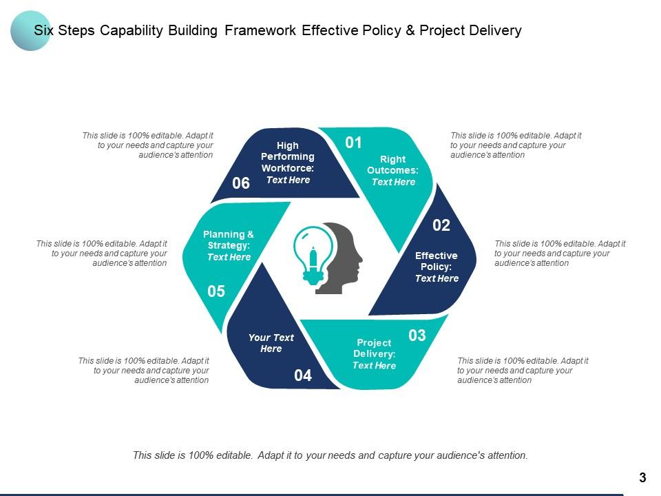
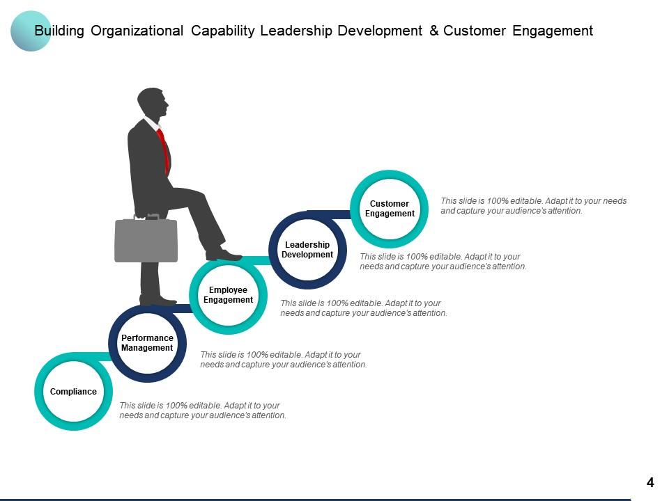
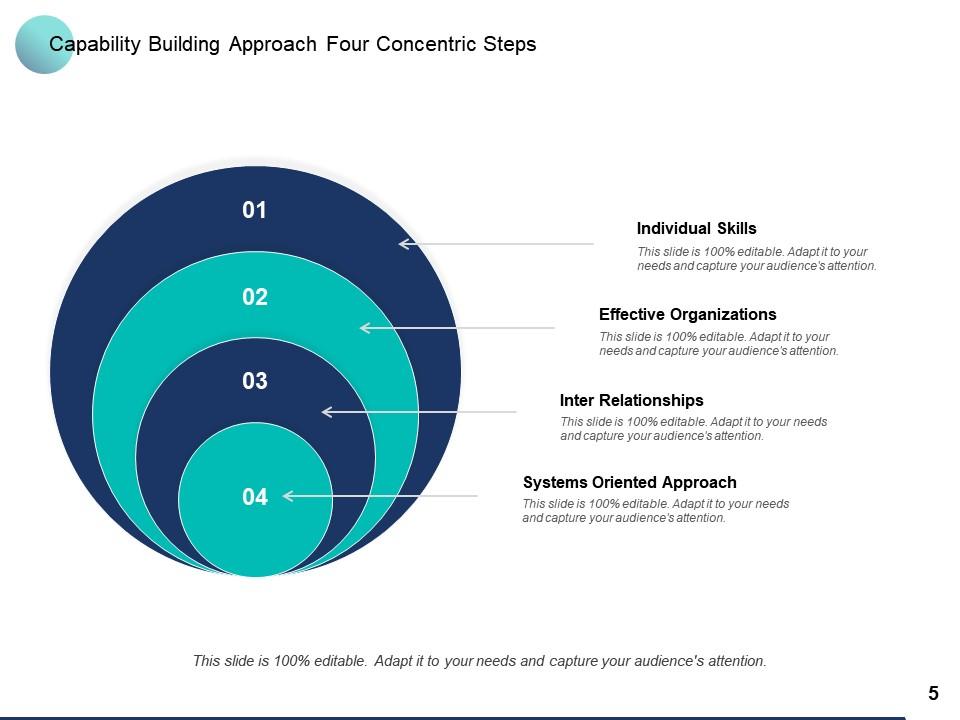
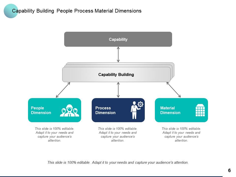
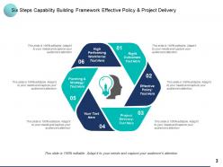
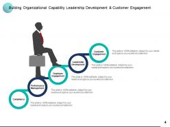
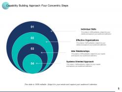
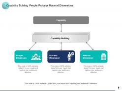
Capability Building Customer Engagement Employee Engagement Leadership Development Compliance

Rating:
88%
Capability Building Customer Engagement Employee Engagement Leadership Development Compliance
Slide 1 of 12
Favourites Favourites

Try Before you Buy Download Free Sample Product

Audience Impress Your
Audience
Editable 100%
Editable
Time Save Hours
of Time
The Biggest Sale is ending soon in
0
0
:
0
0
:
0
0
Rating:
88%
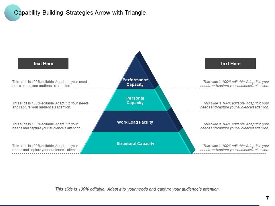
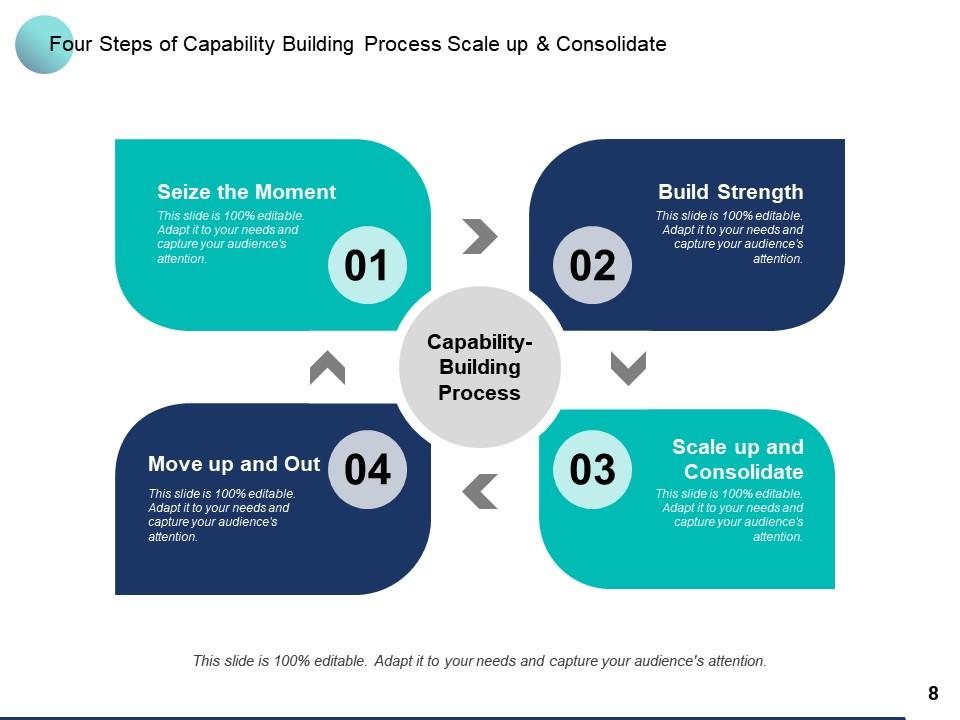
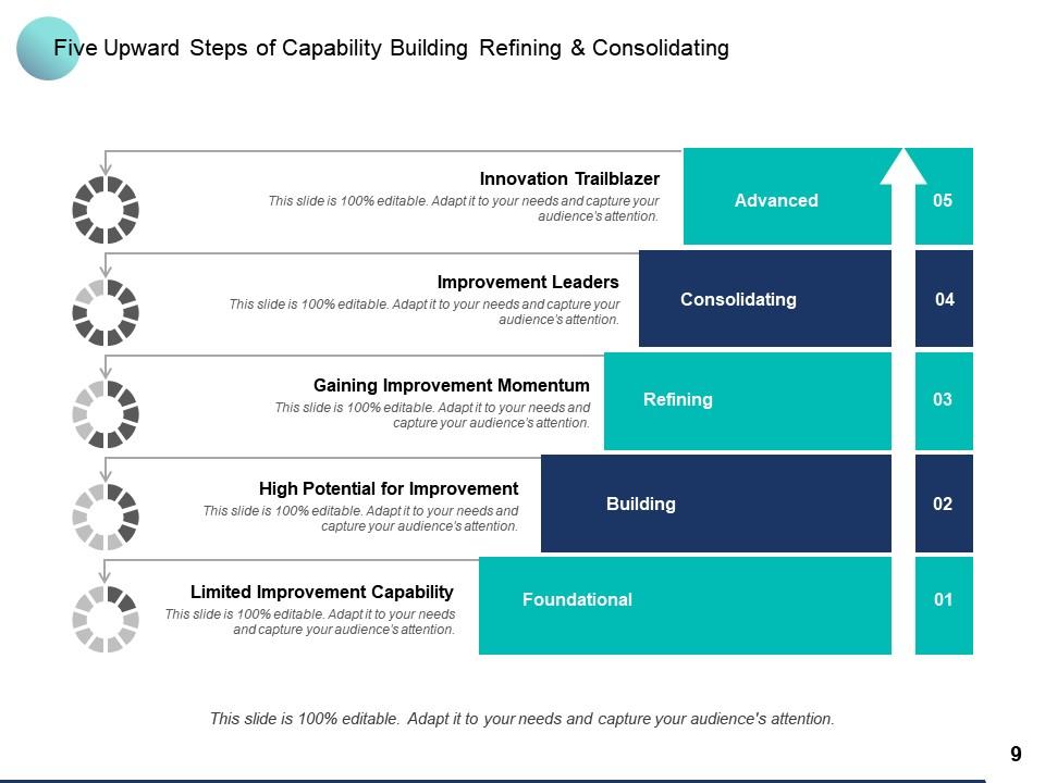
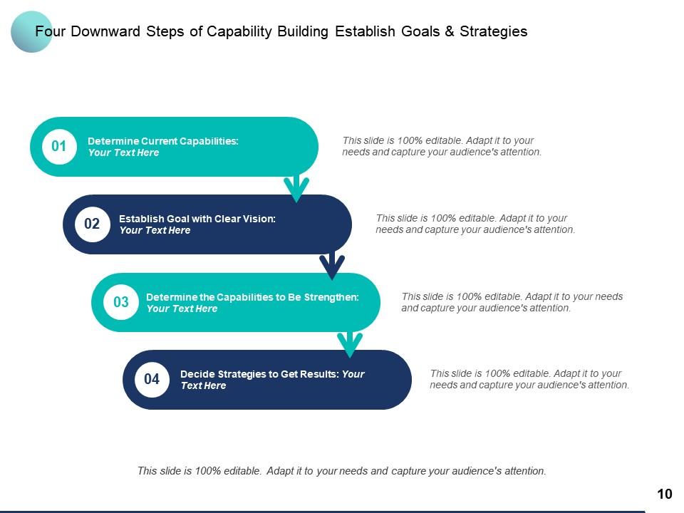
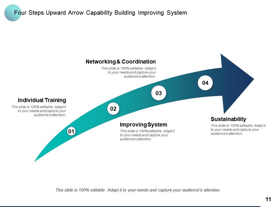
This PPT deck displays twelve with in depth research. Our topic oriented Capability Building Customer Engagement Employee Engagement Leadership Development Compliance presentation deck is a helpful tool to plan, prepare, document and analyse the topic with a clear approach. We provide a ready to use deck with all sorts of relevant topics subtopics templates, charts and graphs, overviews, analysis templates. Outline all the important aspects without any hassle. It showcases of all kind of editable templates infographs for an inclusive and comprehensive Capability Building Customer Engagement Employee Engagement Leadership Development Compliance presentation. Professionals, managers, individual and team involved in any company organization from any field can use them as per requirement.

FAQs for Capability Building Customer Engagement Employee Engagement

Honestly, visuals are a game-changer for keeping people awake during presentations. Your brain craves more than just someone talking at you - it wants charts, props, movement, whatever. I've watched entire rooms perk up the second a speaker pulls out an actual demo or throws up a good graph. Short sentences work. Longer ones with natural flow keep things interesting too. The trick is making sure your visuals actually help your message instead of being distracting. Oh, and don't forget you moving around counts as visual engagement - way better than standing like a statue behind the podium.

Honestly, stories are way more powerful than just rattling off features and stats. Your brain is literally designed to follow narratives - it's wild how much longer people pay attention. Try setting up a problem, building some tension, then boom - your solution saves the day. I always tell people to throw in real customer examples or even made-up scenarios their audience will connect with. "Imagine if..." or "Last month, our client..." hooks them instantly. Those bullet-point presentations? They're death. Next time, skip the boring agenda slide and open with a story instead.

Start with something that grabs attention - maybe a crazy stat or question that makes people actually care. White space is your friend on slides, and please don't dump paragraphs of text everywhere. Stick to like 3-5 main points tops. I always throw in polls or quick discussions because honestly, people zone out fast without interaction. Stories work way better than bullet points for some reason - our brains just latch onto them. Oh, and practice those slide transitions until they feel smooth. Nothing kills momentum like awkwardly fumbling between points. Less content, more engagement. Trust me on this one.

Honestly, the magic happens when people actually *participate* instead of just zoning out. You know how you remember cooking with your mom way better than watching Food Network? Same deal. Throw in some polls, quick Q&As, or even just "who here has tried this?" moments. Their brains have to stay switched on because they might get called on next. I'd say hit them with something interactive every 5-7 minutes - any longer and you'll lose them to their phones. Works like a charm for keeping everyone awake and actually absorbing your stuff.

Okay so here's what actually works - ditch most of your text for visuals. Our brains are weirdly fast at processing images, like 60,000x faster than reading words. Wild, right? One idea per slide max (I know it's tempting to stuff everything in there). Put your biggest points at the start and end since people remember those best. White space is your friend - it makes everything pop. Oh and try that 6x6 thing: six bullets, six words each tops. Honestly makes such a difference.

Oh this is huge! You gotta know who you're talking to first. Like, polling works great for some crowds but feels weird with others. C-suite folks want different stuff than new employees - totally different energy. I'd survey people beforehand if you can, or at least ask whoever's organizing about the group. What's their background? Experience level? Once you know that, you can pick whether to do breakout sessions, demos, whatever actually fits. Plus you'll see pushback coming from a mile away. It's honestly half the battle won right there.

Your data needs to solve whatever's keeping your audience up at night. I'd start there, then build visuals that actually answer their question. Clean is better—learned that after bombing a presentation with like 6 different chart colors last month, yikes. Annotations are your friend for calling out the important stuff. Context matters too, so throw in benchmarks or show trends over time. Interactive charts are cool if people want to dig around, but honestly static ones work fine for most presentations. Test it on a coworker first though—if they squint at your chart, you're not done yet.

Honestly, people's attention spans are shot these days. Dense slides full of text? Total death sentence for any presentation. Your audience will zone out by slide 3, let alone 47. Mix in some videos, charts, or even basic graphics - different people learn differently anyway. Some need visuals, others want to hear stuff explained. I always think about how much I hate sitting through boring presentations myself. Strategic multimedia actually helps clarify your points instead of just looking pretty. Try swapping out one text-heavy slide for a quick video next time. You'll definitely notice more engagement and way fewer people scrolling their phones.

So many ways to get people engaged! Live polls work great - Mentimeter's solid but honestly just asking for a show of hands does the trick too. Q&A sessions are clutch, especially when people can submit questions as you go. If you're doing virtual stuff, breakout rooms are perfect for small group chats. One thing I swear by is "think-pair-share" - people discuss with a partner first, then share with everyone. Way less intimidating. Interactive quizzes hit different too, or analyzing case studies together. Oh, and don't sleep on simple icebreakers at the start. Just pick 2-3 things that actually fit your crowd size and content. Don't try to do everything.

Think of it like DJing - you can't just blast high energy the whole time or people burn out. I usually come out swinging to hook them, then mix in some chill moments where big ideas can actually land. Around 10 minutes in, watch for that glazed-over look (happens every time). That's your cue to throw in a story or get them talking. Heavy info dumps are presentation killers, honestly. If you see phones coming out, either pick up the pace or ask a question to snap them back. Plan your beats ahead of time, but don't be afraid to pivot when the room's energy shifts.

Honestly, humor's a game-changer for presentations. Breaks up tension and keeps people from zoning out (especially after lunch lol). Self-deprecating jokes work well - makes you seem less intimidating. Pop culture references are solid too, just make sure your audience actually gets them. I've bombed with inside jokes before... awkward silence is real. You can also use funny analogies to explain boring stuff. But yeah, steer clear of controversial topics obviously. Read the room first - toss out a light comment and see how they react. Some crowds are just not having it, and that's fine. Adjust from there.

Honestly, feedback is everything for getting better at presentations. I usually do quick surveys after or just chat with people during breaks - way more honest that way. Live polls are surprisingly fun too, though maybe that's just me being a nerd about it. My go-to question is always "what would you change?" because people actually tell you the truth instead of just being polite. But here's the thing - you've got to actually USE what they tell you. Don't be like me and collect a pile of feedback then never look at it again. Pick one thing and try it next time.

Oh man, the worst thing you can do is just dump information on people without any back-and-forth. Reading straight off slides? Death sentence. I learned this the hard way lol. Ask questions every few minutes, actually look at people instead of staring at your notes, and pay attention when they start checking their phones - that's your cue to switch things up. Those bullet-heavy slides are brutal too. Your visuals should tell a story, not be a teleprompter. Honestly, just start with a question right away and you'll already be ahead of 90% of presenters out there.

Dude, this stuff matters way more than you'd think. Japanese audiences want indirect communication and pauses - totally different from Americans who prefer you just say it straight. Some places are super formal with hierarchy, others are chill. I bombed a presentation once because I didn't get the eye contact thing right (whoops). Collectivist cultures participate differently than individualist ones too. My advice? Research who you're presenting to beforehand. Then adjust your questions, interaction style, even jokes to match. Makes such a huge difference in connecting with people.

Oh dude, color psychology is actually a game changer! Different colors mess with people's emotions in crazy ways. Red and orange get people pumped up and create urgency, while blue makes you seem trustworthy and keeps everyone chill. Green's good for that balanced, growth vibe. I used to just pick whatever looked pretty (so dumb lol) but now I actually think about my message first. Quarterly results? Go blue for credibility. New idea pitch? Warmer colors work way better. Just don't use like 5 different colors or you'll give everyone a headache.

Ratings and Reviews

88% of 100
Review Form
Write a review
Most Relevant Reviews
  1. 100%

    by Desmond Garza

    Appreciate the research and its presentable format.
  2. 80%

    by Earle Willis

    Easily Understandable slides.
  3. 80%

    by Michael Allen

    Use of different colors is good. It's simple and attractive.
  4. 100%

    by Dannie Washington

    Graphics are very appealing to eyes.
  5. 80%

    by Derick Meyer

    I discovered this website through a google search, the services matched my needs perfectly and the pricing was very reasonable. I was thrilled with the product and the customer service. I will definitely use their slides again for my presentations and recommend them to other colleagues.

5 Item(s)

per page: