


Coffee Shop Business Dashboard Month Master Plan Kick Start Coffee House Ppt Download




Try Before you Buy Download Free Sample Product
 Impress Your
 Audience
 100%
100% Editable
 Save Hours
 of Time


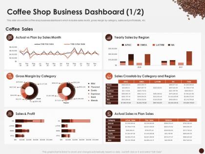
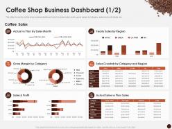
This slide shows the coffee shop business dashboard which includes sales month, gross margin by category, sales and profit details, etc.
People who downloaded this PowerPoint presentation also viewed the following :
Coffee Shop Business Dashboard Month Master Plan Kick Start Coffee House Ppt Download with all 2 slides:
Use our Coffee Shop Business Dashboard Month Master Plan Kick Start Coffee House Ppt Download to effectively help you save your valuable time. They are readymade to fit into any presentation structure.
FAQs for Coffee Shop Business Dashboard Month Master Plan Kick Start Coffee
Start with your basics: daily revenue, transaction averages, and customer count. Coffee beans are crazy expensive right now, so track your cost of goods religiously. Labor costs should stay around 25-30% of revenue if you can swing it. Peak hours are huge - figure out when you're slammed so you don't get caught short-staffed. Watch inventory turnover and waste too (those day-old croissants add up fast). Customer stuff matters - how often people come back, items per order. Oh, and set alerts when anything drops 10% week-to-week. Trust me, catching problems early saves your ass.
Real-time data is honestly a game-changer - you'll catch patterns instead of just winging it. Like when oat milk's flying off the shelf or your actual rush hits at 2:30, not 3 like you thought. Perfect for adjusting staff on the spot or pushing those blueberry muffins that aren't moving. You can see wait times getting crazy and open another register before customers start giving you the stink eye. My advice? Track maybe 2-3 things at first. Don't go overboard with every metric or you'll drown in numbers.
Customer feedback is like your north star for dashboard design - shows you what's actually worth tracking instead of what looks cool. Wait times keep coming up in complaints? Put queue metrics front and center. People going crazy for certain drinks? Track those sales religiously. I swear, half the dashboards I see are total eye candy but miss what customers actually care about. Your reviews help you figure out which metrics deserve the spotlight and which ones are just... well, fluff basically. Go through last month's feedback and see what jumps out.
Honestly, tracking your inventory will save you so much money it's not even funny. I used to just guess how much oat milk to order and kept running out every damn Tuesday! Now I actually track daily usage and spoilage rates for my top items. Two weeks of data and you'll spot the patterns immediately. Your turnover ratios tell you exactly how much milk, beans, and pastries you really need vs. what you think you need. Data beats gut feelings every time - I'm cutting food costs by like 15-20% now while customers stay happy. Start with your top 10 sellers.
Hey! So for your coffee shop dashboard, line charts are perfect for tracking daily sales patterns. Bar charts work awesome for comparing which drinks are selling best. I'd definitely throw in some simple KPI cards at the top for your main numbers - revenue, customer count, that stuff. Heat maps are actually clutch here (didn't expect that, right?). They'll show you exactly when you're slammed and which items people order at different times. Maybe add gauge charts if you're tracking daily goals. Don't go crazy with colors though. Keep it clean and put your most important stuff where you'll see it first.
Yeah, you'll totally notice seasonal patterns when you dig into that dashboard data. Summer's all about iced drinks and tourist crowds. Winter? Everyone wants hot stuff - lattes, seasonal drinks, you know. Spring and fall are pretty steady, but honestly pumpkin spice season is just insane for sales spikes. Your monthly comparisons should show all this pretty clearly. I'd filter by drink type and check year-over-year numbers to really see what's happening. Then you can actually plan your inventory and staff schedule ahead of time instead of scrambling.
Honestly, I'd probably start with whatever connects easiest to your POS system first. Tableau and Power BI are both solid if you want something more heavy-duty - they'll pull from everything (sales, inventory, the works). Google Data Studio is free and does the job well too. Don't sleep on Excel though - I know it sounds basic, but a good Excel dashboard can be surprisingly powerful when you're starting out. Oh, and if you're already using QuickBooks for your books, their reporting isn't terrible either. My advice? Keep it simple at first. You can always upgrade once you figure out which numbers actually matter for your business.
Track sales per barista, completion times, and customer ratings by shift - your POS probably already grabs this stuff. Weekly reports work way better than real-time monitoring (nobody wants Big Brother vibes). Start with positive metrics first since people hate feeling spied on. Then add accuracy rates and upselling numbers once everyone's comfortable. The goal is spotting training needs and celebrating wins, not making your team paranoid. Honestly, automated weekly trends tell you everything you need without the whole surveillance nightmare that tanks morale.
Honestly, start with the basics - how often people come back and what they spend when they do. Set up cohort tracking so you know if customers return after 30 days, 90 days, whatever. If you've got a rewards program, don't just look at signups (those numbers are always inflated) - check actual redemption rates instead. That tells you way more about real engagement. Customer lifetime value's huge too. Oh, and definitely set alerts when these numbers drop below your targets. You'll want to catch loyalty issues before they tank your revenue completely.
Track your follower growth and engagement rates - likes, comments, shares, story views, the whole thing. Mentions and tags matter too. Honestly, watching sentiment in comments is huge because pissed off customers love to blast businesses online. Pull this stuff weekly and compare it to your actual foot traffic and sales. Engagement usually drops before revenue takes a hit, so it's like an early warning system. Oh, and set up alerts for sudden spikes in mentions or sentiment changes. That way you can jump on any issues before they blow up.
Honestly, start with the basics - daily revenue, average transaction size, and cost of goods sold. Those three tell you if you're actually profitable. Labor's probably your second biggest expense after rent, so track that closely. Customer count and items per transaction are gold for figuring out your busy times. Oh, and food waste if you do pastries - that stuff adds up fast. I'd probably skip the complicated metrics like lifetime value for now. These six will give you everything you need to know whether your coffee shop's working or not.
Honestly, your dashboard is like having a crystal ball for your business. You'll see patterns everywhere - maybe iced drinks blow up on Tuesdays or loyalty customers drop way more cash per visit. I'd use that info to time everything better. Push pastries when it's dead at 3pm, or send targeted emails to your latte addicts. The cool part? You can finally see which campaigns actually make money instead of just getting likes. Peak hours tell you when to post on social, and customer data helps you write emails that don't suck.
Breaking down your sales by drink type shows you what's actually selling vs. what's just sitting there. Stock up on the popular stuff before you run out - customers hate when their usual isn't available. You'll catch slow movers early too (trust me, dusty seasonal blends in February are depressing). Morning espresso rushes and summer cold brew spikes become super obvious. Then you can tweak your weekly orders based on real data. Maybe even get better pricing on high-volume items since you'll know exactly what you're moving.
So you'll want to break down your customers into visual segments - age groups, spending habits, when they show up, what they buy. Make charts like "college kids crushing cold brew 2-4pm" or "business people need their espresso before 9am." This stuff can actually surprise you sometimes! Then adjust your menu timing, staffing, even your music based on what you see. Oh, and set up alerts when patterns change so you're not caught off guard. Pretty useful for staying ahead of things.
Okay so definitely do a dual-axis chart - foot traffic on one side, revenue on the other. Makes it super easy to spot patterns. Heat maps are clutch for seeing your busy/dead times color-coded throughout the week. Honestly scatter plots are my favorite though, they make correlations jump out immediately. Oh and throw in a real-time counter plus conversion rates (like how many browsers actually buy stuff). The magic happens when you see high traffic but low sales - that's your cue that pricing or checkout speed is probably screwed up. Keep it all on one dashboard so you're not clicking around forever.
-
Best Representation of topics, really appreciable.
-
Editable templates with innovative design and color combination.
-
Great quality product.
-
Great quality product.
-
Topic best represented with attractive design.