
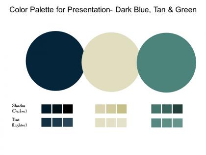
Color palette for presentation dark blue tan and green


Try Before you Buy Download Free Sample Product
 Impress Your
 Audience
Editable
of Time


Astound folks with your adept handling of our Color Palette For Presentation Dark Blue Tan And Green. You will be able to pull it out of the hat.
People who downloaded this PowerPoint presentation also viewed the following :
Color palette for presentation dark blue tan and green with all 2 slides:
Identify areas of interdependence with our Color Palette For Presentation Dark Blue Tan And Green. Establish the connection between individual actions.


FAQs for Color palette for presentation dark blue
Honestly, color psychology is a game changer for presentations. Different colors literally mess with people's emotions - blues and greens make audiences feel chill and trust you more, while reds pump up urgency or excitement. Yellow's great for grabbing attention but gets annoying fast. I bombed a presentation once using way too much red and everyone looked stressed out! Match your colors to your vibe. Cool tones work for data stuff, warmer ones for motivational talks. Pick 2-3 colors that fit your message and stick with them throughout.
Honestly, colors mess with people's heads way more than you'd expect. Figure out your vibe first - corporate and trustworthy? Go blues and grays. Fun and energetic? Bright oranges work great. Luxury brands always go for those deep purples and gold combos. Don't go crazy with too many colors though. Pick maybe 2-3 main ones, throw in some neutrals so it doesn't look like a rainbow exploded. Your audience matters too - what clicks with them? Here's what I'd do: test your palette on different stuff first. Business cards, your website, social posts. See how it actually feels before you commit. Then stick with it everywhere or you'll confuse people.
Honestly, Coolors.co is my go-to - just spam the spacebar and watch magic happen lol. Adobe Color works great too if you're already using their stuff. Paletton's awesome for learning the actual color theory behind everything. Oh, and if you have like a company logo or photo? Canva can pull colors straight from that which is pretty neat. Just don't go crazy with colors though. Stick to 3-4 max or your slides will look like a rainbow threw up. Trust me, I've been there and it's not cute.
Dude, you need way more contrast between your text and background. Dark on light, light on dark - whatever works. I learned this the hard way when my slides looked fine on my laptop but were totally unreadable once projected. It's not just about picking different colors either - you need actual difference in how light or dark they are. Here's what I do: snap a photo of your slide and make it black and white. Can you still read everything easily? If yes, you're good to go. Trust me, your audience will thank you for not making them squint.
Oh man, don't go crazy with colors - 3 or 4 tops. I've seen so many presentations that look like a rainbow exploded lol. Red and green together? Terrible idea since colorblind people can't tell them apart. Also those super light colors on white backgrounds are the worst - everything just vanishes under those harsh projector lights. Test your stuff in different lighting! Here's what I do: squint at your slides. Can't read it while squinting? Your audience definitely won't be able to either. Trust me on this one.
Contrast and patterns are your best friends here - don't lean on color alone. I swear by tools like Stark or Color Oracle to check how your design looks with different types of color blindness. Hit those WCAG ratios (4.5:1 for regular text, 3:1 for big text). Throw in some textures or labels with your color coding. Red-green combos are tricky since that's super common. Oh, and here's a quick test - if someone printed your stuff in black and white, would it still make sense? That usually tells you everything you need to know.
Okay so red screams urgency and passion - think stop signs and love letters. Blue's the trustworthy one (literally every tech company ever), while green says growth and nature. Yellow's super energetic but honestly? It hurts my eyes sometimes. Purple feels fancy or artsy, orange is like that friendly coworker everyone loves. Black and gray are classy but can get heavy real quick. White keeps things clean and modern. But here's what's wild - colors mean totally different things across cultures. So maybe pick 2-3 that match your vibe first, then see how they look together.
Think of color temperature as your secret weapon for setting the vibe. Warm colors like reds and oranges? They're perfect when you want energy - motivational stuff, product launches, that kind of thing. Blues and greens feel way more professional and trustworthy, so I always go with those for data presentations or serious topics. You can totally mix them too - cool backgrounds with warm accents work surprisingly well. Honestly, just ask yourself what emotion you're going for first. Want people pumped up? Go warm. Need them to trust your numbers? Stick with cool tones. It's pretty straightforward once you think about it that way.
Honestly? Navy and white is your best friend for corporate stuff - classic and readable on any screen. Gray/white combo looks super clean too. Stay away from crazy bright colors unless they're actually your company's brand (learned that one the hard way lol). Dark green with cream is nice if you want something different but not weird. Make sure there's enough contrast so people can read from the back row. Two colors tops, and stick with them the whole time. Short sentences work. Longer ones help with flow when you're explaining the details.
Colors are tricky when you're going global - they can totally tank your campaign if you're not careful. Like, red screams good luck and money in China, but over here it's more about danger or aggression. White's another weird one - we see purity, but in some Asian countries it means death and mourning. I actually saw a brand mess this up spectacularly once. Do your homework on color meanings before you finalize anything. Either go with safe, neutral colors or create different versions for each market. Focus groups are clutch if you can swing the budget for them.
So monochromatic is basically using one color in different shades - like going from deep navy to light powder blue. Complementary colors are opposites on the color wheel, think blue and orange. Honestly, monochromatic is foolproof if you want something calm and put-together. Those opposite colors though? They create way more drama and energy since they make each other really pop. I always tell people to pick one as the main color and use the other sparingly as an accent - otherwise it gets overwhelming fast. Monochromatic = safe and elegant. Complementary = bold but trickier to pull off.
Keep gradients subtle - that's the main thing. Use colors already in your palette and make smooth transitions between them. I learned this the hard way after making slides that looked like a geocities website lol. Two or three colors max works best. You can put them behind sections or use them to highlight important stuff. Just make sure people can actually read your text over the gradient! Oh and definitely check how it looks on different screens first. Some projectors are weird and wash out colors completely. Strategic placement is way better than going gradient-crazy everywhere.
So basically everyone's doing super minimal color schemes now - like 2-3 main colors tops. High contrast is where it's at: navy with bright white, or forest green with cream. Monochromatic stuff is really popular too (just different shades of the same color). Honestly, I'm kind of over those crazy bright colors we used to use everywhere? The muted, sophisticated tones look so much cleaner. Your presentations will definitely look more polished this way. Pick one bold accent color and build everything else around neutrals - trust me, it works.
Pick 3-5 colors and actually stick with them - I know it sounds obvious but everyone messes this up. Write down the hex codes somewhere (I literally have them in my phone notes). Then use your software's "recent colors" instead of trying to match shades by eye every time. PowerPoint lets you save custom themes too which is clutch. The thing is, even tiny color differences will make everything look sloppy. I've seen so many presentations where someone used like 6 slightly different blues thinking nobody would notice. We notice. Choose once, then don't get creative later.
Adobe Color's website is probably your best starting point - solid theory plus their color wheel tool is actually pretty useful. Josef Albers' "Interaction of Color" is like the bible for this stuff, but heads up, it can be kinda dry and academic. Coolors.co has tons of real examples you can browse through for inspiration. Oh, and definitely follow Steve Schoger on Twitter if you're on there - he drops genuinely helpful color tips all the time. Refactoring UI's color section is way more digestible than Albers too. Just mess around with Adobe Color first, then grab a book once you're hooked.
-
Content of slide is easy to understand and edit.
-
Attractive design and informative presentation.
-
This is a soothing color palette. Easy to download and use.