


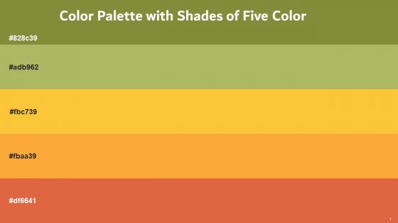
Color Palette With Five Shade Sycamore Olive Green Bright Sun Yellow Orange Red Damask




Try Before you Buy Download Free Sample Product
 Impress Your
 Audience
 100%
100% Editable
 Save Hours
 of Time


Heres a visually-pleasing color palette with Five Color Shades With Hex Code 828c39, adb962, fbc739, fbaa39, df6641. These colors are intuitively picked to ignite the spark of brilliance in your designs and creativity.
People who downloaded this PowerPoint presentation also viewed the following :
Color Palette With Five Shade Sycamore Olive Green Bright Sun Yellow Orange Red Damask with all 17 slides:
Use our Color Palette With Five Shade Sycamore Olive Green Bright Sun Yellow Orange Red Damask to effectively help you save your valuable time. They are readymade to fit into any presentation structure.










FAQs for Color Palette With Five Shade Sycamore Olive Green Bright Sun Yellow
For your presentation colors, start with your audience and what vibe you're going for. Stick to 2-3 colors max or it'll look messy. Make sure there's good contrast - I once used light gray text and nobody could read it, which was embarrassing. Test it on different screens first! Colors have emotional impact too, so don't use bright red for a calming topic or whatever. Oh, and if you have brand guidelines, obviously follow those. Different devices and lighting can really mess with how colors look, so contrast is key.
Colors mess with people's heads way more than you'd think. Red and orange pump everyone up but can stress them out - trust me, I bombed a presentation once with this crazy red background. Blues and greens are your safe bet for looking trustworthy. Yellow's great for grabbing attention, just don't go overboard or you'll give people headaches. Purple screams "creative" if that's your vibe. Honestly, pick 2-3 colors max and call it a day. Oh, and definitely test how it looks on different screens first - projectors can be weird about colors.
So there are three main things I focus on. Make sure your text has strong contrast against the background - at least 4.5:1 ratio. Don't just use color to show important stuff because colorblind people will miss it completely. I actually messed this up once with red/green status dots and my boss was like "what are you even showing me here?" Also, test your designs! WebAIM has this contrast checker that's pretty solid. Honestly, colorblind simulators are great too if you can't find actual users to test with. Way more people will actually understand your presentations.
Think of contrasting colors like a highlighter for your slides - they grab attention exactly where you need it. Bright colors on neutral backgrounds? Blue and orange together? That stuff literally jumps out at people. I used to make everything the same color and wondered why my presentations felt so... blah. But here's the thing - you can't go crazy with it. Highlight everything and suddenly nothing's special anymore. Stick to maybe 2-3 key points max and make those pop against your regular text. Works every time.
So the 60-30-10 rule is basically foolproof for color schemes. Your main color covers 60% (like walls), secondary gets 30% (furniture and bigger stuff), then 10% goes to accent colors for pops of drama. I swear it saves you from that whole "why does my room look like a rainbow exploded" situation. Pick your dominant color first - that's honestly the hardest part. Once you've got that, the rest just falls into place. Works because it creates this natural flow instead of everything fighting for attention.
Look at your brand colors first - whatever you're using for your logo and website. Grab the actual hex codes from your brand guidelines because "close enough" really isn't. Build your whole palette around those main colors for consistency. Add maybe 2-3 supporting colors that work well together - I usually go with neutrals for backgrounds since they're safe. One thing though - definitely test everything on real slides before your presentation. Can't tell you how many times I've seen people pick colors that look terrible under those bright conference room lights. Short sentences mixed with longer ones help too.
Coolors.io is honestly my go-to - you can lock colors you love and keep generating around them. I waste so much time just clicking through combinations lol. Adobe Color works great if you're already using their stuff. Paletton's more technical but gives you better control over how colors actually relate to each other. For inspiration, Pinterest and Dribbble are perfect. My strategy? Pick one color that makes you happy, then let these tools build the rest. Sometimes I'll screenshot random stuff I see just for the color combos.
So basically use bright colors for your main points and keep everything else muted - that way the important stuff pops. I always think of it like traffic lights (weird comparison but whatever). Your brightest colors should only hit the key elements, then tone it down for the rest. Don't go crazy with too many accent colors or it'll just look messy. Maybe stick to one or two max? Here's a trick that actually works: squint at your slides and see what grabs your attention first. That's probably what your audience will notice too.
Honestly, stick to like 2-3 colors max or it'll look like a rainbow exploded. Red and green together are a no-go - colorblind people can't tell them apart. Light colors on white backgrounds? Nobody wants to squint at your slides from the back row. I made that mistake once and it was painful to watch. Bright neon colors are the worst under those harsh projector lights too. Your text has to pop against whatever background you pick. Oh, and definitely test it on an actual projector first if you can - I swear colors look completely different when projected versus on your laptop screen. Trust me on this one.
For formal presentations, stick with safe colors - navy, charcoal, those muted blues and grays. Keeps you looking credible. But informal stuff? Go wild! Bright colors, bold combos, whatever matches your vibe. I'm obsessed with warm tones for casual talks lately - they just feel friendlier, you know? The difference is simple: boardrooms want trust and readability over flashy creativity. Brainstorming sessions let you actually express yourself. So ask yourself what kind of room you'll be in first. That'll tell you if you should play it safe or have some fun with it.
Honestly, pick 2-3 colors and stick with them through the whole thing. Your slides will look way more professional instead of like you threw them together last minute. Plus your audience won't get distracted by random color changes - they can actually focus on what you're saying. It's kind of like how you instantly know a Starbucks or Target just from their colors, you know? The consistent palette creates this visual thread that ties everything together. Trust me, decide on your colors upfront and you won't spend forever second-guessing yourself on every single slide.
Oh dude, you really gotta watch out for color meanings when you're presenting to different cultures. Like, red is lucky in China but screams danger here in the West. White? Super pure to us, but it's actually a mourning color in parts of Asia - who knew, right? Purple still feels fancy everywhere since it used to cost a fortune to make. Green's tricky too. Sure, it's nature, but Americans think money while other places think jealousy. Honestly, just stick with blues or ask someone local what works best.
Okay so for presentations this year, those warm earthy colors are *everywhere* - terracotta, sage green, warm browns. They just feel more real, you know? Bold colors are also huge right now. What I keep seeing that works really well is mixing one bright pop (like electric blue or coral) with the earthier stuff. Skip those cold, sterile color schemes from before - they're so dated now. People respond way better to warmer tones anyway. Just stick to 2-3 colors max and definitely test them on different screens first. Trust me on that one.
Pick one or two colors that'll work throughout your whole presentation - like your main brand color or a good neutral. Those become your anchors. I'd gradually bring in new colors while keeping those base ones visible. Honestly, nobody wants to sit through a presentation that looks like Skittles threw up everywhere! Quick tip: use some plain transition slides between major color shifts. Gives people's eyes a sec to adjust. Also try different shades of similar colors instead of going completely wild with totally different ones. Oh, and sketch out your color plan beforehand - trust me, it saves so much headache later when you're not scrambling to fix everything.
Oh man, background color is everything for readability. Seriously - I've sat through so many presentations where I'm literally squinting at the screen because someone thought neon green text on a bright yellow background was "creative." Dark text on light backgrounds is your safest bet. Light text on dark can look sleek but you gotta be more picky with colors. And please, for the love of all that's holy, don't put text over busy patterns or those gradient things. Step back from your laptop - if you can't read it from across the room, neither can your audience.
-
My presentations were a bit amateur before I found SlideTeam’s designs. I’ve been able to find slides for nearly every topic I’ve had to present. Thanks, Slideteam!
-
Perfect template with attractive color combination.