


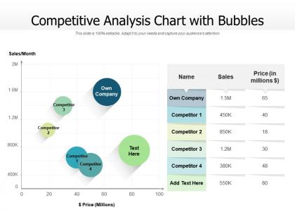
Competitive analysis chart with bubbles




Try Before you Buy Download Free Sample Product
 Impress Your
 Audience
 100%
100% Editable
 Save Hours
 of Time


Our Competitive Analysis Chart With Bubbles are topically designed to provide an attractive backdrop to any subject. Use them to look like a presentation pro.
People who downloaded this PowerPoint presentation also viewed the following :
Competitive analysis chart with bubbles with all 2 slides:
Use our Competitive Analysis Chart With Bubbles to effectively help you save your valuable time. They are readymade to fit into any presentation structure.

FAQs for Competitive analysis
So bubble charts are pretty neat because you can show three things at once - x and y axes plus bubble size. Regular scatter plots or bar charts can't do that. You'll spot patterns you'd totally miss otherwise. The visual thing is huge too - big bubbles grab attention right away, so outliers pop out immediately. I actually used one last week for a work thing and it made the data way clearer. Just don't make bubble size random or meaningless. People will get confused and your whole point gets lost.
Bubble charts are perfect for this! Think scatter plot but way cooler - X and Y axes handle two variables, then bubble size shows your third dimension. The positioning reveals how your first two variables relate, while those bubble sizes expose patterns you'd totally miss otherwise. Pro tip: make the size differences super obvious or people won't catch it. You can even throw in color for a fourth dimension if you're feeling fancy. I've seen people mess this up by making bubbles too similar in size - kills the whole point.
Map bubble size to your most impactful number - whatever shows the biggest differences. Just make sure people can actually tell them apart without squinting. Color's trickier. Different shades of one color work great for continuous data. Categories? Go with distinct colors, but honestly, test it with colorblind simulators first - learned that one the hard way. Always throw in a legend. I know it seems obvious but you'd be surprised how many charts I've seen without one. The real test: can someone glance at it for five seconds and instantly get what the bubbles mean? If not, simplify.
Bubble charts are perfect when you've got three variables to show instead of just two. Scatter plots work great for basic X/Y stuff, but they can't handle that extra layer of info. Like say you're looking at marketing spend vs conversion rates - the bubble size could show total revenue, which honestly makes way more sense than trying to guess that from just two data points. Really useful when you're comparing different segments too. Just don't make the bubbles too confusing or people won't get it. The third dimension thing is what makes them worth using over regular scatter plots.
Oh yeah, that happens when your data points have super similar x and y values - they just pile up on top of each other. Sometimes it's actually telling you something useful about your data, like natural clusters. But other times it just makes your chart look like a mess and nobody can read it properly. Try making the bubbles a bit transparent so you can see through them, or maybe adjust your axis ranges to spread things out more. Honestly, scatter plots with jittering work better sometimes. Oh and definitely add those hover tooltips - that way people can still see the actual values even when everything's stacked up.
Honestly, Excel's bubble charts have gotten pretty decent lately - way better than they used to be. Google Sheets works too for basic stuff. Tableau and Power BI are amazing if you don't mind the learning curve, but they're kinda overkill sometimes. I've been using Flourish recently and it's super clean for web stuff. Datawrapper's good too. Python people love Plotly but that's only if you're into coding. Oh, and matplotlib obviously. I'd just stick with whatever you're already comfortable with first, then maybe upgrade later if you need something fancier.
Yeah, bubble charts can definitely work for real-time stuff! They're perfect when you've got three variables changing constantly - like stock prices or user activity data. Just don't update them too fast or people get motion sick from all the bouncing around (trust me on this one). Keep your data points limited too, otherwise it turns into complete visual mayhem. Honestly, I'd start with maybe 20-30 bubbles max and update every few seconds. You can always speed things up once you see how it feels. Oh, and prototype first with slower refresh rates - way easier to debug when everything isn't flying around constantly.
Bubble charts are great for showing three things at once - x-axis, y-axis, plus bubble size. Way more interesting than regular bar charts, honestly. They're perfect when you want to highlight weird outliers or relationships that'll make people go "huh, didn't see that coming." Visually they just grab attention better too. Only downside? They get crazy cluttered fast. I'd stick to maybe 15-20 bubbles tops, and definitely know what story you're trying to tell before you build it. Otherwise people just stare at pretty circles without getting your point.
Oh man, bubble charts are everywhere once you start looking. Investment firms use them all the time - risk vs return vs market cap, which actually makes perfect sense when you think about it. Healthcare orgs plot patient outcomes against treatment costs and population sizes. Tech companies? They're obsessed with showing user engagement, revenue, and dev costs simultaneously. Marketing teams basically live by them for campaign analysis. Honestly, anytime you've got three dimensions of data that matter, bubbles are probably gonna be your go-to visualization.
Definitely add alt text for your data patterns and make sure you've got good contrast between colors. Don't rely on color alone to show different categories - use shapes or patterns too since colorblind folks won't catch the differences otherwise. Interactive stuff needs keyboard navigation, obviously. I'd also throw in data tables as backup options. Screen readers need clear axis labels and maybe trend summaries to make sense of things. Oh and actually test with real accessibility tools instead of just hoping it works - learned that one the hard way! Your audience will appreciate being able to access the insights.
Overlapping bubbles are the worst - nobody can see your actual data. Don't make your biggest and smallest bubbles too similar in size either. Also avoid using bubble size for weird values that don't make sense visually. I learned this the hard way when my boss stared at my chart for like 30 seconds trying to figure out what it meant. Too many data points just creates chaos. Skip the 3D effects completely. Always add a size legend and keep your axis labels simple. Honestly, test it on someone first - if they're confused, your audience will be too.
Dude, bubble charts are clutch for presentations! You can pack three data points into one visual - x-axis, y-axis, plus bubble size. Way better than drowning people in spreadsheets. Perfect for stuff like plotting market share against growth, where bubble size shows revenue. They actually look interesting too, unlike those soul-crushing bar charts everyone defaults to. Oh, and don't go crazy with bubbles - maybe 15-20 tops? Otherwise your audience won't be able to read anything and you'll lose them completely.
You'll want three numeric variables that actually connect - x and y for position, plus bubble size. Like plotting revenue against profit margin where bubble size shows market share. Continuous data works way better than categories here. The size differences need to matter though, not just look pretty. Clean data is huge because these charts turn into visual chaos fast with messy numbers. Honestly, I've seen so many bubble charts where the bubble sizes represent completely random stuff that nobody cares about. Make sure whatever you're sizing actually means something to whoever's looking at it.
When you're looking at bubble charts, the trends basically show up as clusters or lines - could be diagonal, curved, whatever direction the data's flowing. Outliers are pretty easy to spot since they're just sitting there alone, away from everything else. Oh, and don't forget the bubble sizes can be outliers too - like if you see a massive bubble next to tiny ones in the same area, that's weird. Honestly, I always check the edges first for the obvious weird ones, then trace through the main group to see which way things are trending.
Dude, bubble charts are perfect for this stuff! You can show three things at once - age on one axis, income on the other, then make bubble size show spending power. Honestly, I'm obsessed with them for campaign analysis. The cool part? You'll spot customer clusters that would be invisible on regular charts. Try plotting product performance across markets, or see how satisfaction connects to purchase frequency and lifetime value. I swear you'll find some weird patterns you totally missed before. Makes segmentation way easier too.
No Reviews