


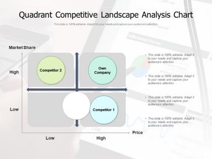
Quadrant competitive landscape analysis chart




Try Before you Buy Download Free Sample Product
 Impress Your
 Audience
 100%
100% Editable
 Save Hours
 of Time


Our Quadrant Competitive Landscape Analysis Chart are topically designed to provide an attractive backdrop to any subject. Use them to look like a presentation pro.
People who downloaded this PowerPoint presentation also viewed the following :
Quadrant competitive landscape analysis chart with all 2 slides:
Use our Quadrant Competitive Landscape Analysis Chart to effectively help you save your valuable time. They are readymade to fit into any presentation structure.
FAQs for Quadrant competitive
So quadrant analysis is where you take two important factors and create a 2x2 grid - like plotting risk against potential return, or how much effort something takes vs the impact it'll have. Everything gets mapped into four boxes. It's honestly pretty genius for business decisions. You can prioritize which projects to tackle first, size up your competition, or figure out where to focus your product lineup. The visual aspect makes it way easier to explain to your team too (nobody falls asleep in those meetings). Just make sure you pick variables that actually matter for whatever you're trying to solve. Works great when you're totally overwhelmed by choices.
Honestly, quadrant analysis is so much better than other frameworks because it's visual - just plot stuff on a 2x2 grid and boom, patterns appear instantly. Way less overwhelming than SWOT or those endless lists that make your brain hurt. You pick two variables that actually matter and suddenly you can see what's high impact/low effort versus everything else. My boss loves it because it's not complicated to explain (rare win there). The cool part is how it forces you to prioritize action. Like, you'll immediately spot what deserves your attention first. Just start with your two most important variables and go from there.
Honestly, the best part is how it turns messy decisions into this super clear 2x2 grid. Way better than drowning in spreadsheets, trust me. You'll spot patterns right away and figure out what actually matters versus what doesn't. Stakeholders love it too since anyone can look at it and immediately get where different options land. I always tell people to put their two biggest decision factors on the X and Y axes first - sounds basic but it works. Plus you won't get stuck analyzing like 20 different variables at once, which is where I usually spiral.
Try quadrant analysis - it's super helpful for mapping customers. Pick two metrics that matter most (like spending vs how often they buy). Plot your segments on a grid and boom, you'll spot your "stars" plus the ones needing work. Each quadrant basically tells you what to do next. High-value customers? Give them the VIP treatment. Low-value ones can just get automated emails or whatever. I've seen this work really well because it makes patterns obvious that you'd miss otherwise. Just start with your two biggest customer metrics and see what pops up.
So you take two key metrics - like performance vs investment or market share vs growth - and plot your products on a 2x2 grid. Classic BCG matrix thing with stars, cash cows, dogs, question marks. It's probably the fastest way to see your whole portfolio situation. Forces you to actually make hard calls about resource allocation too, which honestly most people avoid doing. Pick your two most critical metrics first - that part's key. Oh and don't overthink the plotting, just get it done. You'll spot patterns right away and know which products are draining resources versus which ones deserve more investment.
BCG Matrix is probably the big one - you know, cash cows and stars for portfolio stuff. For task prioritizing, there's the Eisenhower Matrix that plots urgent vs important. Gartner's Magic Quadrant is huge for evaluating vendors, though honestly their reports cost a fortune. SWOT analysis isn't technically a quadrant thing but works the same way. Marketing people love the Ansoff Matrix for growth strategies. Risk matrices are everywhere in project management - just probability against impact. Most industries basically take these 2x2 setups and tweak them. Just pick whatever matches your situation and start plotting.
Quadrant analysis is honestly such a game changer for competitive stuff. Map yourself and competitors on two axes - could be quality vs price, whatever matters most. You'll instantly see where they're weak or completely missing. Those gaps? That's where you want to be. Way better than drowning in endless competitor spreadsheets, trust me. The cool part is finding that sweet spot where you naturally excel but everyone else struggles. I've seen companies completely dominate just by focusing their energy on those underserved areas first.
So you basically need two metrics that work as your X and Y axes - stuff like performance vs effort, or cost vs impact, whatever makes sense for your situation. Getting clean, comparable data is honestly the biggest pain in the ass part. You want at least 10-15 items to analyze, otherwise it's kind of pointless. Make sure your two metrics aren't related to each other though - like don't use "revenue" and "profit" because they're basically measuring similar things. Oh, and define what each quadrant actually means before you start plotting everything. Trust me, it saves confusion later.
Honestly, the main issue is cramming messy real-world problems into neat little boxes - life's way messier than that. Your team will probably spend forever debating whether something goes in quadrant 2 or 3, which just kills all your momentum. Don't let personal bias sneak in when you're placing stuff either. The axes you pick matter tons - choose badly and the whole exercise becomes pointless. I've seen people treat these like they're some magical solution too, but they're just brainstorming tools. Use it to get conversations started, then back up whatever you decide with actual data before moving forward.
Try plotting your skills on a simple 2x2 grid - I use "current skill level" vs "career importance" but you could do urgency vs long-term impact too. Works great for quarterly check-ins (though honestly I sometimes forget and do it randomly). Put your strengths, weak spots, learning goals, and blind spots in the four boxes. Makes it super obvious where you're wasting time vs where you should actually focus. Start with 3-4 things per quadrant so it doesn't get overwhelming. Hit the high-impact urgent stuff first, obviously.
Dude, quadrant analysis is everywhere once you notice it. Boston Consulting Group's growth-share matrix literally saved GE billions in the 80s when they ditched failing business units. Eisenhower's urgent/important thing? Tons of execs swear by it for time management. Product teams (like Spotify) constantly use impact vs. effort grids to figure out what features to build next. Even basic customer satisfaction vs. loyalty charts help companies know where to focus their retention efforts - which honestly makes total sense when you think about it. The trick is choosing two variables that actually matter for your situation, then don't ignore what the data's telling you.
Honestly, visual stuff makes quadrant analysis so much easier for people to get. Scatter plots show exactly where everything lands in each section. Heat maps work great too - they highlight where you've got clusters of data. Color coding is clutch because people instantly see what's high priority vs low priority without having to decode anything. I'm a big fan of interactive dashboards since they let people poke around and test different scenarios themselves. The whole point is making it visual enough that someone can look at it for like 3 seconds and know what needs fixing first.
Pick metrics that'll actually help you make decisions. Impact vs effort is popular because it just works - there's your starting point. But honestly? The "best" ones totally depend on what you're doing. Features? Try customer value vs development complexity. Marketing stuff? ROI vs resources needed. The real trick is making sure people can act on whatever the quadrants show them. I've seen too many pretty charts that look great but don't change anything. What's your specific situation? That'll determine which axes make the most sense for you.
Quadrant analysis is seriously useful for sorting through project chaos. Pick two dimensions - urgent/important works great, or high impact vs low effort. During planning, it'll help you spot your critical path items right away. Risk management becomes way easier too since you can focus on the scary stuff that's actually likely to happen. I use it constantly for resource decisions because the visual layout makes total sense to everyone, even executives who hate details. Honestly just pick whichever framework fits your mess and throw your top 15 items into the boxes. Works every time.
Honestly, Miro's been a lifesaver for this stuff - everyone can jump in and drag things around the quadrants at the same time. Mural does the same thing if you want an alternative. Your team already on Figma? Then FigJam's perfect. Lucidchart works if you need something more structured, or just use Google Jamboard for basic setups. I probably sound like a broken record about Miro, but their free version is solid for testing things out. The main thing is finding something where people aren't fighting over who gets to edit when.
No Reviews