


Complex process flow chart symbols ppt example professional




Try Before you Buy Download Free Sample Product
 Impress Your
 Audience
 100%
100% Editable
 Save Hours
 of Time


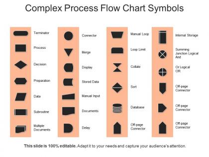
Here’s a ready-to-use Complex Process FlowChart with Symbols PPT to present any complex problem-solving presentation using the given symbols in the flowchart as per the needs. Use our flow chart templates to simplify progress at each step, as that offers an easy visual method to help team members instantly understand what they should do step by step. Each symbol has a specific meaning and context where its use is required for example data symbol is represented as a parallelogram. Our flow chart template stimulates communication among participants and establishes a common understanding of the process of bringing out a clear picture to all. For project managers and resource schedulers, the benefits of our flowchart include the ability to sequence events and reduce the potential for overburdening team members. Use our flowcharts to get an easy grasp of the symbols and their meanings. These process flowchart templates play a vital role in programming any business problem and our flowchart symbols are quite helpful in understanding the logic in complicated problems of the company. Change is a certainty in the future. Our PT& enable you to benefit from it.
People who downloaded this PowerPoint presentation also viewed the following :
Complex process flow chart symbols ppt example professional with all 5 slides:
Our Complex Process Flow Chart Symbols Ppt Example Professional enable an explosive entrance. You will definitely begin with a bang.

FAQs for Complex process flow chart symbols
Ok so the basic ones are pretty straightforward - ovals for start/end, rectangles for your actual process steps, diamonds when you need to make decisions. Parallelograms are for inputs and outputs. Oh, and those little circles? Super useful for connecting different sections, especially if your flowchart gets huge and sprawls across multiple pages (which happens more than you'd think). You've also got cylinders for database stuff, document shapes for paperwork, and this weird half-moon thing for delays or waiting periods. Most software comes with symbol libraries anyway, so honestly just pick whatever makes sense visually and stick with it.
Those diamond-shaped decision symbols are honestly game-changers for flowcharts. They show exactly where someone needs to stop and make a choice instead of just following one messy path. Think of them like GPS directions - "turn left if yes, keep straight if no." Without them, people miss crucial decision points and the whole process falls apart. I learned this the hard way when I made a flowchart without enough decision diamonds and everyone got confused. Just make sure you write clear questions in each diamond so there's no guessing what they're supposed to decide.
So basically, storage symbols are for where data just sits - databases, files, whatever. Process symbols are when you're actually *doing* stuff to the data, like calculations or checking if something's valid. I think of it like this: storage = nouns, processing = verbs. "Customer database" vs "Calculate totals," you know? Honestly took me forever to get this right when I was learning flowcharts. Now I just ask myself - am I putting data somewhere to hang out, or am I messing with it somehow? That usually clears it up pretty quick.
So document symbols are those rectangles with the wavy bottom - they show where your process creates or needs paperwork. Super useful for tracking forms, contracts, invoices, whatever. I use them all the time when mapping workflows that have lots of documentation floating around. They help everyone see what gets produced at each step, which is clutch for compliance stuff or when you're handing work off to other teams. Honestly, even "digital" processes usually generate way more docs than you'd think. Just drop one in whenever your process spits out or requires a specific document.
Dude, feedback loops are a game changer for flowcharts. Real processes aren't straight lines - stuff gets rejected, needs fixing, loops back around. Use those decision diamonds where the "no" path circles back to earlier steps. Like when quality checks bomb and you're back to square one. Most workflows I've seen are messy like that anyway. Your stakeholders will actually get what's happening instead of seeing some fantasy linear process. Throw loops in wherever you've got approval gates or validation points. Makes everything way more realistic and honestly just better. Your charts will actually match reality for once.
Group similar symbols together and keep spacing consistent - makes it way easier to follow. Don't let your flow lines cross if you can help it (learned that the hard way debugging flowcharts at 2am). Align everything on an invisible grid and keep symbol sizes uniform for the same process types. Color-coding helps but honestly, too many colors just looks messy. Most important thing? Someone should be able to trace from start to finish without their eyes glazing over. Have a coworker test it out first.
So most industries just grab the basic flowchart symbols and tweak them for their own stuff. Chemical plants have these wild symbols for reactors and distillation columns that would make zero sense in software. Healthcare throws in patient decision points and regulatory stuff. Manufacturing? They've got quality control gates and inventory symbols - some are honestly pretty clever looking. The trick is making sure your whole team knows what everything means. Oh, and definitely make a legend for any custom symbols you create, otherwise people will just be guessing at meetings.
So basically, those lines and arrows are like the GPS for your flowchart - they show which step comes next and how everything connects. Without them you'd just have random boxes sitting there looking messy. The arrows tell you the direction things flow, and you can use different line styles too (solid for main steps, dotted for maybe/optional stuff). Watch out for spots where arrows split or come together though - that's usually where things get complicated in real life. Honestly, those decision points are where most processes fall apart if you're not careful.
So swimlanes are basically like dividing your flowchart into rows - each team or person gets their own lane. Super helpful when you've got multiple people involved because you can actually see where one department hands stuff off to another. That's usually where everything goes sideways, honestly. Instead of one messy diagram, you break it down by who does what. Makes bottlenecks way more obvious too. I was skeptical at first but they really do help. Try sketching your next process this way - you'll catch problems you totally missed before.
Dude, trust me on this - wrong flowchart symbols will totally tank your presentation. I watched a colleague use rectangles for decisions once and the whole room looked lost. Executives couldn't follow the logic at all. Decision diamonds exist for a reason, same with process rectangles and start/end ovals. Mix them up and people won't get your workflow. Honestly, some executives will even question if you know what you're doing. Grab a symbol guide before you present - way better than scrambling to explain "what I actually meant was..." during Q&A. Been there, it's painful.
Honestly, color coding is a game changer for flowcharts. Your brain picks up colors way faster than reading text, so people can instantly spot their department or whatever they're looking for. I usually do blue for IT stuff, red for approvals, green for automated tasks - that kind of thing. Makes it super easy to trace processes or find where things are getting stuck. Just don't go crazy with it though. Stick to maybe 3-4 colors tops or it'll look like a rainbow threw up on your chart. Trust me, I've seen some truly hideous flowcharts that tried to use every color imaginable.
Honestly, Visio's still the heavyweight champion for complex flowcharts, but man, that interface feels ancient. I'd probably start with Draw.io though - it's free and handles advanced symbols surprisingly well. Lucidchart's another solid web option if you don't mind paying. SmartDraw sits somewhere in the middle power-wise. Oh, and Miro's great for team stuff, though it's more whiteboard-y than symbol-heavy. My take? Try Draw.io first since it won't cost you anything, then upgrade if you need more bells and whistles.
So there's this rectangle symbol with thick borders and a plus sign - that's your subprocess symbol. Anyone who sees it knows there's more detail somewhere else. I usually do the "call out" thing where you name the subprocess and then make a totally separate chart with all the nitty-gritty stuff. Honestly, this way is so much better because your main flowchart stays readable. Just don't forget to label everything clearly and use the same naming style throughout. Trust me, you'll be super grateful when you're trying to update these things six months from now and can't remember what "Process X" was supposed to mean.
Oh man, the hardest part is definitely getting people to actually change their habits. Each team thinks their symbol system is obviously the best one - IT does their thing, operations does theirs, and good luck convincing anyone otherwise. I'd honestly start small with just one team as a test run. Show them how much faster new people can jump in when everything's consistent. Training is huge since people have to basically forget what they've been doing for years. You really need solid documentation they can reference, but here's the thing - if you don't enforce it, you'll end up with this weird mix that's worse than before.
Look, it really comes down to who you're talking to. Technical people? Go ahead and use all the fancy symbols - decision diamonds, subprocess boxes, whatever. They love that stuff. But executives or regular business folks? Stick with basic rectangles and arrows, trust me. I made this mistake once in a board meeting (awkward silence, anyone?) and learned my lesson fast. Complex symbols just muddy your message. Always keep a simple legend nearby though. Oh, and test your flowchart on someone first - saves you from looking ridiculous later.
-
Thanks for all your great templates they have saved me lots of time and accelerate my presentations. Great product, keep them up!
-
Professional and unique presentations.