


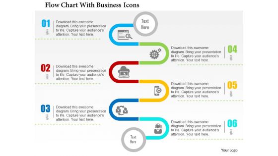
Flow chart with business icons flat powerpoint design




Try Before you Buy Download Free Sample Product
 Impress Your
 Audience
 100%
100% Editable
 Save Hours
 of Time


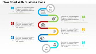
This is a beautifully designed pipe shaped PPT presentation under the head flow chart with business icons flat PowerPoint design. The flow chart provides a systematic flow with the help of which you can elaborate on the sequential flow of any process or project. Moreover if the flowchart PPT PowerPoint presentation is colorful and accessorized with PowerPoint icons then the overall result is way more effective and appropriate. Irrespective of the product or service your deal in or irrespective of the nature of company you work for, you can productively make use of the provided multicolored icon specific flowchart PowerPoint presentation model. Our Flow Chart With Business Icons Flat Powerpoint Design are cutting edge contemporary. You may even find them futuristic.
People who downloaded this PowerPoint presentation also viewed the following :
Flow chart with business icons flat powerpoint design with all 5 slides:
Jazz it up with our Flow Chart With Business Icons Flat Powerpoint Design. They will jam well with your thoughts.
FAQs for Flow chart with business icons
Dude, those flowchart icons are game-changers for presentations. Your audience processes visuals way faster than text - it's wild how much of a difference it makes. Instead of boring text boxes everywhere, you get symbols that instantly show processes, decisions, whatever. Makes complex workflows super easy to follow without people getting lost. Everything looks way more polished too. I used to think they were kinda cheesy honestly, but they really work. Next time you're mapping something out, swap some text for icons. You'll see what I mean - suddenly everything clicks better.
Think of flowchart icons as visual shortcuts - they save everyone from reading walls of text. Drop a headset icon instead of writing "customer service interaction" and people get it instantly. Your whole team stays on the same page when they're looking at workflows, whether it's finance or ops. Honestly, icons are the only thing that makes boring process docs bearable to scan through. Just pick one icon set and use it everywhere - mixing styles gets confusing fast. Plus your flowcharts actually look professional instead of like a word vomit disaster.
Pick icons people actually recognize without having to think about it. Keep the style consistent across your whole flowchart - mixed styles look messy as hell. Simple beats fancy every time, trust me. Make sure they're scalable too so they don't look pixelated when you blow them up for presentations. Oh, and test them on a couple coworkers first. If they're scratching their heads trying to figure out what your icons mean, go back to the drawing board. You want that instant "oh yeah, I get it" reaction.
So basically, customizable flowchart icons are super handy because you can tweak colors, styles, and swap out different icon types for whatever audience you're presenting to. I used to rebuild entire presentations from scratch - what a waste of time, right? Now I just change a few elements and my tech flowchart suddenly works for executives too. It's perfect when you're presenting the same process to different groups. You'll save tons of time while still looking professional. Plus your content actually matches your company branding instead of looking like generic clipart. Honestly changed how I approach presentations.
Honestly, color choices can totally make or break your flowchart. High contrast combos like blue and orange? Your eyes just follow them naturally. Red's perfect for those "hey, pay attention" decision points, while blues keep the regular process steps chill. I've literally seen flowcharts that looked like someone threw up a rainbow - absolute trainwreck. My rule is stick to maybe 2-3 colors tops and actually be consistent with them. Otherwise people get distracted by all the visual noise instead of following your logic. Trust me on this one.
Flowchart icons turn boring slides into actual stories people can follow. They're like breadcrumbs - your audience sees the path from A to B to C instead of getting lost in walls of text. Super helpful for complex processes or workflows where you need to show decision points and outcomes. People get it intuitively because we're wired to follow visual sequences. Plus they save everyone from PowerPoint death by paragraph (we've all been there). I always map out my key story beats first, then find icons that match each stage. Short sentences mixed with longer explanations work best - keeps people engaged without overwhelming them.
Honestly, flowchart icons are like having a universal language for your team. No more "wait, what did you mean by that step again?" in every single meeting. You sketch out a process with those little symbols and suddenly everyone gets it without the back-and-forth. People actually pay attention when there's something visual to follow instead of just listening to you ramble. I've noticed you can catch problems way quicker too - like where things get stuck or take forever. Maybe try drawing out your next presentation beforehand? Even basic shapes work.
Oh man, minimalist line art is everywhere right now - super clean, stripped-down stuff. Also seeing way more inclusive icons which is honestly overdue. Colors are going softer too, none of those harsh primary colors anymore. The 3D glossy look from 2010? Looks ancient now lol. Dark mode compatibility is huge since we're all constantly switching back and forth. I'd just look at what your team uses daily and ditch anything that feels clunky or visually heavy. Trust me, less is definitely more these days.
Dude, animated flowchart icons are honestly a game-changer for presentations. They grab attention way better than boring static boxes. Movement guides people's eyes naturally through each step, so your audience actually follows along instead of getting lost. Complex processes become way more digestible when you break them down with animations - people retain info better too. I'm talking subtle fade-ins or arrows showing flow direction. Just don't go crazy with flashy effects (learned that one the hard way). The movement makes everything look more polished and modern. Your presentations will actually keep people awake for once.
Honestly, Lucidchart and Visio are your best bets - they're made for this stuff and have huge icon libraries already loaded in. Figma's really good too, especially since it's free and you can collaborate with people (I use it for other design stuff anyway). Canva works if you just need something super basic, but it gets limiting fast with complex flowcharts. PowerPoint can actually handle simple ones if you're already familiar with it. I'd probably start with Lucidchart's free trial first. See how it feels before committing to anything paid.
Honestly, flowchart icons are super industry-specific. Tech people get database symbols and API stuff instantly, but show that to a nurse and they'll be lost. Healthcare flowcharts are packed with patient pathway icons and decision points for treatments. Manufacturing? They go crazy for quality checkpoints and process symbols. Finance teams obsess over approval gates and compliance marks - seriously, they put checkmarks on everything. Don't torture yourself starting from zero though. Just find a template that matches your field since people recognize what they see daily.
Honestly, the worst thing you can do is mix a bunch of different icon styles - looks super unprofessional. Pick one set and stick with it. Don't make them tiny either, people in the back won't see anything. Complex icons are another trap... if you're explaining "that squiggly thing means customer feedback," you've already failed. Oh and spacing matters too - cramming icons together just creates confusion. Simple is always better. Test it on someone first though, what makes sense to you might be gibberish to others.
Honestly, flowchart icons are a game-changer for making complicated decisions less overwhelming. You can map out all your scenarios and outcomes visually instead of drowning in paragraphs of text. Everyone gets it instantly because the symbols are standardized. Plus your stakeholders won't glaze over trying to follow your logic - they'll actually understand what you're proposing. I always catch missing steps or bottlenecks way easier when I can see the whole process laid out. My advice? Just start with a basic template and map out whatever big decision you're wrestling with. Way better than spinning your wheels.
McKinsey presentations are perfect examples - they nail the flowchart game by turning messy business processes into clean visuals. Apple does this too in their keynotes, using simple arrows and process icons for product workflows. Even basic PowerPoint templates have decent flowchart sets now (honestly didn't expect that). The biggest thing? Keep your style consistent - mixing outlined icons with filled ones looks super sloppy. I'd start with arrows, decision diamonds, and basic rectangles. You can always add complexity later once you get the hang of it.
Oh definitely, your audience totally changes what icons work. Younger people want that clean, minimal stuff while older users actually prefer icons that look like real things - makes more sense to them. Colors and symbols hit different based on culture too. Industry background is huge though - like, finance folks immediately get certain symbols that would make retail teams go "huh?" I'd honestly just ask your actual users which icons are clearest before you lock anything in. Way better than guessing what works.
-
Great product with effective design. Helped a lot in our corporate presentations. Easy to edit and stunning visuals.
-
Innovative and Colorful designs.