


Vertical icons list for business process flow flat powerpoint design




Try Before you Buy Download Free Sample Product
 Impress Your
 Audience
 100%
100% Editable
 Save Hours
 of Time


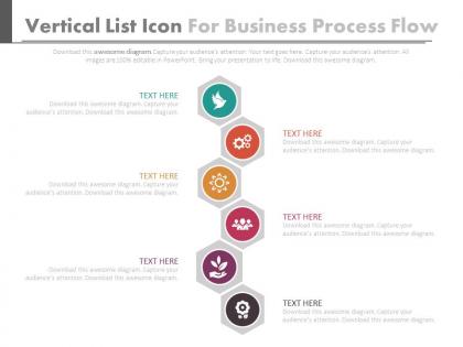
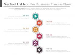
Capture the essence of key business processes in this impressive PowerPoint design that has a vertical list of icons to depict the methodically oriented components that go into the making of a successful business enterprise. Take your audience on a short journey of a product development process, manufacturing process or expansion into new markets and diversification drive through this PPT slide template that has visually appealing icons to represent the important constituent steps. Whether you are in finance and banking, health and medical equipment manufacturing, defense marketing or software design and development, this is a PowerPoint presentation slide that can be suitably deployed in any demonstration on the relevant aspects of any project plan that you may be heading or be a part of. Use this PPT slide design to give an overall view of quality assurance, preventive maintenance, customer service, marketing plan, finance and audit and other heads in a comprehensive manner. Avoid harrowing conditions with our Vertical Icons List For Business Process Flow Flat Powerpoint Design. Keep clear of difficult circumstances.
People who downloaded this PowerPoint presentation also viewed the following :
Vertical icons list for business process flow flat powerpoint design with all 5 slides:
Chariot your thoughts on our Vertical Icons List For Business Process Flow Flat Powerpoint Design. They will go charging ahead.
FAQs for Vertical icons list for business process flow
Keep your icons simple and recognizable - nothing worse than confusing symbols that make people squint. Use brief text under each one so it's crystal clear. I'd go top-to-bottom with consistent spacing between steps. Connect them with arrows or lines to show the flow, and definitely number each step if order matters. Honestly, I always stick with boring icons because they just work better than fancy ones nobody gets. Make sure your colors match throughout. The whole thing should be scannable in like 3 seconds max - people shouldn't have to decode anything.
So here's the thing - people naturally read top to bottom, right? Vertical icons work with that instead of fighting it. Your audience can actually track where they are in the process without their eyes jumping all over the place. I learned this the hard way after cramming way too much stuff horizontally once. Nobody could follow it! Short version: consistent icons going down the page make complex processes way less scary. People won't get lost or zone out halfway through. Just keep your icon styles matching and you're golden.
Keep your icons the same size and give them breathing room - white space is your friend here. Line everything up on a vertical axis so it looks clean. I used to stuff way too much text next to each icon but honestly, less is more. Brief descriptions work better, and stick with one font weight throughout. Your icons should actually make sense for each step (not just random graphics you found). Maybe add subtle arrows between steps? Oh, and here's my test: step back from your screen. Can you grasp the whole sequence at a glance? If not, cut more stuff out.
Dude, colors totally mess with people's heads in ways you wouldn't expect. Blue makes everything feel trustworthy and stable - great for showing process steps. Red screams "urgent!" but also kinda scary, so maybe skip that unless you're trying to freak people out lol. Green feels like progress, orange is super energetic. Purple's got that innovative vibe going. The trick is picking colors that naturally pull your viewer's eye down the list. Each step should feel consistent within its stage. Then use contrast to make the really important stuff pop out. Honestly, I've seen so many designs ruined just because someone picked the wrong shade of something.
Go with basic icons everyone knows right away - lightbulbs for brainstorming, gears when something's processing, checkmarks when it's done. Those fancy detailed ones just mess people up honestly. Outline style beats filled icons every time, especially in vertical flows. Each icon should actually match what's happening in that step, not some random corporate symbol you found. Oh and here's a good test - show your flow to someone without any labels and see if they can figure out what each step does. If they're confused, you picked the wrong icons.
Honestly, just pick one icon style and stick with it - that's like 90% of the battle right there. I always grab a whole set from the same designer because mixing different styles looks messy (trust me on this one). Keep them all the same size and use maybe 2-3 colors max. Oh, and make a master slide with your icon formatting! That way you can just copy it to new slides instead of redoing everything each time. Line weight matters too - thin icons with thick ones never look right together.
Honestly, PowerPoint's built-in icons are way better than they used to be. Just grab some from their library and stack them vertically with text boxes - super simple. If that's not cutting it, Canva has solid business process templates you can steal from. I'd check out Flaticon or The Noun Project too for matching icon sets (way easier than mixing random styles). Adobe Illustrator is amazing but total overkill unless you're going really custom. Start with PowerPoint first though. Good spacing and alignment can make even basic stuff look surprisingly professional.
Yeah, they totally can help! Just don't go overboard with them. I'd stick to simple stuff - like having icons appear one by one as you talk through each step, or maybe a subtle highlight to show where you are in the process. Honestly, I've sat through way too many presentations where the animations were so distracting I forgot what the person was even talking about. Keep it minimal and time it right during practice. The goal is guiding people's eyes through your flow, not giving them a light show. Simple entrance effects work way better than anything flashy.
Dude, typography makes or breaks vertical icon lists. Most people go crazy with like 5 different fonts and it looks messy as hell. Just pick one font family, maybe use 2-3 weights tops. Make your headings bold so they pop against the descriptions. White space is your friend - don't cram everything together or it'll feel suffocating. Oh, and align your text with the icons properly! I swear this one thing will make you look way more legit than half the stuff I see online.
Honestly, stick to like 5-7 icons tops or people's eyes will go crazy trying to follow along. Keep your text super short - just a few words per step. I swear, half the presentations I see look like someone went nuts at the icon store! Cut anything that doesn't actually help explain your main point. Oh, and definitely test it on someone first - you'd be surprised what seems obvious to you but confuses everyone else. You can play with colors or sizes to show what's most important. The whole thing should make sense in like 2 seconds of looking at it.
Honestly, the worst thing you can do is cram like 15 icons on one slide - it's visual chaos. Pick icons that actually relate to your steps, not those random generic business ones that could mean anything. Size them consistently too because nothing screams "amateur hour" like having one giant icon next to three tiny ones. Give each step some breathing room with white space. I'd stick to maybe 5-7 steps tops per slide. Keep your text short and snappy - nobody wants to read paragraphs. Pro tip: show it to someone else first and see if they get it without you explaining everything.
Know your audience first - that's literally everything. Executives want simple strategy symbols and zero fluff, while your tech people can handle the detailed process stuff and wonky jargon. Mixed groups are trickier though. I always go with basic shapes, arrows, and common business icons that everyone gets. Skip the acronyms unless you want confused faces staring back at you. Oh, and keep a backup slide with more detail - you never know when someone's gonna want to dig deeper. Test it on different people beforehand if you can.
Go with SVG files if you can - they're vector so they won't get pixelated when you resize them. AI or EPS work too. High-res PNGs are okay as backup (300 DPI minimum), but definitely skip JPEGs. Trust me, I made that mistake once and the compression made everything look like garbage around the edges. Icon sites like Flaticon usually give you format options anyway. Oh, and most designers I know are pretty snobby about this stuff, but honestly SVG just makes your life easier in the long run.
Give your icons and text way more breathing room than you think - like 1.5x your text height between items minimum. Trust me, cramped lists make people's brains shut off immediately. I always throw extra space above section headers too, breaks things up nicely. Don't feel bad about empty space either - it's actually doing work by guiding where people look. Oh and try squinting at your design. Can't tell items apart easily? More spacing needed. Consistent margins on both sides obviously, but honestly the white space is what saves you from that overwhelming wall-of-text vibe.
First thing - match your icon colors to your brand palette, that'll make the biggest difference. Use your company fonts for any text near the icons too. Spacing matters! If your brand is usually clean and minimal, don't cram everything together. I've seen some designs that look like... well, let's just say less is more. The icon style should fit your vibe - sleek lines for modern brands, solid fills for traditional ones. Oh, and once you nail it, definitely save as a template. Trust me on that one.
-
Visually stunning presentation, love the content.
-
Innovative and attractive designs.