


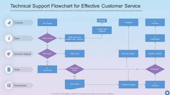
Technical Support Flowchart For Effective Customer Service




Try Before you Buy Download Free Sample Product
 Impress Your
 Audience
 100%
100% Editable
 Save Hours
 of Time


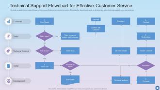
This slide covers technical support flowchart to increase effectiveness in customer service. It involves five departments such as development, tester, technical support, sales and customer.
People who downloaded this PowerPoint presentation also viewed the following :
Technical Support Flowchart For Effective Customer Service with all 6 slides:
Use our Technical Support Flowchart For Effective Customer Service to effectively help you save your valuable time. They are readymade to fit into any presentation structure.





FAQs for Technical Support Flowchart For
So basically you want everyone on your team following the same steps instead of just winging it. A flowchart keeps agents from skipping the obvious fixes or going in circles - which honestly happens more than you'd think. It walks them through each decision point logically, helps them gather the right info upfront, and tells them exactly when to pass something up the chain. Your customers get faster solutions, agents feel less lost, and you're not constantly putting out fires. I'd start with whatever issues come up most and map out the exact process you want everyone using.
Okay so basically a flowchart stops everyone from just randomly guessing when stuff breaks. Your team won't waste time going "umm what now?" because they'll have actual steps to follow. Way faster problem-solving since you're not starting from scratch every single time. New people pick it up super quick too - no more awkward training sessions where Bob explains things totally different than Sarah did last week. You'll catch issues on the first shot more often. Honestly just start with whatever problems happen most and expand from there.
Start by figuring out how customers actually reach you - phone, email, chat, whatever. Map your triage system next: who assesses problems initially, how you prioritize stuff, which team handles what. Escalation paths are crucial (seriously, this is where most companies mess up). Plot out decision trees for your common issues and standard resolution steps. Oh, and don't forget follow-up processes - nobody wants angry callbacks later. Build in some feedback loops so your agents can actually learn from each case. I'd honestly start with your current mess first, then spot the obvious gaps.
Look at which branches get hit constantly - those are your problem spots. It's like traffic jams, everyone ends up taking the same annoying routes. Track what troubleshooting steps people need most, then you can actually fix the root issues or build better help docs. I'd start by marking up those "hot paths" on your flowchart first. Honestly, it's pretty satisfying once you see the patterns emerge. Fix the biggest pain points and you'll cut down on so many repeat issues.
So basically, technical support flowcharts are made for helping customers fix stuff - they've got escalation steps and assume whoever's using them isn't super techy. Problem-solving ones are way more general. You can use them for literally any issue, inside your company or out. The support versions usually have scripts for talking to customers too. Problem-solving flowcharts skip all that fluff and just focus on finding what's actually broken. Honestly, I'd figure out who's gonna be using yours first - that'll tell you which direction to go. Makes the whole thing way easier to plan out.
Your agents are the ones actually using that flowchart every day, so their input is everything. They'll catch the confusing parts and missing steps that look fine on paper but totally suck in practice. Plus they know which customer problems pop up constantly - and honestly, where your current flow just sends people in annoying circles. I'd set up monthly check-ins to get their feedback because they see exactly where things break down. Without their input, you're basically designing blind. Short version: they use it, they know what's broken, so ask them regularly and actually update the thing based on what they tell you.
Honestly? Just go with Draw.io (they rebranded to diagrams.net or something). It's free and has all the flowchart stuff you need. Lucidchart's pretty good too if you don't mind paying. Visio works but feels ancient - only worth it if your company already owns it. Miro and Figma are solid for team stuff. Oh, and real-time editing if that matters to you. My advice? Stop overthinking it. You'll waste more time comparing tools than actually making your flowchart. Pick one and start building.
I'd say every 3 months minimum, but really you need to update it whenever your team starts complaining about dead ends or outdated steps. New software rollout? Update it right away. Getting weird new issues nobody knows how to handle? Time for a revision. Here's something I learned the hard way - your seasoned people will just work around broken flowcharts instead of telling you they're useless. New hires are actually better at spotting what's missing since they're following it step by step. Set a quarterly reminder and tell everyone to ping you when they hit something that doesn't make sense anymore.
Honestly, customer feedback is like your cheat sheet for fixing flowcharts that don't actually work. People get stuck at certain points? That's where your process is broken. I've watched companies create these beautiful diagrams that completely ignore how real customers think - it's frustrating to see. Support tickets are gold mines for this stuff. Check them monthly and you'll start noticing patterns. Maybe your language is too confusing, or you're missing obvious scenarios people run into. Their complaints literally show you which decision points need work. Oh, and set up some way to regularly collect this feedback - you can't improve what you don't measure.
Flowcharts are like training wheels for your new support people. They can follow the visual steps without memorizing every weird scenario customers throw at them - and trust me, there are some weird ones. Your team will ask better diagnostic questions instead of just winging it. The consistency thing is huge too. Customers get the same quality help whether it's Sarah or Mike handling their case. No more random guesswork calls. I'd start with your top 5 issues that come up constantly. Those will give you the biggest bang for your buck right away.
Honestly, most people overcomplicate the hell out of these things. Like, I've seen flowcharts with 25+ decision points - who has time for that when their WiFi's acting up? Keep it simple, focus on your most common issues first. Also, don't forget escape routes! Always include "other issue" boxes and clear ways to reach a human. Oh, and ditch the tech speak - customers don't know what "packet loss" means. Test everything with real support tickets before you launch it. Trust me, what looks perfect on paper usually breaks with actual scenarios.
Shapes are huge for flowcharts - rectangles for processes, diamonds for decisions, circles for start/stop. Your brain just tracks the pathways better. I always use colors too, like red for errors or green for good outcomes. Those text-heavy troubleshooting docs? Total eye-glazers. But throw in some arrows and consistent spacing, people can actually scan and find what they need fast. Icons next to text work surprisingly well for common stuff. Oh, and make sure your flow direction makes sense - I've seen some real disasters where arrows go everywhere.
Yeah, Zendesk crushed it with flowcharts - they cut resolution time by 40% just by mapping out common problems. Spotify does something similar for audio issues, which keeps things from getting bumped up to senior techs all the time. Here's what actually worked for them though: they got their support people involved in making the flowcharts, not just the managers deciding from above. I'd start small - grab your 5 biggest headaches and build around those first. Way less overwhelming than trying to chart everything at once.
Honestly, flowcharts are game-changers for this stuff. They stop that annoying back-and-forth where IT asks "did you restart it?" for the millionth time because everyone can see what's already been tried. During outages especially - and trust me, I've been in those meetings - people actually know their role instead of just pointing fingers. You've got this shared map that shows exactly where issues go next. Customer service, management, IT... nobody's confused about handoffs. I'd sketch out whatever process you're using now. You'll probably find gaps you didn't even realize were there. Makes everything way smoother.
Track your resolution times and first-call resolution rates - those tell you if people are actually getting helped efficiently. Customer satisfaction scores matter too, obviously. Here's what's wild though: you should also check how often your agents ditch the flowchart entirely. Happens way more than managers think! I'd throw in some agent surveys about whether the steps make sense to them. Don't go crazy measuring everything at once. Pick maybe 2-3 metrics that actually align with what your team's trying to accomplish and stick with those consistently.
-
SlideTeam just saved my project! Thank you so much. The variety of templates helped me showcase multiple perspectives easily.
-
I had them make a presentation for an office retirement party. They were very helpful in understanding what we wanted and delivered the perfect presentation. Highly recommended!