


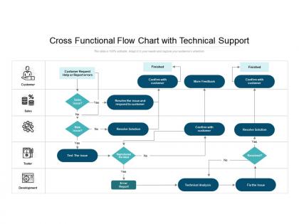
Cross functional flow chart with technical support





Try Before you Buy Download Free Sample Product
 Impress Your
 Audience
 100%
100% Editable
 Save Hours
 of Time


Jerk folks out of complacency with our Cross Functional Flow Chart With Technical Support. Bring back the intensity of focus.
People who downloaded this PowerPoint presentation also viewed the following :
Cross functional flow chart with technical support with all 2 slides:
Bring back the intensity of focus with our Cross Functional Flow Chart With Technical Support. Jerk folks out of complacency.
FAQs for Cross functional flow chart
So you'll need swim lanes - basically horizontal or vertical sections for each department. Add your process steps using rectangles and diamonds, then connect everything with arrows. Don't forget clear start/end points! Decision points (those diamond shapes) show where things can go different directions. Handoff spots between departments are super important too - honestly, that's where most problems happen. I'd start by listing all the departments first, then worry about the actual steps. It's basically a flowchart but way more organized since each team gets their own "lane."
Honestly, cross-functional flowcharts are game changers for getting teams to actually work together. You'll see exactly where handoffs happen and who owns what - goodbye "wait, wasn't that your job?" confusion. The visual aspect is huge because everyone's literally looking at the same map of how things flow between departments. Makes it so much easier to spot where stuff gets stuck too. I mean, we've all been in those meetings where people talk past each other, right? When you map out dependencies ahead of time, those conversations get way more productive. Definitely try sketching one out before your next big project starts.
Healthcare and manufacturing are where these flowcharts really shine. All those handoffs between departments - patient going from admissions to nursing to billing, or products moving through design, production, QA. Software dev teams use them constantly too. Finance companies are pretty big on them, though honestly that surprised me at first. The messier your process and the more teams you've got involved, the more you'll want that overview. If people keep asking "whose job is this part?" then yeah, you should probably map it out.
So basically, regular flowcharts just map out the steps in order. Swimlane diagrams do that too, but they also show you WHO is doing each step by putting everything into separate "lanes" for different people or departments. It's honestly way more useful when you're dealing with processes that involve multiple teams. You can actually see where work gets handed off between groups, which makes it super obvious when there are bottlenecks or confusion about responsibilities. I mean, regular flowcharts are fine for simple stuff, but if you're trying to fix something that involves different departments? Swimlanes all the way.
These flowcharts are honestly game-changers for avoiding the whole "wait, I thought Sarah was doing that" mess. They show exactly who does what and when. The real magic happens at handoff points between teams - that's where everything usually falls apart anyway. You'll catch bottlenecks way earlier and see redundant steps you never noticed before. When the whole team can actually see the workflow, coordinating becomes so much easier. I made one last month and found three completely pointless approval loops we'd been doing forever. Start simple though - even a basic version will surprise you.
Honestly, I'd go with Lucidchart or Visio first - they're made for this and the swimlane templates are solid. Miro's pretty cool too if your team's into the whole collaborative thing (we used it for a workshop last month and people loved it). Draw.io works if you're broke, but you'll spend way more time formatting everything manually. PowerPoint can do it too but ugh, the pain. I'd just check what your company already pays for before buying anything new. Most of these have free trials anyway so you can mess around and see what clicks.
Honestly, start by figuring out who actually does the work - not who's supposed to, but who really handles each step. Map everything out first. Then go through and ask "who decides this?" and "who does this?" for every single thing that happens. You'll be surprised how many people you forget about - like the ones who just need updates but don't actually do anything. I always miss someone obvious when I first try this. Once you've got your list, test it out with a real example. Walk through it with the actual people involved. They'll spot the gaps you missed and tell you where things get handed off. Trust me, it's way better to catch this stuff early.
Honestly, the worst thing you can do is make your swimlanes confusing - nobody will know who's supposed to do what. Don't cram a million details into each step either. Oh, and those decision points? Actually show them properly instead of glossing over them. I hate when people cross lines between lanes for no reason - it looks like spaghetti. Keep your symbols consistent (seems obvious but you'd be surprised). The real key though is walking through it with people who actually do the job. They'll catch stuff you missed. Don't map every tiny thing or you'll go crazy.
Dude, these flowcharts are seriously underrated for fixing broken processes. They expose all those awkward handoffs between teams where stuff just sits and rots. You'll spot redundant steps instantly - like why are three people approving the same thing? The visual aspect is clutch when you're trying to convince your boss to change something. Map out how things work now (probably a disaster) then draw what it should look like. Honestly, once you see everything laid out, the bottlenecks become super obvious. It's way better than trying to explain process problems with just words.
Dude, cross-functional flowcharts are seriously a game changer for getting everyone on the same page. They show exactly who handles what and when handoffs happen between departments. Way better than trying to explain everything in meetings where half the people zone out anyway. The visual thing really works - even the least tech-savvy people can follow along and see how their piece fits into the whole process. I swear it cuts down on so much confusion about who's supposed to do what. Next time you're dealing with messy cross-department stuff, just draw it out first.
Think of flowchart symbols like road signs - everyone needs to know what they mean or you'll have chaos. Rectangles are for processes, diamonds show decisions, circles mark start/end points. Pretty standard stuff. Swim lanes show who's responsible for what step, which honestly saves so many arguments later. Without these conventions, people just make up their own interpretations and suddenly nobody's on the same page. Stick with the widely recognized symbols so anyone can jump in without playing guessing games. Oh, and keep a legend around for any weird custom symbols you end up adding.
Honestly, these flowcharts are perfect for agile teams. They show exactly how developers, testers, and product owners pass work around during each user story. Short sentences work best here. What I love about them is spotting those annoying bottlenecks between teams - and yeah, there's always at least one hiding somewhere. Don't make them too complex though. Just map out who does what and when, then tweak them after each sprint as your process changes. Definitely try making one before your next planning session. You'll probably find handoffs you didn't even realize were slowing things down.
Grab the people who actually do this stuff day-to-day and walk through it with them. They'll spot the weird gaps you missed. Run a couple real scenarios through your flowchart - does it actually work like you mapped it? Those "what if" situations are super important too, trust me on this one. Once you've fixed their feedback, get someone totally fresh to look at it. New eyes catch everything. Oh, and definitely keep track of changes so everyone's using the same version later.
So cross-functional flowcharts are honestly game-changers for compliance stuff. They map out who's responsible for what and when things need to happen. All those approval steps and documentation requirements that auditors obsess over? You can show exactly where they fit in your process. Gaps become super obvious when you see everything laid out - way better than trying to explain it verbally during an audit (trust me on that one). When regulators show up, you'll have this clear visual of your documented process to reference. I'd start with whatever processes get the most regulatory attention first, then work from there.
Ok so first thing - walk everyone through the whole process before you get into the weeds. Get a big screen or print copies because nobody wants to squint at tiny boxes. As you go through each step, point and pause to ask if the handoffs actually make sense to the people doing that work. Trust me, they'll spot stuff you totally missed. When improvement ideas pop up (and they will), jot them down but don't try redesigning everything right there in the meeting. That's a recipe for chaos. Wrap up by nailing down who's doing what next.
No Reviews