


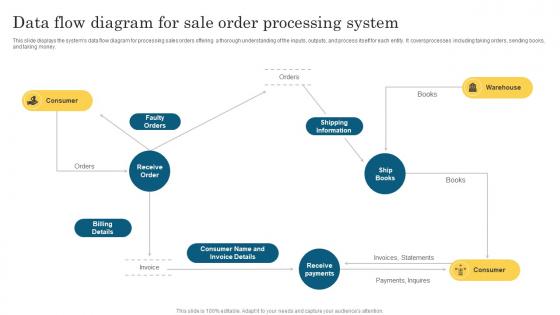
Data Flow Diagram For Sale Order Processing System




Try Before you Buy Download Free Sample Product
 Impress Your
 Audience
 100%
100% Editable
 Save Hours
 of Time


Our Data Flow Diagram For Sale Order Processing System are topically designed to provide an attractive backdrop to any subject. Use them to look like a presentation pro.
People who downloaded this PowerPoint presentation also viewed the following :
Data Flow Diagram For Sale Order Processing System with all 6 slides:
Use our Data Flow Diagram For Sale Order Processing System to effectively help you save your valuable time. They are readymade to fit into any presentation structure.





FAQs for Data Flow Diagram For Sale
So DFDs have four basic parts: processes (circles or rectangles that change data), data stores (open rectangles holding info), external entities (squares for outside people/systems), and data flows (arrows showing movement). Picture mapping how info travels through your system - way easier than it looks honestly. Your arrows need clear direction and each process should actually transform something meaningful. Oh and pro tip, start with the big processes first then drill down. You can always add more detail once you get the hang of it.
So basically, DFDs track data movement - like where info flows between processes and storage. Flowcharts are different - they map out actual steps and decisions in order. DFDs don't show timing at all, which confused the hell out of me when I first learned this stuff. They're just about data transformation. Flowcharts show the "how" with step-by-step logic. If you're documenting something, I'd start with a DFD to see data relationships first. Then do flowcharts for the detailed process stuff. Makes way more sense that way.
Honestly, DFDs are a lifesaver when you're trying to figure out how data moves around your system. You can catch bottlenecks and redundant stuff before writing any code - trust me, that'll save you so much pain later. Non-tech people actually get them too, which is rare for diagrams. When I'm stuck with messy legacy code, I draw these out to see what's really happening vs what I thought was happening. Sometimes it's embarrassing how wrong I was. Start with the big picture context diagram first, then get into the weeds.
Honestly, DFDs are clutch for requirements gathering. You basically map out how data flows through your system, and it forces you to think about every piece. Missing processes? You'll spot them instantly. Same with figuring out which external entities actually need to talk to your system and what data you need to store. The visual aspect is huge - stakeholders can literally see their workflow laid out instead of trying to parse through dense documentation (which nobody reads anyway). Plus you catch those gaps early that people inevitably forget to mention. Seriously, try sketching one in your next requirements meeting.
So DFDs basically have three levels that get more detailed as you go deeper. Level 0 is super high-level - just your whole system as one bubble with outside entities around it. Great for explaining things to managers who don't want all the technical stuff. Level 1 breaks out the major processes and shows how data moves between them. This is honestly where you'll spend most of your time. Then Level 2 and beyond drill down into each individual process - though I rarely go that deep unless something's really complex. My advice? Start with Level 0 to make sure everyone's on the same page about what you're building, then focus your energy on getting Level 1 right.
DFDs are perfect for this - they show data flow without all the techy stuff that confuses people. Start with a big picture context diagram, then break it down into detailed levels depending on who you're talking to. Business folks can actually follow where their data goes without drowning in code nonsense. Honestly? I've had more "aha!" moments with stakeholders using DFDs than any other diagram type. They're like flowcharts but way better focused. Just run them by your team first to make sure you didn't miss anything obvious before presenting them.
DFDs are clutch when you need to show how data flows through a system but don't want to dive into all the technical weirdness yet. Perfect for meetings with non-tech people - seriously, way better than those confusing UML charts that make everyone zone out. Use them when you're analyzing processes, gathering requirements, or hunting down where data gets stuck. Also super helpful if you're documenting some old system before ripping it apart. Honestly? Start with DFDs early on. Gets everyone aligned on what data's moving where without the headache.
Honestly, the biggest trap is mixing up external entities with actual processes - I see this constantly. Also watch out for "black hole" processes that only suck data in or spit it out. Most need both directions flowing. Don't obsess over perfection right away (guilty as charged - used to redraw the same diagram like five times). Keep process names simple with action verbs. Skip the physical stuff like "filing cabinets" and definitely don't add decision points or control flow - that's a different diagram entirely. Start with your context diagram first, then drill down. Trust me, it'll save you from scrapping everything later.
So DFDs have three main parts. Circles show processes - stuff like "calculate payroll" or "validate login." Open rectangles are data stores (databases, files, whatever). Squares represent external entities - people or systems outside your boundaries. Don't be lazy with naming though. "Process 1" is useless, but "Generate Monthly Report" actually tells you something. Each process needs inputs AND outputs. Oh, and data stores can only connect to processes, not directly to external entities - learned that the hard way once. Keep your labels specific and you'll save yourself headaches later.
Yeah, DFDs are actually solid for Agile stuff - just don't go crazy with them upfront like waterfall projects. Sketch quick ones during sprint planning when you need to figure out how data flows through whatever you're building. Super helpful for complex integrations or when someone new joins mid-sprint. Honestly, a visual beats explaining data flow verbally every time. Keep them simple and tweak as you go. Oh, and try using them in retros to map out any data headaches the team hit - works surprisingly well.
Totally! DFDs play really well with other modeling techniques. I always pair them with ERDs - one shows your data structure, the other shows how it flows around. Makes perfect sense when you think about it. You can throw in use case diagrams or flowcharts too depending on what you're working on. Honestly, UML diagrams work great if you're doing something more complex. My approach? Start with the DFD to get your big picture mapped out, then add other models where you need to drill down into specifics. It's like building layers - each one gives you a different angle on the same system.
Okay so first thing - trace through each process step by step and check the data flows actually make sense. I know it sounds super basic but I literally use a highlighter to follow the paths, works way better than just staring at it. Walk through some real scenarios to make sure every input connects to an output and your data stores aren't just floating there. Your process names should be specific enough that anyone could understand what's happening. Oh and don't forget external entities that touch your system - I always miss at least one. Honestly though? Get someone else to look at it because you'll be too close to spot the obvious gaps.
Honestly, I'd go with Draw.io (now called diagrams.net or something) - it's free and way better than it has any right to be. Works great with Google Drive too. Lucidchart is solid if you don't mind paying, super clean interface and good for team stuff. Visio's still around but feels kinda dated now, though it works fine if you're already stuck in Microsoft land. There's also Creately and SmartDraw but I haven't used those much. Draw.io will probably cover everything you need without costing anything, which is nice.
So compliance stuff basically makes your DFDs way more complicated than they need to be. First thing - map out what regulations you're dealing with because that's gonna drive everything else. GDPR is honestly the biggest pain since you have to track every tiny personal data flow. You'll end up adding audit trail stores, consent processes, and all these regulatory reporting connections you wouldn't normally bother with. Plus encryption, access controls, data retention - they all become separate boxes instead of just background assumptions. It's tedious but beats getting fined later.
You'd be surprised how much DFDs pop up everywhere. Banks map transaction flows and fraud detection with them. Healthcare systems use them for patient records - those workflows get messy fast, trust me. Manufacturing tracks supply chains and inventory this way too. Online retailers diagram everything from purchase to delivery. Government agencies document their compliance processes (because paperwork). Software teams sketch out how data flows through apps. Honestly, whenever you're trying to figure out how information moves between departments or systems, just draw a quick DFD. It'll clear up so much confusion.
-
Use of icon with content is very relateable, informative and appealing.
-
“Ample and amazing variety of templates available, really helpful for making professional PPT for day to day workings.”