


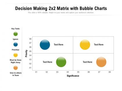
Decision making 2x2 matrix with bubble charts




Try Before you Buy Download Free Sample Product
 Impress Your
 Audience
 100%
100% Editable
 Save Hours
 of Time


Extend there awareness with our Decision Making 2x2 Matrix With Bubble Charts. Enrich their appreciation of events around.
People who downloaded this PowerPoint presentation also viewed the following :
Decision making 2x2 matrix with bubble charts with all 2 slides:
Extract the advantage with our Decision Making 2x2 Matrix With Bubble Charts. They allow you to grab it with both hands.
FAQs for Decision making 2x2 matrix
So basically you make a scoring table for whatever decision you're stuck on. List out your criteria - cost, timing, how risky it is, whatever matters to you. Weight them by importance, then score each option against those factors. Honestly, it's a lifesaver when you've got multiple decent choices and can't decide. The numbers do most of the work, which beats having everyone argue in circles during meetings (you know how that goes). Super handy for picking vendors or figuring out project priorities. Next time you're torn between options and need to show stakeholders why you picked something, try it out.
Honestly, decision matrices are kind of a game-changer. You basically make a grid - options down the side, important factors across the top. Then score everything objectively. Takes all that messy emotional stuff out of it, which is huge because I always overthink things otherwise. The cool part is seeing the numbers actually reveal what's best. Don't forget to weight your criteria though! Like, salary probably matters more than office snacks (though good snacks are tempting). It's weirdly satisfying once you start filling it out.
Okay so you'll need four main things: what criteria matter to you, how important each one is (like ranking them), all your options laid out, and then scores for how each option hits those criteria. Honestly the criteria part is make-or-break - mess that up and the whole thing's useless. I'd start with maybe 3-5 things that would actually determine if this works out or not. Then just weight them based on what really matters in your situation and rate everything on a 1-5 scale or whatever. The math basically does the rest for you after that.
List out all your criteria first, then give each one a weight using either 1-10 or percentages that add up to 100. I always start by asking myself what single factor would matter most if everything else disappeared - that's your heaviest weight. Then compare the rest against that top one. Honestly, the hardest part is being real about what actually matters to you versus what you think *should* matter. Like, maybe location trumps salary even though that sounds irresponsible. Test it out by running through a couple scenarios - if the results feel weird, adjust your weights until they don't.
Decision matrices are clutch when you've got multiple options with tons of moving parts to consider. Perfect for stuff like hiring people, picking vendors, or deciding between project approaches - you know, situations where winging it could backfire. They're honestly great for getting stakeholders on the same page since everyone has to spell out what they actually care about. Way better than those basic pros/cons lists because you can actually score things systematically. Though I wouldn't bother for simple yes/no calls. Save it for decisions where you'll need to explain your reasoning later - trust me, it's worth the extra work.
Oh totally! So you basically make a grid - options down the side, then all the stuff that matters to you across the top. Cost, time, how it'll mess with your family life, whatever. Score each combo and add it up. I did this when I was picking between job offers last month and honestly it saved me from overthinking myself into oblivion. Works amazing for the big stuff like houses or schools. Just be real about what you actually care about, not what sounds good on paper. The math kinda cuts through all the emotional noise, you know?
Honestly? Just start with Excel or Google Sheets - everyone already knows them and they work fine for basic decision matrices. If you need something fancier with visual stuff, Lucidchart and Miro are solid for getting stakeholders on board. I've watched teams waste weeks picking the "perfect" tool when a simple spreadsheet would've worked perfectly. For really complex decisions, AHP Online and Decision Lens are pretty powerful, but there's definitely a learning curve there. My advice is stick with what your team already uses first, then worry about upgrading later if you actually need it.
Totally! Start by having everyone score independently, then meet up to hash out the big differences. Works surprisingly well - other people spot stuff you totally missed. Split up the research too. Like your finance person can dive into costs while ops handles how complex implementation would be. Here's the thing though - don't just average everyone's scores and call it done. The real magic happens in the discussion part where you're actually talking through why someone gave a 7 versus a 3. That's where you get the good insights that actually matter for your decision.
Honestly, most people mess up the criteria part - they either go super obvious or don't think about what actually matters for their situation. You'll end up just confirming your bias if the scoring gets too subjective. I've watched friends make these crazy detailed 1-100 scales when a simple 1-5 works way better. Way less overthinking that way. Also don't forget to loop in the right people early on. Get them to weigh in on your criteria before you start ranking everything, or you might miss something important.
So here's the thing - decision matrices basically force you to show your work. You can't just go with your gut anymore (though honestly, gut feelings aren't always wrong). Everything gets laid out: your criteria, how much each thing matters, scores for every option. Your team can actually see why option A beat option B instead of wondering what happened behind closed doors. If someone thinks you weighted something weird, they can call it out. It's like turning those messy "I just think this one's better" conversations into something you can actually discuss and maybe even agree on.
Just tweak the criteria and weights based on what actually matters in your field. Healthcare folks obsess over patient safety and compliance - rightfully so. Tech companies? They're all about scalability and user experience since everything moves at breakneck speed. Financial services live and breathe risk assessment. You can switch up the scoring too - maybe 1-10 instead of 1-5 if you need more precision. Or throw in industry-specific stuff like compliance checklists. Honestly, just list what keeps you up at night professionally, then build your matrix around those things. Works every time.
Add a "results tracking" column to your decision matrix and actually use it. When you implement decisions, write down what happened vs what you thought would happen. This tells you which criteria were spot-on and which weights were totally off. Most teams (myself included) get weirdly attached to their original setup, but honestly the magic happens when you adjust based on real outcomes. Look for patterns across multiple decisions - you'll catch blind spots you didn't know existed. Set reminders to check back on big decisions after 30/60/90 days and tweak your matrix accordingly.
Look, data analysis is what makes your decision matrix actually worth doing. Otherwise you're just throwing numbers around randomly, which honestly defeats the whole point. You need real data to score each option against your criteria - stuff like cost breakdowns, performance stats, risk levels, whatever applies to your situation. The tricky part is making sure your data isn't outdated garbage. First figure out exactly what numbers you need for each criterion, then collect all that info before you start filling anything out. Trust me, doing this legwork upfront saves you from making decisions based on hunches that could totally backfire.
Dude, turn that boring spreadsheet into something visual - your brain will thank you. Color-code the scores so good options are green and bad ones are red. Bar charts work too, or even just basic conditional formatting in Excel (honestly, anything beats staring at raw numbers). Heat maps are pretty solid for spotting patterns quickly. I always find it way easier to see which choice wins when it's visual rather than trying to compare a bunch of cells. Your eyes can process colors and shapes so much faster than scanning through data rows. Even something super simple will make the best option obvious right away.
Oh totally! Decision matrices are everywhere in business. Apple used one for the original iPhone - weighing stuff like technical feasibility against user impact and dev costs. Toyota's whole production system runs on them for picking suppliers and improving processes. NASA does it too for mission planning (those must be some intense spreadsheets lol). They work great when you've got several solid options but need to take feelings out of it. Honestly, I'd try making a simple one next time you're stuck between vendors or approaches - just weight your top criteria and score each choice. Takes like 20 minutes but saves you from second-guessing yourself later.
No Reviews