


Download right wrong decision display chart powerpoint template




Try Before you Buy Download Free Sample Product
 Impress Your
 Audience
 100%
100% Editable
 Save Hours
 of Time


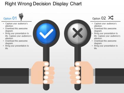
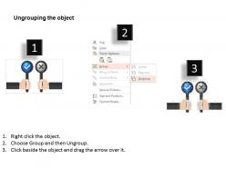
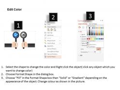
In an Organisation, Decision making is an extremely vital and crucial part of the business system as one decision made can either make or break the entire system. And so, considering this our team has come up with a download Right Wrong Decision Display map PPT slide. These presentation layouts have been specifically crafted to keep the members of the audience informed about the Do’s and Don’ts while undergoing enterprise operations. Also, the user does not even have to put much effort to explain the aim of the presentation as it becomes evident after simply looking at these diagrams. Apart from this, the graphics of the decision chart in which two hands are holding the banners of right and wrong along with a box to display the details of the decisions to be taken are of exceptional quality to provide high definition view. So, what are you waiting for simply click download and never go wrong with these amazing PowerPoint illustrations. Blast your thoughts with our download Right Wrong Decision Display Chart Powerpoint Template. Get ready to hear a surge of applause.
People who downloaded this PowerPoint presentation also viewed the following :
Download right wrong decision display chart powerpoint template with all 5 slides:
Teams of designers have worked to develop and curate this collection of thousands of download Right Wrong Decision Display Chart Powerpoint Template. We have designs available for every occasion.
FAQs for Download right wrong decision display
Decision chart templates are basically flowcharts that help you think through big choices systematically. Instead of just winging it, you map out all your options, criteria, and potential outcomes visually. Honestly, I used to think these were overkill until I tried one for choosing between job offers - total game changer. The visual format makes overwhelming decisions feel manageable. You'll spot risks you might've missed and can actually explain your reasoning to other people later (which bosses love, btw). It forces you to consider everything instead of going with whatever feels right in the moment. Definitely worth trying.
Decision charts are perfect when you're juggling multiple factors - like picking vendors, hiring people, or big strategic moves. Use them when you've got several good options and need to compare stuff like cost, timing, and risk systematically. God, I really should've started using these earlier in my career instead of just going with my gut all the time. They're also great for decisions you make regularly since you can reuse the same framework. Skip them for simple yes/no stuff though. Just pick your trickiest upcoming decision and build a template around that - you'll be surprised how much clearer everything becomes.
Honestly, decision charts are game-changers for team stuff. They stop those endless meetings where everyone just talks in circles. You map out your options, compare the pros and cons side by side, and boom - everyone's looking at the same info. No more "wait, what were we deciding again?" moments. The visual layout actually makes sense of messy choices. Best part? When your boss asks why you picked something months later (and they will), you've got everything documented. I use them for pretty much any big team call now. Way better than winging it and hoping for the best.
Honestly, most templates are just pretty flowcharts that won't actually help when you're stuck. The good ones have decision criteria boxes with weighted scoring - super helpful for ranking what matters most. Customizable fields are clutch so you can tweak it for whatever you're deciding. I always look for pros/cons sections and space to map out potential outcomes. Risk assessment stuff is useful too, though sometimes I skip that part if I'm being lazy. The best templates let you compare multiple options side-by-side instead of just one at a time. Download a few different styles first and test them on something small to see what works for your brain.
Oh absolutely! Healthcare and finance are probably the biggest users - think stuff like diagnosing patients or approving loans. Manufacturing too, especially for quality control. Can't really mess around when there's that much at stake, you know? Tech companies use them for product decisions, and basically any industry with tons of regulations will love them. The whole point is when your decisions have serious consequences and multiple moving parts, templates keep you from screwing up. I'd start with whatever decisions you're making over and over again first.
Honestly, customizing those templates makes a huge difference. Generic ones are kinda useless if we're being real. You'll want to add criteria that actually matter for your specific situation - like industry stuff or whatever priorities your team cares about. The scoring system should reflect what you think is important too. Oh and definitely adjust the language so it doesn't sound corporate-y. People will actually use it then instead of just nodding and forgetting about it. Figure out what makes your decisions different first, then tweak from there. Way better than some cookie-cutter approach.
Honestly, don't overcomplicate it - that's where most people mess up. I used to throw like 15 criteria into mine and it was a nightmare. Stick to maybe 3-5 things that actually matter. Also, weight them properly! Your salary probably matters more than whether the office has good coffee (though good coffee is nice...). But here's the real kicker - don't make the chart after you've already picked what you want. I've totally done this before just to feel better about a decision I'd already made. Pretty pointless. Keep it simple and let it actually guide you instead.
Dude, charts are a game changer for getting stakeholders on board. People actually *see* what you're thinking instead of trying to follow your rambling explanation. Visual stuff just clicks differently - it's like showing someone a map instead of giving directions over the phone. Stakeholders can spot the trade-offs right away and understand why you picked that option. Honestly, it makes you look way more legit too, less like you're just pushing whatever you want. They'll ask smarter questions and catch problems before they blow up. Just grab a template online and chart out your next big decision before that meeting.
Oh yeah, they usually do! Most templates connect with stuff like Asana, Trello, Excel, Google Sheets - the usual suspects. Slack integration is pretty common too. Microsoft ones obviously work best if you're already in that whole Office 365 world (which honestly makes sense). Just double-check what integrations are actually available before downloading anything. You don't want to get stuck rebuilding everything manually. Look for basic import/export at minimum - that'll save you tons of headaches later.
One decision per chart - trust me on this one. Don't try cramming everything onto a single slide because people will just get lost. Use clear arrows and keep the text in each box super minimal. Colors are great but honestly, I've seen some presentations that look like a rainbow exploded... not the vibe you want. Walk through it step by step instead of showing the whole thing at once. You'll want to practice the flow beforehand so you're not stumbling through it. The real magic happens when you explain WHY you're making each decision - that's what people actually care about.
Dude, color choices can totally screw up your decision charts. I learned this the hard way when I made everything the same boring blue once - people couldn't tell paths apart at all. Use red for "stop/danger" stuff and green for "go" since that's what our brains expect. Different colors for each path are crucial or people will miss key distinctions. Font size matters too - make important decision points pop visually. High contrast is your friend here. Oh, and definitely test it on someone else first because you'll be too close to see the obvious problems.
Honestly, I'd go with Draw.io first - it's free and super easy to use for decision trees. Microsoft Visio is obviously the fancy option with all the bells and whistles, but it's probably way more than you need right now. Lucidchart is solid too if you want something web-based that's good for sharing with people. Google Drawings works if you're already using their stuff anyway. I literally use Draw.io for like 90% of my charts because why pay for premium features when the free version does everything? You can always upgrade later if you need more advanced stuff.
Dude, getting team feedback on decision charts is clutch. Other people will spot stuff you totally missed - like unclear steps or options that sound good on paper but are completely unrealistic. Different roles = different perspectives, which is gold. Don't just ask "thoughts?" though, that gets you nothing useful. Be specific: "Does this flow actually make sense?" or "Am I missing any scenarios here?" Sometimes you're way overthinking it and need someone to tell you to chill. Once you get their input, actually use it to tweak things before you call it done.
Yeah totally! Canva's probably your best bet if you want something that looks decent without much effort. Lucidchart has a free version that's solid too. If you've got Office, check their template gallery - I always forget about that one but it's actually pretty good. Google Drawings works but honestly the interface is kinda annoying to use. SmartDraw has some nice free decision tree templates if you need something more specialized. PowerPoint's always there if you want to build from scratch. Just depends on how complex your decision chart needs to be really. Simple stuff? Any of these work. More complicated analysis? Go with Lucidchart or SmartDraw.
Case studies are honestly way better than made-up examples because you see real teams actually using these charts. They show which template worked, what criteria mattered most, and how the visuals helped everyone get on the same page. I've watched some total disaster meetings turn around with the right decision chart - it's pretty cool. The good case studies also warn you about stupid mistakes like making your scoring too complex or forgetting obvious factors. Try finding ones from your industry though. Makes it way easier to picture how you'd actually use it.
-
Great quality slides in rapid time.
-
Informative design.