


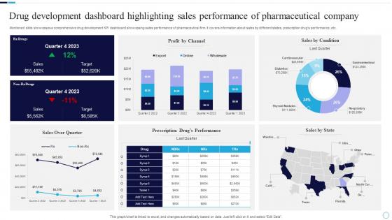
Drug Development Dashboard Highlighting Sales Performance Of Pharmaceutical Company




Try Before you Buy Download Free Sample Product
 Impress Your
 Audience
 100%
100% Editable
 Save Hours
 of Time


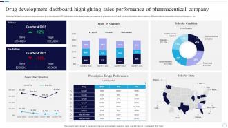
Mentioned slide showcases a comprehensive drug development KPI dashboard showcasing sales performance of pharmaceutical firm. It covers information about sales by different states, prescription drugs performance, etc.
People who downloaded this PowerPoint presentation also viewed the following :
Drug Development Dashboard Highlighting Sales Performance Of Pharmaceutical Company with all 7 slides:
Use our Drug Development Dashboard Highlighting Sales Performance Of Pharmaceutical Company to effectively help you save your valuable time. They are readymade to fit into any presentation structure.





FAQs for Drug Development Dashboard Highlighting Sales Performance
Focus on revenue by product line and market share first - that's what executives actually care about. Sales rep performance matters too, plus prescription volume trends and territory coverage rates. Customer acquisition cost is brutal in pharma since doctor relationships take forever to build. Conversion rates from samples to scripts are gold. Compliance stuff like call frequency can't be ignored either (regulatory nightmare otherwise). Inventory turnover and days sales outstanding round it out nicely. Honestly though? Stick to maybe 8-10 metrics max. Any more and nobody will use your dashboard.
Dude, real-time analytics is where it's at - you'll catch problems while you can actually do something about them instead of finding out weeks later. Your dashboard shows prescription trends, inventory, rep performance, all that stuff instantly. So when a territory starts tanking or competitors make moves, you can pivot fast. Way better than sitting around waiting for those monthly reports that are basically useless by the time you get them. Honestly I'd focus on whatever metrics tie directly to your quarterly numbers first. Don't overwhelm your team with everything at once - they'll hate you for it.
So customer segmentation is like your cheat code for sales. You group people by what they buy, where they are, how much they're worth - stuff like that. Then you can actually talk to them in ways that make sense instead of using some generic pitch that makes everyone's eyes glaze over. Your dashboard will show you which groups are crushing it and which ones... aren't. That's where you focus your energy. The whole point is turning those insights into real plans for each segment. Otherwise you're just staring at data that looks impressive but doesn't actually help you sell anything.
Honestly, charts and graphs are a game-changer compared to staring at endless spreadsheet rows. Your sales team can instantly see which territories are tanking with a good heat map. Marketing spots winning campaigns right away. And those trend lines for drug launches? They'll show patterns that would take forever to find otherwise. During meetings, managers make decisions way faster when they're looking at visuals instead of hunting through data. Just keep the charts simple and focus on what each team actually needs to see - nobody wants cluttered graphs that are harder to read than the original data anyway.
Track your call frequency and conversion rates first - that's the bread and butter stuff. Sales volume per rep is obvious, but prescription influence rates are where you'll see real impact (like how often docs actually prescribe after visits). New physician acquisitions and relationship scores matter for pipeline health. Don't sleep on market share by territory either. Compliance metrics are absolutely critical in pharma since one regulatory mess can wreck everything. Also worth tracking deal cycle length and customer retention. Honestly, start with these basics then build out territory-specific KPIs based on whatever therapeutic areas you're working.
Honestly, trend lines and time series charts are your best bet for tracking sales over months/quarters - they make momentum shifts super obvious. YoY comparisons are clutch too since pharma stuff tends to be seasonal. I'd definitely add color coding for growth vs decline periods, plus overlay competitor data if you can get your hands on it. Heat maps work great for geographic territory stuff. Just keep everything visual instead of boring people with endless tables (learned that one the hard way). Start simple with your top 3-5 products, then layer on more complexity once everyone's comfortable reading the data.
Honestly, a sales dashboard is like having one place where everyone can actually see what's happening. Marketing can tweak their campaigns based on real data instead of guessing. Finance stops pestering you for revenue updates every five minutes (thank god). R&D figures out which products are tanking or need backup. Just make sure people have the right access levels and you're all looking at the same numbers - otherwise it's pointless. Oh, and do regular cross-team reviews with the dashboard pulled up. Beats those endless email threads where nobody knows what anyone's talking about.
Ugh, data integration in pharma is such a nightmare. Everything's scattered across different systems - your CRM, ERP, research databases, regulatory tools. None of them talk to each other properly, and each one has its own weird formats and update schedules. Don't even get me started on compliance requirements making everything 10x more complicated. I've watched entire teams burn months just trying to figure out which data fields match up (seriously, it's painful). Honestly? Start with solid data governance first, then maybe hire some integration specialists who actually know pharma. Trust me on this one.
Feed your historical sales data and market trends into machine learning models - they're great at spotting future demand patterns. Include stuff like competitor launches and patent expirations too. Patent cliff predictions are honestly game-changers for avoiding nasty surprises. Time-series forecasting works best since pharma has weird cycles (prescription refills, flu season, etc.). I'd start simple with a moving average model first. Then add fancier algorithms once your data gets cleaner. The seasonal illness spikes alone make it worth doing properly.
Start with the basics - revenue, units sold, market share, territory stuff. That's what they actually want to see. Clean bar charts and trend lines work way better than those fancy graphics that just annoy pharma execs anyway. You'll want drill-down capability so people can dig into specific products or regions when something looks weird. Oh, and maybe avoid the whole red/green thing since literally every healthcare dashboard does that. Here's the thing though - definitely run it by some actual sales reps first. They'll spot problems you totally missed and save you headaches later.
Dude, you NEED compliance tracking on that dashboard. Pharma's heavily regulated and the FDA doesn't mess around - I've watched reps get completely screwed over by missing this stuff. Your dashboard should track HCP interaction limits, sample accountability, and territorial compliance in real-time. Off-label promotion flags too, obviously. Without it you're basically asking for violations that'll cost millions in fines. Oh, and make sure you can pull audit trails quickly - compliance audits always happen at the worst possible times and you'll want that data ready to go.
For pharma sales dashboards, I'd go with Tableau or Power BI first. Both handle complex data really well and connect to your CRM, sales databases, all that stuff. Qlik Sense is solid too if you want more interactive features. Honestly though, don't overthink the tool choice - I've watched teams spend months debating this when they could've been building. The real trick is making sure it plays nice with your regulatory requirements (which is always fun in pharma). My advice? Pick one and test it with a single dataset first. You'll learn way more from actually using it than comparing feature lists.
So your sales dashboard basically turns all that data into moves you can actually make. Real-time campaign results, spotting which territories are tanking, seeing what products are taking off - way better than waiting months for reviews. Set up alerts for your main KPIs so you're not glued to the screen all day (learned that one the hard way). Then when patterns pop up, you can shift resources around, tweak territory assignments, or copy what your top reps are doing. It's honestly game-changing how fast you can pivot when the market shifts.
Honestly, looking at historical sales data is a game changer for spotting trends. You'll see seasonal patterns pop up, plus which products are hot vs. tanking. External stuff like new competitors really shows up in the numbers too - sometimes in ways you wouldn't expect. I love how the patterns just hit you visually when you're scrolling through. You can compare current performance to last year or last quarter to set realistic goals. Pro tip: check monthly, quarterly, AND yearly views together. Each timeframe tells you something different about what's actually happening in your territory.
Dude, mobile access is seriously clutch when you're never actually at your desk. You can check real-time sales data and inventory right there in the doctor's office - no more trying to remember random numbers off the top of your head. Plus you'll look way more professional pulling up product info on your tablet during meetings instead of fumbling around. I honestly don't know how reps survived before smartphones because you can update your pipeline instantly and track everything on the fly. Just download the app and keep your data synced so you're not caught off guard.
-
They guys always go the extra mile to meet the expectations of their customers. Almost a year has been associated with them.
-
“Excellent information with easy access.”