

Drug Development Dashboard For Pharmaceutical Industry


Try Before you Buy Download Free Sample Product
 Impress Your
 Audience
Editable
of Time


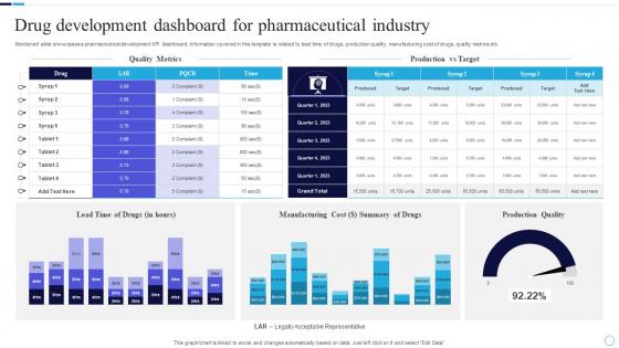
Mentioned slide showcases a pharmaceutical development KPI dashboard. Information covered in this template is related to lead time of drugs, production quality, manufacturing cost of drugs, quality metrics etc.
People who downloaded this PowerPoint presentation also viewed the following :
Drug Development Dashboard For Pharmaceutical Industry with all 7 slides:
Use our Drug Development Dashboard For Pharmaceutical Industry to effectively help you save your valuable time. They are readymade to fit into any presentation structure.


FAQs for Drug Development Dashboard
Start with pipeline progression - compounds moving through phases, timelines, success rates per stage. Your CFO's gonna ask about money immediately, so track burn rate and budget vs actual spend. Regulatory milestones are huge, plus any safety red flags that could tank everything. Honestly, competitive intel might be the most interesting part - seeing where rival drugs stand in development. I'd probably get obsessed with that data. Safety signals and adverse events are non-negotiable too since those can kill programs overnight. Build from these basics, then add therapeutic-specific metrics once you know what people actually look at.
Dude, real-time analytics is a game changer - you catch problems while they're happening instead of finding out weeks later when you're stuck reviewing boring reports. Safety signals pop up immediately, recruitment issues become obvious, and you can actually fix protocols before things get messy. The dashboard grabs data from everywhere at once (which honestly feels like cheating sometimes), so decisions come from what's actually happening right now. When trials start going sideways, you can jump in fast instead of discovering the mess at your next monthly meeting when it's way too late.
Oh man, the data is absolutely brutal - every trial site formats things differently, like they're all speaking different languages. Missing data points everywhere, and you can't just ignore them because of regulatory stuff. Time-series visualization gets messy fast when you're trying to show patient progression, side effects, AND efficacy without it looking like a disaster. Your audience is all over the place too - stats people want every tiny detail while execs just want the big picture trends. Honestly? Fix your data standardization first (I know, boring but crucial), then build dashboards that can flip between detail levels depending on who's looking.
Look, AI basically turns your dashboard into a data-crunching machine that works around the clock. Instead of your team spending weeks on analysis, you get instant pattern recognition and predictive modeling for trial outcomes. It'll catch correlations between biomarkers and patient responses that you'd probably never spot manually - honestly, some of this stuff is pretty mind-blowing when you see it in action. You end up making way faster decisions because you're getting actual insights instead of drowning in spreadsheets. I'd start with whatever repetitive analysis is currently eating up most of your time.
So these are basically your "oh shit, are we gonna get fined?" metrics. Track stuff like submission deadlines, protocol deviations, adverse event timelines - you know, all the things that'll make the FDA cranky if you mess up. Honestly, I've seen teams get blindsided by compliance issues that could've been caught early. Set up alerts when things hit yellow or red status so you can fix problems before they become expensive disasters. Nobody wants their phone buzzing at 2 AM because of a regulatory emergency. Trust me on this one.
So here's the thing - good UX can totally transform those clunky research dashboards. Start by actually watching how researchers work with their data (seriously, shadow them for a day). Most dashboards look sleek but are nightmare to navigate when you're in a rush. Focus on intuitive navigation first. Then make sure the most critical metrics are right upfront, not buried three clicks deep. Customizable views are huge too - different studies need different priorities. Oh, and group related stuff together logically. Sounds obvious but you'd be surprised how many miss this. Don't make people think harder than they need to.
Start with ClinicalTrials.gov and WHO registries - that's your bread and butter right there. FDA/EMA regulatory stuff comes next, plus whatever internal R&D metrics you're tracking. Patent databases are honestly make-or-break for this kind of work, so hit up USPTO early. You'll also want financial tracking for budgets, competitive intel feeds, and market research platforms. Oh, and if you're dealing with post-market drugs, don't skip the real-world evidence and safety monitoring systems. Clinical trial data should be your first priority since it drives most of the big decisions anyway.
So basically you feed all your historical trial data, regulatory stuff, and compound info into ML models. They'll analyze past wins and failures to spot where things usually get stuck. Honestly, the prediction ranges are way more useful than trying to nail down exact dates - nobody believes those anyway. Your models need constant updates though, especially when new trial results come in or regulations shift. Start by figuring out which factors actually move the needle on your timelines. It's not perfect but beats guessing blindly. Way better than the old spreadsheet approach we used to rely on.
Set up automated validation rules first - catches errors before they mess up your whole dashboard. I got burned once by completely bogus clinical trial dates, so trust me on this one. Pull from single sources instead of random spreadsheets whenever you can. Data governance sounds boring but figure out who owns what data and update schedules. Alerts are clutch for weird spikes in enrollment numbers. Oh, and build validation directly into the dashboard architecture. Way easier than hunting down errors later when everyone's already seen the bad data.
Look, dashboards basically fix that annoying silo problem where everyone's working off different info. Clinical sees one thing, manufacturing sees another - total mess. With a good dashboard, all your teams are looking at the same real-time data instead of that telephone game nonsense we've all dealt with. Everyone can actually spot bottlenecks before they screw up your timeline. The trick is automating the data feeds so you're not stuck updating spreadsheets manually every damn week. Cross-team planning becomes way less painful when people can see milestones, risks, and who needs what resources.
Real-time data integration is huge right now - pulling live updates from trials, regulatory stuff, and market research into one dashboard. Interactive timelines are everywhere too, where you can drill down from pipeline overviews to specific milestones. Predictive analytics overlays are trendy (though sometimes feels like they're just showing off). Mobile design is basically expected now since execs want updates on their phones. Oh, and clean interfaces beat flashy ones every time - the best dashboards I've seen focus on insights you can actually use rather than just looking impressive.
Honestly, I'd hook up APIs from Citeline or EvaluatePharma - they'll feed benchmarks straight into your dashboard. Just watch out for comparing weird stuff together, like you want similar trial phases and therapeutic areas or the data's useless. Set up alerts when your numbers start looking off compared to industry standards. Timeline charts with benchmark overlays work great too - stakeholders love seeing that visual comparison right away. Oh, and don't dump 20 metrics on people at once. Pick 3-4 key ones first, then build from there.
So for drug development dashboards, Tableau's probably your best bet to start with. Power BI works too, especially if you're already in the Microsoft ecosystem. Spotfire gets thrown around a lot in pharma circles - decent option. I've watched teams try building custom solutions and wow, what a mess that usually becomes. R Shiny's actually pretty solid if your data scientists can handle the coding, but you'll be doing way more upkeep. Tableau handles everything from preclinical stuff through Phase III really smoothly though. Just double-check whatever you pick plays nice with your current clinical databases first.
Honestly, the biggest mistake people make is building dashboards that look nice but don't actually help with day-to-day work. Talk to your users first - find out what numbers they really need and how they'd actually use them. Nobody's got time for slow-loading screens, so keep it fast and simple. Give people a quick walkthrough when you launch it (maybe grab coffee with them or whatever). The real key though? Check back in a few weeks to see if they're even using the thing. I've seen so many beautiful dashboards that just get completely ignored because they missed the mark on usefulness.
ML is honestly pretty wild for drug development stuff. You can catch patient subgroups that respond way better to treatments - things you'd totally miss doing it by hand. It handles those huge clinical trial datasets really well too. The pattern recognition thing still blows my mind sometimes, not gonna lie. Dosing schedules, predicting side effects, finding the right patients faster - it does all of that. Oh and it's great at flagging compounds that'll probably fail early, which saves you tons of time. My advice? Pick one thing to start with instead of going crazy with it everywhere at once.
-
“Easy to use. I always wanted to have a quick search for products and SlideTeam has helped me have it.”
-
“One of the best experiences with SlideTeam for my presentation.Everything on time, communication is efficient and price is reasonable. All good in one place.”