


Global Export And Trade Management Dashboard Export Strategic Guide For Global Market Entry




Try Before you Buy Download Free Sample Product
 Impress Your
 Audience
 100%
100% Editable
 Save Hours
 of Time


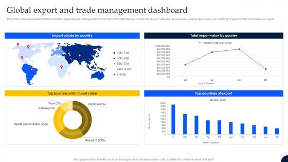
This slide showcases dashboard that can help organization to manage export of products into international markets. Its key elements are top business units by import value, top countries of export and import values by country.
People who downloaded this PowerPoint presentation also viewed the following :
Global Export And Trade Management Dashboard Export Strategic Guide For Global Market Entry with all 7 slides:
Use our Global Export And Trade Management Dashboard Export Strategic Guide For Global Market Entry to effectively help you save your valuable time. They are readymade to fit into any presentation structure.





FAQs for Global Export And Trade Management Dashboard Export Strategic Guide For
Start with trade flows - import/export volumes, values, and growth rates by country and product. Trade balance data is crucial, plus your top partners ranked by volume. Tariff rates matter a ton (leadership will definitely ask). Currency exchange rates and commodity prices too. Oh, and shipping times with port congestion metrics - that stuff directly hits operations. Supply chain disruption indicators are key right now. Honestly, trade agreement impacts can make or break your analysis. Begin with these basics. You can always add more detailed data once you see what stakeholders actually care about.
Dude, visualizations are a total game changer for trade data. Raw spreadsheets will make your eyes bleed - trust me on this one. Line charts instantly show you seasonal patterns and when things suddenly tanked. Heat maps? Perfect for geographic stuff over time. You'll spot correlations between regions super fast, plus catch weird anomalies that might mean the market's about to shift. I'd mess around with a few different chart types first. See what patterns pop out. Way easier than scrolling through endless rows of numbers trying to make sense of everything.
Look, global trade moves crazy fast and you can't afford to find out about problems days after they happen. Port delays, supply bottlenecks, demand spikes - I've seen companies get blindsided by stuff they could've seen coming. Hours matter when you're trying to reroute shipments or adjust inventory. Live data feeds let you spot patterns early and pivot before small issues blow up. Oh, and definitely set up alerts for whatever metrics actually matter to your business - otherwise you'll just get buried in useless notifications all day.
So basically, these trade dashboards show you import/export data and trade volumes across different regions - super helpful for finding new markets. I'd filter for countries where GDP is growing and they're importing more of whatever you're selling. Look for spots where there's rising demand but not much competition yet. The visual stuff makes patterns way more obvious than staring at boring spreadsheets all day (been there, done that). Oh, and once you find promising markets, definitely research their regulations before jumping in. Trust me on that one.
Start with your data architecture - get standardized schemas and ETL pipelines running to clean everything before it reaches your dashboard. Trade data is messy as hell, trust me on this one. Set up automated validation rules since you're juggling customs databases, shipping APIs, and market feeds all at once. Track your data lineage so when numbers go sideways you can actually figure out why. Different sources update at different speeds - some hourly, others daily - so plan your refresh schedules accordingly. Don't try integrating everything right away though. Focus on your critical KPIs first, then build from there.
So geopolitical stuff totally screws with dashboard data. You'll see crazy spikes when trade routes suddenly shift or shipping gets delayed because of tensions. Sanctions are the worst for this. Ships start avoiding certain areas or straits, which makes your volume metrics look super weird even though actual demand hasn't changed - it's just politics being politics. Price volatility goes nuts too during trade wars or conflicts. Honestly, I'd set up some kind of alert system for major world events so when your data starts looking funky, you'll know why.
So basically, tariffs and trade deals mess with all those dashboard numbers you're looking at. Higher tariffs? You'll see import volumes drop from those countries, but then trade picks up with their competitors instead. Trade agreements work the opposite way - suddenly those partner countries are doing way more business together. Honestly, it's wild watching policy changes play out in the data like that. Oh, and definitely filter by specific partnerships or tariff codes when you're analyzing recent stuff. Otherwise your year-over-year comparisons are gonna look completely off because of all these policy shifts happening.
So basically you'd dump your old trade data into ML models to spot patterns - import/export volumes, pricing stuff, supply chain mess-ups. Your dashboard shows forecasts for the next 6-12 months based on what's happening now. Some of these systems are honestly pretty crazy - they'll even track geopolitical drama and weather. Build different models for various trade routes and commodity types, seasonal changes too. I'd start by figuring out what trends your stakeholders actually care about, then create simple forecast widgets that update themselves when new data comes in.
Honestly, Tableau and Power BI are your best bets here. Tableau kills it with maps and geo stuff - super important for trade data. Power BI's cheaper though, and if you're using Microsoft already it just plugs right in. Both can grab data from APIs, databases, whatever you throw at them. Trade info comes from like 10 different places so that's huge. D3.js looks cool but you'll spend forever coding instead of actually analyzing. I'd probably start with Power BI unless money's no object - it does 90% of what Tableau does for way less cash.
Look at your trade volumes and growth rates next to industry averages - the dashboard breaks it all down by export destinations, product categories, that kind of stuff. Honestly? It's wild seeing the data side-by-side like that. You'll catch where competitors are crushing you and spot markets you're totally missing. Their competitor analysis tool shows which countries and products are making them money. I'd hit the biggest gaps first since those are your best shots at growth. Fair warning though - it can be a bit of a reality check when you see how far behind you might be on certain metrics.
Ugh, the data nightmare is real. You're pulling from customs agencies, ports, shipping companies - they all use different formats and update whenever they feel like it. Some countries report monthly, others quarterly, and product classifications? Total mess across borders. Currency conversions are annoying enough without adding time zones into the mix. Then random data providers just disappear sometimes. Oh, and there's always lag - December shipments might not hit import records until February. Build multiple validation checks and always timestamp everything so users aren't working with mystery data.
So the dashboard lets different teams customize their view based on their role. Executives get the high-level KPI stuff and trend summaries. Operations people see detailed shipment tracking and all the logistics data they actually need. Finance wants cost breakdowns and tariff info right up front - no surprise there. You can save these setups as templates, which is pretty handy since new people automatically get the right view for their department. Honestly, I'd start with whoever complains the loudest about the current system. They'll tell you what's broken and what actually matters vs. the pretty widgets nobody touches.
Look for trade concentration ratios first - they'll show you if critical stuff is coming from just a handful of suppliers. That's where things break down fast. Port congestion and shipping delays give you the real-time picture of what's actually stuck. I'd also watch inventory-to-sales ratios; when they're weirdly low, supply chains are basically running on empty and can't handle any surprises. Currency swings and geopolitical risk scores help predict where the next mess might pop up. Oh, and map your most critical routes using these metrics before you dive into everything else.
Honestly, sustainability data is a game-changer for trade decisions. It shows the real costs hiding in your supply chains - carbon footprints from different shipping routes, which suppliers have sketchy environmental records, regulatory risks that could bite you later. Customers actually give a damn about this now too. The dashboard lets you see which partners match your green goals and where compliance headaches might pop up. I'd start with your biggest 10 trade routes and check their emissions first - that's where you'll probably find the worst surprises.
So basically AI spots all those patterns you'd miss scrolling through data for hours. It'll predict when supply chains might get messed up, catch weird pricing stuff happening, and honestly gets better the more you use it. Like instead of you trying to figure out why copper prices are acting strange, it just tells you "hey, expect demand to jump in Q3" or whatever. Oh and it flags risks too - super helpful for trade teams. I'd probably start with anomaly detection first since that's usually where you see results fastest. Way better than staring at spreadsheets all day.
-
Well-designed and informative templates. Absolutely brilliant!
-
SlideTeam never fails to surprise me with its amazing PPT designs. Thanks team for providing me with your constant support!