


Guiding principles ppt background images






Try Before you Buy Download Free Sample Product
 Impress Your
 Audience
 100%
100% Editable
 Save Hours
 of Time


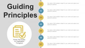
We present our Guiding principles PPT background for the better functioning and achievement of your organisational goals and objective. The PPT slideshow is based upon the guiding principles that are going to guide your organisation throughout. It can help you grow your organisation at a rapid pace. Our experts have spent a lot of their precious time on making this PowerPoint template. You are going to get benefited a lot if you once download and go through the complete slideshow. The template is ready for instant download in just a single click. It will assist you in your brand definition as well. Accordingly the business template will help you increase the quantity and quality of your audience. The complete use of these principles is given in the slideshow. This guiding principles PPT is a seven stage process and the stages included in the process are financial, management, business, marketing and the points that guide an organisation throughout. Our Guiding Principles Ppt Background Images assist in brand definition. Elaborate on all the fascinating features.
People who downloaded this PowerPoint presentation also viewed the following :
Content of this Powerpoint Presentation
Description:
The image depicts a PowerPoint slide titled "Guiding Principles" which is likely meant to outline the core values or standards that steer an organization's actions and decision-making processes. Below the title, the subtitle "Points That Guides An Organization Throughout" suggests that the principles serve as a continual reference for the organization's conduct and strategic direction.
The slide features a vertical line connecting seven circular nodes, each numbered from 01 to 07, indicating a list of items that will be detailed further. These nodes are placeholders where specific guiding principles or values can be added. The color coding (alternating shades of blue and yellow) and the layout provide a clear and organized visual path for the viewer to follow.
Each node is accompanied by a text box that repeats, "This slide is 100% editable. Adapt it to your needs and capture your audience's attention." This message emphasizes the slide's customizable nature, allowing the presenter to modify the content according to the specific guiding principles of their organization.
Use Cases:
Guiding principles are essential across industries, serving as a compass for organizational behavior, culture, and decision-making processes.
1. Technology:
Use: Communicating company values in innovation and ethics
Presenter: CEO
Audience: All Employees
2. Healthcare:
Use: Outlining patient care standards and medical ethics
Presenter: Hospital Administrator
Audience: Medical Staff, Administrative Teams
3. Education:
Use: Defining educational values and teaching philosophies
Presenter: School Superintendent
Audience: Educators, School Board Members
4. Finance:
Use: Setting the tone for fiscal responsibility and integrity
Presenter: Compliance Officer
Audience: Finance Teams, Company Shareholders
5. Hospitality:
Use: Sharing customer service excellence guidelines
Presenter: General Manager
Audience: Hotel Staff, Customer Service Representatives
6. Retail:
Use: Establishing principles for customer interactions and quality service
Presenter: Retail Operations Director
Audience: Store Managers, Sales Associates
7. Construction:
Use: Emphasizing safety, quality, and environmental stewardship
Presenter: Safety Officer
Audience: Construction Workers, Project Managers
Guiding principles ppt background images with all 5 slides:
Inspire folks to hear good bands with our Guiding Principles Ppt Background Images. Educate them about jazz.
FAQs for Guiding principles
Okay so three main things: figure out your audience first, stick to ONE message (seriously, don't try to squeeze in everything), and make it a story instead of random facts. What do they actually care about? That's your starting point. Then write down your main takeaway in one sentence - that's gonna guide everything else. Structure it like you're telling someone what happened, with a beginning and end. Your slides are just backup, not the main event. I always mess this up and try cramming too much in, but honestly? Less is way more effective.
Good design principles are basically your secret weapon for not losing people mid-presentation. You know how some slides just feel... messy? That's usually because there's no visual hierarchy or the colors are all over the place. Clean typography and smart use of white space actually help your main points hit harder. I'm a big believer in the "less is more" approach - contrast draws the eye where you want it. Honestly, don't try to master everything at once though. Pick one principle each time and you'll see the difference. Your audience will thank you for not making their brains work overtime.
Honestly, presentations work so much better when you treat them like stories. People's brains are just wired that way - we follow narratives naturally. You'll remember a good story way longer than some random bullet points, guaranteed. Set up a problem first, then build some tension in the middle while you explore solutions. End with a resolution that ties everything together. Even boring technical stuff works with this formula - though I know that sounds weird. Next time, map out your presentation like you're telling a story instead of just throwing information at people. Trust me, you'll see the difference immediately.
Oh totally, culture makes a huge difference in presentations! Like, some audiences want all the data and details right away, while others prefer you start with the big picture. Direct communication works great in some places but can seem rude in others. Eye contact, formality levels, even colors mean different things depending where you're presenting. Honestly, I learned this the hard way once when I used way too much humor for a pretty formal crowd. Do a quick Google on their cultural norms beforehand – it'll save you from looking clueless up there.
Okay so here's what works for me: put your main point right up front. Don't bury the lead! Then go back and slash everything that's not pulling its weight - I swear, first drafts are like 40% bloat. Keep your words simple too. Nobody's impressed by fancy vocabulary when they're trying to figure out what you actually mean. Break up those monster sentences while you're at it. Oh, and read everything out loud before you hit send. Sounds weird but you'll catch so much awkward stuff that way. Your readers are probably skimming anyway, so make their lives easier.
Honestly, just make sure your visuals actually help explain whatever you're talking about. Don't add charts just because they look cool - I've seen way too many presentations that do this. Keep things simple and directly connected to your content. Colors need good contrast so people can actually read them, and size everything appropriately. Oh, and always add alt text for screen readers! Consistency matters too - same fonts, similar formatting throughout. Before adding anything, ask yourself: does this visual genuinely help my point or am I just filling empty space? Your audience will thank you.
Honestly, just stick to three things: be truthful, respectful, and responsible. Don't hide your data's flaws or pretend there's no bias - people aren't stupid. Never waste their time with dumbed-down explanations or sneaky charts that twist the story. Think about who might get hurt by what you're saying too. I've sat through way too many meetings where someone clearly cherry-picked their numbers. Super annoying. Before you present anything, ask yourself if you'd be cool with someone fact-checking everything you just said. That's basically it.
Think of past feedback as your cheat sheet for what actually works. Scan through it and find the patterns - like if people always zoned out during your technical parts, make "keep it simple" your new rule. Honestly, the storytelling bits probably got the best reactions anyway (they usually do). Don't ignore what the feedback's telling you just because it stings a little. Pull out 2-3 solid principles from those patterns. Maybe it's cutting jargon or adding more examples. Then test them out next time you present.
Totally doable, just gotta be smart about it. First figure out your hard lines - what you absolutely won't compromise on. Then run every tech decision through that filter. Like if you're big on transparency, skip the sketchy platforms with murky data policies. I've watched so many people get excited about the latest shiny thing and completely forget their values (guilty of this myself tbh). Short version: ask yourself "does this actually help our mission or just create more noise?" Your principles should guide the choice, not get buried under cool features.
Yeah, you gotta update those principles pretty regularly. Remote work totally flipped everything - suddenly all that "face-to-face collaboration" stuff felt ancient. I'd say review them whenever big communication shifts happen, like new platforms or generational changes. Nobody was even thinking about Zoom fatigue three years ago, you know? Your core values can stay put, but how you actually apply them needs to evolve. Maybe do quarterly check-ins? Just see if your principles match how your team really communicates now - not how they did two years ago.
First thing - write down your principles and keep them front and center. Share a doc with the team so everyone's on the same page. During planning and rehearsals, actually refer back to them (I know, sounds obvious but people forget). Here's what really works: pick someone to be the "principles police" - yeah it's corny but trust me, you need that person to call out when you're going off track. Do quick check-ins to see if your content matches what you originally committed to. Otherwise those principles just become meaningless words that sit in some forgotten Google doc.
Totally! Your principles are more like creative guardrails than walls. They give you structure to play within. You wouldn't show up in a clown suit for quarterly reports, but engaging visuals or storytelling? Hell yes. The trick is figuring out what "appropriate creativity" means for your specific audience. Ask yourself: does this serve them and match our values? If so, run with it. I honestly think most presentations are way too boring anyway. Next time you're prepping something, pick the dullest section and brainstorm three creative spins on it. You'll be surprised what works.
Dude, ignoring your guiding principles is like throwing your business into a blender. Your team won't know what they're doing anymore. Decision-making gets weird and inconsistent. Employees start checking out because nothing makes sense. Customers lose trust since your brand feels scattered everywhere - kinda like when companies rebrand every six months and you're like "what are they even about?" Internal drama skyrockets too. People need shared values to handle tough situations. It messes with hiring, planning, everything really. Figure out your core principles first and actually stick to them daily.
Oh totally, they change a ton depending on your industry. Healthcare is all about patient safety first - you can't mess around there. Tech companies? They're chasing the next big thing and making users happy. Financial services are paranoid about risk (which honestly makes sense when it's people's life savings). Nonprofits have to answer to donors and stay true to their mission. But here's the thing - your principles should match what actually matters in your space. Look at what successful companies in your industry worry about most. That's usually where you'll find your north star.
Having solid principles makes public speaking way less terrifying, honestly. Pick like 3-4 values that actually matter to you - clarity, empathy, whatever feels right. Then use them as your north star for every presentation. It's weird how much this helps with organization too. Your thoughts just flow better when you've got a framework instead of randomly throwing ideas around. Audiences can totally tell when you're speaking from genuine beliefs vs just BS-ing your way through. I swear it reduces that awful pre-speech anxiety because you're not constantly wondering what to say next.
-
Very unique, user-friendly presentation interface.
-
Thanks for all your great templates they have saved me lots of time and accelerate my presentations. Great product, keep them up!
-
Best way of representation of the topic.
-
Enough space for editing and adding your own content.