


Key metrics powerpoint slide background designs





Try Before you Buy Download Free Sample Product
 Impress Your
 Audience
 100%
100% Editable
 Save Hours
 of Time


Display deep insight with our Key Metrics Powerpoint Slide Background Designs. Demonstrate awareness of core functioning.
People who downloaded this PowerPoint presentation also viewed the following :
Content of this Powerpoint Presentation
Description:
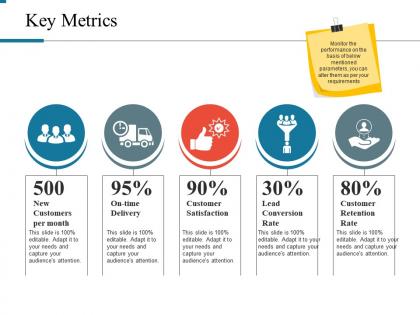
The image depicts a presentation slide titled Key Metrics, which is likely used to showcase performance indicators relevant to a business or organization. The slide outlines four primary metrics, each with a corresponding icon, percentage or number, and a brief descriptive text.
1. 500 New Customers per month:
This metric, accompanied by an icon featuring multiple figures, indicates the number of new customers acquired each month. It suggests a focus on growth and customer acquisition strategies.
2. 95% On-time Delivery:
Displayed with a delivery truck icon, this metric reflects the reliability and efficiency of the entity's delivery or operational process, emphasizing the importance of meeting deadlines.
3. 90% Customer Satisfaction:
The third metric, represented by a starburst icon with a smile, measures the percentage of customers who are satisfied with the service or product, highlighting the significance of customer experience and service quality.
4. 30% Lead Conversion Rate:
With an icon showing a figure holding up a trophy, this metric signifies the success rate of turning leads into customers, indicating the effectiveness of sales and marketing efforts.
5. 80% Customer Retention Rate:
The last metric, with an icon featuring a hand holding a figure, sheds light on how well the organization keeps its customers over time, emphasizing loyalty and long-term customer value.
Use Cases:
The metrics presented in this slide can be adapted to a wide range of industries focused on customer relationship and process optimization:
1. Retail:
Tracking customer behavior and sales efficiency
Market Analyst
Sales Team
2. E-commerce:
Monitoring online sales conversion and delivery performance
E-commerce Manager
Operations Team
3. Telecommunications:
Assessing customer acquisition and service satisfaction
Customer Service Director
Customer Support Agents
4. Financial Services:
Managing client growth and retention
Financial Advisor
Client Relations Team
5. Healthcare:
Overseeing patient acquisition and satisfaction
Healthcare Administrator
Healthcare Providers
6. Manufacturing:
Examining supply chain efficiency and client relations
Supply Chain Manager
Production and Distribution Staff
7. Technology:
Evaluating customer growth and software adoption rates
Product Manager
Development and Support Team
Key metrics powerpoint slide background designs with all 5 slides:
Your effort is bound to be impeccable due to our Key Metrics Powerpoint Slide Background Designs. It allows you to accept the job.
FAQs for Key metrics powerpoint
Revenue and profit margins are your bread and butter - executives live for that stuff. Customer acquisition cost and lifetime value round out the must-haves. Beyond that, I'd add conversion rates and churn rate. Maybe throw in some operational efficiency metrics too, but honestly it depends what industry you're in. Don't go over 6-8 total or you'll lose people. The trick is picking numbers that actually tell your business story, not just flashy stats. Oh, and start by thinking about what decisions these will help people make - that's usually backwards from how most folks approach it.
Honestly, less is more with background metrics. I'd go with light watermarks or maybe some transparent data overlays - just keep the opacity around 20-30% so they don't fight your main content. Stick to muted colors like soft grays. Position them in corners or edges where they won't mess with your text. I've definitely seen people overdo this and it looks awful. But done right? It actually reinforces your point without being distracting. Oh, and faded charts work pretty well too if you've got the space for them.
Honestly, just go minimal with your backgrounds - high contrast is your friend here. Light colors or neutrals work way better than dark ones, trust me on this. I learned that the hard way when half my text disappeared under conference room lighting. Skip anything busy like textures or gradients that'll fight with your data. Subtle grids are fine if they help guide the eye. Your background should basically vanish once you add charts and numbers. Oh, and definitely test on whatever screen you're actually presenting on - projectors are notorious for washing everything out.
Yeah, so different industries totally have their favorites when it comes to metrics slides. Tech is obsessed with DAU/MAU and user engagement stuff. Finance goes hard on ROI and profit margins. Healthcare's all about patient outcomes (makes sense with all the regulatory stuff they deal with). Retail focuses on conversion rates and customer acquisition costs. Manufacturing loves efficiency metrics like OEE - honestly didn't know what that stood for until recently. But here's what I've learned: your specific audience trumps industry norms sometimes. Just pick 3-5 metrics that actually matter for your situation instead of copying what everyone else does.
Honestly, just go with clean whites or light grays for your KPI slides. Your data needs to be the star here, not some fancy background that makes people squint at the numbers. I've watched presentations where busy patterns completely killed the readability – super frustrating. Neutral tones work best, especially ones that play nice with your brand colors. Dark backgrounds can look sleek if your charts really stand out against them. Quick test: if you're struggling to read any text or data, tone it down. Simple beats pretty every time when you're dealing with metrics people actually need to see.
Colors mess with people's heads before they even look at your numbers. Like, red backgrounds make good growth look scary, while green just feels right for success stuff. Blue's solid for financial data since it screams trustworthy, but honestly? It can make exciting results look kinda bland. I've literally watched great metrics tank because someone picked terrible colors - it's wild how much it matters. Your background needs to vibe with your story, not work against it. Just pick something that matches the feeling you want and definitely check how it looks beforehand.
Bright colors are your friend with dark backgrounds - white and neon shades really pop for bar charts and line graphs. Light backgrounds are way more forgiving though, you can get away with almost anything except maybe pale yellow (that stuff just vanishes). Honestly, I always go with clean white or light gray for dashboards since they're foolproof. Pie charts need solid backgrounds, not textured ones - they get messy otherwise. Oh, and definitely test everything in presentation mode first! I've learned this the hard way when stuff looked great on my screen but was completely unreadable projected.
Okay so first thing - make a master template with your fonts, colors, layout, all that stuff locked down. Then just copy it for every new slide instead of rebuilding from scratch each time. I stick to like 2-3 colors max because honestly those rainbow charts just scream amateur hour. Same chart styles throughout, keep your metric titles in the exact same spot, format all your numbers the same way. The spacing matters too - don't get sloppy with it. Once you've got that template dialed in, you'll be shocked how much more professional everything looks. Way less work too since you're not reinventing the wheel constantly.
Ugh, don't use busy backgrounds! Those gradient things or patterns just make your numbers impossible to read. People will be squinting instead of actually looking at your data. Dark backgrounds might seem cool but they're terrible in bright meeting rooms - learned that one the hard way. And please skip those random geometric shapes or stock photo overlays. Makes it look like you grabbed the first template you found. Honestly, white or super light gray works best. Let your charts do the talking instead of fighting with some swooshy design nonsense behind them.
Dude, you gotta turn those boring numbers into actual stories people care about. Like instead of "sales went up 15%," start with whatever problem your team was dealing with, walk through how you solved it using the data, then hit them with that win. Think of it as making a mini-movie out of your spreadsheet - which sounds weird but totally works. Your slide colors can help too. Dark backgrounds for the messy problems, bright ones when you're showing solutions. Short sentences hit different than long ones, you know? Structure the whole thing like a three-act play and watch people actually pay attention for once.
Dude, whitespace is everything on metrics slides. Seriously. Your numbers need room to breathe or people's eyes just glaze over trying to process everything. I always leave tons of space around charts and between data points - cramming stuff together looks amateur honestly. Plus it creates this natural hierarchy where your most important metrics stand out first. Oh and try squinting at your slide when you're done. Sounds weird but if you can still spot the key numbers easily while squinting, you've nailed the spacing. Trust me on this one.
Keep your branding super subtle - you don't want it fighting with your data. Thin borders work great, or just toss a small logo in the corner. White/light gray backgrounds are your friend here. The numbers should be doing all the talking, not your brand stuff! I actually like using brand colors for the actual charts - like your secondary colors for bars or line graphs. Way better than logo overload. One branded thing per slide is plenty. Trust me, people will still know it's yours without going overboard.
Honestly, Canva's your best friend here - they've got tons of dashboard templates you can just swap your colors into. Super quick. If you're feeling fancy, Adobe stuff like Photoshop gives you way more control but yeah, it's a pain to learn. PowerPoint's actually gotten pretty decent lately too, which is weird to say. Oh, and removing.bg is clutch for clean icon overlays. Unsplash has some nice geometric patterns that don't look cheesy. I'd just start with a Canva template and mess around from there. You'll have something that looks professional in like 10 minutes.
Honestly, backgrounds should help people focus on your data, not distract from it. I'd go with subtle gradients or simple geometric shapes - skip the busy patterns that make numbers impossible to read. Dark backgrounds actually look pretty slick for financial stuff, gives off that professional dashboard vibe. You want visual hierarchy so your biggest metrics jump out right away. Try color zones to group related KPIs together, maybe add some subtle lines to guide where people look. Here's my test - glance at it for 3 seconds. Can't find the key number immediately? Your background's doing too much.
Okay so this is huge - your audience's culture totally shifts how they read the same data. Japanese companies care way more about long-term patterns than hitting this quarter's numbers. Meanwhile Americans want those immediate wins highlighted. Even colors mess with people differently! Red screams "bad news" here but means luck in China. Plus what looks like amazing growth in one market might seem pretty meh somewhere else. I bombed a Tokyo presentation once because I didn't get this. Now I always dig into who I'm presenting to first and actually explain what the numbers mean out loud instead of just assuming everyone's on the same page.
-
Wonderful templates design to use in business meetings.
-
Innovative and attractive designs.