


Happy new year style 1 powerpoint slides




Try Before you Buy Download Free Sample Product
 Impress Your
 Audience
 100%
100% Editable
 Save Hours
 of Time


Sit back, relax and let your thoughts flow. Our Happy New Year Style 1 Powerpoint Slides will work out the rest for you.
People who downloaded this PowerPoint presentation also viewed the following :
Content of this Powerpoint Presentation
New Year is an annual celebration that people across professions celebrate and even carry the festivity home to their family, friends, and peers. Some workplaces will call for a midnight celebration on 31st December, while others will just want to shoot emails organization-wide. In their personal lives, too, people who are not that big on celebrations will just slip a card or a silent note to their loved ones and try to have the rest of the day to themselves in peace.
Want to wish your colleagues on their work anniversaries, we have the perfect slides summed here.
Nonetheless, SlideTeam caters to tastes of all possible ranges. Want to drop an invite for the New Year’s ball? We have the New Year template for it. Wish to only pass on greetings and do your duty, we have the greeting card template for it, too!
Celebrate birthdays with our unique PPT Designs linked here.
Explore this richly-packed presentation design of content-ready wishes, invites, and gift cards to be dropped next New Year’s. These are pre-designed Happy New Year Templates for all the blissful, successful, and prosperous years that lie ahead of you. Claim these now and manifest the good years that the future holds for you.
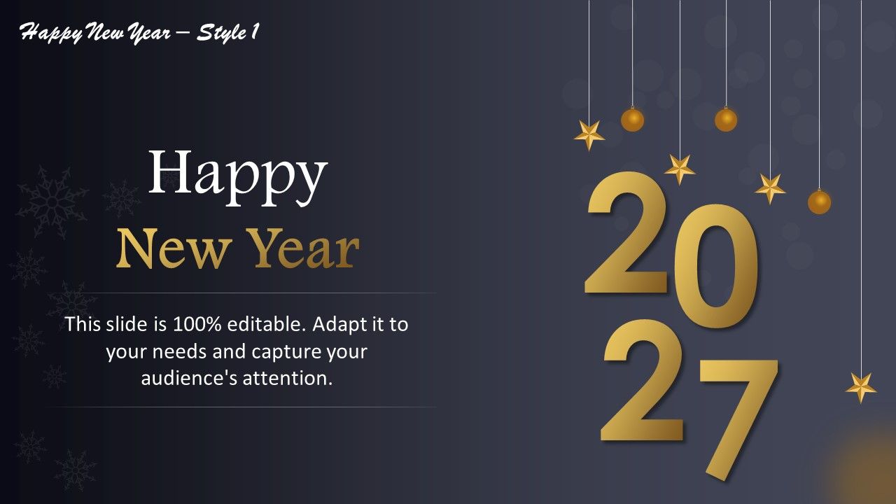
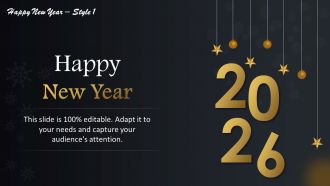
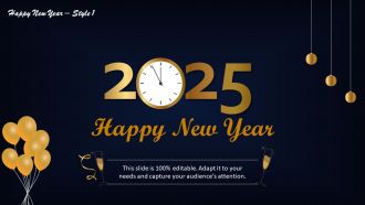
Template 1: Happy New Year Template Style 1
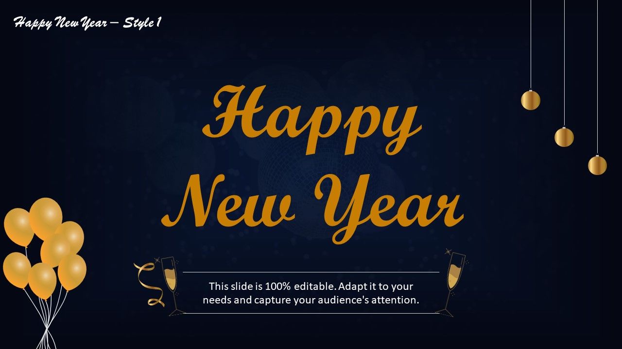
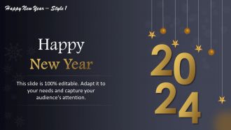
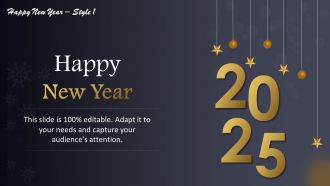
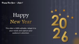
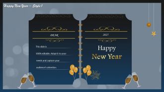
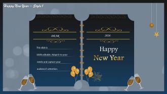
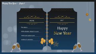
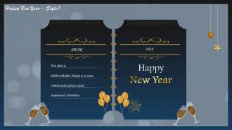
Want an opening cover page for your invite or a greeting card for New Year’s? Use this PPT Template to draw eyeballs. The dynamic layout of this presentation template will wish your recipients in bold font while also having room in the subtext to add special wishes or regards. Other elements of this PPT Template include images of party elements like balloons, lights, decorations, etc., to signify celebrations. Download now!
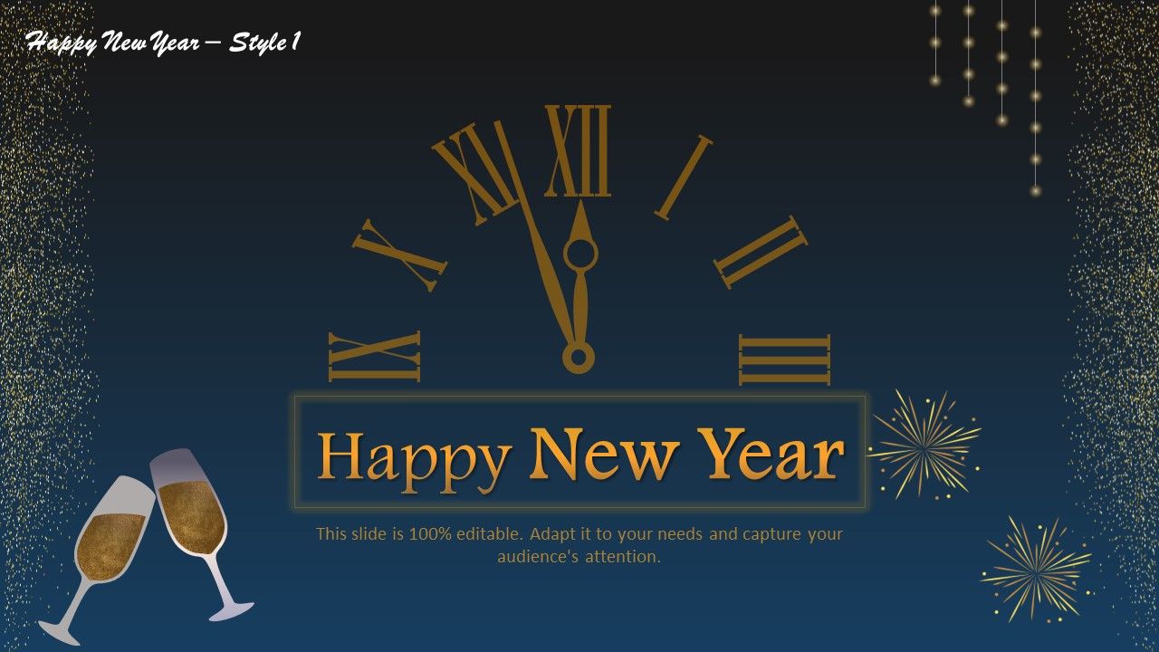
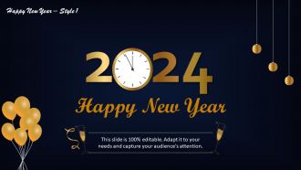
Template 2: Happy New Year Template Style 2
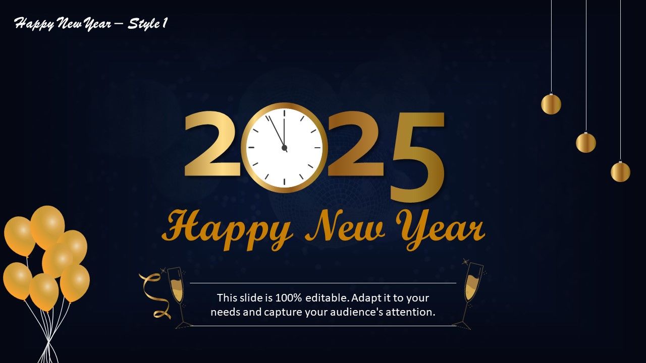
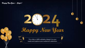
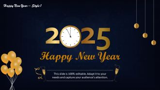
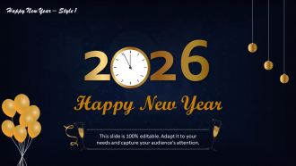
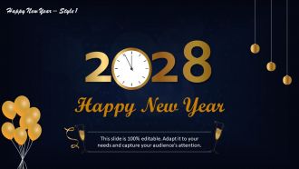
This PPT Design is ideal for invitations to midnight celebrations. Indicate the punctuality with the clock design embedded in the digit zero of the year. Party-indicating icons like balloons, lights, and, above all, the glittering color gold will reinforce the celebration that is hinted at with this invite card. You may even add other details like venue, time, and rules, if any. Download this creative PPT Layout to share these details along with the wish now!
Template 3: Happy New Year Template Style 3
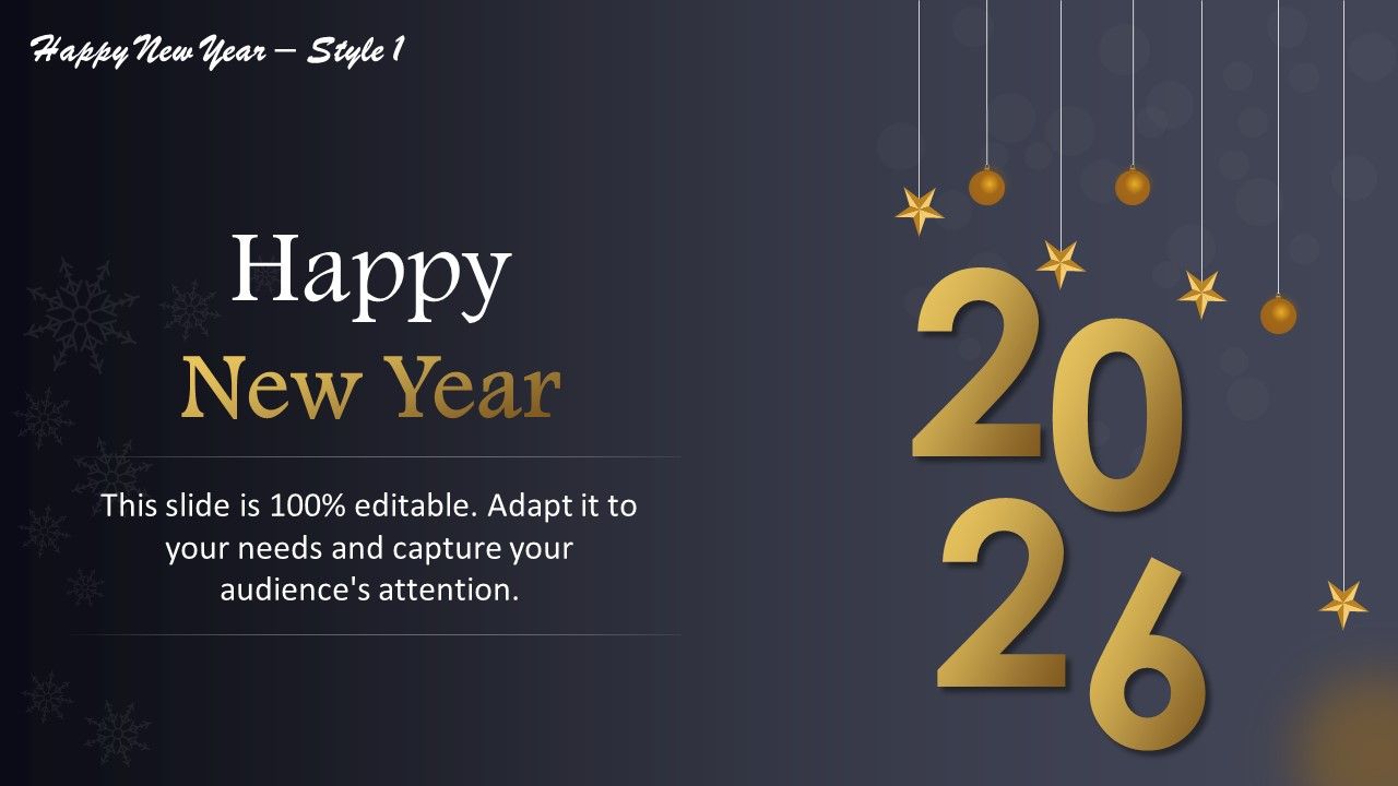
Employ this presentation side to extend wishes to your workplace and families. Edit the PPT Layout to add wishes by putting your heart in it. Each element of this PPT Slide is 100% editable, allowing you to move around elements and rearrange the wish or greeting card as you like. Get it now from the link below.
Template 4: Happy New Year Template Style 4
Here’s another PPT Template to share your new year’s wishes for your peers, friends, and colleagues. This PPT Design can also be used to inform them about any upcoming event planned for the New Year. Thus, use this engaging design to with and invite them both. Go ahead and grab this multipurpose presentation design now!
Template 5: Happy New Year Template Style 5

This presentation template features an elegant design featuring dazzling fireworks to share a cheerful New Year's message. It is ideal for workspaces when kicking off a successful and prosperous year. Your audience will love this presentation design whether you're planning to host a New Year's Eve party, developing a business strategy, or simply spreading New Year cheer.
Template 6: Happy New Year Template Style 6
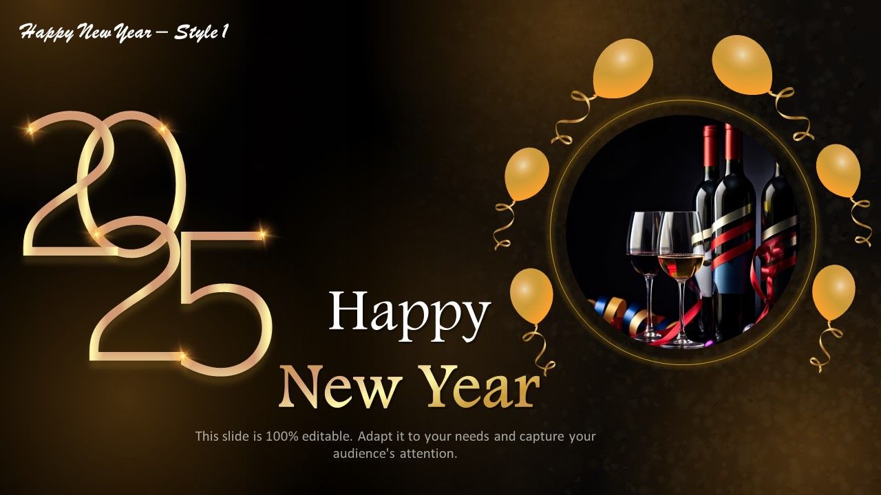
Ring in the New Year with this festive PowerPoint Preset. Its vibrant fireworks design and festive colors make this template perfect for inviting and exciting your audience. Let your presentations reflect the spirit of the New Year by wishing them a prosperous new year!
Template 7: Happy New Year Template Style 7
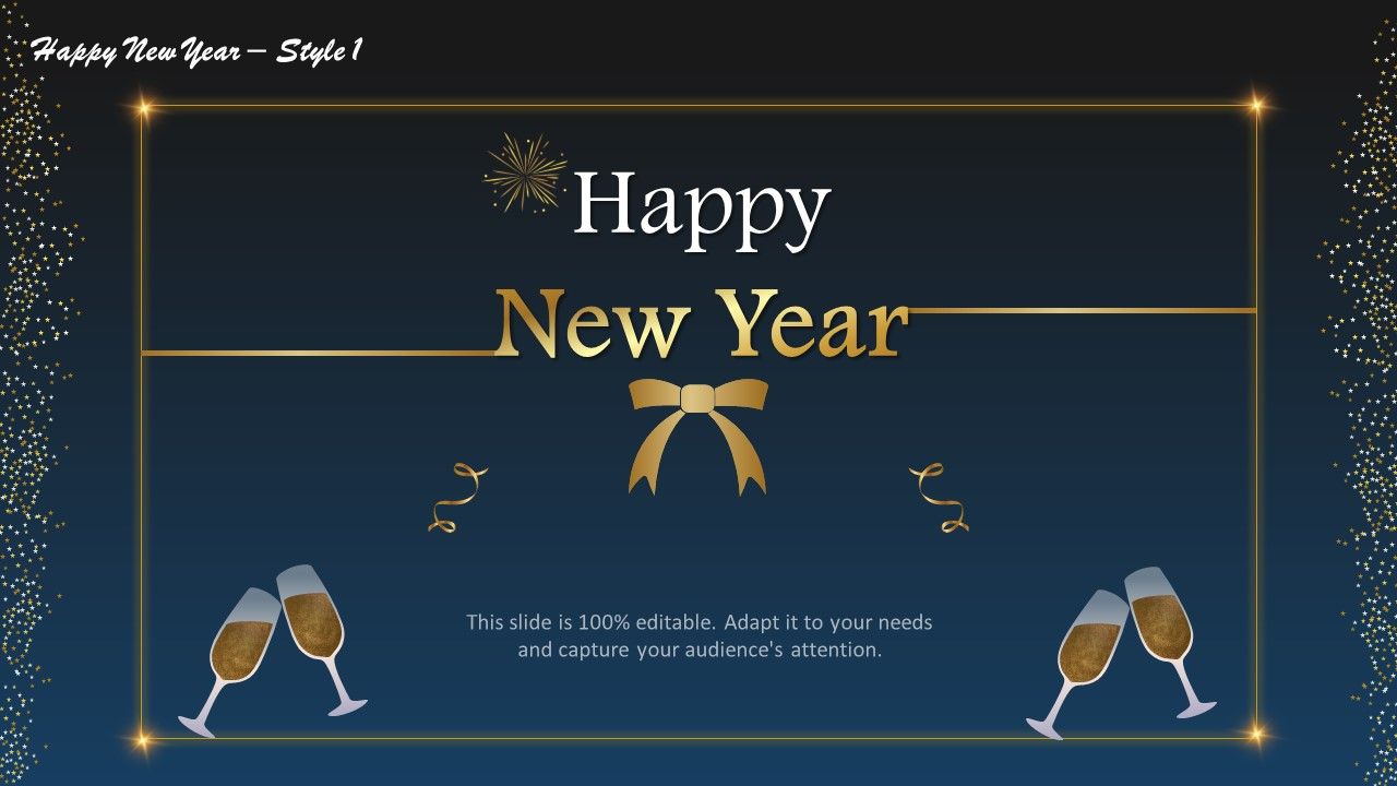
Our Happy New Year PPT Layout is the perfect way to welcome the New Year! It features a glistening champagne bottle and glasses, perfect for hinting at your New Year party and inviting the audience to join in the celebration. Wish them in advance and send a warm invitation with this dazzling PPT Presentation! Download now.
Template 8: Happy New Year Template Style 8

Ignite the festive spirit with our Happy New Year PowerPoint Layout! This lively design features colorful balloons and a celebratory message, inviting your audience to embrace the New Year joyfully. Wish them a year of prosperity and happiness, and let this presentation template add enthusiasm to your New Year’s celebrations!
Template 9: Happy New Year Template Style 9
Get ready to ring in the New Year with our vibrant Happy New Year PowerPoint Slide! With its festive design featuring a sparkling disco ball and a cheerful message, this PPT Design is perfect for inviting your audience to join the celebration. Wish your audience a year full of success and joy, and have the New Year help convey the spirit of this celebration!
Template 10: Happy New Year Template Style 10
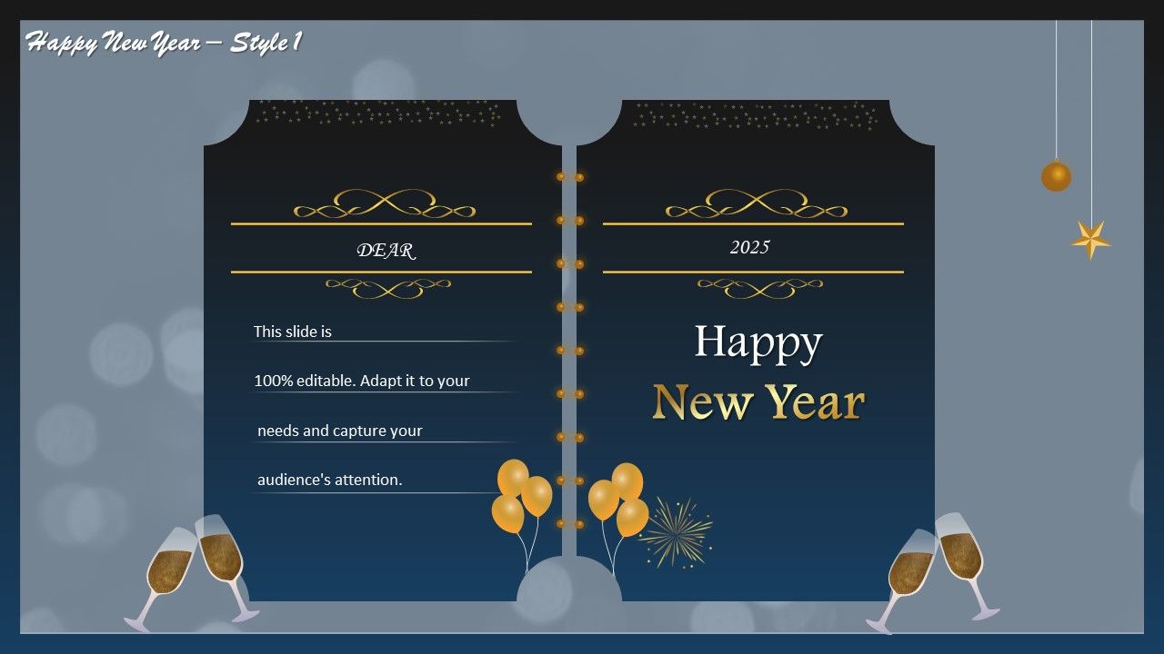
Celebrate the arrival of the New Year in style with our captivating Happy New Year PowerPoint Preset! It shows a dazzling fireworks display to which a joyful message can be added. With this presentation template, invite your audience to embrace the spirit of renewal and optimism. Wish them a joyous year ahead with this greeting card layout that can also act as an invite to your New Year get-togethers.
Stir the New Year’s Spirit
Download these charismatic presentation layouts for use in your formal and informal spaces. Set up an invite list and distribute these ready-to-use New Year Invitations. You can also use our enriched greeting card layouts to wish your colleagues and family without the hassle of creating these from scratch.
Happy new year style 1 powerpoint slides with all 45 slides:
Take the extra moment to make your presentation perfect. Our beautiful Happy New Year Style 1 Powerpoint Slides are ready in seconds.






















FAQs for Happy new year style
Okay so definitely go with festive stuff - fireworks, confetti, maybe some classy gold and silver colors. Your main message needs to be front and center, whether it's work goals or whatever you're hoping for this year. Obviously include the 2024→2025 transition since that's the whole point lol. Throw in some motivational quotes about fresh starts. People eat that up. Just don't overload with text - nobody wants to read a novel during a celebration. Oh and seriously, test those animations beforehand! Nothing kills the vibe like slides that freeze up when you're presenting.
Honestly, gold and silver are your safest bet - they scream celebration and luxury. Deep blues work amazing for business stuff since they feel trustworthy. I'd throw in some purple for those vision slides because it hits that ambitious vibe perfectly. Warm orange is killer for injecting optimism into your resolutions (though maybe that's just me being obsessed with citrus colors lately). Red's exciting but don't go crazy or you'll stress people out. Green's obvious for fresh starts and growth themes. Just pick 2-3 max and stick with them throughout - more than that gets messy real quick.
So for New Year slides, go with the obvious stuff - fireworks, champagne, confetti, countdown clocks. I know it's predictable but honestly it just works. Bold text with your main points looks great over celebration images. Timeline graphics are perfect since it's all about moving forward, right? Oh and don't go crazy with glitter effects - I made that mistake once and it was painful to look at. One strong visual per slide is plenty. The sparkly aesthetic matches what people expect anyway, so lean into it.
Honestly, adding cultural themes to your New Year slides is a game-changer for connecting with different audiences. When you acknowledge celebrations like Chinese New Year or Diwali instead of just the typical Western stuff, people actually feel seen. It shows you care about who's watching. The visuals get way more interesting too - different colors, symbols, traditions all mixed in. I'd definitely research what your specific audience celebrates first though. Some companies go overboard with this, but when it's done right? Your slides won't be another boring deck everyone forgets.
Timeline layouts work great for this - just flow from "2024 highlights" straight into "2025 goals" across your slides. Split-screen designs are having a moment too, perfect for contrasting old vs new year stuff. Those fireworks templates? Honestly pretty cheesy, but if your crowd expects that traditional look, whatever works. Circle layouts are solid for showing cycles and fresh starts. Oh, and try countdown-style numbering for your main points - makes everything feel more event-like. Don't just pick what's flashy though. Match your layout to how your content actually flows, trust me on this one.
Honestly, less is more with animations. Simple fades or gentle zooms work way better than those crazy spinning effects - nobody wants to get motion sickness during your presentation lol. Stick with the same transition throughout, maybe just a smooth fade between slides. For New Year stuff, those little sparkle animations are pretty nice on key points, but don't go overboard. Like 2-3 elements max per slide or it gets distracting. Oh and definitely test your timing beforehand! You want everything to feel smooth, not like you're rushing through. Your audience will notice the polish without feeling overwhelmed by all the effects.
Keep it universal - fresh starts and growth work for everyone. Skip religious stuff since people celebrate differently. I'd go with "new beginnings" and "opportunities ahead" instead of specific traditions. Mix up your visuals so different people see themselves represented. Maybe create a few versions? Professional ones for business meetings, casual for team stuff. Honestly, the worst presentations are when someone assumes everyone has the same background. Test your main points with colleagues first - saves you from awkward moments later.
Make two separate slides - one for "2024 Wins" and another for "2025 Goals." For the wins, just bullet point your biggest stuff from this year. Promotions, projects you crushed, new skills, whatever made you feel good about yourself. Then flip to goals using "I will..." or "My focus is..." - sounds way more confident than being wishy-washy about it. Oh, and people actually eat this personal growth content up during presentations, which surprised me at first. Keep it to 3-5 points max per slide or you'll lose them. Throw in some icons if you're feeling fancy.
Dude, infographics are a game changer for New Year presentations. They turn your boring stats into actual visual stories people remember. Charts and timelines work way better than endless bullet points about 2024 wins or 2025 goals. Everyone's so tired of text-heavy slides anyway - I literally watched people zone out during the last quarterly review because it was just paragraphs everywhere. Visual chunks make complex data way easier to digest. Use them for year-over-year comparisons especially. Your audience won't have to suffer through reading walls of text about performance metrics.
Skip the cheesy "New Year, New You" stuff - it makes everyone roll their eyes. Talk about actual opportunities and growth instead of vague feel-good nonsense. Your audience wants concrete outcomes they can relate to, not generic motivation speak. Throw in some visuals that show progress - arrows, charts, whatever works. Oh, and definitely include a quick personal story about bouncing back from something tough. People connect with that way more than corporate fluff. End each slide with something they can actually DO right away, not just think about.
Honestly, just go with clean sans-serif fonts like Montserrat or Poppins for your main text. They're modern but not too playful. If you want your headers to feel fancy, Playfair Display works great – but seriously, avoid those crazy script fonts that look like wedding invites. Nobody can read that stuff from across the room anyway. Body text should stay simple since people will be squinting from different seats. Oh, and here's what really helps: use different weights from the same font family (bold, regular, light) to make things pop without looking like a hot mess.
Honestly, interactive stuff is a game changer for presentations. Throw in polls like "What's your biggest 2024 goal?" or buttons that reveal different resolution types. Those spinning prediction wheels are kinda cheesy but people eat them up every time! Live Q&As where folks share their wins work really well too. Oh, and clickable timelines are pretty solid if you want them exploring on their own. Animation triggers for countdowns always land. The whole point is getting them involved instead of just staring at slides - even basic "raise your hand if" moments make everything way less boring.
Keep it super simple - one main point per slide, maybe 4-5 slides total. Everyone's brain is fried from the holidays anyway lol. Big visuals work way better than walls of text. Just use a bold image with maybe one headline or stat. Tell it like a story instead of boring bullet points - what you accomplished, what went wrong, where you're headed. Oh and actually practice moving between slides so you don't sound robotic. The ending's crucial though. Don't just trail off - tell people exactly what you want them to do next. Otherwise they'll just sit there nodding politely and forget everything in five minutes.
Dude, stories beat bullet points every single time. Your brain just remembers them better! Think about it - nobody's gonna recall your Q3 metrics, but they'll definitely remember the story about how your team pulled an all-nighter to save that big client. Frame your whole year like a movie: rough start, plot twists, epic comeback. I always picture it as one of those underdog sports films, honestly. Open with something that hooks people emotionally first, then let the data support your narrative. Way more engaging than just rattling off accomplishments.
Ugh, don't cram a wall of text on every slide - seriously, people zone out instantly. Short bullet points work way better. Also those cheesy clip art graphics? Hard pass. They always look so dated, even the "new" ones lol. Skip the crazy animations too - spinning text just makes everyone dizzy. Oh and use bigger fonts! I learned this the hard way when half the room couldn't read my slides. Stick to clean designs and maybe 2-3 main points per slide. Way less overwhelming.
-
Unique design & color.
-
Helpful product design for delivering presentation.