


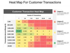
Heat map for customer transactions


Try Before you Buy Download Free Sample Product
 Impress Your
 Audience
Editable
of Time


Build belief in your heart with our Heat Map For Customer Transactions. Develop faith in your considerable capability.
People who downloaded this PowerPoint presentation also viewed the following :
Heat map for customer transactions with all 5 slides:
Adapt to the circumstances with our Heat Map For Customer Transactions. Get a big dose of flexibility.


FAQs for Heat map
So heat maps are basically your best friend for spotting patterns fast - colors show you where the action is without drowning in spreadsheets. Hot colors = high values, cool colors = low ones. Pretty intuitive stuff. They're clutch for finding correlations or showing geographic data that would otherwise bore people to death. Honestly, I use them way too much in presentations because they just *look* impressive. Your stakeholders will actually pay attention instead of zoning out. Just pick colors that make sense (red for bad, green for good, whatever) and don't forget a legend or people will bug you with questions later.
Dude, heat maps are seriously game-changing. They show where people actually click and scroll on your site - way better than regular analytics. You'll spot those dead zones where nobody's clicking anything, or find out people are rage-clicking stuff that isn't even clickable (so frustrating for them!). Most people barely scroll past the fold anyway. Plus you can see if your CTA buttons are getting ignored. The best part? Finding all those annoying friction points so you can fix your layout and actually get more conversions.
For heat maps, you're mostly looking at website analytics (Google Analytics is super popular for tracking user behavior), survey data, sales numbers, and geographic datasets. Sensor data works great too. Social media metrics, financial stuff - honestly, almost anything with coordinates or categories that have measurable values will do the trick. I'd probably start with figuring out what relationships you actually want to show first. Then find data that fits that goal. Trust me, it's way easier than trying to force random data into a visualization later. Matrix-style data is your friend here.
Oh man, color choice is everything with heat maps! Rainbow scales are the worst - they make continuous data look like separate categories. Go with sequential colors instead (light to dark blue) for showing "more vs less" stuff. Diverging palettes like red-white-blue work great when there's a meaningful middle point. One thing that drives me crazy - so many people still use red-green combos and completely forget about colorblind users. Just use ColorBrewer or whatever your tool suggests. Trust me, those palettes are built to actually make sense visually.
So there's basically three types you'll run into: correlation heat maps show how variables relate to each other, cluster ones group similar data patterns, and geographic maps handle location stuff. I always start with correlation maps when exploring new datasets - they're clutch for spotting which things actually influence each other. Cluster maps work well for customer segmentation or finding groups in your data. Geographic ones are obvious - use them for anything location-based like sales or traffic patterns. Just pick whatever matches your goal: exploring relationships, finding groups, or mapping spatial stuff. Pretty straightforward once you think about it.
Heat maps are honestly a game changer - they show you exactly where people click and scroll on your site. What you think is working might be totally ignored while random stuff gets all the attention. Pretty wild when you first see it! Move your important buttons to those hot spots where eyes naturally go. Ditch the elements nobody's touching - why waste the space? Oh and definitely heat map your main landing pages first, then maybe test different layouts based on what you find. Way better than just guessing what works.
Honestly, color choice makes or breaks heat maps. Go with sequential colors (light to dark blue) for continuous data, but if you've got a meaningful center point like zero, diverging colors work better - think red to blue. Keep it simple though - 3-7 color segments max or people's brains just shut off. Make your legends super clear and definitely think about colorblind folks in your audience. Actually, before you even start, sketch out what story you want to tell. Sometimes a boring old bar chart does the job way better than a fancy heat map anyway.
So basically run heat maps at the same time as your A/B tests - it's like getting the full story instead of just the ending. Your conversion numbers tell you *what* happened, but heat maps show you *where* people actually clicked and scrolled. I've seen tests where variant B converted better, but then the heat map showed users were totally lost, clicking random spots before finally hitting the CTA. Wild, right? Focus on your main conversion pages first - that's where you'll get the biggest wins. The combo is honestly game-changing for understanding what users are really doing.
Dude, heat maps are seriously the best for spotting trends over time. The color coding makes patterns pop instantly - like you'll notice engagement tanks every Wednesday or whatever. Way better than squinting at spreadsheets for hours. Just put time on one axis and your main metric on the other. Honestly, I get a little excited when I see a good heat map because you catch seasonal stuff and gradual changes you'd totally miss otherwise. Those color gradients basically do the work for you. Takes like two seconds to spot when things peak or drop.
Heat maps are amazing for geographic stuff - you can spot patterns in customer density, sales by region, all that. Way better than staring at spreadsheets honestly. Just overlay your data on a map and boom, you'll see hot spots you never noticed before. Perfect for picking store locations or figuring out where to focus marketing. My old team found some crazy regional trends they'd completely missed. Oh and start with sales data by zip code - most BI tools can whip up geographic heat maps from that pretty easily.
So many ways to do this! Start with Excel or Google Sheets if your data's pretty basic. Tableau and Power BI are where it's at for fancier stuff - way better for presentations and they look actually professional. Python people go crazy for matplotlib and seaborn. R has ggplot2 which is solid too. I always get sucked into tweaking colors in Tableau for like an hour when I should be doing other work lol. Honestly? Try Excel first to get your data sorted out, then move to Tableau when you need more bells and whistles.
Heat maps are honestly game-changers - they show exactly where users click, scroll, and bail out. You'll spot if people are missing your main button or getting lost in navigation. Super helpful for figuring out what's actually broken vs what you think might be an issue. I've seen teams waste months building features nobody wanted when a simple heatmap would've shown the real problems. Look for patterns where users get stuck or abandon ship. Those spots should be your top priority fixes since they'll actually move the needle on conversions and user experience.
Heat maps can be tricky honestly. Outliers will mess up your color scaling big time - everything else just looks washed out. Reading exact values? Forget it, those color gradients are useless for precision. They work great with continuous data but cramming categorical stuff into them feels awkward. Oh and definitely think about colorblind users since they might miss key patterns completely. I always throw the actual numbers somewhere on there too. Test a few different color schemes to make sure people can actually see what you're trying to show them.
So heat maps are basically your data turned into colors that make sense instantly. Instead of scrolling through boring spreadsheets, you just look for the bright/dark spots. Higher values = stronger colors usually. I love them for website stuff, sales by location, customer patterns - honestly saved me hours last week analyzing user clicks. Short sentences work better than long ones here. You'll see correlations pop out that you'd totally miss otherwise. Just don't go crazy with colors or it looks like a unicorn exploded. Stick to simple schemes so people actually get what you're showing them.
Dude, heat maps are a game changer for ML stuff. They'll show you confusion matrices, feature correlations, all that good data. Think of them as x-ray vision for your model - suddenly you can see what's actually happening under the hood. Spotting overfitting becomes way easier. Plus your stakeholders won't hate you for showing them another boring spreadsheet (trust me on this one). You can even highlight which data points are giving your model the most trouble. Definitely try making one next time you're evaluating a model.
-
Best way of representation of the topic.
-
Illustrative design with editable content. Exceptional value for money. Highly pleased with the product.