


Heatmap design





Try Before you Buy Download Free Sample Product
 Impress Your
 Audience
 100%
100% Editable
 Save Hours
 of Time


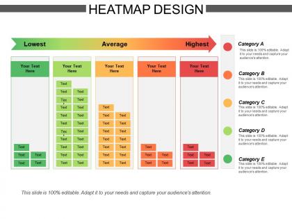
Represent different data values by the color intensity with the assistance of the Heatmap Design presentation template. Use the data graphical representation PowerPoint graphic to give a visual summary of information to others. Enable the user to understand complex data in an efficient manner with the aid of this web analytics PPT slideshow. With the help of the heatmap chart PowerPoint layout, you can assess a large amount of data and grab the attention of your target audience. Employ the statistical graphics PPT visual to explain how to identify the areas that get the most attention from the public. Take the assistance of the correlation heatmap presentation slide to visualize the volume of items present in a specific dataset. You can use high-quality icons that are present in the slide which makes your presentation reliable and attractive. You can monitor the behavior of the viewers and the structure of your websites by downloading our ready-to-use business mapping PowerPoint theme.
People who downloaded this PowerPoint presentation also viewed the following :
Heatmap design with all 5 slides:
Enable folks to identify invalid documents with our Heatmap Design. Clearly indicate the flaws that exist.
FAQs for Heatmap design
Honestly, color choice is everything - go with something intuitive like blues to reds for low to high. Your legend needs to be super obvious or people will just stare at it confused. Don't overcomplicate the color gradients though, that's where most people mess up. Think about who's actually looking at this thing - if it's your boss who hates details, keep it simple. If it's the analytics team, you can get nerdy with it. Oh and sketch out your main point first, then build the heatmap around that story. Sounds backwards but trust me, it works way better.
Honestly, color choices can totally make or break your heatmap. Too similar colors? Your patterns just vanish. Red-green combos are the worst - colorblind people can't tell them apart at all. For showing magnitude, go with sequential schemes like light-to-dark blue. Got a meaningful center point like zero? That's when blue-white-red diverging schemes shine. Oh, and those default rainbow palettes most tools give you? They're garbage for actual data viz. Perceptually uniform palettes are way better. Pro tip: always run your final heatmap through a colorblind simulator before you share it.
Honestly, rainbow color schemes are the worst - they look pretty but make data impossible to read. Also don't forget about colorblind users (way more common than you'd think). Keep it simple with like a two-color gradient at first. Another thing - don't cram everything into one view or it becomes total visual noise. Your color scale needs to actually match how your data's distributed, not just look cool. Always add a clear legend. And if people might view this on phones, test that early. Trust me, get user feedback before you go wild with fancy designs.
Skip red-green combos since that's what most colorblind people struggle with. Blue-yellow contrasts work way better, or just stick with light-to-dark versions of one color. ColorBrewer is honestly a lifesaver for this stuff - I'm always on that site. You could also throw in some patterns or textures if you want to be extra safe. Oh, and definitely add data labels when you can. The whole point is making sure your heatmap makes sense even if someone can't see certain colors. There are colorblind simulators online that'll show you exactly how it looks.
Heatmaps are perfect for matrix data where you're comparing two categorical things. Correlation matrices, time series stuff, geographic data - that kind of thing. Survey responses across demographics work really well too. Color intensity needs to actually mean something though, not just look pretty. I got obsessed with them last year, honestly they're super satisfying once you get the hang of it. You want enough data points to show clear patterns but not so many that everything looks like a mess. Oh and make sure whoever's looking at it can figure out what the colors mean without having to guess.
Data range totally dictates your heatmap strategy. Huge ranges like 1 to 10,000? You'll need logarithmic scaling or buckets, otherwise it's just visual chaos. Small ranges are honestly trickier - minor differences suddenly look massive and misleading. I always end up testing like 3-4 different scaling approaches before finding what works. The goal is matching color intensity to what actually matters in your specific context. Sometimes the "technically correct" scaling just doesn't tell the story your audience needs to see, you know?
Clustering is your best friend here—seriously, it'll clean up like 80% of the mess by grouping similar stuff together. Also try binning to combine nearby values into bigger cells, cuts down on all that visual noise. Oh and please avoid those rainbow color schemes, they look fancy but nobody can actually read them! Stick with a focused palette that has clear breaks between intensity levels. If you can add zoom/pan features, do it—makes exploring way easier. Start with the clustering thing though, that's where you'll see the biggest difference right away.
Hover tooltips are clutch - users really want those exact numbers when they mouse over. I'd also throw in some filtering so people can slice by different categories or time periods. Clickable cells work great too, especially if you want them drilling down into more details. Oh and animations are pretty cool, like showing changes over time with a play button or something. Just don't go crazy with too many features at once though. I've seen dashboards that are so interactive they're basically unusable. Keep it simple but useful, you know?
Think of annotations as your heatmap's translator - they turn colorful blocks into actual insights people can understand. Without them? You're just showing pretty colors that mean nothing. Value labels are crucial, plus axis descriptions and callouts for weird outliers. I've literally watched people stare at gorgeous heatmaps for minutes trying to figure out what they're looking at. Short sentences work. Longer ones help explain why viewers need to quickly grasp what high and low values represent. Always throw in basic labels and a decent legend - your audience will thank you later.
So heatmaps are pretty versatile - retail stores use them to track where customers walk around, which honestly makes so much sense for figuring out product placement. Tech companies do the same thing but for websites, seeing where people actually click. Healthcare uses them for patient flow and staffing (smart move). Finance people are obsessed with them for risk stuff and portfolio tracking. Sports teams even map player movements now! You'll want to pick the right type based on what problem you're actually trying to solve first though.
Tableau and Power BI are your go-to if you're dealing with business stuff - they handle big datasets really well. Python with seaborn is amazing for customization, same with R and ggplot2. I've honestly spent way too much time making beautiful heatmaps in Python lol. Excel works fine for quick and dirty ones. There's also Plotly which is nice because it's web-based. My advice? Just start with whatever you already know how to use. You can always get fancier later once you've figured out what actually looks good.
So I usually throw a line chart next to heatmaps when I want to track how things change over time. Bar charts work great too if you need to call out specific categories that are really popping in your heat data. Oh, and side-by-side comparisons are clutch - like putting correlation heatmaps right next to scatter plots of the same stuff. Geographic heatmaps with small multiples are honestly my favorite combo for breaking down different segments. The trick is picking a second chart that either explains why certain spots are hot/cold or shows a totally different angle of your data. Just figure out what questions your heatmap brings up first, then find charts that actually answer them.
Your titles should actually tell people what they're looking at - "Q3 Sales Performance by Region and Product Line" beats boring old "Sales Data" every time. Make your axis labels big enough that people can actually read them (I swear, some charts have microscopic text). Orient them so nobody's doing neck gymnastics. Always include units like "Temperature (°F)" or "Revenue ($000s)" - saves confusion later. Put your legend somewhere smart where it won't block the actual data. Oh, and test how it looks at normal viewing size before you send it out. Trust me on that one.
Honestly, just ask people directly - run quick surveys or watch them look at your heatmaps in meetings. I'd ask stuff like "what grabbed your attention first?" or "which parts were confusing?" Colors always mess people up for some reason. Oh, and don't make it a one-time thing. Keep collecting feedback regularly so you can actually fix what's not working. If everyone's missing the same hot spots, maybe bump up your color intensity or make the legend clearer. A/B testing helps too when you can swing it.
Honestly, the coolest thing happening right now is AI-powered adaptive coloring - heatmaps that automatically switch up their colors based on your data and who's looking at it. You'll also see tons more interactive layering where people can toggle between different data layers on one map. Real-time updates are pretty much expected now instead of being this fancy bonus feature. The whole accessibility push is making colorblind-friendly palettes way more common too. Start playing around with dynamic color mapping tools because those old rainbow scales are gonna look super outdated by next year. Trust me on this one.
-
Great quality product.
-
Informative design.