

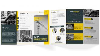
Industrial Construction Company Brochure Trifold





Try Before you Buy Download Free Sample Product
 Impress Your
 Audience
 100%
100% Editable
 Save Hours
 of Time


Utilize our Tri-fold Brochure Template for your Industrial Construction Company with an attention-grabbing design to promote your construction business. Take advantage of this brochure format to highlight essential details about your business uniqueness. You can effectively communicate the services offered by your company, such as architectural design, general contracting, interior design, and small-scale constructions, using the construction-inspired theme of this brochure in PowerPoint. Use this expertly crafted PowerPoint brochure to showcase your companys mission, vision, and values. Employ this Construction brochure PowerPoint layout to emphasize the numerous projects your company has undertaken to attract customers.
People who downloaded this PowerPoint presentation also viewed the following :
Industrial Construction Company Brochure Trifold with all 1 slides:
Use our Industrial Construction Company Brochure Trifold to effectively help you save your valuable time. They are readymade to fit into any presentation structure.
FAQs for Industrial Construction
Start with your main stuff - manufacturing facilities, warehouses, processing plants. Show project photos that demonstrate scale because these clients need proof you can handle big builds. Safety certs and team experience with specialized systems are huge too, like heavy machinery foundations. Technical specs trump pretty design here, no question. Highlight your timelines, budget management, and niche expertise - food processing, automotive, whatever. Client testimonials help but honestly the hard numbers matter more. Oh, and don't forget clear next steps for consultations or estimates at the end.
Dude, visuals are everything for construction brochures. Nobody wants to read paragraphs about your concrete work - they want to SEE it. Get some solid photos of finished projects, maybe throw in some before/after comparisons. Drone shots always kill it if you can swing that. Technical stuff like diagrams actually help explain boring processes without putting people to sleep. Oh, and make sure the photos don't look like they were taken with a flip phone from 2005. Your work probably looks amazing in person, so the pictures need to match that quality. Show don't tell, basically.
Your font game needs to be solid for construction stuff - go with clean sans-serifs that look as sturdy as the buildings you're showcasing. Bold headers will break up all that technical info nicely. Keep your body text super readable because nobody wants to squint at project specs. And seriously, avoid anything cutesy (my cousin used Papyrus once... yikes). Two fonts max should do it. Make sure they don't get wonky when you shrink them down for the detailed sections. The whole point is showing you're as precise with design as you are with steel beams.
Layout is honestly everything when it comes to project brochures. You want clear sections, lots of breathing room, and visuals breaking up the heavy technical stuff - otherwise people's eyes just glaze over. I've flipped through so many that were basically text walls... ugh, impossible to get through. Good design pulls readers from your big picture goals down into the nitty-gritty details without losing them. Short sentences help. So do progress photos and diagrams scattered throughout. Oh, and sketch out your content flow first before jumping into InDesign or whatever - saves you from redesigning everything later when the structure doesn't work.
Get shots of actual work happening - welding sparks flying, cranes moving steel, workers doing real tasks in their safety gear. Those cheesy stock photos with people just posing in hard hats? Total waste of money, honestly. Wide shots work great for showing project scale, then mix in close-ups of the technical stuff and equipment actually running. Just make sure the photos match what you actually do - a manufacturing floor looks way different than an oil refinery. Oh, and don't cheap out on image resolution or you'll regret it when everything prints blurry.
Put those testimonials right up front - like on your cover or second page. Get the full details too: company name, what you built for them, their job title. Industrial clients care about that stuff. Skip the fluffy "amazing work!" quotes and go for hard numbers instead - "finished our plant renovation 3 weeks ahead of schedule, 8% under budget." Way more convincing. Oh, and definitely ask permission before using company names first. Some of these bigger industrial firms get weird about it. Photos of the actual projects help a ton too. Honestly, one solid testimonial from a recognizable company beats ten generic ones every time.
Skip "Contact Us" - that's lazy. Go with something specific like "Schedule Your Site Assessment" or "Get Your Project Quote in 48 Hours." Put your main CTA above the fold, then repeat it at least twice more. Industrial folks hate forms anyway, so make your phone number huge and obvious. They'd rather talk through complex stuff. Oh, and give them a reason to act now - maybe limited scheduling or "we're booking March projects." I've seen this work way better than generic buttons. Test different action words too. Some audiences respond to "schedule" while others prefer "request." Worth experimenting with.
Definitely loop in compliance and legal right away - they'll know exactly what regs you need to hit. Get all your safety certs and permits front and center, updated obviously. This paperwork stuff is honestly such a pain but you gotta do it. Any equipment shots need to show proper safety gear, no shortcuts there. Oh, and have safety review everything before you print. Trust me, you don't want some brochure promising things you can't deliver or showing guys without hard hats - that's just asking for trouble.
Definitely start with a PDF version - super easy to email and throw on your website. Then maybe do one of those flipbook things that looks fancy on tablets when you're meeting clients. Breaking it into social media posts works well too, like carousel slides for LinkedIn or Instagram with your best project shots. Honestly though? Video walkthroughs crush brochures every time, but that's probably more work than you want right now. A mobile landing page could be cool later - same content but with videos embedded and contact forms. I'd just focus on the PDF and flipbook first since you can bang those out pretty quick from whatever print version you already have.
Dude, don't cheap out on the paper - it's honestly more important than you think. Flimsy stuff screams "we cut corners everywhere" before they even open it. You want thick cardstock, at least 100gsm, with a nice matte or satin finish. Sounds bougie but trust me on this. I've literally watched contractors miss out on jobs partly because their brochures felt like grocery store flyers. Heavy paper tells them you're solid and detail-oriented without saying a word. It's one of those weird psychological things that just works.
Honestly, keep the tech specs light - people just want the main points, not a manual. Those generic hard hat photos? Total waste of space. Every construction company uses them. Show off your actual finished projects instead - real timelines, real results. That's what sells jobs. Skip tiny fonts too. These things get passed around dusty job sites where you can barely see. Oh, and make your contact info super obvious. When someone's ready to talk about a million-dollar project, they shouldn't have to hunt for your phone number. Make it dead simple to reach you.
Honestly, market research saves you from making stuff nobody wants. I used to think I knew what contractors cared about - made this beautiful brochure that flopped completely. Turns out they wanted pricing upfront, not fancy design mockups. Do like 10-15 quick phone calls with your actual target audience first. Ask about their biggest headaches and how they prefer getting info. Some want technical specs immediately, others need to see case studies before they'll even consider you. Also helps you figure out if they're more visual or data-driven people. Way better than guessing and wasting time on the wrong approach.
Dude, QR codes that link to project videos are a game changer - way better than boring text blocks. AR stuff is pretty sweet too, like scanning a photo to see 3D models of your builds. Most contractors aren't doing this yet so you'd stand out. Throw in some fold-out diagrams and before/after shots with real project stories, not stock photos (those are the worst). Oh, and attaching actual material samples is smart. Honestly, just pick one cool feature first and see how people react. You don't want to go overboard right away and confuse everyone.
Dude, aim for every 12-18 months or whenever big stuff changes with your services. Nothing makes you look more out of touch than showing off 2019 projects with ancient pricing - trust me on that one. Construction moves crazy fast with new tech, regulations, all that jazz. Maybe do smaller updates quarterly? Swap in fresh project pics or recent testimonials. The industry's always shifting and clients notice when your materials look stale. Oh, and set a reminder now to check yours next quarter before you forget about it completely.
Check out Canva or Adobe Creative Suite first - they've got solid templates for construction stuff. Shutterstock's your best bet for those impressive heavy machinery photos. Honestly, I'd peek at what your competitors are doing before anything else. Industry associations have decent guidelines too, though they can be kinda boring. Marketing agencies are an option if you don't want the headache. Oh, and grab some of your best project photos - those always beat stock images. Start with a template and just swap in your own specs and pics. Way easier than starting from scratch.
-
Informative design.
-
Use of different colors is good. It's simple and attractive.