

Industry Overview Powerpoint Presentation Slides






Try Before you Buy Download Free Sample Product
 Impress Your
 Audience
 100%
100% Editable
 Save Hours
 of Time


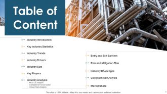
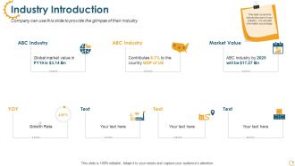
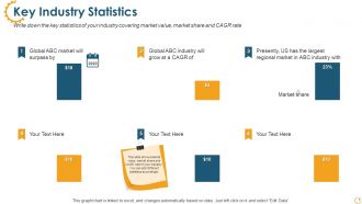
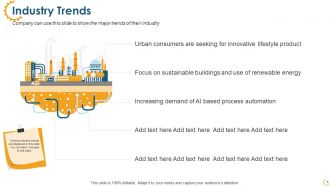
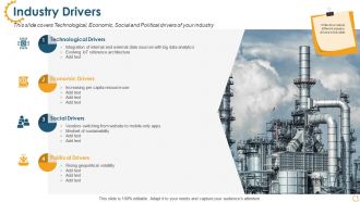
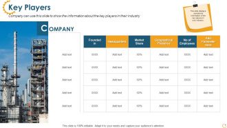
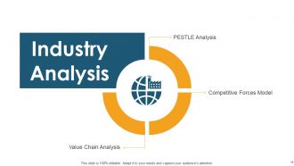
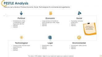
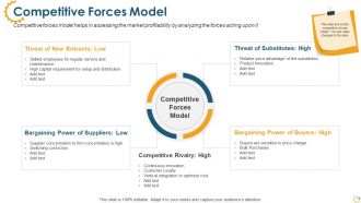
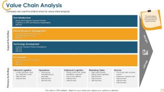
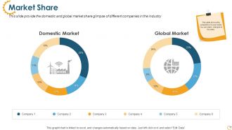
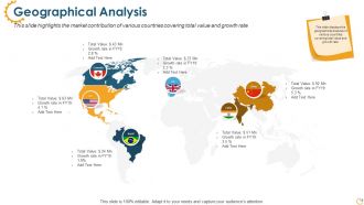
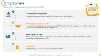
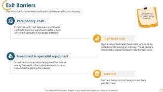
Review the industry potential based on various growth drivers and trends with the aid of our professionally designed Industry Overview PowerPoint Presentation Slides. Talk about the latest industry trends such as focus on sustainable buildings, use of renewable energy and innovative product lifestyle, etc. using this visually appealing industry analysis PPT slideshow. Take advantage of the well-researched market analysis PowerPoint templates to list down the industry drivers like technological, social, economic and political. The components of industry profile PowerPoint complete deck contain thirty-two ready to use PPT slides that will help you to assess the market profitability. Utilize the topic-specific business competitive analysis presentation graphics to display the operational information on key players in your industry e.g. market share, geographical presence and so on. Thus download our content ready business plan PowerPoint templates to showcase value chain analysis of your company. Our Industry Overview Powerpoint Presentation Slides are akin to a badge of authority. It is as good as any insignia.
People who downloaded this PowerPoint presentation also viewed the following :
Industry Overview Powerpoint Presentation Slides with all 32 slides:
Use our Industry Overview Powerpoint Presentation Slides to effectively help you save your valuable time. They are readymade to fit into any presentation structure.



FAQs for Industry Overview
AI tools are totally taking over - Gamma and Beautiful.AI are doing basic design work now. Clients don't want boring static slides anymore, they want interactive stuff you can actually click through. Data storytelling is huge too, which honestly makes sense since most presentations are just spreadsheets in disguise. Since everyone's still presenting remotely, mobile-friendly designs are a must. Oh and subscription services are replacing one-off projects - way more predictable income that way. You'll definitely want to learn an AI design tool and get good with data viz. Those aren't optional anymore if you want to stay relevant.
Dude, presentation tech has gotten insane lately. AI can literally write your slides and speaker notes in like 5 minutes - I tried it last week and was shocked. Cloud platforms are perfect for collaborating with your team, especially if you're working remotely. Interactive stuff like live polls and Q&A sessions actually keep people awake during presentations (thank god, because nobody wants another death-by-PowerPoint situation). You can even see analytics afterward showing which slides people cared about. Honestly, just pick one new tool every few months to mess around with. Your presentations will stop feeling so... bland.
Oh dude, you've gotta think story first when you're doing presentations. Like, our brains are just wired to remember narratives way better than random facts thrown at us. Structure it like problem-journey-solution and people actually follow along instead of zoning out. We've all been tortured by those endless bullet point slides, haven't you? Your data should back up the story you're telling, not be the main event. Makes complex stuff way easier to digest too. Honestly, once you start thinking this way, you'll never go back to just dumping information on slides again.
Dude, seriously - charts and graphs will save your life in presentations. I can't tell you how many times I've watched people's eyes glaze over at spreadsheets, then suddenly perk up when you show the same data as a simple bar chart or heat map. It's wild how much more convincing your argument becomes when people can actually *see* the patterns instead of hunting through rows of numbers. Even basic visuals beat bullet points every day of the week. Your stakeholders will thank you for not making them decode tables. Oh, and interactive dashboards are chef's kiss if you've got time to set them up properly.
Honestly, just keep it clean and simple. White space is your best friend - don't cram everything together. Pick 2-3 colors max (trust me, rainbow slides are distracting af). Make your fonts big enough so people in the back can actually read them. Tell a story with your flow instead of just dumping info everywhere. Add slide numbers because someone will definitely ask you to go back to slide whatever. Keep text super minimal - bullet points work great. Oh, and build in spots where you can actually talk TO people, not just at them. Find a template that doesn't make you cringe and tweak it from there.
Oh man, remote work totally changed everything for presentation tools. Sales teams, teachers, literally everyone suddenly needed to present online. Zoom and Teams exploded obviously, but so did stuff like Prezi and Canva. It's not just video calls though - people want better screen sharing, interactive features, real-time collab. Plus mobile support since half your audience is probably on their phone anyway (which is honestly kind of annoying but whatever). If you're building in this space, focus on making everything super smooth and integrated. That's where companies are really competing now.
Oh man, culture totally changes everything when you're presenting. Americans in tech want flashy demos and big promises, but Japanese companies? They're all about detailed docs and getting everyone on board first. German finance folks need tons of data and conservative approaches - honestly, they'll tear you apart if your numbers are off. But in Latin America, it's way more about relationships and good storytelling. Healthcare gets even trickier since some cultures involve the whole family in decisions while others don't. My advice? Do your homework on who you're presenting to, especially internationally.
Ugh, the worst thing you can do is cram everything onto one slide - people just check out. Don't read word-for-word either, it's painful to watch. Make your font big enough so the person in the nosebleeds can actually see it. Those generic stock photos? Skip them, they're useless. I learned this the hard way but always test your tech first - had a presentation crash once and wanted to disappear. Keep colors simple, save the rainbow for kids' parties. Practice moving between slides so you're not clicking around looking confused. Oh, and ditch the wall-of-text bullet points.
So surveys after each template release are a good starting point - but honestly, real-time feedback channels work way better. Users can actually tell you what's broken when they hit it. Track your analytics too, see which templates people love vs where they bail out. Quick user testing during prototyping saves you tons of headaches later. The thing that matters most though? Actually doing something with the feedback and telling people you fixed their stuff. I'd probably set up monthly reviews to tackle the biggest complaints first. Oh, and don't overthink it - sometimes users just want basic things to work smoothly.
Dude, the presentation space is getting wild right now. AI assistants are gonna auto-build your slides from just content you throw at them. There's crazy real-time collab tools coming that'll make Google Docs look ancient. Voice editing is in testing - literally just talk and slides appear. AR/VR presentations where people walk through your data? Yeah that's happening. The interactive stuff is coolest though - audiences pick their own path through content. Honestly Microsoft and Google are obvious, but I'd watch the random startups more closely.
Dude, brand consistency is so important for presentations. People need to recognize your company right away - like when you see those McDonald's golden arches, you know? Your slides should all use the same colors, fonts, and logo placement every time. Otherwise you look super unprofessional and clients get confused about who they're even working with. I'd make a basic template with your brand stuff that everyone can just copy and use. Honestly, I've seen companies lose deals over messy, inconsistent presentations. Takes like an hour to set up but saves you tons of headaches later.
Yeah, digital's definitely the way to go environmentally. You're cutting out all the paper, ink, and shipping waste - no more trees getting chopped down for your PowerPoint deck. Plus printing uses some nasty chemicals that end up in waterways. The energy from your laptop and servers is still there, but honestly it's nothing compared to the whole printing supply chain. What really sells me on it though is how you can update digital stuff instantly instead of reprinting everything when something changes. I mean, how many times have we all printed presentations just to trash them later? Go digital, especially for internal stuff.
So basically, corporate presentations are all about convincing people to do something - buy your idea, approve your budget, whatever. Clean slides, solid data, keep it tight. Educational stuff is totally different though. You're actually teaching, so you need way more detail and interactive bits to keep people engaged. Corporate audiences just want the facts so they can make decisions. Students need time to actually absorb the concepts, you know? Once you figure out corporate format it's honestly pretty cookie-cutter. The key is asking yourself upfront - am I trying to persuade someone or teach them? That'll determine everything else about your approach.
Make your fonts huge - like 24pt minimum - or people will be squinting like they're reading the fine print on a contract. Buttons need to be thumb-sized, not made for ants. Most folks hold their phones vertically anyway, so design for that. Here's what I learned the hard way: test it on your actual phone first. Animations can make older phones choke, so keep those simple. Sometimes you'll need totally different slides for mobile vs desktop. Honestly? Just pull up your presentation on your phone right now. If you can't read it comfortably, nobody else will either.
Dude, interactive stuff gets like 2-3x more engagement than regular slides. Makes sense though - polls, Q&A sessions, breakout rooms make people actually participate instead of just sitting there. You know how your brain checks out after 7 minutes of straight PowerPoint? Yeah, everyone does that. Live quizzes and group activities keep people awake and actually create moments they'll remember later. Even if you're mostly doing slides, just toss in 2-3 interactive bits to wake the room back up. Trust me, it's worth the extra planning.
-
Great designs, really helpful.
-
Wonderful templates design to use in business meetings.
-
Unique design & color.
-
I discovered this website through a google search, the services matched my needs perfectly and the pricing was very reasonable. I was thrilled with the product and the customer service. I will definitely use their slides again for my presentations and recommend them to other colleagues.