

Input process output model template powerpoint ideas




Try Before you Buy Download Free Sample Product
 Impress Your
 Audience
 100%
100% Editable
 Save Hours
 of Time


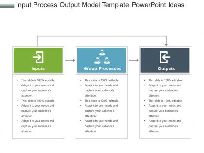
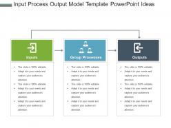
Stay confident and work with our input process output model template PowerPoint ideas. Bringing you a delightful design which contains the graphics of teams and the concept of group processes and data management. This three-staged PPT design is comprised of inputs, group processed and output as three stages. Filled up with soothing colors and captivating icons which represent terms like target, finances, management etc. add up in delivering a combined solution. This engaging input process output model PPt diagram is created to help you reach closer to your purpose. Take the right step towards the resolution by downloading this impeccable slide. This is the usual convenient way of modeling and composing your process of information flow. Your enthusiasm becomes evident with our Input Process Output Model Template Powerpoint Ideas. Everyone begins bubbling with energy.
People who downloaded this PowerPoint presentation also viewed the following :
Input process output model template powerpoint ideas with all 5 slides:
Our Input Process Output Model Template Powerpoint Ideas facilitate faster development. They act as an elixir for growth.
FAQs for Input process output model
So the IPO model is pretty straightforward - you've got Input, Process, and Output working together. Raw data goes in, gets transformed through whatever work needs doing, then you get your end result. It's literally like making dinner - ingredients, cooking, finished meal. One thing that's kinda neat is how outputs from one system become inputs for the next one, creating these whole chains. Really helps when you're trying to figure out where something went wrong too. Just follow the flow from start to finish and you'll spot the problem. Works for designing new stuff or fixing broken systems.
So basically, IPO helps you map out each project phase better. Your inputs are things like resources, requirements, team skills - stuff like that. Processing is where the actual work happens, all the execution and decisions. Then outputs are your final deliverables. Honestly? It's pretty great for catching bottlenecks before they bite you. You can spot missing inputs early, clean up messy processes, and nail down what "done" actually looks like upfront. No more scope creep nightmares. Just pick one current project and try mapping it this way - you'll probably find some obvious gaps you missed.
Feedback is what makes the IPO model actually work instead of just looking good on paper. Picture a thermostat - it checks if you're hitting your targets and adjusts things when you're not. Without it, you're basically flying blind and crossing your fingers. Pretty risky move if you ask me. The trick is building those feedback loops right from the start so problems don't spiral out of control. Figure out which metrics actually matter for your situation first. Then set up regular check-ins to see how things are going and tweak as needed.
So for measuring each stage, I'd pick 2-3 key metrics per phase and check them weekly. Input stuff is like resource costs, supplier reliability, material quality - pretty straightforward. Process metrics get more interesting though - you're tracking cycle times, error rates, throughput, basically how smooth everything's running. Output measurement is honestly the easiest part since you're just looking at final deliverables and customer satisfaction. The real trick? Making sure these metrics actually talk to each other so you can see the full picture. Oh and don't go overboard with tracking everything - you'll drown in data.
Once you know about IPO, you'll spot it everywhere. Coffee machines? Water and beans go in, brewing happens, coffee comes out. GPS works the same way - it takes where you are and where you're going, runs some calculations, then spits out directions. Even laundry fits this pattern. I actually find it weirdly satisfying to notice these things now. Your car, your phone, pretty much any system you can think of follows input-process-output. Try picking apart something you used today - maybe your microwave or whatever. It's a good way to understand how stuff actually works.
IPO is super basic compared to other frameworks - you've got input, process, output. Done. Six Sigma and BPMN? Those get into every tiny detail, decision points, who does what. Honestly, sometimes that's overkill. With IPO you're staying high-level, not mapping every single step. Perfect for when you need to grasp something fast or explain it to someone who doesn't want all the technical stuff. I usually start there to get my head around things, then if I need more detail, that's when I'll use the heavier tools.
Honestly? You'll probably overthink it and try to make everything look way too neat and linear. Real work is messy - stuff overlaps, feeds back into itself, creates weird loops. My team spent forever trying to figure out where "input" actually stops and "process" starts, especially with creative work where it all just... blends together. Also don't forget the feedback parts - that's what makes this whole thing actually work instead of just being a pretty diagram. We mapped out what we thought was one simple process and it turned into like 12 mini-processes all talking to each other. Start with something basic first, then build from there once you get the hang of it.
Honestly, tech can really speed things up if you focus on the right spots. Start with automation tools and APIs for data collection - way cleaner than doing it manually. Cloud computing and AI algorithms are game-changers for processing (this is where you'll see the biggest wins, trust me). Dashboards and automated reporting help you get results out faster too. Oh, and don't just grab whatever's trending - pick stuff that actually fixes your current bottlenecks. I've seen too many people waste time on shiny new tools that don't solve real problems.
Honestly, IPO is great for quality stuff because you can catch problems at every step. Bad materials or crappy data? That's your input issue right there. Process running like garbage or people making mistakes? Middle stage problem. Then you've got output defects hitting customers - which obviously sucks. Think of it like quality gates everywhere. When things break (and they will), you can actually trace backwards through the whole chain to find where it went sideways. I'd start by mapping what you've got now using IPO, then throw some metrics on each part so you can spot the patterns.
So basically every industry just tweaks the three parts to fit what they do. Manufacturing is pretty straightforward - raw materials go in, assembly lines do their thing, finished products come out. Healthcare switches it up though. Patient symptoms are your inputs, then diagnosis and treatment happen, and you get health outcomes. Tech companies are obsessed with data inputs, then there's all the coding and testing, finally software gets released. Oh and retail works too - inventory in, sales process, revenue out. Just figure out what flows into your process, what actually transforms it, and what pops out the other end. You'll catch bottlenecks way faster this way.
Dude, you can't just skip parts of the IPO model - it'll totally screw you over. Garbage data in means garbage results out, no matter how solid your process is. Without proper process design, you're basically crossing your fingers and hoping stuff works (which, let's be real, it never does). And here's the thing - if you don't nail down what your outputs should look like, how will you even know if you solved anything? I learned this the hard way on a project last year. Each piece needs the others to work. Map out all three before you build anything or you'll waste tons of time.
Workshops are your best bet here - map out real workflows so people see how customer complaints become resolution reports. Most employees honestly never think about their job this systematically. Get teams together to spot bottlenecks in their current processes. Skip the theory stuff and go hands-on instead. Have them actually redesign a messy workflow using IPO. Interactive sessions work way better than lectures, trust me. Start with just one department first. Success stories will spread on their own once people see results.
Break down each stage but connect them clearly. First, list what you need going in - data, materials, people, whatever. Map the actual steps with decision points and who does what. Flowcharts are honestly your best friend here for showing how everything flows together. Don't forget outputs and how you'll know if it worked (I always miss this initially). Someone else should be able to follow your documentation and get the same results. If they can't, add more detail. Version control matters too - set review dates so it doesn't get stale.
Honestly, just start with one piece of your IPO model - trying to fix everything gets messy fast. Set up feedback loops at each stage so you're constantly checking what's working. Look at your inputs for quality problems, watch your processes for slowdowns, and track outputs for weird patterns. Here's the thing though - sometimes your outputs will show you input issues you totally missed. I'd do regular reviews where you just ask "what's broken here?" then make small tweaks and see what happens. The whole iterate-and-measure thing actually works if you stick with it.
Honestly, there's a bunch of solid options. Most people go with Lucidchart or Visio - they're pretty straightforward with the whole drag-and-drop thing. If your team's working remotely, Miro and Mural are clutch since everyone can edit at once. Bizagi and ProcessMaker get super detailed if you need that level of granularity, but they're probably way more than you need for basic IPO stuff. Even something simple like Draw.io works fine. Actually, PowerPoint isn't terrible either if you're just doing straightforward maps. I'd start with whatever your company already pays for - why make it complicated right off the bat?
-
The content is very helpful from business point of view.
-
Content of slide is easy to understand and edit.