

Input process output enablers example ppt presentation




Try Before you Buy Download Free Sample Product
 Impress Your
 Audience
 100%
100% Editable
 Save Hours
 of Time


Identify the frontrunners with our Input Process Output Enablers Example Ppt Presentation. Elaborate on their inclusion among the best.
People who downloaded this PowerPoint presentation also viewed the following :
Content of this Powerpoint Presentation
Description:
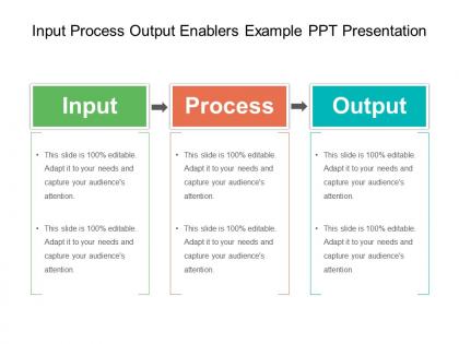
The image presents a PowerPoint slide with the title "Input Process Output Enablers Example PPT Presentation." This slide depicts a simplified model commonly used in business and project management to illustrate how any operation or project can be broken down into three key components: Input, Process, and Output.
1. Input:
This section is usually where resources, data, or materials that are put into the system are described. The slide indicates that this part can be edited to include specific inputs relevant to the particular operation or project.
2. Process:
This middle section represents the actions, operations, or work performed to transform the input into the final product or result. Again, the text emphasizes the editable nature of the slide, allowing the presenter to detail the specific processes involved.
3. Output:
The final section is where the results or products of the process are detailed. The outputs can be goods, services, or any form of results generated from the processes applied to the inputs.
Each section has a placeholder text that repeats "This slide is 100% editable. Adapt it to your needs and capture your audience's attention," suggesting that the template is designed to be customized for different presentations.
Use Cases:
Here are seven industries where this model and such slides can be used:
1. Manufacturing:
Use: Illustrating the production workflow.
Presenter: Operations Manager
Audience: Production staff, new employees
2. Software Development:
Use: Explaining the development lifecycle.
Presenter: Project Lead
Audience: Developers, stakeholders
3. Healthcare:
Use: Describing patient care pathways.
Presenter: Healthcare Administrator
Audience: Medical staff, management
4. Education:
Use: Outlining the educational content delivery system.
Presenter: Academic Director
Audience: Educators, educational planners
5. Marketing:
Use: Presenting campaign development stages.
Presenter: Marketing Strategist
Audience: Marketing team, clients
6. Construction:
Use: Demonstrating project phases from inception to completion.
Presenter: Construction Manager
Audience: Contractors, investors
7. Consulting:
Use: Explaining problem-solving frameworks to clients.
Presenter: Management Consultant
Audience: Client companies, business owners
Input process output enablers example ppt presentation with all 5 slides:
Nullify the effects of hazards with our Input Process Output Enablers Example Ppt Presentation. Be able to create an excellent counter.
FAQs for Input process output enablers
So the IPO model is pretty much systems thinking 101 - you break anything complex into inputs, processes, and outputs. Works for business stuff, coding problems, whatever. Once you get the hang of it, you'll start seeing everything this way (which is weirdly satisfying tbh). What I love about it is how it cuts through all the chaos. Forces you to map out what's actually happening step by step. Stuck on something? Just draw it out as what goes in → what transforms it → what comes out. Trust me, it works.
So IPO breaks everything down into three parts - inputs, process, outputs. Super straightforward but it actually works really well. I've started using it for most projects now and honestly? It catches so many gaps early on. Like you'll realize you don't have the right data or your process steps are way too fuzzy. Teams stay way more aligned too since everyone knows exactly what they're working toward. Plus it makes spotting bottlenecks obvious - you can see where things get stuck. The output focus is probably my favorite part though, forces you to define success upfront instead of just winging it.
Manufacturing is basically Input-Process-Output everywhere you look. Take car assembly - steel and plastic parts get welded and painted, then boom, finished vehicles roll out. Food companies do this too. Raw ingredients go through mixing, cooking, packaging steps to become whatever's on grocery shelves. Quality control departments follow the same pattern, honestly. They take defective parts, run them through inspection and sorting, output the good ones. Chemical plants are probably the most obvious example though - raw chemicals get processed through reactions and refinement to make everything from pills to plastic bottles. It's pretty wild once you start noticing it everywhere.
So the IPO model is just a way to break down your BI stuff into three parts. Input is where you grab data from different sources. Processing is all the analytics and transformations you do to it. Output is your final dashboards and reports. Super simple concept, but it actually works really well for troubleshooting. When something's broken, you can figure out which stage is the problem - messy data coming in, bad processing logic, or weird output formatting. I swear it saves so much debugging time. Just map out your current pipeline using these three buckets and you'll see where things are getting stuck.
Think of it like prepping for a dinner party, honestly. First, figure out what your students already know - that's your starting point. Then design activities that'll actually get them thinking and doing stuff, not just sitting there. The tricky part is nailing down what you want them to walk away with at the end. I'd map out their existing knowledge first, then work backwards from your goals. What skills do you want them to have? Build your assignments around that. It's pretty straightforward once you see the gaps between what they know coming in versus what they should know leaving. Keeps everything connected instead of just random lessons thrown together.
Okay so feedback is basically your quality control - it stops your IPO model from being totally useless. You get output, see how it performed, then loop back to tweak your inputs or methods. It's like cooking, you know? Taste and adjust. Otherwise you're just guessing whether your system works or if it's producing complete trash. Honestly, most people skip this part and wonder why everything falls apart later. Set up regular checkpoints so you catch problems early instead of realizing months later that your whole process was broken.
So there's this thing called Input-Process-Output that's basically a game changer for thinking through code. Map out what's coming in first - like user clicks or data from an API. Then figure out what your code actually does with that stuff. Finally, nail down what goes back out to the user or gets stored somewhere. I know it sounds stupidly simple, but it makes everything clearer. Your functions end up way more organized, debugging becomes less of a nightmare, and explaining features to teammates gets easier. Honestly wish someone had told me about this earlier. Just sketch it out before diving into the actual coding.
Honestly, the hardest part is figuring out what even counts as "inputs" and "outputs" - way trickier than it sounds. Measuring stuff like employee morale? Good luck with that. Most people also make the mistake of thinking processes are super linear, but there's actually tons of feedback loops and weird dependencies everywhere. Reality is just messier than these models suggest. Oh, and don't try to map out your entire operation right away - you'll go crazy. Pick one simple process first, get good at that, then move on to the complicated stuff once everyone's not completely lost.
So IPO is basically how you map out your whole process before diving into Six Sigma work. Map your inputs first - materials, people, methods, whatever. Then trace how stuff flows through and measure outputs against your quality standards. Honestly, most people skip this step but it's huge for DMAIC. Once you've got it sketched out, spotting where defects sneak in becomes way easier. You'll see exactly which inputs mess with your outputs too. I always tell people to do the IPO mapping first because it makes everything else so much more targeted.
Yeah definitely! Healthcare is actually perfect for the IPO model - way better than some other industries I've seen try to force it. So your inputs are all the patient info you collect: symptoms, test results, medical history, whatever. Process part is where you diagnose, plan treatment, deliver care. Then outputs are your patient outcomes, discharge notes, follow-up plans. The whole thing just clicks together naturally. I'd honestly just pick one procedure you do all the time and map it out real quick. You'll spot the workflow problems right away - like where things get bottlenecked or documentation falls apart.
Yeah so the IPO model breaks down fast with complex stuff. Real systems don't flow in neat little lines - they're chaotic with feedback loops everywhere. Outputs become inputs, everything affects everything else. The whole "black box" thing is useless when you actually need to peek inside and see what's breaking. Also it can't handle when processes run parallel or when weird emergent behaviors pop up (which happens more than you'd think). Honestly? Skip IPO for big projects. Systems thinking frameworks will save you so much headache because they actually map out all those messy interconnections.
Honestly, the IPO model is perfect for spotting Lean waste - it just clicks. Break down your inputs and you'll catch excess inventory or defects right away. Process analysis shows you all those pointless steps and waiting around. Outputs? That's where overproduction and quality problems pop up. I always tell people to sketch out their IPO first before jumping into improvements (sounds nerdy but it works). You naturally find the seven wastes because you're looking at each piece separately instead of getting overwhelmed by the whole mess. It's basically like having a roadmap for where your biggest waste problems are hiding.
Tech can seriously transform your IPO model - saves so much time. Automate the boring data collection stuff first, then use AI to speed up processing and catch errors you'd normally miss. Real-time dashboards are clutch for analyzing outputs too. Honestly, the amount of manual work you can cut is pretty crazy these days. I'd map out where you're wasting the most time first - that's where you'll see the biggest payoff. Start with your worst bottlenecks and find tools that actually solve those specific problems.
So you want to watch your inputs first - resource quality, costs, that stuff. Then track how the actual process is going: cycle times, error rates, how well you're using resources. Outputs are pretty straightforward - quality metrics, customer happiness, target achievement. Honestly, the process stage metrics are where you'll probably find the most surprises. Compare everything over time to spot patterns. Dashboards help you see all three stages at once so bottlenecks jump out. Don't go crazy though - start with maybe 2-3 key metrics per stage or you'll drown in data.
Honestly, the biggest mistake I see is people making their inputs and outputs way too vague. Be specific about what's actually going in and what you're getting out. The middle process box? Keep it simple - don't overload it with every tiny detail. Focus on *what* happens, not the nitty-gritty how. Your inputs should logically connect to your outputs too, which sounds obvious but you'd be surprised. Skip the fancy software at first. Just sketch it out on paper or whatever. Way easier to spot problems that way. Oh, and ditch any industry jargon - your stakeholders will thank you later.
-
It saves your time and decrease your efforts in half.
-
Content of slide is easy to understand and edit.