


Input process output workflow powerpoint templates




Try Before you Buy Download Free Sample Product
 Impress Your
 Audience
 100%
100% Editable
 Save Hours
 of Time


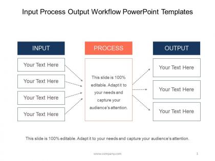
Highlight your operations management concept in a professional way with our input process output workflow PowerPoint slideshow. Our dedicated designing team has made this brilliant slide presentation possible. Representing the data can sometimes be problematic as you need to ensure that all the information is shown in a way which is easily understandable by your audience. Our input output model PPT visual consists of a ready-made PPT slide with graphics and text boxes to represent your important business information. This input output process helps in identifying the inputs, outputs and required processing tasks to transform inputs into outputs. The model is sometimes configured to include any storage that might happen in the process as well. The processing step includes all tasks required to effect a transformation of the inputs. The outputs are the data and materials flowing out of the transformation process. So, create a remarkable input output model PPT graphic slide by pressing the download button now. Get customers entering your doors with our Input Process Output Workflow Powerpoint Templates. They will always decide in your favor.
People who downloaded this PowerPoint presentation also viewed the following :
Input process output workflow powerpoint templates with all 5 slides:
Guide the destiny of generations to come with our Input Process Output Workflow Powerpoint Templates. Install your ideas firmly in their heads.

FAQs for Input process output
So IPO breaks down into three parts: **Inputs** (raw materials, data, resources, people), **Process** (the actual work transforming everything - workflows, procedures, analysis), and **Outputs** (final products or results). Honestly, it's just how business works when you strip away the jargon. That middle process step? That's where you're actually adding value and turning basic stuff into something customers want. Try mapping your team's workflows this way. You'll probably catch bottlenecks you didn't even know existed. I've seen people discover weird redundancies just by walking through it step-by-step.
Honestly, just walk through your whole process and write down everything you need at each step - sounds tedious but it actually works. Materials, people, info, tools, whatever. I like grouping them into "must have" vs "nice to have" or internal vs external stuff. Don't miss the weird inputs like approvals or data feeds (those always bite you later). Environmental stuff too if that matters. The boring upfront work pays off because then you can actually fix what's broken instead of guessing.
Honestly, data analysis is like having X-ray vision for your IPO workflow - it shows you exactly what's working and what's falling apart. You can catch patterns in your inputs (which sources actually deliver good data), track how efficient your processes are, and see if your outputs hit the mark. The cool part? Looking at how each stage connects. Maybe crappy inputs are creating bottlenecks down the line, or you'll notice certain processes just work better consistently. I'd start simple though - pick one metric per stage and check them weekly. Gives you the full picture without drowning in numbers.
IPO breaks down any feature into three parts - inputs, processing, outputs. So inputs are user data, API calls, database stuff, file uploads. Processing is where the real work happens: your algorithms, business logic, validation, data transforms. Outputs are what users actually see or what gets saved. Honestly, it's a lifesaver for debugging. When shit breaks, you can narrow down if it's bad input data, a processing bug, or something wrong with the output. Makes sprint planning way clearer too since you're thinking through each piece instead of just diving into code.
Honestly, the biggest mistake is making everything look too clean and linear. Real processes are messy - outputs loop back as inputs, things connect in weird ways you didn't expect. I always see people create these beautiful flowcharts that completely ignore feedback loops. Don't oversimplify your inputs/outputs either. And for the love of god, plan for when stuff breaks! Map out your happy path first, sure, but then throw some realistic curveballs at it. Exception handling isn't sexy but it's what separates models that actually work from ones that crumble immediately.
Dude, your inputs literally make or break everything. Bad materials? Your end product will be trash no matter what. It's like trying to make a decent cake with expired flour - even Gordon Ramsay can't fix that mess. Quality control starts at the beginning, not the end. Small changes in what you put in can snowball into huge problems later. I learned this the hard way at my last job actually. Check your suppliers constantly and don't cheap out on materials upfront. Trust me, it's way less expensive than fixing defects afterward.
Yeah, totally! Each sprint basically becomes its own mini IPO cycle - inputs are your user stories, process is the actual dev work, outputs are the features you ship. Works great for sprint planning meetings too. You can map everything out beforehand and catch missing requirements early. Honestly, I've found stakeholders who don't really "get" agile terminology love this approach since IPO is way more straightforward. Makes retrospectives cleaner as well. Worth trying on your next sprint - you'll probably spot gaps you'd normally miss until halfway through.
So basically you want three types of metrics for your IPO thing - quality stuff like defect rates and how happy customers are, quantity metrics (volume, throughput), and efficiency ones like cost per unit. Don't get caught up in those meaningless vanity numbers though. Like who cares if you processed 10,000 items if half were garbage? Start with what success actually looks like for your process, then figure out which combo of metrics tells the real story. The key is making sure your outputs actually hit what stakeholders need - that's where the magic happens.
Dude, visuals are a game changer for explaining IPO stuff. Flowcharts with arrows show exactly how inputs flow through processes to outputs - way better than just talking through it. Color-coding each stage helps too. I swear, people zone out during text-heavy explanations, but show them a diagram and they're suddenly paying attention. Real examples work best - like demonstrating raw materials going through manufacturing to become finished products. Makes it click instantly. Sometimes I think we overthink presentations when a simple visual does all the heavy lifting.
So manufacturing's a good example - raw materials go in, assembly line does its thing, finished products come out. Healthcare's the same deal: symptoms and test results go in, doctors diagnose and treat, healthier patients come out. Even restaurants work like this! Ingredients in, cooking happens, meal gets served. Once you notice it, you'll see this pattern literally everywhere. I'd actually map out how your own department works using this input-process-output thing - you might catch some weird inefficiencies you didn't notice before. It's pretty useful for spotting where things get bottlenecked.
Okay so feedback loops are like your reality check system. You take whatever data comes out of your process and use it to fix what goes in next time. Instead of just hoping things work out, you're actually learning from your results. Honestly, most people skip this step and wonder why they keep making the same mistakes. It's this continuous cycle - your outputs become your inputs for the next round, which makes everything smarter over time. My advice? Start with just one process you're already doing and figure out what data you could use to improve it next time.
For IPO mapping, I'd go with Lucidchart or Draw.io first - both have solid templates and don't make you overthink things. Visio's decent too if you're already using Microsoft stuff, though honestly it feels like using a sledgehammer sometimes. You can totally get away with simpler options like PowerPoint or Google Drawings. Miro's pretty slick for collaborative stuff. I still start most of mine on a whiteboard though, which probably makes me old school. Whatever you pick, just focus on getting those inputs, processes, and outputs laid out clearly so people actually understand the flow.
Honestly, the IPO model is great because it stops you from just guessing what's wrong. You map out inputs, processes, and outputs - then boom, you can actually see where things are breaking down. Maybe it's crappy data coming in, maybe your process is outdated, or maybe the final result just sucks. I've found it way better than randomly trying fixes. Like, instead of panicking about customer complaints, you can trace back through each step. Bad training? Process bottleneck? Pick one workflow that's driving you crazy and just map it out using IPO. You'll spot the problem area right away and stop wasting time on the wrong stuff.
Look, stakeholder feedback will totally change how you approach your IPO process - and that's a good thing. They'll spot stuff you missed, like input requirements that seemed obvious to them but you had no clue about. Plus they know what actually works in the real world vs what looks good on paper. I've watched entire projects do a complete 180 because someone finally said "uh, you're fixing the wrong thing." Getting their input early saves you from building something nobody wants. Don't be that person who asks for feedback after everything's done!
So here's the thing - map your training straight to that IPO model and you'll actually see results. Start with inputs: give people the skills, knowledge, and tools they need upfront. Technical training, resources, clear expectations - the basics. Then process is where the magic happens (and honestly where most companies screw up). Don't just dump info and bounce. Set up mentoring, feedback, practice time - help them actually use what they learned. Finally, outputs - track if performance actually improved and if it moved the business needle. Most training fails because it's just random workshops instead of connecting these three pieces together.
-
Great quality product.
-
Enough space for editing and adding your own content.