

IOT Powerpoint Ppt Template Bundles





Try Before you Buy Download Free Sample Product
 Impress Your
 Audience
 100%
100% Editable
 Save Hours
 of Time


Our IOT Powerpoint Ppt Template Bundles are topically designed to provide an attractive backdrop to any subject. Use them to look like a presentation pro.
People who downloaded this PowerPoint presentation also viewed the following :
Content of this Powerpoint Presentation
The Internet of Things (IoT) is an up-and-coming technological advancement that has benefitted various industries and organizations. If your business provides some IoT services, you may need to share the advantages of IoT in different sectors and domains.
As multiple potential clients may contact you for your IoT services, describing client—or domain-specific advantages and services offered each time for every client can be a bit troublesome. For a start, you can use a pre-designed and ready-to-use IoT PowerPoint Template.
SlideTeam’s highly flexible and 100% editable IoT template is here. It has everything you need to address the general queries of your potential clients or general audience. This template contains data about various domains, benefits to different industries, and more. Use it to deliver first-hand information to your clients with ease. So, check out the template below and use it to your benefit.
This template makes it easy to showcase the stages of IoT applications in different industries and businesses.
Template 1: IoT Energy Management for Home Smart Services
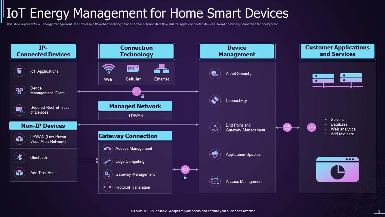
If your client or audience wants to know about some home smart services that can help in energy management via IoT, then you can use this document to showcase how the services work and the elements involved. This infographic shows the relationship between IP-connected devices, connection technology, device management, and customer applications or services. The connection technology used for IoT can be Wi-Fi, Cellular, or even Ethernet. Other reliable information is also available in this slide.
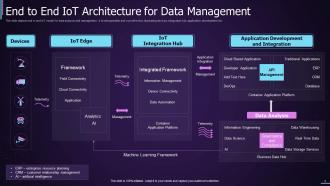
Template 2: End-to-End IoT Architecture for Data Management
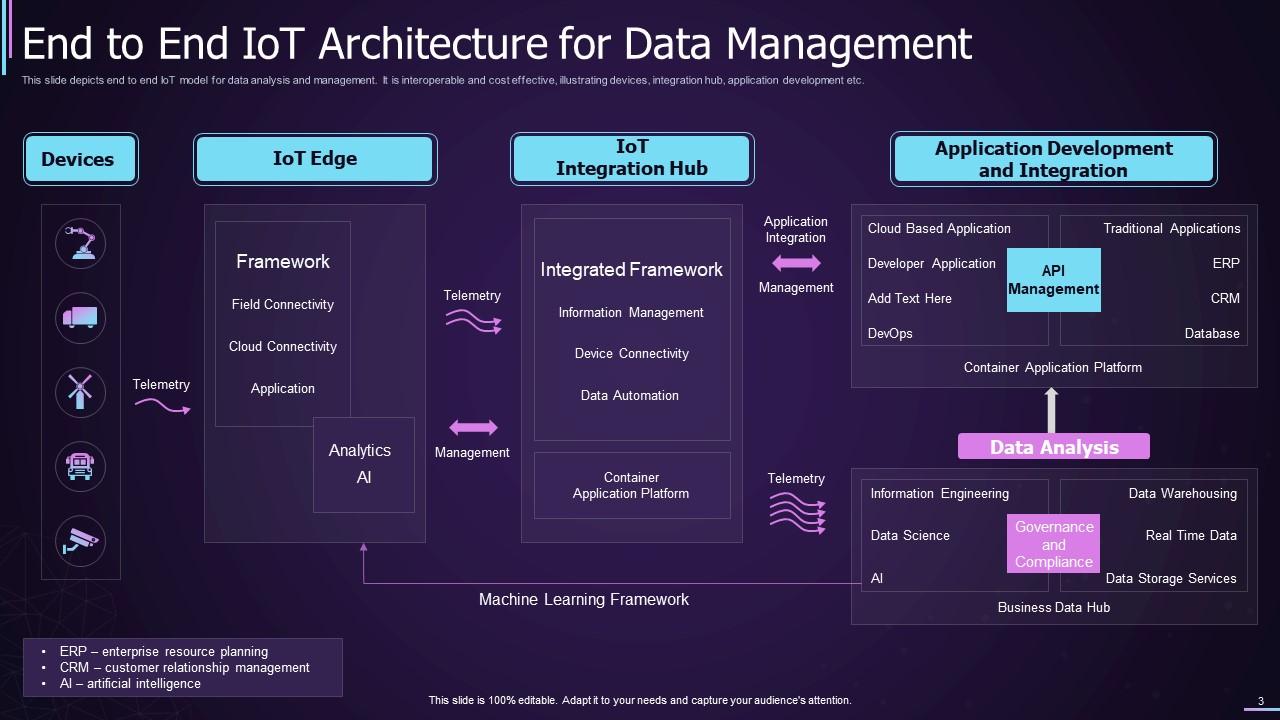
Use this PPT Slide to explain the pattern or structure of the End-to-End IoT for data management services. Showcase all the devices involved in the process, the IoT Edge used for connection, IoT integration Hub (including integrated framework, information management, and more), and the process of Application Development and Integration (including API management and Data Analysis). This information will help me understand how to execute data management with IoT.
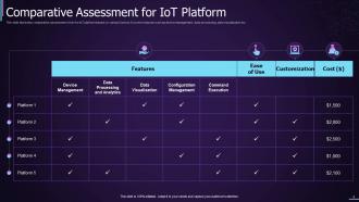
Template 3: Comparative Assessment of IoT Platforms
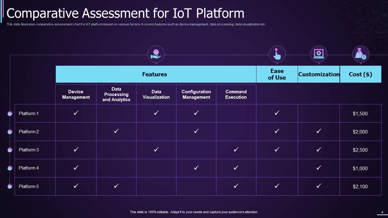
As you know, a business can use multiple IoT platforms to execute various tasks. Hence, sharing a comparative assessment of such platforms with your audience is better. This slide allows you to do the same by developing 5 different platforms according to their features (Device Management, Data Processing and Analysis, Data Visualization, Configuration Management, and Command Execution), Ease of Use, Scope of Customization, and Cost. This will help the client choose the best platform.
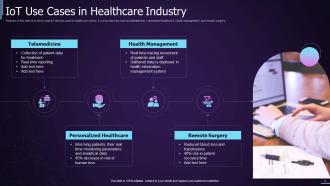
Template 4: IoT Use Cases in HealthCare Industry
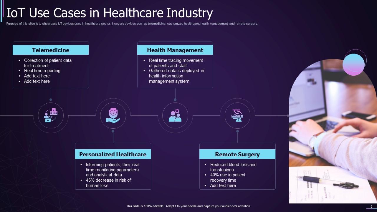
This PowerPoint Presentation helps explain the benefits of IoT in the healthcare industry. It helps showcase that IoT can help you deliver Remote Surgery requirements, Personalized Healthcare facilities, Health Management services, and telemedicine. You can add supportive text in the form of pointers within each service domain to provide further information. For example, under Health Management services, you can showcase that IoT can track real-time staff movement and gather necessary data.
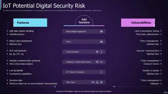
Template 5: IoT Potential Digital Security Risk
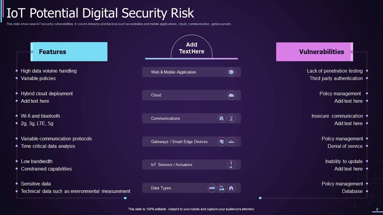
This PPT Slide outlines the digital domain's features and vulnerabilities. To ensure the feasibility of information delivery, the document is divided into three parts: the name of the IoT Service, Features, and Vulnerabilities. If the service is related to Web and Mobile development, then you can include features like high-data volume handling and variable policies. Vulnerabilities can include the lack of penetration testing and the requirement for third-party authentication.
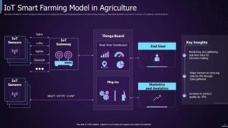
Template 6: IoT Smart Farming Mode in Agriculture
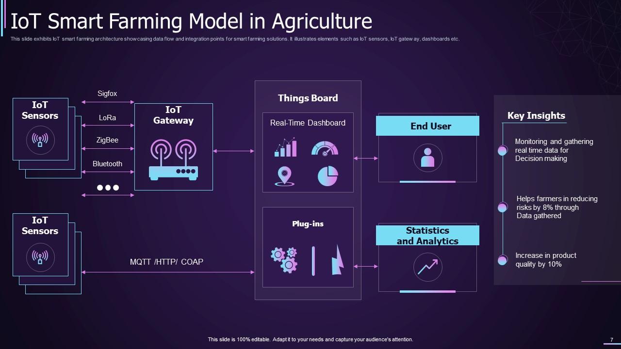
IoT is beneficial for the agriculture sector. It involves using smart farming techniques. Use this PPT Framework to showcase the features of smart farming. It starts with setting up IoT sensors and pairing them with an IoT gateway. Thereon, the real-time dashboard can be employed to compare or monitor the patterns/discrepancies in farming and then proceed to other stages.
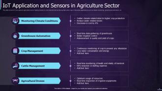
Template 7: IoT Applications and Sensors in the Agriculture Sector
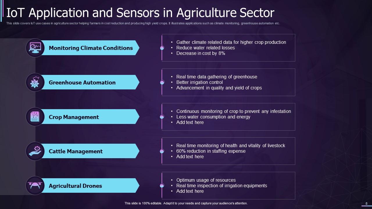
This slide complements the previous slide to help the audience learn about the benefits of IoT in the agriculture sector. It highlights the benefits related to feasible monitoring of the climate conditions, execution of greenhouse automation, feasibility of crop management, increased accessibility of cattle management, and more. You can add supportive text to extend the information further.
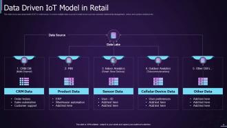
Template 8: Data-Driven IoT Model in Retail
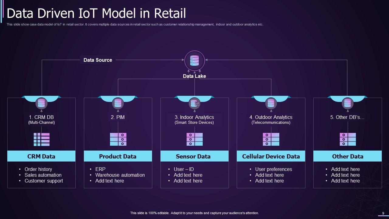
This PPT Preset explains the benefits of using IoT in the retail sector and its complexities. It showcases how the IoT platform divides collective information into respective categories. These categories can be CRM database (includes order history, customer support, and sales automation), PIM (includes ERP services and warehouse automation), Indoor Analytics (includes user-id info), Outdoor Analytics (includes user preferences), and other categories as feasible.
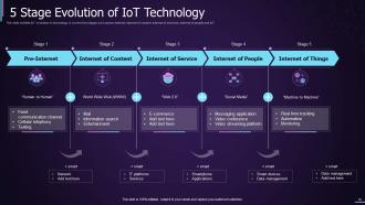
Template 9: 5-Stage Evolution of the IoT Technology
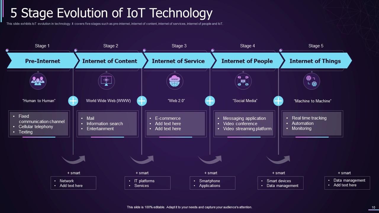
IoT is comparatively a newer addition to the world of technology. Your audience may have some queries related to the evolution and development of technology to reach IoT. This slide helps in showcasing this evolution. It all started with the pre-internet period when there was no digital interaction, only human-to-human interaction. Then came the Internet or the World Wide Web, which later proceeded to the Internet of Service or Web 2.0. After Web 2.0, we got to the Internet of People or social media services, which then connected to the Internet of Things or IoT in the present world.
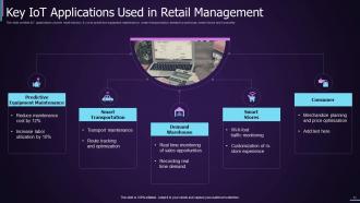
Template 10: Key IoT Applications Used in Retail Management
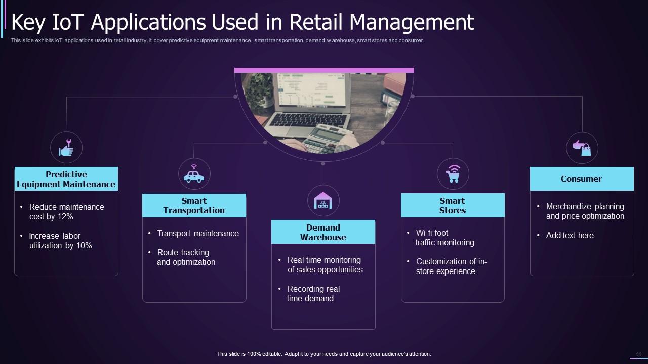
As retail is a big domain with various aspects, IoT can cater to different problems in this sector. This slide helps showcase how IoT can help you execute Predictive Equipment Maintenance, channel Smart Transportation, establish Demand Warehousing, set up a Smart Store, and serve your entire Customer base.
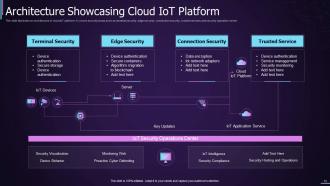
Template 11: Cloud IoT Security Application Framework
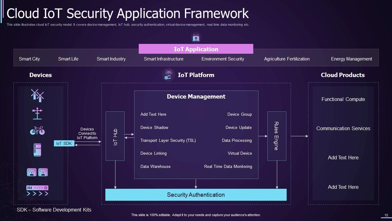
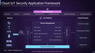
This PowerPoint Presentation helps to understand the applications of IoT in cloud security. It explains that IoT can help achieve the states of Smart State, Smart Life, Smart Industry, Smart Infrastructure, Environment Security, Agriculture Fertilization, Energy Management, and more. You can also showcase that the framework starts with connecting the devices with different IoT platforms and then with Cloud Products (including products related to functional computing and communication services).
This highly inclusive and thorough IoT Template can help you cater to the queries of a specific client(s).
IoT: One-Stop to Various Business Connectivity and Management Needs
IoT services and platforms are improving daily. It's beneficial for different businesses to take advantage of emerging technologies, centralize different operations, and easily manage them. IoT can help you achieve all that, but only if you make a strong case for your services in front of your clients. The above template will help you share every crucial aspect of your services for a change.
Here’s a quarterly technology evolution roadmap for the Internet of Things (IoT) to further fuel your cause.
IOT Powerpoint Ppt Template Bundles with all 24 slides:
Use our IOT Powerpoint Ppt Template Bundles to effectively help you save your valuable time. They are readymade to fit into any presentation structure.






FAQs for IOT Powerpoint
Go with something clean and techy - dark themes look way better for IoT stuff anyway. You'll need tons of device icons (smartphones, sensors, all that) plus layouts that work for network diagrams and data flow charts. Infographic-style slides are clutch for showing how everything connects. Oh, and animated templates are really helpful if you need to demo data moving around or device interactions. Cloud storage and analytics dashboard graphics are must-haves too. I'd probably start with at least 15-20 different slide layouts so you're not stuck redesigning everything.
Dude, visuals are everything for IoT presentations. You're explaining invisible stuff - data flows, networks, devices chatting with each other. People need to SEE it. Connected home diagrams work great, or simple icons showing sensors sending info to the cloud. Nobody's gonna sit through paragraphs about MQTT protocols (snooze fest). Flowcharts help show data movement between devices. Throw in some real photos of actual IoT setups too. I've seen way too many presentations that just dump technical specs on people. Visual metaphors and infographics make complex concepts click instantly. Your audience will thank you.
Blues and teals are your best bet - they just scream "tech innovation" in the best way. I'd go with dark navy or charcoal backgrounds, then pop in some electric blue or cyan accents. Orange is honestly everywhere these days (kinda overdone IMO), but it works great for highlighting data or CTAs. Skip pastels completely - way too soft for IoT stuff. Keep it to 2-3 colors max. Oh, and make sure there's solid contrast or people won't be able to read anything. Nothing worse than squinting at a presentation!
So with tech people, go all in on the nitty-gritty - show them data flows, network diagrams, security protocols, the whole nine yards. They actually want to see how everything works under the hood. But flip the script for general audiences. Focus on what it means for them - real outcomes, benefits, simple visuals that make sense. I learned this the hard way after boring a room of executives to death with API documentation once, haha. Now I keep two presentation templates ready to go. Swap those complex diagrams for basic icons and user flows when you're talking to non-tech folks. Makes all the difference.
Start with your network diagram - shows how everything connects. Then add real-time dashboards with your key metrics and device statuses. Data flow visuals are honestly my favorite part because people actually get excited seeing how info moves through the system. Historical trends and predictive stuff comes next, plus maps if your sensors are spread out geographically. Don't cram everything onto one slide though - learned that the hard way. Keep charts clean and build your story layer by layer after that foundation slide.
So I always start with stuff they actually deal with - their thermostat figuring out when they're home, or getting those Amazon delivery pings. Way more relatable than diving into technical stuff right away. The "day in the life" thing works great too - just walk through someone's morning and show how IoT quietly makes it better. People get it instantly. Sometimes I compare IoT networks to like, your nervous system sending signals around your body (sounds nerdy but it clicks). Oh, and always end with something concrete they can picture in their own house. Makes it stick better.
Hey! So for IoT presentations, I'd animate the data flow - like watching sensor info actually "travel" from device to cloud to your dashboard. Pretty cool effect. Fade-ins work well when you're revealing network layers bit by bit. Definitely skip those spinning cube transitions though (seriously, what is this, 2010?). Morph animations are perfect for showing device states changing in real-time. Keep everything around 0.5-1 seconds max or people zone out. The trick is making your animations mirror how these systems actually function. Oh, and try "Appear" animations on click - lets you walk through the whole architecture step-by-step.
Stick with simple device icons - phones, smart thermostats, sensors, that kind of stuff. Minimalist line art works best since detailed graphics look terrible when projected. Trust me on that one. Connection visuals are clutch too. Dotted lines between devices, wireless signals, cloud icons - anything that shows they're talking to each other. PowerPoint's icon library is honestly pretty decent now, or hit up Flaticon if you want more options. Just keep your colors and style consistent throughout. Nothing screams amateur like mixing five different icon styles in one deck.
Put your case studies right after you explain the IoT concepts - don't wait until the end like most people do. Nobody's paying attention by then anyway. Stick to 2-3 slides per case study, real company names, actual numbers if you can get them. Problem-solution-results format works best. Visuals are huge here - before/after dashboards, network diagrams, whatever shows the impact clearly. People connect way better with concrete examples than theory. Oh, and always connect it back to their specific industry. That's what makes them actually care about what you're saying instead of just nodding politely.
Honestly, you've got to lead with hard numbers or people will just tune out. Show them the 40% reduction in downtime or that $2M in saved maintenance costs - that's what actually gets attention. Nobody gives a damn about "smart connectivity" buzzwords until you prove it works. Before/after comparisons are your best friend here. Also throw in some industry benchmarks so they can see how you stack up. The thing is, IoT projects cost serious money upfront, so executives want concrete proof of ROI. Skip the fluffy tech talk and go straight for the metrics that'll make their ears perk up.
Build your slides with swappable placeholder content instead of locking into specific topics. Go with generic IoT stuff - data flows, device maps, dashboard mockups. Trust me, I learned this the hard way when I had to rip out smart home icons from every single slide later. Such a headache. Keep your color schemes neutral and use flexible infographic templates. That way whether you're talking agriculture sensors or fitness trackers, you just drop in new content. No redesigning the whole deck every time.
Just go with simple fonts like Calibri or Arial - they look clean and techy without being weird about it. Helvetica works too if you're feeling fancy. Honestly, anything serif is gonna be a nightmare since IoT stuff is already confusing enough. Oh, and Segoe UI is decent if you're stuck on Windows. Make sure your text is at least 24pt and headers are 36pt+. Trust me, nothing's worse than people squinting at tiny text from the back row. You'll look way more professional when everything's actually readable.
Open strong with a real IoT success story - people need to see impact immediately. Then hit them with problem-solution-demo structure. Mix concept slides with visuals because honestly, too much theory makes everyone zone out. Around the halfway point, throw in some interaction - polls work great or just pause for questions. Break technical stuff into bite-sized pieces with lots of diagrams. Real examples beat abstract concepts every time. After each section, spell out the "so what" for your specific audience. Oh, and here's what works: put your best demo or case study on slide 3 or 4. That's right when people's attention starts drifting, so hit them with your knockout punch there.
Ditch the technical jargon - nobody wants to decode your acronyms during a presentation. Keep those IoT diagrams super simple. Show data flow instead of cramming every sensor and wire into one messy chart. Please, for the love of all that's holy, stop using those generic circuit board stock photos. We've literally all seen them a thousand times. Real use cases hit way harder. Don't go crazy with animations either. That spinning logo isn't impressing anyone. Subtle transitions work better anyway. You're trying to tell a story about solving actual problems, not showing off your PowerPoint skills. Focus on benefits people actually care about.
Dude, consistency will make or break your IoT presentation. Same fonts, colors, layouts - otherwise people get distracted by your design mess instead of focusing on the actual data. I've watched brilliant sensor insights get totally ignored because slides looked thrown together. Stick to your brand colors and maybe 2-3 fonts max. Your charts should match too. When you're showing complex connected systems, visual consistency helps people actually follow what you're saying. Trust me on this one - stakeholders will zone out if slide 5 suddenly looks like it's from a different deck entirely.
-
Been using SlideTeam for some time now…can’t imagine why I wasted all that time in front of the screen trying to make the perfect presentation.
-
I took a chance with SlideTeam. I never looked back. Great products and great service.