


Ipa Powerpoint Presentation Slides





Try Before you Buy Download Free Sample Product
 Impress Your
 Audience
 100%
100% Editable
 Save Hours
 of Time


Introducing our content ready Ipa PowerPoint Presentation Slides. Intelligent digital operations help organizations to meet strategic challenges. Talk about the new set of technologies like robotic process automation, cognitive computing, artificial intelligence, etc. using the professionally designed robotic process automation framework PPT visuals. Automated IT systems are necessary for enhanced decision making. Optimize workforce productivity and back-office operations with the help of professional looking intelligent process automation PowerPoint Presentation Slides. The visually appealing technology-driven process PowerPoint complete deck comprises self-explanatory templates such as intelligent process framework, template, spectrum, process mapping, to name a few. Utilize these artificial intelligence PowerPoint templates to enhance interactions & speed up the business process. Additionally, the topic-specific business process automation framework PowerPoint presentation deck is also helpful in presenting the concepts of advanced algorithms, machine learning and other forms of AI. Thus, download this machine learning PowerPoint presentation design to automate your business processes. facets are considered by our Ipa Powerpoint Presentation Slides. Every angle fully assessed.
People who downloaded this PowerPoint presentation also viewed the following :
Content of this Powerpoint Presentation
Slide 1: This slide introduces IPA. State Your Company Name and begin.
Slide 2: This is Our Agenda slide. State your agendas here.
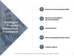
Slide 3: This slide shows Intelligent Process Automation Framework.
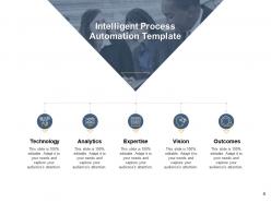
Slide 4: This slide presents Intelligent Process Automation Template describing- Technology, Analytics, Expertise, Outcomes, Vision.
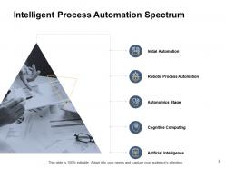
Slide 5: This slide displays Intelligent Process Automation Spectrum describing- Initial Automation, Robotic Process Automation, Autonomics Stage, Cognitive Computing, Artificial Intelligence.
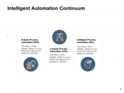
Slide 6: This slide represents Intelligent Automation Continuum describing- Robotic Process Automation (RPA), Intelligent Process Automation (IPA), and Complex Process Automation (CPA).
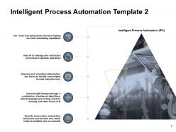
Slide 7: This slide showcases Intelligent Process Automation Template 2 with related imagery.
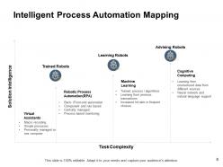
Slide 8: This slide shows Intelligent Process Automation Mapping.
Slide 9: This slide displays icons for IPA.
Slide 10: This slide is titled as Additional Slides for moving forward.
Slide 11: This is About Us slide to show company specifications etc.
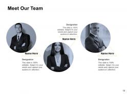
Slide 12: This is Meet Our Team slide with names and designation.
Slide 13: This is Our Mission slide with related imagery and text.
Slide 14: This is a Venn slide with text boxes.
Slide 15: This is a Quotes slide to convey message, beliefs etc.
Slide 16: This is a Timeline slide to show information related with time period.
Slide 17: This is a Financial slide. Show your finance related stuff here.
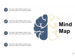
Slide 18: This slide shows Mind Map for representing entities.
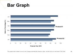
Slide 19: This slide shows Bar Graph with two products comparison.
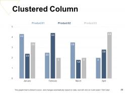
Slide 20: This slide presents Clustered Column chart with three products comparison.
Slide 21: This is a Thank You slide with address, contact numbers and email address.
Ipa Powerpoint Presentation Slides with all 21 slides:
Use our Ipa Powerpoint Presentation Slides to effectively help you save your valuable time. They are readymade to fit into any presentation structure.


FAQs for Ipa
So you need the usual suspects: problem statement, current state analysis, root cause stuff, proposed solutions ranked by priority, and timeline. Executive summary up front obviously. Oh and appendix for all your data dumps. One slide = one key point, trust me on this. Death by bullet points kills presentations faster than anything. Build in spots where people can actually give input and make decisions - otherwise you're just talking at them. Start with whatever template your company uses if they've got one. Then tweak it based on how messy your particular problem is.
Interactive charts are your best friend here - click a symbol, hear the sound. People eat that up. Throw in some mouth diagrams showing tongue placement and airflow patterns. Audio waveforms help too, plus video clips of native speakers actually making the sounds. Honestly, the visual stuff makes such a difference compared to just staring at abstract symbols. Mix up visual, audio, and hands-on elements since everyone learns differently. Start with the basic symbols they'll see most, then work up to the weird ones. Oh, and articulatory diagrams are clutch for showing what's happening inside the mouth.
Dude, you've gotta tell a story with your IPA data or people just zone out. Think of it like this - present the business problem first, walk them through what you found, then hit them with the big discoveries. Way too many analysts just throw charts at people without any context (guilty of this myself tbh). Connect each insight to actual business impact. Your stakeholders need to picture how this affects their real work. Instead of diving straight into numbers, try opening with "So here's what we discovered when..." Trust me, it makes all the difference.
So basically, interactive stuff makes people actually DO things instead of just staring at your content like zombies. Add clickable hotspots or quick polls - anything that gets them involved. People have zero attention span now (myself included, honestly). The cool part is you get instant feedback on what's actually working. I'd start small though - maybe just a clickable diagram or super short quiz. You'll see way better completion rates right away. Plus people remember more when they're actively clicking around versus just reading through everything.
Honestly, the worst thing you can do is stuff way too much text on each slide. People just zone out. One main point per slide, that's it. And please don't just read everything word for word - we've all been tortured by those presentations lol. Use bullet points as your talking points instead. Oh, and practice your transitions! Nothing screams "unprepared" like awkwardly fumbling between sections. I learned this the hard way. Rehearse out loud a few days before. Trust me, you don't want to be figuring out what you're saying for the first time in front of people.
Dude, totally depends on your audience. Executives? Hit them with ROI and business impact right away - skip the weedy details. Tech folks are the opposite though, they actually want to see your methodology and all that nerdy stuff. Mixed crowds are tricky but I usually prep modular sections I can swap around. Reading the room is honestly everything here. Oh and definitely have backup slides ready because someone always asks that one random deep question. I like prepping a few different opening slides too so I can test the waters first and see what they're vibing with.
Praat's honestly your best starting point - super powerful for spectrograms and audio analysis stuff. The Cambridge IPA Chart app is clutch for quick symbol references mid-presentation. PowerPoint with embedded audio works surprisingly well too, especially for classroom settings. There's also web tools like Speechling and Sounds of Speech if you want interactive demos. Oh, and apparently Canva has IPA symbols now? Wild. But yeah, definitely learn Praat first - bit of a learning curve but you'll end up using it for everything phonetics-related once you get the hang of it.
Drop those charts right where they matter most in your IPA sections. Bar charts work great for survey stuff, trend lines for performance metrics. Heat maps are perfect for regional breakdowns - honestly, I use those way too much but they just look so clean. Don't stick visuals at the end where nobody sees them. Put each chart right after you mention the data point. Give everything clear titles and quick explanations. Keep colors consistent throughout or it'll look messy. Trust me, stakeholders actually pay attention when data pops visually instead of being buried in text walls.
Lead with your biggest "aha" moment - the one insight that'll actually make people sit up and pay attention. Build everything around that. I always go problem-solution-evidence because it just works. Set up the challenge, pitch your approach, then hit them with data and real examples. Visuals over text - seriously, death by PowerPoint is real. Have a solid "so what now?" section that spells out next steps. Oh, and definitely prep those budget numbers ahead of time. Someone will ask about cost the second you finish talking. Trust me on that one. End with clear recommendations and realistic timelines so they can't wiggle out of making decisions.
After each presentation, I write down what bombed and what actually worked. Audience questions are gold - they show you exactly where your template confused people. That pronunciation slide that always makes everyone squint? Trash it and start over. I track which visuals clicked and which ones made people zone out (you know that look). Timing's huge too - some sections always eat up way too much time while others feel weirdly rushed. Don't change everything based on one person's random comment though. Wait for patterns to emerge, then fix those recurring problem spots in your template.
So there's like American IPAs with those citrusy, piney hops, then English ones that are more malty and earthy. New England IPAs are super hazy and juicy - honestly my favorite style right now. Double IPAs pack way more alcohol, and there's weird newer stuff like Brut or Milkshake IPAs too. The variations are honestly endless these days! For your templates, build in flexibility so you're not reinventing the wheel every time. Maybe do modular hop timing, adjustable malt ratios, different yeast options. That way you can just tweak things instead of starting over when you want to try a new style.
Oh man, this is such a good question! So warm colors like reds and oranges are super attention-grabbing - they scream "urgent problem here!" Cool blues and greens feel way more chill and analytical. You've gotta match the vibe to your message though. Like if you're showing process improvements, go with calming blues instead of panic-inducing reds that'll freak out leadership. I've literally watched brilliant analyses get shot down because someone used those awful rainbow charts that assault your eyeballs. Keep it simple - maybe 2-3 colors max that actually support whatever story you're trying to tell.
Stick with the official IPA guidelines from the International Phonetic Association - they're your best bet. Use the current chart and keep your transcription style consistent throughout. Oh, and decide upfront whether you're doing broad or narrow transcription, plus specify which accent you're targeting. I always mess this up at first, but it matters! Don't forget stress markers and syllable boundaries. Honestly, the prosodic features part depends on what you're actually using this for. Quick tip: double-check your symbols against recent IPA resources since they do update sometimes.
Don't just randomly throw multimedia everywhere - be strategic about it. Audio clips are perfect for showing pronunciation differences (way better than those confusing IPA symbols). Interactive phoneme charts let people actually click and hear the sounds themselves, which is pretty cool. For tricky stuff like retroflex consonants, video clips of mouth movements really help. Just don't go overboard with fancy effects - they'll distract from what you're actually trying to teach. Every piece should have a clear purpose. Oh, and definitely test everything beforehand! Tech always fails at the worst moments, so keep backup slides ready.
Dude, go bold with those hop illustrations and vibrant gradients - most beer designs are so boring. Try craft-style fonts, like hand-drawn or industrial ones that actually look small-batch. I swear half the IPAs out there look exactly the same now, so you gotta stand out somehow. Throw in some brewing elements - hop cones, citrus slices, maybe geometric patterns for the bitterness levels? Texture overlays work great too, especially ones that look like foam or hop residue. Pick one main element first, then build everything else around it. Way easier than trying to cram everything in at once.
-
Thanks for all your great templates they have saved me lots of time and accelerate my presentations. Great product, keep them up!
-
Unique and attractive product design.
-
Innovative and Colorful designs.
-
The Designed Graphic are very professional and classic.
-
Excellent products for quick understanding.