


Key Performance Indicators For Staff Performance Management




Try Before you Buy Download Free Sample Product
 Impress Your
 Audience
 100%
100% Editable
 Save Hours
 of Time


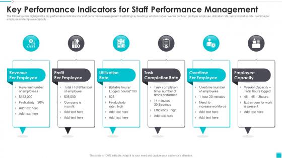
The following slide highlights the key performance Indicators for staff performance management illustrating key headings which includes revenue per hour, profit per employee, utilization rate, task completion rate, overtime per employee and employee capacity.
People who downloaded this PowerPoint presentation also viewed the following :
Key Performance Indicators For Staff Performance Management with all 6 slides:
Use our Key Performance Indicators For Staff Performance Management to effectively help you save your valuable time. They are readymade to fit into any presentation structure.





FAQs for Key Performance Indicators For
Look, focus on the money metrics first - conversion rate, CPA, and ROAS. Those actually tell you if you're profitable or just burning cash. Click-through rates matter too for seeing if people care about your ads. I swear, half the marketers I know obsess over impressions and other fluff that doesn't pay the bills. Set your benchmarks before launching so you can tell what's bombing right away. Oh, and if brand awareness is your thing, then sure, track reach and frequency later. But seriously, start with revenue drivers or you'll waste tons of time on pretty charts that mean nothing.
Honestly, automated dashboards are a game changer - Tableau and Power BI are solid, or Google Analytics if that fits your data better. Connect everything directly so it updates itself because manual spreadsheets are the worst. Most places I know pull from their CRM, accounting software, and marketing tools into one main dashboard. Focus on metrics that actually move the needle, not just pretty numbers that look good. Oh, and set up alerts when things hit certain levels so you don't miss important changes. Start with maybe 3-5 key metrics first though - don't go overboard right away.
Honestly, data visualization is what turns your KPIs from boring spreadsheet numbers into something you can actually use. Charts and dashboards let you spot trends and problems instantly - way faster than scanning through rows of data (which is mind-numbing anyway). You'll catch outliers and patterns that would otherwise take hours to find. The trick is picking the right chart type for each metric. Bar charts work great for comparisons, line graphs show trends over time - that kind of thing. When stakeholders can see performance at a glance, everything just clicks better.
Look, generic metrics are basically useless. What matters to a SaaS company - like monthly recurring revenue and churn - is completely different from what a manufacturer cares about (production efficiency, defect rates). Healthcare? They're obsessed with patient outcomes and safety stuff. Totally different ballgame. Here's what I'd do: figure out what actually makes companies in your industry successful first. Then build your KPIs around that. Don't just steal what works for other people - it probably won't work for you anyway. Ask yourself what your customers and stakeholders actually care about, then find ways to measure those things.
Oh man, don't go overboard with too many KPIs - you'll lose track of what actually matters. Pick like 3-5 max. Also avoid those vanity metrics that look impressive in meetings but tell you literally nothing useful (learned this the hard way). Make sure your team can actually influence whatever you're measuring, otherwise it's just frustrating for everyone. And honestly? Skip the ones that sound super important but don't connect to your real goals. Keep it simple - focus on stuff you can actually track that directly shows if your project's working or not.
Check your KPIs every quarter minimum, but some need monthly reviews if you're moving fast. Don't wait until something feels wrong to look at them - that's a mistake I see all the time. Business priorities shift constantly, and metrics that made sense six months ago? Probably useless now. Monthly feels excessive for most stuff, but quarterly is non-negotiable. Kill any KPIs that aren't actually driving the right decisions anymore. Set a calendar reminder so you don't forget - otherwise you'll end up tracking vanity metrics forever while missing what actually matters.
So leading KPIs are like early warning signals - stuff like web traffic or how many leads you're getting. Lagging ones tell you what already went down, like actual revenue or customer ratings. Here's why it matters: you can actually fix leading indicators before they mess up your results. Website conversions tanking? Jump on it now before sales crater next month. Honestly, lagging KPIs are kind of useless for decision-making since the damage is already done. Track both obviously, but lean heavy on the leading ones for your day-to-day calls.
Start with your big picture goals and work backwards from there. If you're trying to expand into new markets, tracking generic stuff like website visits is pretty useless - focus on things like market penetration or what it costs to get customers in those specific regions. Each metric should answer "does this actually help us hit our main goals?" I've seen too many companies get obsessed with vanity metrics that look impressive but don't move the needle. Check in quarterly since priorities change way more than people think they will.
Honestly, Google Analytics and Data Studio are your best bet if you're just starting out - they're free and handle web stuff really well. Excel works too, don't let anyone make you feel bad about using it lol. Tableau and Power BI are amazing but probably overkill unless you need fancy visuals. Oh, and tools like Klipfolio or Geckoboard are solid for pulling everything together into one dashboard. My advice? Start with whatever you can access right now, then upgrade later when things get messier. The fancy tool means nothing if your team won't actually use it consistently.
Yeah, KPIs totally shape culture - they're basically telling everyone what you really care about. Measure only individual sales? You'll get a cutthroat vibe. Track teamwork and customer happiness too? Way different energy. Here's the thing though - people will game any system you build. It's just what we do. So you need metrics that actually match the culture you want. I'd start by looking at what you're measuring now. Are your current KPIs accidentally creating the wrong behaviors? That happens more than you'd think. Focus on stuff that drives the culture you actually want to see.
Look, happy customers literally = more money. They spend 2-3x more over time and actually tell their friends about you (crazy how that still works, right?). Track stuff like NPS or retention rates - those numbers basically show you how much future revenue you've got coming. Honestly, I'd just pick 2-3 metrics that make sense for your business and check them monthly. You'll catch problems way earlier that way. Plus it's so much cheaper to keep the customers you already have than constantly hunting for new ones. Start simple and you'll see the patterns pretty quickly.
Honestly, you'll want to measure what actually matters for your mission - like how many people you're helping and whether their lives are genuinely improving. Skip the vanity metrics (nobody cares how many events you hosted). Track things like beneficiary satisfaction and long-term outcomes when you can. Obviously keep an eye on the money side too - fundraising efficiency, cost per person helped, how much you've got in reserves. But here's the thing: don't go crazy with metrics. Pick maybe 5-7 that really tell your story. I always tell people to imagine what success looks like in three years, then figure out what numbers would prove you got there.
Honestly, just use Google Analytics and whatever reporting stuff you already have - most people don't even realize how much data they're sitting on. Focus on maybe 3-5 metrics that actually move the needle for revenue or keeping customers happy. Don't go crazy tracking everything (learned that lesson the hard way lol). Simple spreadsheets work fine for weekly or monthly trends. You don't need some fancy dashboard right away. The real trick? Be consistent about it. I'd rather spend 30 minutes each week actually looking at numbers than build some elaborate system I'll forget about. Start basic, then add more later.
KPIs are your proof when stakeholders want to see if their money's actually working. Pick 3-4 that tie directly to revenue or cost savings - none of that vanity metric stuff. Show clear before-and-after comparisons, like "customer acquisition costs dropped 30%" or "revenue per user went up $50." Numbers they can connect to dollars? That's what gets them excited. I always focus on the ones that show real business impact rather than just looking impressive on paper. It's way more convincing when you can point to actual efficiency gains.
Put your KPIs everywhere - dashboards, team meetings, Slack bots, whatever works. People need to see the numbers daily, not just when quarterly reviews roll around. Here's the thing though: connect each person's work to those bigger metrics or they won't give a damn about some abstract number. When KPIs go up, celebrate. When they tank, figure out why without pointing fingers. Oh, and your team actually needs the power to move those numbers - otherwise what's the point? I'd start with just 2-3 key metrics. Don't overwhelm them with a spreadsheet nightmare.
-
My search for complete decks ended with SlideTeam. Such a surplus collection of HD PowerPoints. Moreover, their standard and widescreen formats have helped me in delivering bullseye presentations.
-
“As you have innovative ideas and they are all customizable, this saves a huge chunk of your time to prepare well-read presentations.”