


Keys update powerpoint ppt template bundles




Try Before you Buy Download Free Sample Product
 Impress Your
 Audience
 100%
100% Editable
 Save Hours
 of Time


Our Keys Update Powerpoint Ppt Template Bundles are topically designed to provide an attractive backdrop to any subject. Use them to look like a presentation pro.
People who downloaded this PowerPoint presentation also viewed the following :
Keys update powerpoint ppt template bundles with all 17 slides:
Use our Keys Update Powerpoint Ppt Template Bundles to effectively help you save your valuable time. They are readymade to fit into any presentation structure.
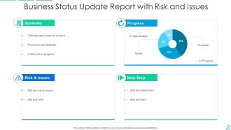
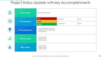
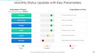

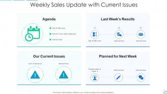





FAQs for Keys update powerpoint
First thing - get bundles with tons of different slide types. Title slides, charts, content layouts, the whole deal. I learned this the hard way but make sure everything actually matches when you mix slides together. Some bundles look amazing separately but become a hot mess when combined. You'll want at least 50-100 unique slides or you'll get sick of using the same layouts over and over. Also crucial: check they work in regular PowerPoint, not some weird design program. Light and dark themes are pretty standard now. Oh, and definitely test the editing before you buy anything - some templates are way harder to customize than they look.
Honestly, good templates just make people actually listen to you instead of getting distracted by ugly fonts or weird colors. I've been in presentations where the slides hurt to look at - not fun for anyone! Clean designs help your audience process info better too. Your key points hit different when everything looks polished instead of thrown together. Plus visual hierarchy and proper spacing matter more than you'd think. Those Keys bundles are worth checking out, you'll notice people paying way more attention once your stuff looks professional.
Honestly, sales decks benefit the most - you need that polished look to not seem sketchy to prospects. Client presentations and quarterly reviews are huge time-savers too since you're not stuck fixing fonts for hours. I always recommend grabbing bundles for high-stakes stuff like investor pitches or conference talks because sloppy slides kill your credibility fast. Training materials work great with templates too, though that's probably obvious. The industry-specific ones are worth the extra cost if you can swing it. Even if you're decent at design, why waste time when templates do the heavy lifting?
Honestly, think of PowerPoint templates as your brand's fingerprint - people should recognize your stuff instantly. Your team won't waste hours picking fonts and colors for every single deck, which is honestly a lifesaver. Consistent branding across all presentations makes you look way more professional too. The trick is actually making templates that feel like *your* brand, not just throwing your logo on some boring corporate slides. When done right, your audience will spot your presentation from across the room. It's basically visual shorthand for "this is us" without saying a word.
Oh totally! Colors mess with people's heads way more than you'd think. Blues and greens make audiences trust you more - super helpful for boring corporate stuff. Reds and oranges pump up the energy but can feel aggressive if you overdo it. I learned this the hard way when my boss used this hideous lime green template that literally gave people headaches lol. Dark backgrounds look sleek but good luck if you're presenting in a sunny conference room. Test your colors first because honestly? You're setting the mood before you even open your mouth.
Dude, minimalist stuff is huge right now - clean layouts with bold fonts and tons of white space. Those messy, cluttered slides are finally dying out (thank god). Data visualization is getting baked right into templates now, which is pretty cool. Dark mode templates are everywhere too. Oh, and companies are actually using sophisticated color palettes instead of random bright colors that hurt your eyes. Honestly, if you're redoing your deck, just grab one of those minimalist template bundles. Makes everything look professional without you having to stress about design.
Start with the right chart type for what you're trying to say. Those PowerPoint template bundles usually have decent layouts already - just swap in your brand colors. Here's the thing: don't dump everything on one slide. I've sat through way too many presentations where people cram like 15 data points together and nobody can follow it. Split complex stuff across multiple slides instead. Your text needs to be big enough that someone in the back row can actually read it (learned this the hard way). Oh, and always add a clear headline that basically tells people "here's what matters."
Don't just swap out text and call it done - that's the fastest way to look lazy. Change colors, fonts, layouts to actually match your brand. I cringe every time I see someone cram content into every available space just because it's there. Less is more, seriously. Oh, and double-check you replaced ALL the placeholder text (awkward when "Your Company Name Here" shows up mid-presentation). Test animations beforehand too. Projectors hate fancy transitions, so have a backup ready. Basically, customize everything but keep slides clean.
Honestly, I'd refresh them every 6-12 months. Those 2019 gradients are looking pretty rough now, aren't they? Microsoft keeps adding cool new features that make templates way more interactive. Twice a year works well - spring and fall when companies usually update their branding stuff anyway. Just keep tabs on what's trending in corporate design. Oh, and definitely scope out competitor presentations for inspiration. Start planning your next refresh now so you're not stuck scrambling when everything suddenly looks outdated. Trust me on that one.
Good typography can make or break your presentation, honestly. Sans-serif fonts like Calibri or Arial are your best bet - they're way cleaner on screens than those fancy serif ones. Make sure it's big enough for people in the back to actually read. I learned this the hard way when half my audience was squinting at my slides. Keep it to 2-3 font sizes max and stay consistent. You don't want people struggling to read your text instead of listening to what you're saying. Clean fonts might seem boring, but they work.
Honestly, these themed bundles are a lifesaver when you're drowning in grading. You just drop your content into pre-made layouts - charts, timelines, whatever you need. Students actually pay more attention when slides look consistent and professional instead of like... well, whatever chaos I used to create at 2am. The visual branding helps them follow along better too. I mean, who actually has time to design from scratch anymore? Pick something that fits your subject and you're set. Way less time spent wrestling with formatting, and your lectures instantly look more put-together.
Okay so first thing - compress your images and videos before you add them or your file will be huge. I always put media in the same spots across slides, like having a dedicated video zone or whatever. Trust me on this one - my presentation completely died during a client pitch once because I didn't test it properly. Oh and definitely use placeholders in your master slides so people know where stuff goes. You'll want to test everything on different devices too since videos that work fine on your laptop might be glitchy elsewhere. Pro tip: keep backup static images ready because videos love to break at the worst possible moments.
Yeah, so most PowerPoint bundles split things up by what you're trying to do. Persuasive templates have all the flashy stuff - bold layouts, emotional hooks, call-to-action slides. Pretty clever honestly. Informative ones are way cleaner, focused on data viz and logical flow. They usually organize the folders by purpose too, which is nice because you don't have to dig through random slides. The persuasive templates definitely feel more "salesy" with dynamic elements, while informative ones just want you to understand the content clearly. Makes picking the right style super easy.
Honestly, bundles are the way to go. You'll save like 40-70% compared to buying templates one by one, which adds up fast. Plus everything matches design-wise so you don't have that awkward thing where you're trying to make different templates look cohesive. I made that mistake early on - such a pain. The best part? You've got this whole library to choose from whenever you need slides. Different layouts, tons of options, all designed to work together. Find a bundle that fits your industry or whatever style you usually present in. Trust me on this one.
Three big things to focus on: contrast, fonts, and structure. High contrast colors help people with visual impairments actually read your text. Stick with simple fonts - Arial or Calibri work great. Alt text is honestly the biggest game changer though. Add descriptions to images so screen readers can pick them up. I used to skip this step but it makes such a difference. Keep layouts consistent and use proper headings. Oh, and PowerPoint has this built-in accessibility checker that's pretty solid - it'll flag most problems automatically. Way easier than trying to catch everything yourself.
-
Graphics are very appealing to eyes.
-
Unique research projects to present in meeting.