


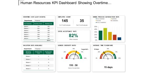
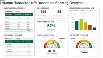
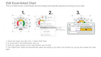
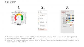
Kpi dashboard showing overtime cost gender diversity ratio





Try Before you Buy Download Free Sample Product
 Impress Your
 Audience
 100%
100% Editable
 Save Hours
 of Time


Help yourself to happiness with our Kpi Dashboard Showing Overtime Cost Gender Diversity Ratio. Be able to fulfill your cherished dreams.
People who downloaded this PowerPoint presentation also viewed the following :
Kpi dashboard showing overtime cost gender diversity ratio with all 6 slides:
The humor in our Kpi Dashboard Showing Overtime Cost Gender Diversity Ratio gets everyone to feel at ease. Jokes will have the desired effect.
FAQs for Kpi dashboard showing overtime cost
So for your KPI dashboard, start with maybe 5-7 metrics that actually matter to your goals - don't go crazy with like 20 different charts. Nobody wants to stare at something that looks like mission control, trust me. Make sure the visuals show trends clearly and you're getting real-time data (or close to it). Oh, and add context stuff like targets and benchmarks so people know if they should panic or celebrate when they see the numbers. Mobile-friendly is huge too since everyone checks these things on their phone now. Once people start using it regularly, then you can add more metrics. But seriously, keep it simple at first or it'll just sit there collecting digital dust.
Honestly, bad UX will tank your dashboard faster than anything else. People just won't use it if they can't find stuff or if it's confusing to navigate. I've watched amazing dashboards collect dust because they were annoying to work with – like, the data was perfect but nobody wanted to deal with the interface. You want clean visuals and logical groupings. Fast loading too, obviously. When everything flows naturally, your team will actually dig into the insights instead of avoiding the whole thing. Oh, and test it early with actual users – they'll tell you exactly what sucks about it.
Honestly, keep it super simple with KPIs - execs hate squinting at complicated stuff. Line graphs work great for showing trends. Those big number cards are actually clutch for revenue or whatever key metric. Bar charts are solid for comparisons too. Gauge charts are good when you're tracking against targets. I'd skip bubble charts or anything with multiple axes though, way too much mental work. Stick with the obvious color scheme - red bad, green good. Oh and if you can get real-time updates going, that's always impressive. The whole point is they should understand everything in like 3 seconds max.
Look, first thing - make sure every KPI connects to an actual business goal. Can't draw that line? Ditch it. I always ask myself "will this number actually change what we do?" because tracking random vanity metrics is just noise. Focus on stuff that predicts what's coming, not just what already happened. Like if you want better retention, track engagement scores AND churn rates. Oh, and keep it tight - maybe 5-7 KPIs tops. Each one needs an owner who's actually responsible for improving it. Otherwise you'll just have pretty charts nobody acts on.
Honestly, real-time data is the difference between a useful dashboard and just looking at old news. You can actually catch problems while they're happening instead of finding out your metrics tanked three days later. It's like - would you rather know your website crashed right now or next Tuesday? Spot trends early, fix issues before they get worse, jump on opportunities while they matter. Oh and definitely set up alerts for your most critical stuff so you're not glued to your computer all day refreshing charts.
Honestly, you've gotta build in regular check-ins or your dashboard will become totally useless. Every quarter, grab your key people and ask "are we even measuring the right stuff anymore?" Priorities change fast - like, what mattered six months ago could be completely irrelevant now. Take your current metrics and see if they actually line up with where you're heading strategically. Cut the dead weight. Don't be scared to try new indicators either as things evolve. Monthly chats with department heads work great for catching problems early. Trust me, it beats having a gorgeous dashboard that nobody actually uses for decisions.
Don't cram everything onto one screen - that's the biggest mistake I see. Make sure your KPIs actually connect to business goals, not just pretty numbers that look good but don't help anyone decide anything. Simple charts beat fancy ones every time, trust me on this. Executives need totally different views than your frontline managers, so think about who's actually using this thing. Oh, and definitely test it with real users first - they'll catch stuff you never would've thought of. Keep the design consistent too, otherwise it just looks messy.
Honestly, half the problem is people don't even know what they're looking at. Start by walking them through which metrics actually matter for their specific role - I've seen way too many pretty dashboards that just sit there collecting digital dust. Set up regular sessions where you dig into the "why" behind numbers, not just showing them what happened. Get them comfortable asking questions when something looks off. Set alerts for the critical stuff so they're not constantly checking. But here's the key thing - every KPI needs to connect to something they can actually do about it. Otherwise you're just making expensive art projects instead of tools that drive real decisions.
Start with the basics - total sales, pipeline value, conversion rates. Those actually matter. Track how fast your deals close and what percentage of quota you're hitting. I'd also watch customer acquisition cost because nobody talks about it enough but it'll bite you later. Calls made and meetings booked are fine to track, just don't get obsessed. Half the dashboards I see are packed with useless numbers that look impressive but don't help anyone sell more. Lead quality scores are solid too. Build from there once you figure out what's actually broken.
Set up line charts and bar graphs to track your KPIs over time - week-over-week, month-over-month, whatever makes sense. Rolling averages are a game changer for smoothing out random spikes (learned that the hard way). Add benchmark lines so you can spot when things go south immediately. Most dashboard tools make this pretty straightforward. Automated alerts are clutch for catching big changes. Oh, and check critical stuff daily, other metrics weekly. Sparklines are nice too if you want something compact.
Tableau and Power BI are your best bet if you don't mind the learning curve - they're ridiculously powerful. Google Data Studio is free and honestly works great for simpler stuff. Excel can work too but gets ugly real quick with big datasets, trust me on that one. Grafana's solid for web dashboards, or you could go custom with D3.js if you're feeling ambitious. I'd figure out what data sources you're working with first, then see which tool connects easiest. Power BI's probably the sweet spot for most people though.
Honestly, KPI dashboards are game-changers for breaking down those annoying data silos. Everyone can finally see what other departments are doing - sales, marketing, customer success, whatever. Your team's numbers suddenly make sense in the bigger picture. No more of those awkward "well, our numbers look good" moments followed by crickets. Real-time metrics mean you'll spot bottlenecks way faster. Plus, people actually collaborate on fixing problems instead of just blaming each other (which happens more than anyone wants to admit). Set up shared views for your main cross-team projects. Trust me, it works.
Honestly, the best part is having your numbers right in your pocket. No more rushing back to your computer to check if something's broken. You can spot issues super fast and actually do something about it while you're out. Your whole team stays on the same page too since everyone's looking at the same live data. I'd definitely set up alerts for your main metrics - trust me, you don't want any nasty surprises. Plus you can impress people in meetings by pulling up real stats on the spot (okay maybe that's just me being a data nerd).
Dude, visualization tools are a game changer - they turn your messy spreadsheet nightmare into actual pictures your brain can handle. Charts and graphs instantly show you what's trending up or down without squinting at endless rows of numbers. Who wants to do that anyway? You can spot problems way faster when everything's color-coded. Heat maps are honestly my favorite for most stuff. Bar charts work great too. Oh, and the filtering thing is clutch - you can zoom into specific problems without getting lost in all the data noise. Trust me, once you start using them you won't go back.
Honestly, you need to nail three things here. First, set up validation rules right when data comes in - required fields, format checks, that stuff. Manual monitoring is basically useless, so get automated alerts for weird spikes or missing data. Have someone actually look at the numbers regularly too because sometimes patterns jump out that alerts miss. Oh, and this saved me so many headaches - always know where your KPIs come from originally. When something looks off (and it will), you can trace it back fast instead of panicking.
-
Easily Understandable slides.
-
Commendable slides with attractive designs. Extremely pleased with the fact that they are easy to modify. Great work!