

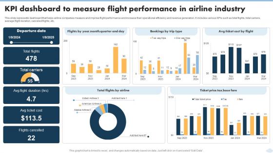
KPI Dashboard To Measure Flight Performance In Airline Industry




Try Before you Buy Download Free Sample Product
 Impress Your
 Audience
 100%
100% Editable
 Save Hours
 of Time


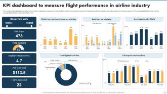
This slide represents dashboard that helps airline companies measure and improve flight performance and increase their operational efficiency and revenue generation. It includes various KPIs such as total flights, total carriers, average flight duration, canceled flights, etc.
People who downloaded this PowerPoint presentation also viewed the following :
KPI Dashboard To Measure Flight Performance In Airline Industry with all 10 slides:
Use our KPI Dashboard To Measure Flight Performance In Airline Industry to effectively help you save your valuable time. They are readymade to fit into any presentation structure.








FAQs for KPI Dashboard To Measure Flight Performance
Start with your money stuff - total sales, growth rate, average deal size. Pipeline health is huge too: conversion rates, how long deals take, qualified leads coming in. Don't forget activity tracking like calls and demos scheduled. I always add individual rep performance because honestly, a little competition never hurt anyone! Win/loss ratios help you catch problems early, and forecast accuracy shows if your team's being realistic. Oh, and keep it under 8 KPIs or you'll just get overwhelmed trying to track everything.
First thing - figure out what metrics actually matter in your field. Retail? You're looking at conversion rates and how fast inventory moves. Healthcare is all about patient outcomes and staying compliant. Manufacturing tracks OEE and quality scores. Here's what I've learned the hard way: generic dashboard templates are basically worthless. Build yours around your actual workflow instead. Like, manufacturing needs those real-time downtime alerts, hospitals need patient flow charts. Map out how you actually make decisions day-to-day, then design dashboards that support that process. Way more useful than copying someone else's setup.
Put your most important stuff right at the top where people actually look. Consistent colors and fonts, obviously. Less is definitely more - I've seen way too many dashboards that look like they threw up data everywhere. Your charts should make sense in like 2 seconds, not require a PhD to decode. Group similar metrics together (seems obvious but you'd be surprised), and use plenty of white space so it doesn't feel claustrophobic. Skip those spinning animations - they're just annoying. Oh, and test it with real people first! They'll roast the stuff that doesn't work and save you from looking clueless later.
Dude, real-time data changes everything for your KPI dashboard. You'll catch problems while you can actually fix them instead of finding out three weeks too late. I can't tell you how many times I've watched teams scramble over issues that were already ancient history - super frustrating. Your dashboard becomes like a live heartbeat of what's happening right now. Quick decisions when they matter, you know? Start with KPIs around customer stuff or operations breaking down, those need the instant visibility. Way better than staring at dead data that tells you nothing useful.
Honestly, the worst thing you can do is throw like 15 different metrics on there. Nobody knows where to look. Stick to maybe 5-7 that actually matter for decisions you're making. Also - and I learned this the hard way - don't just dump charts without showing what "good" actually looks like. Add targets or comparisons so people get it immediately. Automating the data feeds will save your sanity later, trust me. Manual updates are soul-crushing after week two. Oh, and skip the vanity stuff that just makes everyone feel warm and fuzzy but doesn't change anything. Figure out your main business questions first, then work backwards to find metrics that answer them.
Look, each department cares about totally different stuff, so their dashboards should reflect that. Sales wants conversion rates and pipeline data. HR's obsessing over turnover rates and employee happiness surveys. Finance? They're all about cash flow and budget variances - honestly those guys would choose Excel over oxygen if forced to pick. Marketing needs lead gen numbers and campaign ROI. The cool thing is you can set up separate views so nobody's drowning in metrics they don't actually need. Everyone gets their own customized snapshot for faster decisions.
Honestly, this is huge - if people can't actually use your dashboard, you've basically wasted all that time building it. Think about colorblind users, readable fonts, easy navigation. Mobile matters too since everyone's checking stuff on their phones now (which still surprises me sometimes). I've seen amazing dashboards that nobody touches because they're impossible to navigate or the text is tiny. Quick test: grab a few coworkers with different tech skills and watch them try to use it. You'll spot the problems immediately, and their confusion will tell you exactly what needs fixing.
Start with clean data sources and automate validation rules to catch errors early. Pull from reliable systems only. Have someone actually review the metrics regularly - seriously, I've seen dashboards showing wrong numbers for months because no one bothered checking! Data quality alerts are crucial so you'll get notified when something's wonky. Also establish clear ownership for each data source. Oh and build verification into your workflow from the start. Way easier than fixing accuracy issues after you've already made decisions based on garbage data.
Honestly, they're total lifesavers for seeing what's actually going down in your business right now. No more waiting around for monthly reports or just winging it with decisions. You'll catch problems early and spot good opportunities fast. My favorite part? When everyone's looking at the same dashboard, nobody's confused about what matters most. The data overload thing is real - I used to drown in spreadsheets before setting mine up. Just make sure it updates automatically and check it during your weekly planning. Trust me, once you start using one you won't go back to flying blind.
Honestly, when you're starting out, you're basically just trying not to die. Track your cash runway, how much it costs to get customers, and whether people actually stick around and use your product. That's it - maybe 3-5 metrics max, but watch them like a hawk. Once you've got some stability (and aren't panicking about payroll every month), then you can start caring about fancier stuff like market share and operational efficiency. Mature companies can afford those huge dashboards with 50 different KPIs. But early on? Keep it simple and obsess over what'll get you to your next funding round.
Dude, the real-time access thing is clutch - I'm constantly checking our numbers from my phone now. No more bugging IT about server crashes or updates since everything runs in the cloud. Your whole team can jump in and mess around with the same live data, which honestly beats those old static reports we used to email around. Oh and you don't get hit with those crazy upfront costs either, just pay for what you actually use. The mobile piece alone will probably change how you think about tracking stuff. Maybe grab a free trial first? That's what we did and ended up loving it way more than expected.
Honestly, KPI dashboards are game-changers for this stuff. People can actually see how they're performing against goals in real time instead of waiting for quarterly reviews or whatever. Pick 3-5 solid metrics per person that tie back to team goals. The cool part? It cuts out those weird conversations where someone's like "so... how am I doing?" because the data's right there. Most people find it motivating when they can track their own progress - though obviously some hate being monitored that closely. Just make sure it updates frequently enough to matter.
Honestly, start with the money stuff - conversion rates, cost per acquisition, and ROAS. Those actually tell you if you're winning or losing. Click-through rates? Pretty much useless vanity metrics that won't pay your rent. Lead quality scores are clutch if you can track them, plus customer lifetime value. Don't go crazy though - pick like 4-6 max that connect to actual revenue. Oh, and definitely set up alerts when things hit certain numbers. You'll catch problems way faster that way instead of checking dashboards constantly.
Honestly, you should be updating that thing weekly at minimum. Daily is even better if you're tracking stuff like sales numbers or web traffic. Monthly? Way too slow - you'll totally miss what's happening with your business. Match your update schedule to how often people actually look at it, you know? If your team checks it every morning over coffee, then yeah, make sure the data's fresh. Set up automatic refreshes wherever you can because manually updating spreadsheets is the worst. Just pick something realistic that you won't abandon after two weeks.
Depends what you're after really. Tableau and Power BI are crazy powerful but take time to learn. Geckoboard's my personal favorite though - super clean interface and way easier to use. Google Data Studio works great if you're already using Google stuff and it's free, which is nice. Excel can handle basic dashboards too if that's all you need. Oh, and Klipfolio's decent as well. First thing though - figure out which KPIs you actually care about tracking. Then just pick whatever connects to your data sources without making your team want to quit.
-
This design is not only aesthetically pleasing but it has many uses making the cost worthwhile. The graphics look stunning, and you can edit them as per your needs.
-
Every time I ask for something out-of-the-box from them and they never fail in delivering that. No words for their excellence!