


KPI Dashboard To Track Lab Efficiency And Costs




Try Before you Buy Download Free Sample Product
 Impress Your
 Audience
 100%
100% Editable
 Save Hours
 of Time


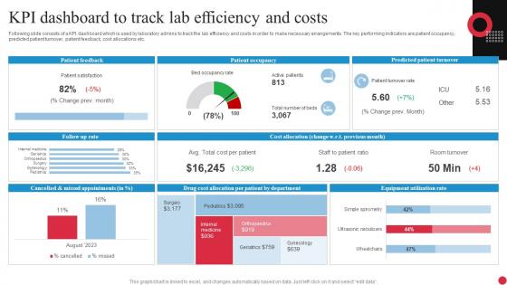
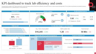
Following slide consists of a KPI dashboard which is used by laboratory admins to track the lab efficiency and costs in order to make necessary arrangements. The key performing indicators are patient occupancy, predicted patient turnover, patient feedback, cost allocations etc.
People who downloaded this PowerPoint presentation also viewed the following :
KPI Dashboard To Track Lab Efficiency And Costs with all 7 slides:
Use our KPI Dashboard To Track Lab Efficiency And Costs to effectively help you save your valuable time. They are readymade to fit into any presentation structure.





FAQs for KPI Dashboard To Track Lab
Focus on metrics that actually move the needle for your business goals first. Visual charts should make trends super obvious - no one wants to squint at spreadsheets. Real-time data is clutch, plus you need filters so people can dig into specifics when something looks off. Context matters too - add targets or benchmarks so the numbers actually tell a story. Honestly, I've seen so many overcomplicated dashboards that look impressive but collect dust because they're impossible to navigate. Keep everything on one screen if you can. Start with your top 5-7 KPIs and don't get fancy until those are dialed in.
Honestly, just connect your KPIs straight to what you're actually trying to accomplish - no clear connection means it's gotta go. What's driving your revenue or customer happiness right now? That's your focus. I've seen way too many dashboards packed with metrics that look cool but do absolutely nothing for the business (total waste). Try to pick leading indicators over the stuff that already happened - you want to predict what's coming. Oh, and here's what really works: ask your team what decisions they're making each week, then find maybe 3-5 metrics that'd actually help with those calls.
Start with clarity - make your most important KPIs pop visually and group similar stuff together. White space is your friend here, seriously. Don't try shoving everything on one screen (I've seen so many dashboards that look like a hot mess because of this). Colors should actually mean something - red for problems, green for good news, that sort of thing. Think about how people will actually use it too. If they need to dig deeper into the data, make those paths super obvious. Oh, and definitely test with real users first - what seems logical to you might totally confuse them.
Honestly, it depends on how fast your business moves. Sales and marketing stuff? Update daily - you need to catch problems while you can still fix them. Strategic metrics though, weekly's plenty. I learned this the hard way when we were updating everything daily and people just stopped checking because it was too much noise. Here's what actually works: ask yourself how fast you'd need to know if something went wrong. Match your updates to that speed. You'll dodge both outdated data and the dreaded dashboard burnout that makes everyone ignore your reports anyway.
Honestly, there's a bunch of ways you could go with this. Tableau and Power BI are like the gold standard - crazy powerful but yeah, they'll cost you. Google Data Studio is free though, works great if you're already using Google stuff. Don't sleep on Excel or Sheets either - I know it sounds basic but you can actually build some decent dashboards with pivot tables. There's also Klipfolio and Geckoboard which are made specifically for this kind of thing. Start by figuring out what data you need to pull from first, then just pick whatever connects to those sources easiest.
Your brain processes visuals way faster than numbers, so charts and gauges make KPI data actually make sense. Instead of staring at spreadsheet rows trying to figure out what's happening, you'll spot trends and problems instantly. A bright red gauge showing you're 20% behind target? That hits harder than some decimal buried in a cell. Line charts work great for trends, bar charts for comparing stuff. Oh, and keep your colors consistent - nothing's more annoying than a dashboard that looks like a rainbow threw up on it. People who hate data will actually pay attention when it looks good.
Focus on three things: data validation, reliable sources, and regular check-ups. Automated alerts for weird numbers or missing data are a lifesaver - seriously saves you from scrambling later. Pull from one solid source instead of mixing systems that contradict each other (learned that the hard way). Monthly spot-checks against real business results help catch issues. Oh, and document where each KPI actually comes from first. That's boring but necessary. Build these checks into your normal routine rather than doing damage control afterward.
So it really depends on what actually matters for your specific industry, you know? Retail companies are all about inventory turnover and conversion rates - makes sense. Manufacturing? They're obsessing over equipment downtime and quality control stuff. Healthcare is obviously tracking patient outcomes and wait times, which is a completely different beast than SaaS companies who live and die by churn rates. Financial services get super into risk management metrics (probably because they have to). The trick is figuring out what actually drives success in your space first. Then build your dashboard around those numbers that genuinely impact your bottom line.
Honestly, user feedback is what makes or breaks your dashboard. Ask stakeholders regularly what's working and what's total garbage. I've watched so many beautiful dashboards collect dust because they showed the wrong stuff or were way too busy. Watch which parts people actually use vs. what they completely skip over - that's your real data right there. Also notice what sections they're screenshotting for meetings. Set up feedback sessions every few months and don't get precious about changes. A dashboard that never evolves just becomes expensive wallpaper nobody looks at.
Honestly, KPI dashboards are game-changers because you can see what's actually happening in real-time instead of guessing. No more drowning in spreadsheets trying to figure out if that spike in March was good or bad. Pick your top 5-7 metrics that actually matter for your business. Having everything in one spot means your whole team stays on the same page. You'll catch problems way earlier and can pivot fast when things go sideways. My old boss used to love his Excel reports but dashboards would've saved him hours each week.
Honestly, interactivity changes everything. Your stakeholders can actually dig into the data instead of just looking at boring static charts. They'll click around, filter stuff, drill down into specifics - suddenly they're finding patterns you might've missed. Way better than those painful meetings where someone clicks through endless PowerPoint slides (we've all been there, right?). When people can explore on their own, they ask smarter questions. Just throw in filters for whatever metrics matter most to them. Oh, and those little hover tooltips are clutch for explaining what your KPIs actually mean.
Honestly, ditch the technical stuff completely - executives don't care about your methodology. Tell a story instead. Use simple visuals with red/yellow/green color coding because it just works. But here's the key: always start with "here's what this means for our goals" before diving into charts. Connect everything to what they actually understand - revenue, customer happiness, efficiency. I learned this the hard way after boring too many people with raw numbers. Create a narrative around your trends. Skip the jargon and focus on the "so what" factor. Trust me, you'll see way more engagement.
Don't cram everything onto one screen - it's overwhelming. Make sure your KPIs actually connect to what the business cares about. Skip the vanity metrics too; page views mean nothing if you're trying to track conversions. Bad data will kill you faster than anything else, so double-check those numbers are current and accurate. I've seen so many dashboards that are just way too complex. Nobody uses them! Test it with real people first - like, actually watch them try to use it. You can always add more features later, but start basic and build from there.
Just stick your KPI dashboard right into whatever tools your team actually lives in - Slack, email, your PM software, whatever. Most platforms have APIs that'll push the important stuff automatically. Honestly, I see so many companies build these beautiful dashboards that just sit there collecting dust because nobody remembers to check them. Way better to set up alerts that ping you when numbers hit certain thresholds. Short bursts work better than long reports anyway. Figure out where your team spends most of their time first, then see what integrations you can hook up there.
Honestly, mobile accessibility is a game changer for KPI dashboards. Your team can actually see what's happening when they're not glued to their computers - which is most of the time these days. Real-time decisions become possible, and people respond to problems way faster. The adoption rates go through the roof too because let's be real - if it's not mobile-friendly, people just ignore it. Limited screen space forces you to focus on what actually matters instead of cramming everything in. Just make sure you test on real phones, not just browser resize. Trust me on that one.
-
Informative and engaging! I really like the design and quality of the slides.
-
The PPTs are extremely simple to modify. Thank you for providing the slides that are ready to be used. They assist me in saving a lot of time.