


KPI Dashboard To Track Performance Of Order To Cash Process




Try Before you Buy Download Free Sample Product
 Impress Your
 Audience
 100%
100% Editable
 Save Hours
 of Time


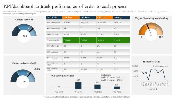
This slide depicts a dashboard for business managers to keep the track of performance order to cash process for effective decision making. The key elements are orders received, cash receivables, order to cash key performance indicators, days of inventory outstanding etc.
People who downloaded this PowerPoint presentation also viewed the following :
KPI Dashboard To Track Performance Of Order To Cash Process with all 7 slides:
Use our KPI Dashboard To Track Performance Of Order To Cash Process to effectively help you save your valuable time. They are readymade to fit into any presentation structure.





FAQs for KPI Dashboard To Track Performance Of Order
Pick your top 5-7 metrics that actually move the needle - don't dump everything on there just because the data exists. Make sure it loads quickly (slow dashboards are the worst). Your team should understand what they're looking at instantly, so group similar stuff together and use visuals that make sense. Real-time data is clutch, plus everyone's gonna check this on their phone anyway so it better work on mobile. Oh, and definitely include targets or benchmarks - otherwise people are just staring at random numbers wondering if 47% conversion is amazing or terrible. Context is everything with these things.
Dude, visuals are a game changer for KPIs. Red vs green color coding? You'll know what's broken instantly. Charts show trends way better than staring at endless spreadsheet rows - honestly saved me so many headaches. Progress bars are clutch because nobody wants to calculate percentages in their head. Icons help people focus on the important stuff first. Just don't go crazy with fancy graphics everywhere. I learned that the hard way when my dashboard looked like a Vegas casino and nobody could find anything.
Depends what field you're in, but here's the pattern I notice: retail obsesses over conversion rates and average order value. SaaS? Monthly recurring revenue and churn rate, obviously. Manufacturing tracks OEE and defect rates like crazy. Healthcare's kind of nuts - they monitor patient satisfaction scores, readmission rates, pretty much everything you can think of. Financial services watch loan approval rates and customer acquisition costs. Marketing teams everywhere are glued to CTR and ROAS numbers. Honestly though, don't go overboard. Pick maybe 5-7 KPIs that'll actually help you make real decisions, not just ones that sound impressive in meetings.
Honestly, daily or weekly updates work best for most dashboards. Sales data and web traffic? Yeah, those need daily refreshes since things can shift fast. But your bigger strategic stuff doesn't need constant babysitting - weekly or monthly is totally fine. I've watched people go crazy checking metrics every hour and it just creates chaos. Match your refresh schedule to how fast you can actually do something about the data. Like, what's the point of seeing bad numbers if you can't fix them till next week anyway? Start weekly and see what sticks.
Tableau and Power BI are the big names but honestly they're probably overkill unless you need all the bells and whistles. Google Data Studio is free and works great if you're already using Google stuff. I know it sounds old school, but some of the best dashboards I've seen are just really well-made Excel ones - don't sleep on that. Klipfolio and Geckoboard look super clean right out of the gate if you want something fancy. My advice? Start with whatever your team already knows how to use, then move up if you need more features later.
Honestly, start with what actually matters to your business - don't get caught up tracking random stuff just because it looks cool. Pick 5-7 metrics max per view, otherwise it gets overwhelming. Most tools let you drag widgets around and change how things look, which is pretty straightforward. I'd organize by department so people aren't hunting for their numbers. The real trick is building backwards from your biggest business question - like if you're worried about churn, focus there first. Set up alerts for weird spikes or drops. Your team should glance at it and immediately know if something's off.
Honestly, data visualization is what saves your KPI dashboard from being a total mess of numbers nobody wants to look at. Your brain processes visuals way faster than text - like, would you rather stare at spreadsheet rows or instantly spot that concerning red spike? Charts and graphs let you catch trends and weird outliers right away. I always tell people to keep their visuals super simple though. Pick the right chart type for what you're measuring, and make sure anyone walking by can figure out what's happening without squinting at tiny labels or asking questions.
Think of it this way - execs want the big picture stuff. Revenue trends, customer satisfaction, whether you're hitting those major goals. They don't care about the nitty-gritty that stresses you out daily. Middle managers need more meat though - team performance, project updates, budget stuff. Front-line managers? Give them real-time data they can actually do something with right now. Daily sales, inventory, productivity metrics. Honestly, the trick is just asking each group what decisions they're making every day, then work backwards from there. Match the detail level to what they can control.
Honestly, treat your KPIs like you're telling a story, not just throwing data at people. Give them context first - what actually happened and why they should care. Charts and color coding are your best friends here, makes everything way easier to scan quickly. I swear, half the dashboards I see look like someone just copy-pasted Excel everywhere. Stick to maybe 5-7 metrics per screen tops. The key thing? Always include the "so what" factor - like what do they actually need to DO with this info. People should leave knowing what's broken, what's crushing it, and their next steps.
Connect your dashboard to whatever you've got - databases, data warehouses, even old CSV files work. Tableau and Power BI make this pretty straightforward, though honestly Google Data Studio isn't bad either if you're on a budget. Just make sure your historical data matches your current KPI format first. Otherwise you'll be stuck cleaning messy data for hours (learned this the hard way). Once it's hooked up, you can build those year-over-year comparisons and spot seasonal trends. Start with just one dataset to test things out before going crazy with everything.
Honestly, just track what matters for survival: revenue, customer acquisition cost, monthly recurring revenue, and how much runway you've got left. That's it. I swear, half the startups I know are obsessing over Instagram followers while their conversion rates are trash. Your dashboard should answer three things: are we making money, spending smart, and how long before we're broke? Don't overcomplicate it - maybe 5 key metrics tops. You can get fancy later, but right now you need to know what's actually working and what isn't.
Start with clean data and build validation checks right into your workflow. Set up alerts for weird spikes - catching errors early will save you tons of time later. Your data sources need to be solid, and everyone should use the same definitions for each KPI (otherwise you'll get totally different numbers). I do monthly spot-checks where I compare calculations back to raw data - boring but necessary. Document how you calculate everything too. When someone inevitably questions your numbers, you can quickly trace back and prove it's right instead of scrambling around trying to remember what you did.
Honestly, the biggest thing is making sure your dashboards connect to what your team actually does day-to-day. Like, don't track stuff they can't even influence - that's just frustrating for everyone. I'd definitely add some visual elements too... progress bars, colors, maybe celebrate when people hit their numbers. Oh and keep the data fresh! Nothing kills credibility faster than outdated metrics. But here's what really works: just ask your team what they want to track. They'll tell you exactly which numbers would help them do their jobs better. Clean design matters too, obviously.
So basically you want to add forecasting stuff to your current dashboard instead of just showing what already happened. Most dashboard tools make this pretty straightforward now - you can throw in trend lines and predictive charts without too much hassle. The trick is figuring out which metrics actually tell you something useful about the future. Like customer acquisition costs probably give you a decent read on next quarter's revenue, or employee satisfaction might hint at turnover rates. I'd start simple with basic trend lines, then get fancier with forecasting models once you see what works.
Honestly? Getting everyone to agree on which metrics matter is brutal - every department thinks their stuff is crucial. Then you've got all these systems that refuse to talk to each other, so pulling data becomes this whole nightmare. Your data quality will probably suck at first too (classic garbage in, garbage out situation). Half your time gets wasted debating what "success" even means. Oh, and here's what always happens - someone builds this gorgeous dashboard that loads slower than dial-up, so nobody bothers using it. My advice? Start with maybe 5 key metrics that people actually give a damn about. You can always add more later.
-
Slideteam offers pocket-friendly products. As a college student this is a really necessary thing to look at while paying for something.
-
SlideTeam’s pool of 2Million+ PPTs has really benefited my team, everyone from the IT department to HR. We are lucky to have crossed ways with them.