


KPI Dashboard For Modernizing Restaurant Business




Try Before you Buy Download Free Sample Product
 Impress Your
 Audience
 100%
100% Editable
 Save Hours
 of Time


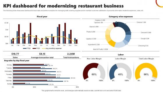
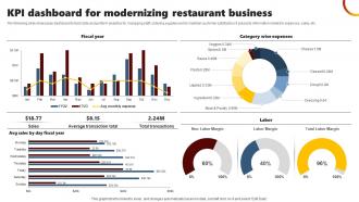
The following slide showcases dashboard to track data and perform analytics for managing staff, ordering supplies and to maintain customer satisfaction. It presents information related to expenses, sales, etc.
People who downloaded this PowerPoint presentation also viewed the following :
KPI Dashboard For Modernizing Restaurant Business with all 7 slides:
Use our KPI Dashboard For Modernizing Restaurant Business to effectively help you save your valuable time. They are readymade to fit into any presentation structure.






FAQs for KPI Dashboard For
It's totally dependent on what you're doing, but here's the thing - most people overcomplicate this. Retail? Focus on conversion rates, average order value, inventory turnover. SaaS is all about MRR, churn, and what it costs to get customers. Manufacturing companies should track OEE, defect rates, on-time delivery. I swear half the dashboards I see are completely useless because they're trying to show every metric under the sun. Pick maybe 5-7 things that actually move the needle and get your leadership team fired up in meetings. You can always add more stuff later, but don't start there.
Visual hierarchy is everything - put your most critical stuff at the top where people look first. Red/yellow/green color coding is honestly foolproof for showing performance status. Keep it clean though, nobody wants to be bombarded with a million charts and numbers. Simple visuals work best. Add little notes explaining what trends actually mean because stakeholders want quick context, not puzzles to solve. Comparisons are huge - "vs last quarter" or benchmarks help people grasp the real impact. If you can make it interactive, do it. People love drilling down when something catches their eye.
Tableau and Power BI are your best bets if you want something really powerful - both let you dig deep into data and make those fancy charts that impress higher-ups. Google Data Studio works great for simpler stuff and won't cost you anything. Excel's actually not bad either if you're just doing basic dashboards with pivot tables. I've been seeing some cool dashboard setups in Notion recently too, which is kinda random but whatever works, right? Just pick something that matches your team's tech skills. You can always start basic and level up later when things get more complicated.
Weekly updates work for most people, but honestly it depends on what you're tracking. Some stuff needs daily attention if it's moving fast. I made the mistake of checking ours monthly once and we completely missed when our conversion rates tanked. Real-time is overkill unless you're in crisis mode or something. Start weekly and see how it feels - if your numbers don't change much, maybe go longer. But if things are shifting quickly, you'll want to check more often. You'll figure out what works pretty fast.
Keep it simple - 5-7 metrics max. Otherwise people just stare at it and do nothing. Skip the vanity stuff that looks cool but doesn't actually help anyone make decisions. Your data needs to be fresh too - nobody wants yesterday's numbers on today's problems. Honestly, I see so many teams go overboard with fancy charts when a basic number would work fine. We love our visualizations but sometimes they're just... extra. Test it first! Show it to whoever's gonna use it and ask "what would you do differently after seeing this?" If they shrug, you've got more work to do.
Honestly, most dashboard tools can handle this pretty easily - Tableau, Power BI, even Google Data Studio will connect to your CRM and pull live data. But here's the thing: not everything needs to update in real-time. Focus on stuff that actually changes hourly and affects decisions you're making today - like web traffic or sales conversions. System performance metrics too if that's your jam. Set up refresh intervals that make sense for each source. I'd start with maybe 3-4 critical KPIs first and test those connections. Last thing you want is broken feeds when your boss is breathing down your neck.
So for dashboards, put your biggest metrics right up top - don't make people hunt for the important stuff. Keep your colors consistent and charts super simple. I'm honestly amazed how many companies still make dashboards that look terrible on phones, so definitely test that. You'll want drill-down options so people can dig deeper, plus filters for dates and departments. But here's the thing - resist cramming everything onto one screen! Pick your top 5-7 KPIs first, then build around those. Clean beats cluttered every time.
Honestly, work backwards from what your company actually wants to achieve. If they're pushing for 20% better customer retention, track churn rate and satisfaction scores - not some random stuff that's just easy to pull. I've seen way too many dashboards that are basically data dumps with zero strategy behind them. Put your biggest strategic metrics right at the top, then layer in the operational details underneath. The key thing is making sure every single KPI connects to something leadership genuinely cares about. You should be able to draw that line super clearly.
Honestly, data visualization is what makes KPI dashboards actually work. Without charts and graphs, you're just staring at endless spreadsheet rows - good luck finding patterns in that mess. Visual stuff like bar charts and line graphs let you spot trends immediately. Your stakeholders will thank you too since nobody wants to decode raw data tables in meetings. I learned this the hard way when I once presented just numbers and watched everyone's attention disappear. Pick the right visual for each metric though - bar charts for comparing things, line graphs for trends, those gauge things for hitting targets. Makes everything way more digestible.
Honestly, just make separate dashboards for each group - they need totally different stuff. Executives want the big picture metrics like revenue growth and market trends, not all the detailed operational crap that'll just confuse them. Your operational folks are the opposite though. They need granular data they can actually do something with - production numbers, quality metrics, response times. Most tools let you set up different views based on roles anyway. I'd start by literally asking each team what numbers they look at when making decisions. Way easier than guessing what they want.
Dude, mobile dashboards are seriously clutch for remote teams. Your people can pull up key metrics from literally anywhere - coffee shops, home, whatever. Real-time data means nobody's out of the loop even across different time zones. Honestly, I love getting those urgent alerts on my phone way more than missing them at my computer. The small screen actually helps too since you can't cram a million charts on there. Forces you to pick what actually matters, you know? I'd start by figuring out which 3-5 metrics your team can't live without checking.
So basically, dig into your dashboard's old data to find patterns - seasonal stuff, growth trends, how different metrics connect. Most tools nowadays have decent forecasting features built right in, which is clutch. I'd focus on your 3-4 best predictive KPIs first (don't overwhelm yourself). Set up rolling averages and compare year-over-year to cut through the noise. Then create forecast views that project those trends out by quarters. Honestly, the trend lines do most of the work for you once you get it set up right.
Honestly, start simple with just NPS (shows if people would recommend you), CSAT scores right after they interact with support, and maybe churn rate. Customer Effort Score is solid too - basically measures if you're making things unnecessarily complicated for them. You could also look at support ticket resolution times, though that gets into the weeds a bit. First-call resolution is clutch if you have phone support. Repeat purchases are probably my favorite metric though - people vote with their wallets, you know? Don't try tracking all this stuff at once or you'll go crazy. Pick 2-3 and build from there.
Start with clean data and set up validation rules to catch weird stuff before it reaches your dashboard. Make sure everyone's defining metrics the same way - can't tell you how many times I've seen sales and finance argue about "revenue" when they're literally measuring different things! Run monthly spot-checks on your KPIs against source systems. Document where your data comes from and how you're transforming it so people can actually trace the numbers. Oh, and create a way for users to flag when something looks wrong. Trust me, they'll be the first to notice.
So tons of companies crush it with KPI dashboards. Netflix watches viewing data in real-time to recommend shows and pick renewals. Starbucks managers get location dashboards for tracking store performance and inventory - super helpful for quick decisions. Healthcare's wild too - Mayo Clinic uses patient flow dashboards to cut wait times. Toyota's production dashboards catch bottlenecks instantly, which honestly blows my mind how fast they can adjust. Oh, and definitely check out industry templates when you're building yours. Way easier than starting from scratch and making all the same mistakes everyone else already figured out.
-
The templates you provide are great! They have saved me tons of time and made my presentations come alive. Thank you for this awesome product. Keep up the good work!
-
Fantastic collection of visually appealing PowerPoint templates. They certainly uplift the look of the presentation.