Strategic PMO Dashboard For Managing Project Status

Rating:
80%
Strategic PMO Dashboard For Managing Project Status
Slide 1 of 7
Favourites Favourites

Try Before you Buy Download Free Sample Product

Audience Impress Your
Audience
Editable 100%
Editable
Time Save Hours
of Time
The Biggest Sale is ending soon in
0
0
:
0
0
:
0
0
Rating:
80%
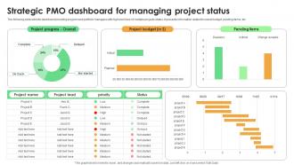
The following slide exhibits dashboard providing program and portfolio managers with high level view of multiple projects status. It presents information related to overall budget, pending items, etc. Introducing our Strategic PMO Dashboard For Managing Project Status set of slides. The topics discussed in these slides are Project Progress, Project Budget, Pending Items. This is an immediately available PowerPoint presentation that can be conveniently customized. Download it and convince your audience.

FAQs for Strategic PMO Dashboard For

For your PMO dashboard, start with the basics: project health, budget variance, resource utilization, and timeline stuff. Red/yellow/green indicators work way better than spreadsheets - executives hate digging through data. Risk ratings are clutch because leadership always freaks out about those. Portfolio ROI matters too, obviously. Oh, and strategic alignment scores - though honestly, half the time those feel made up. Benefits realization is another big one since everyone wants to see actual value delivery. Keep the visuals clean and simple. Once you've got these running, just listen to what questions come up in meetings and add metrics for those. That's usually where the real insights are anyway.

Honestly, most teams have no clue how their projects actually tie back to company goals. A Strategic PMO Dashboard fixes that mess - you get real-time visibility into which initiatives are actually moving important metrics vs. just eating budget. Everyone from PMs to execs can finally see those connections clearly. Short sentences work. Longer ones help you catch early warning signs when stuff starts going sideways. Set it up to track maybe 3-5 key strategic KPIs and you'll instantly know which projects need more resources and which ones you should probably just kill. Trust me, it's way better than flying blind.

So for PMO dashboards, Power BI and Tableau are your best bets if you want real analytics power - I've been using Power BI a ton lately and it's honestly pretty great. Smartsheet and Monday.com work too if you want something simpler with decent built-in dashboards. Excel's fine if you're being cheap, but trust me, it gets messy quick when you need real-time stuff. Oh, and definitely figure out what metrics you actually care about first. Then just pick whatever plays nice with your current project tools. Makes the whole thing way easier.

Dude, visuals are everything for PMO dashboards. Color-code your project health status - green, yellow, red - executives eat that stuff up. Progress bars show completion rates instantly. Heat maps work great for resource allocation too. The whole point is making complex data actually readable instead of those soul-crushing spreadsheets nobody opens. Let people click into details when they need to, but keep the main view simple. Oh, and stick to the same colors meaning the same things across everything. Consistency matters or people get confused and just ignore the whole thing.

Honestly, data integration is what separates useful dashboards from those fancy-looking ones that don't actually help anyone. You need to pull info from your project tools, financial systems, resource planning - all of it. Without that, you're stuck with bits and pieces scattered everywhere (trust me, it's a nightmare). The cool part is when everything flows together automatically. Suddenly you can see what's actually happening across your whole portfolio. My advice? Figure out your main data sources first, then get decent integration tools. Don't cheap out on this part - it'll save you so much headache later.

Honestly, just talk to the people who'll actually use it first. Send them a quick survey or grab coffee and ask what they care about - what's driving them crazy right now, how they like seeing data, daily reports vs weekly whatever. I've watched so many beautiful dashboards just collect dust because nobody bothered asking users what they wanted. Make some rough mockups based on what you hear, then test those with your power users before going all-out building something fancy. Way better to iterate early than realize later you built the wrong thing entirely.

Oh man, data quality will make you want to pull your hair out. Different teams track stuff completely differently and it's a mess to clean up. Executives are the worst though - they want dashboards for everything but refuse to change their workflows. Classic, right? Pick KPIs that actually matter, not just numbers that look impressive. Honestly, I'd start super small. Grab clean data from maybe 2-3 projects, show some quick wins, then slowly add more. Don't try to boil the ocean on day one or you'll burn out fast.

Get automated data feeds set up first - that's gonna save you so much headache. Connect directly to your project management tools and financial systems so everything flows without manual entry (seriously, that's where things get messy fast). Build validation checks that catch missing or weird data right away. Oh, and assign someone to actually own each data source - can't just hope it magically stays clean. Regular audits are boring but necessary. Map out where all your data comes from and tackle the riskiest stuff first. Your dashboard's worthless if garbage is flowing into it.

For your portfolio, definitely start with the basics: schedule variance, budget variance, scope creep, and resource utilization. Those four will tell you if things are going sideways fast. Risk mitigation status is huge too - I've seen too many "green" projects crash because nobody was watching the warning signs. Quality metrics like defect rates matter if that's relevant to your work. Oh, and don't sleep on stakeholder satisfaction scores. Sounds fluffy but trust me, unhappy stakeholders kill projects even when everything else looks perfect. Build from those core ones based on what your execs actually care about.

Your Strategic PMO Dashboard basically gives you x-ray vision into every project happening right now. No more waiting around for boring status meetings or hunting through endless spreadsheets. You'll instantly see budget problems, timeline issues, and resource conflicts before they blow up in your face. Game changer, honestly. Focus on tracking the metrics that actually matter to your business goals first - that's where you'll notice the biggest difference in making smart decisions. Plus you can shift resources around quickly and decide which projects to keep or axe based on real data instead of gut feelings.

So basically, dashboards show you what's going wrong in real time instead of finding out when it's too late. Heat maps and trending stuff help you see patterns. The big thing though? Those risks just sitting there with no plan - that's where projects usually die. You can track who owns what risks and whether fixes are actually working. Portfolio rollups keep executives happy (always important lol). Set alerts for the scary stuff so nothing gets missed. Oh, and you'll spot new problems early through health metrics before they become real headaches.

Different project types need totally different dashboard setups. Agile teams want sprint burndowns and velocity tracking. Waterfall? Focus on milestones and budget vs actual spend. Infrastructure projects care more about resource utilization. The worst thing you can do is cramming everything into one view - just creates a mess. Ask each team what 3-5 metrics they actually check every day, then work backwards from there. I learned this the hard way when I built this "comprehensive" dashboard nobody ever looked at. People will only use dashboards that show what matters to them, not what we think should matter.

Honestly, collaboration transforms your PMO dashboard from something people ignore into something they actually use. Your team can comment directly on metrics and tag each other about problems. Real-time updates mean way better data quality. No more drowning in email threads either - which is honestly a godsend. People engage with it instead of that weekly glance-and-forget routine. The context everyone adds through comments? Game changer. Makes the numbers actually tell a story. Start with commenting on key metrics first. You'll see what I mean pretty quickly.

So predictive analytics with AI is seriously worth watching - the machine learning stuff can actually spot resource issues before they hit, which blows my mind when I see demos. Real-time collaboration features are everywhere now too. Mobile dashboards are basically required since execs want everything on their phones. Oh, and voice reporting is getting weird but surprisingly useful? The whole shift is moving away from just reporting what happened to actually predicting what's coming. I'd honestly start poking around at vendors now before your stakeholders inevitably start demanding this stuff.

So for remote PMO dashboards, cloud access is obviously non-negotiable - everyone needs real-time updates without refreshing constantly. Add way more detailed status indicators since you can't just peek over someone's shoulder anymore. Video call links right in the project tiles are clutch, plus comment threads on milestones help replace those random hallway conversations. Timezone displays matter too if you've got global people. Honestly, the biggest thing is surveying your team first about what visibility gaps they're actually hitting. Remote work murders those casual check-ins, so communication has to be stupidly easy.

Ratings and Reviews

80% of 100
Review Form
Write a review
Most Relevant Reviews
  1. 80%

    by Dennis Stone

    Thank you for showering me with discounts every time I was reluctant to make the purchase. 
  2. 80%

    by Deangelo Hunt

    Enough space for editing and adding your own content.

2 Item(s)

per page: