


Dashboard Showcasing Portfolio Fund Investment Analysis Ppt Show Graphics Download




Try Before you Buy Download Free Sample Product
 Impress Your
 Audience
 100%
100% Editable
 Save Hours
 of Time


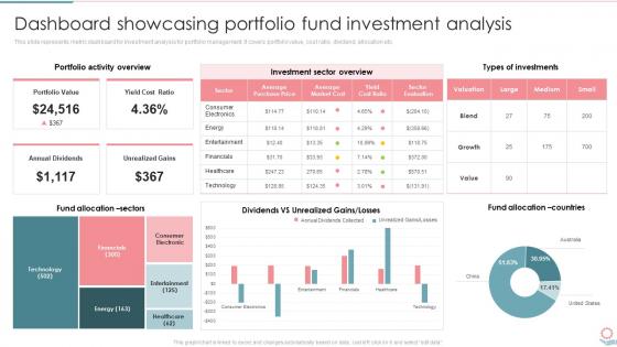
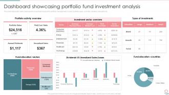
This slide represents metric dashboard for investment analysis for portfolio management. It covers portfolio value, cost ratio, dividend, allocation etc.
People who downloaded this PowerPoint presentation also viewed the following :
Dashboard Showcasing Portfolio Fund Investment Analysis Ppt Show Graphics Download with all 7 slides:
Use our Dashboard Showcasing Portfolio Fund Investment Analysis Ppt Show Graphics Download to effectively help you save your valuable time. They are readymade to fit into any presentation structure.





FAQs for Dashboard Showcasing Portfolio Fund Investment Analysis Ppt
Honestly, start with figuring out what 3 questions your audience actually cares about - everything else is just noise. Put your biggest metrics right up front where people can't miss them. I'd skip all those flashy animations that look cool but distract from the actual data. Colors should mean something, not just be random rainbow vomit. Make your text big enough so the person in the back row can read it (learned this the hard way). Keep your formatting consistent and always include context like dates or benchmarks. Otherwise people just stare at numbers wondering what they're supposed to think.
Think newspaper layout but for your data. The main headline (your biggest KPI) grabs attention first. Then you've got your subheadings for trends, followed by all the detailed stuff. Size and color are your best friends here - bold the important numbers, keep secondary info small and gray. Don't make everything fight for attention like those awful dashboards we've all seen! Short sentences work. Longer ones should actually flow naturally when you read them. Pick one key message first, then build everything else around it. Your audience's eyes will follow exactly where you want them to go.
Color psychology makes a huge difference in dashboards. Users see red and think "oh crap, something's broken" - perfect for alerts but terrible for regular metrics. Green feels safe, so it's great for good news or growth trends. Blue's pretty neutral and trustworthy. I've seen people freak out over totally normal data just because someone used alarming colors! Thing is, people already have these color associations baked in, so don't fight against them. Quick tip: test your colors with real users first. You'll be surprised how differently they might read your data.
Honestly, start by just asking each team what they actually need to make decisions - that'll save you so much time. Sales wants revenue trends and pipeline stuff right up front. Executives? They just want the high-level KPIs and strategic overview. Operations teams are totally different - they're all about process metrics and finding bottlenecks. Some people need to drill down into details while others just want the summary. Most dashboard tools let you set up different views and permissions for each role anyway. The key is matching the data level to what each group actually uses.
Honestly, Tableau and Power BI are your best bets for most stuff - super intuitive for business dashboards. D3.js is amazing if you want total control, but man, it'll eat up your weekends learning it. Python people swear by Plotly Dash and Streamlit (I'm partial to Streamlit myself). Google Data Studio works fine for basic charts and it's free, which is nice. Really comes down to your data setup and how much you want to code. I'd go Power BI if you're already using Microsoft everything, otherwise Tableau's pretty bulletproof.
Honestly, visuals just make data click way faster for people. Your brain processes patterns instantly instead of wrestling with spreadsheet numbers. Think of charts like subtitles for data - suddenly everything makes sense. People spot trends and weird outliers in seconds rather than doing mental math forever. The trick? Match your visual to what you're actually trying to show. Bar charts work great for comparisons, line graphs for trends over time... you get it. I always start backwards - figure out what decision I want them to make, then pick whatever visual gets them there fastest. Works every time.
Honestly, the worst thing you can do is cram everything onto one screen - it's overwhelming as hell. Put your most important metrics right up front where people can't miss them. Cluttered layouts with tiny fonts? Skip it. Twenty random charts that don't connect? Also skip. Simple visualizations usually work better than fancy ones anyway. Don't make users dig around hunting for key info. Oh, and definitely test it with actual people first - I learned this the hard way when something I thought was super obvious left everyone confused. Those flashy animations might look cool but they're often just distracting.
Honestly, keep it simple - stick to 3-5 metrics max per dashboard or you'll drown in data. Real-time feeds are clutch, and make sure you're tracking stuff that actually matters to your business goals (not just numbers that look impressive). Color coding and arrows help you catch issues super quick. Oh, and set up alerts for when things go sideways - trust me on this one. The dashboards I've seen that work best? They're the ones teams actually review together regularly and take action on. Otherwise you're just staring at pretty charts that don't move the needle.
So basically you want clean layouts where stuff makes sense - group related things together and don't make people think too hard. Put your biggest metrics right at the top where everyone can see them. Quick search and filters are huge because honestly, who wants to dig through a million menus? Keep your colors and icons consistent throughout (I learned this the hard way). If someone needs a tutorial just to figure out your dashboard, you've overcomplicated it. Oh, and here's what really works - figure out the 3 things your users do most and build everything around those. Navigation should feel obvious, not like solving a puzzle.
APIs and webhooks are your best bet for pulling live data into your dashboard. Tableau and Power BI handle this pretty well, but honestly, don't go crazy with refresh rates - I've seen people crash their whole system trying to update every second when hourly would've been fine. Figure out what actually needs real-time updates first. Your sales numbers? Probably. That quarterly report metric? Definitely not. Start with just one or two data sources and test how stable the connection is. Once that's solid, then you can add more. Oh, and make sure your data pipeline won't buckle under the load before you flip the switch.
Dude, mobile responsiveness is huge for dashboards. Your users need to check data on the go, and if it's clunky on their phone, they'll just stop using it altogether. I've watched entire teams ditch dashboards because scrolling around was such a nightmare. Touch controls need to work smoothly. Key metrics have to stay readable on small screens. Navigation can't be a pain - honestly, this stuff should be obvious but you'd be surprised how many companies mess it up. Test everything on actual devices before you launch. If people can't use it mobile, you're basically cutting your audience in half.
Honestly, good animations totally change how people interact with your dashboard. They guide attention to the important stuff instead of overwhelming users when data refreshes. Subtle is key though - gentle fades work way better than crazy bouncing charts (learned that the hard way). Use them when metrics change or you're switching views so people can actually follow what's happening. I'd start with basic hover effects first, maybe some smooth loading transitions. The worst dashboards just throw new info at you without any warning. Makes such a difference when done right.
Start with the big picture stuff, then let people dig deeper if they want. Group similar metrics together and use size/color to show what's most important. Honestly? I've seen way too many dashboards that try to cram everything in - it's a mess. Keep your main view to maybe 5-7 key things max. Skip the corporate jargon for clear labels people actually understand. Different user types probably need different views too. Here's what works: figure out what decisions your users are actually making first. Then build the dashboard around that. Less really is more with this stuff.
Dude, get feedback constantly - like after every big change, not just when you're "done." Talk to real users, not your boss or whatever. Ask them what's confusing or straight up broken. I've watched so many dashboards crash and burn because teams thought they knew better than their actual users (spoiler: they didn't). Focus on whether people can actually use the thing first. Pretty colors come later. Quick surveys work great, or just hop on a call with someone for 15 minutes. Even screenshot feedback in Slack is better than nothing. Small tweaks as you go beats massive rewrites later - trust me on this one.
Honestly, dashboards are a game changer - they show your important metrics in real time so you can actually see what's happening with your business. I've seen companies in retail, healthcare, manufacturing, you name it, all use them to catch problems early instead of scrambling later. The best part? You can compare how you're doing now vs last month or see which departments are killing it. Way better than just guessing based on how things "feel." Oh and don't go crazy at first - pick your top 3-5 numbers that actually matter and start there.
-
The visual appeal of the templates is just unparalleled! I was so worried about the design of my presentation but SlideTeam made it all so easy.
-
I was really impressed with the presentation I created with their templates. I’ll be using their services moving forward.