


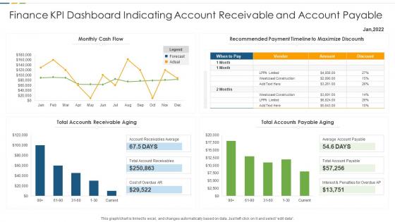
Finance KPI Dashboard Indicating Account Receivable And Account Payable




Try Before you Buy Download Free Sample Product
 Impress Your
 Audience
 100%
100% Editable
 Save Hours
 of Time


Our Finance KPI Dashboard Indicating Account Receivable And Account Payable are topically designed to provide an attractive backdrop to any subject. Use them to look like a presentation pro.
People who downloaded this PowerPoint presentation also viewed the following :
Finance KPI Dashboard Indicating Account Receivable And Account Payable with all 7 slides:
Use our Finance KPI Dashboard Indicating Account Receivable And Account Payable to effectively help you save your valuable time. They are readymade to fit into any presentation structure.





FAQs for Finance KPI Dashboard Indicating Account Receivable
Start with revenue, profit margins, cash flow, and expenses - that's your core health check right there. Accounts receivable aging is clutch too because chasing payments gets old fast. Growth metrics matter, so track revenue growth rate. If you've got debt, throw in debt-to-equity ratio. Customer acquisition cost and lifetime value are super valuable for customer-focused businesses. Honestly though, cap it at 6-8 metrics tops. Any more than that and you'll just end up with dashboard paralysis. Pick what actually helps you make decisions, not what looks impressive.
Honestly, getting a finance KPI dashboard was one of the smartest moves we made. You get instant access to cash flow and profitability data instead of waiting forever for monthly reports. Executive meetings became way less painful - no more frantically searching through Excel files when someone asks a question. When numbers look weird, you can dig into the details right away. Though I'll warn you, it's kinda addictive checking the metrics constantly at first. Start simple with maybe 5-6 KPIs that actually matter for decisions, then expand later.
Power BI and Tableau are your best bets if you need something heavy-duty for complex financial stuff. Excel's honestly still great for smaller datasets - everyone knows how to use it anyway. Google Data Studio won't cost you anything and works fine for basic dashboards, though it's pretty limited. I've actually seen people build some crazy impressive things just using Excel pivot tables and charts (my old boss was obsessed with this approach). Don't overthink it though. Start with whatever you can access now and upgrade later when you run into walls.
I'd go monthly for most financial stuff. Cash flow and revenue though? Update those daily if you can swing it - super helpful when things get tight. ROI and debt ratios are fine quarterly since they don't swing around much anyway. Honestly just pick monthly as your baseline, then see what your team actually uses. There's literally zero point updating metrics that sit there gathering dust. Oh, and if you're in retail or something crazy fast-paced, you'll probably want daily updates on way more things.
So basically, leading KPIs are like your early warning system - stuff like sales pipeline data or customer acquisition costs that hint at what's coming down the road. Lagging ones? That's your quarterly revenue, profit margins, all the results that already happened. You definitely want both on your dashboard (honestly, I see too many people obsessing over just the backward-looking stuff). Leading indicators let you actually do something about problems before they hit. Otherwise you're just documenting the disaster after it's over, which isn't super helpful.
Dude, charts and graphs are total game-changers for financial stuff. You can spot trends instantly instead of squinting at endless spreadsheets. Heat maps show you which departments are bleeding money. I actually look forward to our monthly reviews now (weird, right?). Bar charts work great for revenue - you'll see if things are tanking or climbing without doing math. Line graphs are perfect for expenses over time too. The visual stuff helps you ask smarter questions like "what the hell happened in March?" Trust me, start simple and you won't go back to those boring number dumps.
Dude, bad data will absolutely wreck you. I've seen it happen - one wrong number and suddenly you're making terrible decisions based on garbage info. Cash flow, profits, budget stuff? That's not where you want surprises. Small errors turn into massive headaches fast. Honestly, most people skip the boring validation part, but you gotta check your sources constantly. Set up some basic checks if possible. The whole dashboard becomes useless if you can't trust what you're looking at. Trust me on this one.
Honestly, most people mess this up by cramming irrelevant metrics everywhere. Look at what your industry actually cares about first. SaaS? Track MRR, churn, and customer acquisition costs - forget inventory stuff that doesn't even apply to you. Retail needs same-store sales growth and inventory metrics instead. I'd start by gutting your current dashboard of useless KPIs (you probably have way too many). Research what your competitors watch, then pick maybe 5-7 that actually help you make decisions. Put those front and center. The rest is just noise that'll distract you from what matters.
Ugh, the worst thing people do is cram like 20 different charts on one screen. Nobody knows what to look at first! Skip the vanity metrics too - they look cool but won't help you make actual decisions. I learned this the hard way at my last job. Focus on KPIs that connect to real actions your team can take. Different audiences need different views - what works for executives definitely won't work for analysts. Test it with actual users before you launch. Trust me, a simple dashboard that people actually use beats a fancy one that sits there collecting dust.
So basically, these dashboards track all your compliance metrics in real-time instead of you scrambling for data every month. Game changer during audit season, trust me. Set up alerts when your ratios get wonky, monitor cash flows, keep your audit trails clean - all automated. When regulators show up, you can pull standardized reports instantly plus all your historical data is right there. Oh and start with whatever KPIs your specific regulators actually want to see first. Don't get distracted building fancy charts for metrics that don't matter yet.
Pick 3-4 metrics that actually relate to what you do every day. Revenue growth is obvious - shows if you're moving the needle. Gross margin tells you how well you're delivering without burning money. Cash flow though? That's the real killer - I've watched profitable companies die because they couldn't pay bills. Customer acquisition cost versus lifetime value helps you figure out if your marketing spend makes sense or if you're just throwing money away. Oh, and budget variance keeps you honest about spending. Don't overthink it - just grab the ones that connect most to your actual job.
Hook your dashboard up to whatever historical data you've got - ERP, accounting software, data warehouse, whatever. Tableau and Power BI handle this stuff pretty easily once you set up the connections. Here's the thing though: make sure your old data actually matches your current setup. I've seen people mess this up with mismatched account codes and their trends look completely wrong. Pull about 12-24 months back for decent patterns. Monthly or quarterly views work best - daily gets too noisy. Oh, and set those refreshes to run automatically so you're not manually updating everything like it's 2005.
Dude, having real-time data is honestly a total game-changer for finance dashboards. You'll catch budget issues and cash flow problems as they're happening instead of finding out weeks later when it's too late to fix anything. I used to hate waiting for those monthly reports - by then you're already screwed if something went wrong. Quick adjustments become actually possible when you can see expenses creeping up or revenue dipping right away. Set up some alerts for the big stuff so you don't have to constantly watch everything. Way better than those static reports we dealt with before.
Honestly, these dashboards are game-changers for budget tracking. You'll see your actual spend vs budget in real-time, so catching variances becomes super easy. No more digging through endless spreadsheets (seriously, the worst). The trending stuff is where it gets really useful - you start noticing spending patterns and seasonal trends that make forecasting way more accurate. When departments go over budget, you can drill right into the details to figure out what's happening. Oh, and definitely set up alerts for anything over 10% variance. Trust me on that one.
Honestly, less is more with these presentations. Stick to simple charts - line graphs for trends, bar charts for comparisons. Your audience will tune out the second they see spreadsheet data. Lead with what it actually means for business first, then get into the details if needed. Three to five key points max per slide (trust me on this one). Skip all the technical jargon completely. Oh, and use intuitive colors - red bad, green good. People get that instantly. Before you even start building slides though, figure out what decisions they're trying to make. That'll guide everything else.
-
This visual representation is stunning and easy to understand. I like how organized it is and informative it is.
-
A big thanks to SlideTeam! An incredible and diverse library of templates helped me with my business project presentation.