


Financial KPI Dashboard With Liquidity Ratios And Current Assets Breakdown




Try Before you Buy Download Free Sample Product
 Impress Your
 Audience
 100%
100% Editable
 Save Hours
 of Time


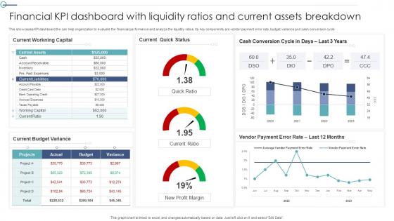
This showcases KPI dashboard the can help organization to evaluate the financial performance and analyze the liquidity ratios. Its key components are vendor payment error rate, budget variance and cash conversion cycle
People who downloaded this PowerPoint presentation also viewed the following :
Financial KPI Dashboard With Liquidity Ratios And Current Assets Breakdown with all 7 slides:
Use our Financial KPI Dashboard With Liquidity Ratios And Current Assets Breakdown to effectively help you save your valuable time. They are readymade to fit into any presentation structure.






FAQs for Financial KPI Dashboard With Liquidity Ratios And
Start with the big three: revenue growth, profit margins, and cash flow - that's your foundation. Then layer in burn rate, customer acquisition costs, and how fast you're collecting on invoices. I swear, half the dashboards I see are just ego metrics that look pretty but tell you nothing useful. Stick to 8-12 KPIs tops or it gets overwhelming. Weekly updates are key - stale data means nobody bothers checking it. Oh, and make sure you can actually dig deeper when numbers look weird, otherwise what's the point?
So basically, financial dashboards show you what's happening with your money right now instead of making you wait weeks for those boring monthly reports. You can see cash flow, revenue, margins - all that stuff instantly. I mean, it's honestly like having superpowers for your business finances. When something looks weird, you can dig deeper right away. Plus you can compare how different departments are doing or look at trends over time. The cool thing is you'll spot problems (and opportunities) way faster. Makes decision-making so much easier when you're not flying blind.
Honestly, start with Excel or Google Sheets if you're just getting into this stuff. I know it sounds boring but a good spreadsheet can do way more than people think. Power BI and Tableau are where you'll end up eventually though - they're what everyone in finance actually uses for the fancy dashboards. Tableau looks slick but Power BI's cheaper and if you're already using Microsoft everything it just... works better together. My old boss was obsessed with Tableau but honestly Power BI did everything we needed. Don't overthink it - begin simple and upgrade when you outgrow what you've got.
Honestly, just start with APIs connecting straight to your ERP and accounting systems - way less headache than manual uploads. I'd do 15-30 minute refresh intervals depending on how obsessive your stakeholders get about real-time data. Error handling is crucial though, you'll want alerts when stuff breaks. Oh and definitely test one connection at a time until it's bulletproof before adding more. I learned that the hard way on my last project. Bank feeds are usually pretty straightforward to set up too. The whole thing's really about building something reliable rather than trying to do everything at once.
Stick with line charts for tracking trends and bar charts when you're comparing stuff. KPI cards work perfectly for the big numbers like revenue. Tables are solid for detailed breakdowns too. Seriously though, skip the pie charts and gauges - they look cool but executives can't read them fast enough. Simple color scheme, consistent currency formatting, and put your most important metrics right at the top where people actually look. I'd start with maybe 4-6 visuals max. You can always add more once you see what they actually use.
So basically, think of your dashboard like you're telling a story. Start with the big picture - what went down this quarter and why people should care. Then add little notes pointing out the juicy bits, like "see this spike? That's when our marketing campaign actually worked" or whatever. Group similar stuff together so it flows naturally - honestly, the best dashboards feel more like you're having a coffee chat than staring at boring numbers. Oh, and always wrap up each section with what it means and what to do next. People hate being left hanging without knowing the next move.
Honestly, cramming too many metrics on one screen is the worst thing you can do - users just get overwhelmed. Skip the vanity stuff like total page views when your revenue's in the toilet. Nobody cares about that fluff. Your KPIs need to actually match what the business wants to achieve, and don't use some fancy spinning gauge when a basic bar chart works better. I see people do this all the time - they think complex = better. Keep your data fresh enough to act on. Start with maybe 5-7 key metrics, then add more based on what people actually ask for.
Look, historical data is what makes your dashboard actually useful instead of just pretty numbers floating around. You can spot patterns, see what's normal vs. weird, and catch problems early. Without it, you're basically flying blind - like trying to budget without knowing what you spent last year, you know? Pull 2-3 years of data if you've got it. The algorithms get way smarter with more info to work with. Plus comparing today's performance against seasonal trends? That's where you'll find the real insights. Way better than staring at isolated daily numbers and panicking over nothing.
Honestly, UX can make or break your dashboard. People will straight up abandon it if they can't figure out where anything is - doesn't matter how solid your data is. Make the navigation obvious and let users dig deeper without losing their place. I've watched people struggle with these "impressive" dashboards that look fancy but are a nightmare to actually use. Quick trend spotting should be easy, same with finding specific metrics. Oh, and definitely test it with real users first - you'll be shocked at where they get confused. Short version: if it feels like work to use, you've already lost them.
Honestly, most businesses should go with daily or weekly updates - daily's better if people actually check it regularly. Monthly is way too slow unless you're in something super stable where nothing ever happens. Match it to how fast your business moves, you know? I've seen so many dashboards updating every hour but the team only looks at month-end numbers. Total waste. Weekly's a good starting point, then see how much your team actually uses the data for real decisions. Oh and don't overthink it - you can always change the frequency later if it's not working.
Honestly, just figure out what each team actually gives a damn about. Sales wants revenue trends and pipeline stuff - conversion rates too. Finance needs their cash flow reports and budget variance breakdowns. Operations? They want efficiency metrics they can actually fix. Don't give them vanity numbers or they'll just ignore your whole dashboard. Set up permissions so department heads can dig into their own data but can't peek at company-wide financials. Oh, and definitely sit down with each team lead first - like actually talk to them about their day-to-day decisions. Then build dashboards around that workflow. Makes everything way more useful.
Honestly, dashboards are game-changers for budgeting. You'll see your spending patterns in real-time, which makes forecasting way less of a guessing game. The visual stuff is clutch - you can immediately spot where you're bleeding money or coming in under budget. Seasonal trends become obvious too, so you're not caught off guard by those weird December spikes or whatever. I always set up alerts when I hit certain thresholds because catching problems early saves so much headache later. You can also play around with different scenarios to see how changes might mess with your bottom line. Super helpful for staying on track.
Start with the big three: gross profit margin, operating margin, and net profit margin. They show you how much money you're actually keeping at each stage. EBITDA's pretty clutch too - cuts through all the accounting BS. ROA and ROE are solid for seeing if you're squeezing enough profit from your assets and investment. Honestly, profit per customer can be way more telling than the fancy ratios sometimes. Set up some alerts when these dip below whatever targets make sense for you. That way you'll catch problems before they snowball into bigger headaches.
Honestly, these dashboards are a game-changer for compliance stuff. They pull real-time data automatically, so no more digging through endless spreadsheets at month-end (thank god). You can set alerts when metrics go wonky and track all those ratios auditors obsess over. The audit trail feature is clutch too. Best part? Everything stays consistent across reports, and you'll actually catch issues early instead of scrambling later. Just create templates for your regular reports once and you're golden - saves me hours every cycle.
Honestly, hands-on workshops are your best bet - get them clicking around with real data instead of just watching demos. Role-play scenarios work too, like spotting issues during fake quarterly reviews. Quick reference guides are clutch for the basics. Pick a few dashboard "champions" from each team who can help when people get stuck. The real magic happens when you give them solo exploration time after training though - that's where it actually clicks. Oh, and don't underestimate how much people hate being talked at for hours. Keep sessions interactive or you'll lose them.
-
SlideTeam is a great place for PPT templates. They have many templates on a single topic. It has made my life a lot easier.
-
Great quality product.