KPI Dashboard To Analyze Stock Market Sector Wise Performance

Rating:
90%
KPI Dashboard To Analyze Stock Market Sector Wise Performance
Slide 1 of 7
Favourites Favourites

Try Before you Buy Download Free Sample Product

Audience Impress Your
Audience
Editable 100%
Editable
Time Save Hours
of Time
The Biggest Sale is ending soon in
0
0
:
0
0
:
0
0
Rating:
90%
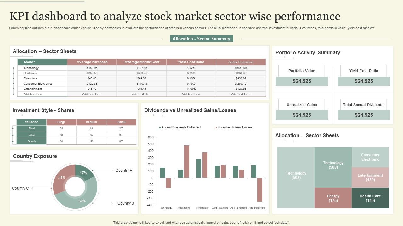
Following slide outlines a KPI dashboard which can be used by companies to evaluate the performance of stocks in various sectors. The KPIs mentioned in the slide are total investment in various countries, total portfolio value, yield cost ratio etc. Introducing our KPI Dashboard To Analyze Stock Market Sector Wise Performance set of slides. The topics discussed in these slides are Country Exposure, Portfolio Activity Summary. This is an immediately available PowerPoint presentation that can be conveniently customized. Download it and convince your audience.

People who downloaded this PowerPoint presentation also viewed the following :

FAQs for KPI Dashboard To Analyze Stock Market

Marketing KPI dashboards typically include conversion rates, customer acquisition cost, return on ad spend, lead generation metrics, and website traffic analytics. These indicators enable marketing teams to track campaign effectiveness, optimize budget allocation, and demonstrate ROI across channels, with many organizations finding that real-time visibility into these metrics significantly enhances strategic decision-making and competitive positioning.

Businesses can tailor KPI dashboards by selecting metrics that directly measure strategic objectives, customizing visualization layouts for stakeholder needs, and incorporating industry-specific benchmarks. Through strategic alignment workshops and regular metric reviews, organizations streamline decision-making, enhance performance visibility, and accelerate goal achievement, with many finding that targeted dashboards ultimately deliver faster strategic responses and improved operational efficiency.

Best practices for designing intuitive KPI dashboard layouts include prioritizing key metrics prominently, using consistent visual hierarchies, implementing logical data groupings, ensuring responsive design across devices, and maintaining clean white space for clarity. These design principles enhance user experience by reducing cognitive load, accelerating decision-making processes, and improving data comprehension, with many organizations finding that well-structured dashboards increase executive engagement and strategic insights.

KPI dashboards should be updated based on business velocity and decision-making needs, with real-time updates for critical metrics, daily refreshes for operational KPIs, and weekly or monthly cycles for strategic indicators. Many organizations find that automated data integration streamlines this process, enabling faster responses to market changes, enhanced operational efficiency, and ultimately delivering competitive advantage through timely, actionable insights.

Effective KPI dashboard tools include Tableau, Power BI, Qlik Sense, Google Data Studio, and Looker, each offering real-time data integration and customizable visualizations. These platforms streamline reporting by connecting multiple data sources, automating updates, and enabling interactive analytics, with many organizations finding that cloud-based solutions deliver faster insights and enhanced collaboration across teams.

Organizations ensure KPI dashboard accuracy through automated data validation, real-time integration systems, standardized data collection protocols, regular audit processes, and establishing clear data governance frameworks. These methods streamline accuracy by eliminating manual errors, maintaining consistent metrics, and implementing systematic quality checks, with many financial services and healthcare institutions finding that robust validation ultimately delivers reliable insights and confident decision-making.

Visualization transforms raw KPI data into intuitive charts, graphs, heatmaps, and gauges that enable instant pattern recognition, trend identification, and performance assessment. Through strategic visual design, organizations streamline decision-making processes, enhance stakeholder comprehension, and accelerate response times to critical metrics, with many executives finding that well-designed dashboards ultimately deliver faster insights and improved operational efficiency.

KPI dashboards enable teams to make informed decisions by providing real-time data visualization, centralized performance metrics, automated alerts for anomalies, and customizable reporting across departments. Through streamlined data access, marketing teams can optimize campaigns instantly, operations managers can identify bottlenecks quickly, and executives can allocate resources strategically, ultimately delivering faster responses and competitive advantage.

Common pitfalls include selecting too many KPIs, choosing irrelevant metrics, poor data quality, lack of stakeholder alignment, and insufficient training. These challenges can undermine dashboard effectiveness by creating information overload, misleading insights, and low user adoption, with many organizations finding that starting simple, ensuring data accuracy, and involving end-users throughout development delivers better outcomes.

KPI dashboards enable comprehensive performance tracking by centralizing metrics across sales, marketing, operations, finance, and HR departments through real-time data visualization and automated reporting. These platforms streamline cross-departmental analysis by providing unified performance views, customizable metric displays, and trend identification capabilities, with many organizations finding that centralized dashboard systems enhance accountability, accelerate decision-making, and improve overall operational efficiency.

Customer success KPI dashboards should prioritize customer satisfaction scores, net promoter scores, churn rates, customer lifetime value, and retention metrics. These indicators streamline performance tracking by identifying at-risk accounts, measuring engagement effectiveness, and quantifying revenue impact, with many organizations finding that combining leading and lagging metrics delivers comprehensive insights for proactive customer relationship management.

KPI dashboards enhance team accountability by providing real-time performance visibility, establishing clear metrics ownership, and enabling transparent progress tracking across departments. Through automated reporting and role-based access controls, organizations streamline performance reviews, minimize accountability gaps, and foster data-driven decision making, with many teams finding that shared visibility ultimately drives improved collaboration and measurable results.

Leading indicators predict future performance through metrics like sales pipeline, employee training hours, and customer acquisition rates, while lagging indicators measure past results such as revenue, profit margins, and customer satisfaction scores. Effective KPI dashboards combine both types, with financial services using loan application volumes (leading) alongside actual loan approvals (lagging), ultimately enabling proactive decision-making and comprehensive performance tracking.

KPI dashboards accommodate real-time data monitoring through automated data integration, cloud-based architectures, and interactive visualization tools that refresh continuously. These systems enable organizations to track performance metrics instantaneously, identify trends as they emerge, and respond to operational changes immediately, with many businesses finding that real-time insights significantly enhance decision-making speed and competitive responsiveness.

Mobile access to KPI dashboards significantly enhances team performance by enabling real-time decision-making, increasing accountability through constant visibility, and facilitating faster response times to critical metrics. Teams across retail, manufacturing, and financial services find that mobile dashboard access streamlines communication, reduces delays in addressing performance gaps, and ultimately delivers improved operational efficiency and competitive advantage.

Ratings and Reviews

90% of 100
Review Form
Write a review
Most Relevant Reviews
  1. 80%

    by Chong Richardson

    My presentations were a bit amateur before I found SlideTeam’s designs. I’ve been able to find slides for nearly every topic I’ve had to present. Thanks, Slideteam!
  2. 100%

    by Eddy Guerrero

    This PowerPoint layout is very helpful from a business point of view, and it's visually stunning too! I'm so happy with this product because it has helped me understand and deliver great presentations. 

2 Item(s)

per page: