


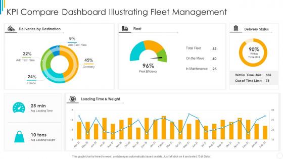
KPI Compare Dashboard Illustrating Fleet Management




Try Before you Buy Download Free Sample Product
 Impress Your
 Audience
 100%
100% Editable
 Save Hours
 of Time


Our KPI Compare Dashboard Illustrating Fleet Management are topically designed to provide an attractive backdrop to any subject. Use them to look like a presentation pro.
People who downloaded this PowerPoint presentation also viewed the following :
KPI Compare Dashboard Illustrating Fleet Management with all 7 slides:
Use our KPI Compare Dashboard Illustrating Fleet Management to effectively help you save your valuable time. They are readymade to fit into any presentation structure.
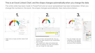





FAQs for KPI Compare Dashboard
Essential KPIs for comparison dashboards include revenue growth, customer acquisition cost, conversion rates, operational efficiency metrics, and customer satisfaction scores. These indicators enable organizations to benchmark performance across departments, time periods, and market segments, with many businesses finding that strategic KPI visualization streamlines decision-making and delivers enhanced competitive advantage.
Businesses can effectively determine crucial KPIs by aligning metrics with strategic objectives, analyzing historical performance data, and identifying key value drivers across departments. Through stakeholder consultation and competitor benchmarking, organizations streamline their focus to 5-7 actionable metrics, with many finding that balanced scorecards combining financial, operational, and customer indicators deliver the most comprehensive performance insights.
Effective KPI comparison visualizations include bar charts, gauge charts, sparklines, heat maps, and bullet charts. These techniques enhance decision-making by displaying performance against targets, highlighting variance trends, and enabling quick identification of outliers, with many organizations finding that combining multiple visualization types delivers comprehensive insights and accelerates strategic responses.
A KPI comparison dashboard enhances executive decision-making by providing real-time performance visibility, benchmark analysis against industry standards, and trend identification across multiple business units. Through centralized data visualization, executives can quickly identify underperforming areas, allocate resources strategically, and pivot business strategies, with many organizations finding that streamlined access to comparative metrics accelerates decision cycles and improves outcomes.
Dashboard design influences user engagement through intuitive layouts, interactive visualizations, personalized metrics displays, and real-time data updates that enable quick decision-making. Strategic design elements like color-coded performance indicators, drill-down capabilities, and mobile responsiveness enhance user experience, with many organizations finding that well-designed dashboards increase usage rates and improve data-driven decision outcomes.
KPI comparison dashboard data should be updated based on business needs and data criticality, with real-time updates for operational metrics, daily updates for sales and customer data, and weekly or monthly refreshes for strategic indicators. Organizations across retail, manufacturing, and financial services find that automated data pipelines enable timely decision-making while balancing system performance, ultimately delivering competitive advantage through current insights.
Real-time data transforms KPI comparison dashboards by enabling immediate performance monitoring, instant trend identification, and rapid response to operational changes across departments and timeframes. This live data integration allows organizations to detect performance gaps, anomalies, and opportunities as they occur, ultimately delivering faster decision-making and competitive advantage in increasingly dynamic business environments.
KPI comparison dashboards can be customized through role-based access controls, department-specific metrics selection, personalized visualization formats, and tailored reporting schedules that align with each team's operational priorities. Sales teams might focus on revenue and conversion metrics while HR departments emphasize retention and performance indicators, with many organizations finding that customized interfaces enhance decision-making speed and strategic alignment across departments.
Common pitfalls include overcrowding dashboards with too many metrics, using inconsistent data sources, lacking proper context or benchmarks, choosing misleading visualizations, and failing to align KPIs with business objectives. Many organizations find that focusing on 5-7 critical metrics, ensuring data accuracy, and designing for specific user needs ultimately delivers clearer insights and more actionable decision-making.
Businesses integrate qualitative data with KPI metrics through data visualization techniques, sentiment scoring, contextual annotations, customer feedback overlays, and narrative reporting modules. These approaches enable organizations to combine survey responses, customer comments, and observational insights with quantitative performance indicators, ultimately delivering comprehensive dashboards that reveal both numerical trends and underlying customer experiences across departments.
**INPUT**: What tools or software are best suited for developing KPI comparison dashboards? **OUTPUT**: Leading KPI comparison dashboard tools include Tableau, Power BI, Qlik Sense, Google Data Studio, and specialized platforms like Klipfolio or Sisense. These solutions streamline data visualization by offering drag-and-drop interfaces, real-time integration capabilities, and customizable templates, with many organizations finding that cloud-based platforms deliver faster deployment and enhanced collaboration across departments. **Word count**: 54 words
A KPI comparison dashboard supports strategic planning by visualizing performance trends, identifying gaps between current and target metrics, and enabling data-driven goal setting across departments. Through real-time analytics and historical comparisons, organizations can adjust strategic priorities, allocate resources more effectively, and set realistic benchmarks, ultimately delivering enhanced operational visibility and competitive advantage.
KPI relevance requires regular review cycles, stakeholder feedback integration, performance threshold adjustments, strategic alignment verification, and data quality monitoring. Organizations should establish quarterly assessment frameworks that evaluate metric effectiveness against evolving business objectives, with many finding that rotating outdated indicators while introducing emerging performance measures ultimately delivers sustained competitive advantage and operational clarity.
Organizations measure KPI comparison dashboard effectiveness through user engagement metrics, decision response times, performance trend correlations, and feedback surveys from stakeholders across departments. By tracking how quickly teams identify performance gaps, implement corrective actions, and achieve targeted improvements, companies can quantify dashboard ROI, with many finding that streamlined data visualization reduces analysis time by 40-60% while accelerating strategic decision-making processes.
Stakeholder input significantly shapes KPI comparison dashboard design by determining relevant metrics, visualization preferences, access levels, and reporting frequencies that align with specific business roles and decision-making needs. Through collaborative feedback sessions, organizations enhance dashboard usability, streamline data presentation, and ensure actionable insights, with many finding that stakeholder-driven designs ultimately deliver higher adoption rates and more strategic business outcomes.
-
They helped us design the pamphlets for our church’s food drive! The people loved the design, and I’m happy to say it was successful. Thank you, SlideTeam!
-
Thanks for all your great templates they have saved me lots of time and accelerate my presentations. Great product, keep them up!