


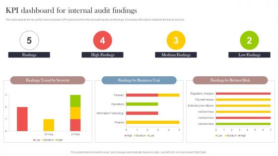
KPI Dashboard For Internal Audit Findings




Try Before you Buy Download Free Sample Product
 Impress Your
 Audience
 100%
100% Editable
 Save Hours
 of Time


This slide depicts the key performance indicator KPI dashboard for internal audit reports and findings. It includes information related to the trends and risk.
People who downloaded this PowerPoint presentation also viewed the following :
KPI Dashboard For Internal Audit Findings with all 7 slides:
Use our KPI Dashboard For Internal Audit Findings to effectively help you save your valuable time. They are readymade to fit into any presentation structure.





FAQs for KPI Dashboard For
Hey! So for KPI dashboards, pick metrics that actually move the needle - don't just dump everything in there. Get real-time data if you can, and make the design super clean so people can scan it fast. Put your most critical stuff top-left since that's where everyone looks first. Context is huge too - add targets or benchmarks so folks know whether 47% is amazing or terrible, you know? Keep it simple though. I've seen way too many dashboards that look like someone threw up spreadsheets everywhere. Build in drill-down options for when people need details, and definitely test with real users first.
Honestly, just connect your KPIs straight to what actually makes you money or grows the business. Can't see the connection? Toss it. Way too many dashboards are packed with metrics that look cool but don't help you decide anything. Stick to maybe 5-7 KPIs your team can actually control day-to-day. Here's my test: if this number went crazy tomorrow, would you do something about it right away? No? Then it doesn't belong on your dashboard. Pick stuff that works together and gives you a heads up before problems hit, not just tells you what already went wrong.
Start with what matters most to your team - sketch that out first. Green means good, red means trouble, keep colors simple. I've literally seen dashboards that look like slot machines with all the blinking widgets, it's insane. Group similar stuff together so people aren't hunting around. Your biggest KPIs should be the biggest things on screen, obvious right? Charts need to tell the story fast. Too many data points just confuse everyone. Really though, less is more - make it scannable in like 5 seconds max.
Honestly, weekly updates are your best bet to start with. Daily's even better if you can swing it, but don't stress too much about it. How often your data actually changes matters way more than what some business guru tells you. I've watched teams drive themselves crazy checking dashboards every hour when the numbers barely moved week to week – total waste of energy. Monthly? That's usually too slow unless you're tracking big picture stuff. Just pick weekly and see how it feels. You can always dial it up or down once you figure out what your team actually pays attention to.
So for KPI dashboards, there's a few routes you can go. Tableau and Power BI are like the gold standard but honestly might be way more than you need. Google Data Studio is free and works pretty well for most stuff. If you're already using Microsoft everything, Power BI just clicks with Excel and all that. I've actually seen people build decent dashboards in Google Sheets too - gets wonky with tons of data though. My advice? Figure out what data you're working with first and how tech-savvy your users are, then just pick whatever fits your budget.
Honestly, KPI dashboards are game-changers because you can see what's actually happening in real time instead of guessing. All your important stuff - revenue, customer happiness, efficiency metrics - lives in one spot. No more waiting forever for reports or drowning in Excel hell (seriously, who has time for that?). Trends jump out at you visually. Problems become obvious before they explode. You'll catch opportunities you would've totally missed otherwise. Just don't fall into the trap of tracking metrics that look cool but don't actually move the needle - I've seen too many companies do that and wonder why nothing improves.
Leading indicators show you what's coming - stuff like sales calls or web traffic that hints at future results. Lagging indicators? That's what already happened, like last month's revenue or customer scores. Most people get stuck tracking lagging metrics because they're obvious to measure. Honestly though, you need both. Leading ones let you fix things before they break. Lagging metrics prove if your fixes actually worked or not. I'd pick 2-3 leading indicators that directly feed into your main goals. Way more useful than just staring at last quarter's numbers all day.
Honestly, just talk to each group first - ask what decisions they're actually making with the data. Executives want the big picture stuff like revenue and growth metrics. Managers are more into operational things - team performance, project deadlines, that kind of thing. Front-line people just need to see their own targets and how they're tracking day-to-day. Most dashboard tools make it pretty straightforward to set up different views and permissions now. I'd start with maybe 3-5 key metrics per role, then you can always add more later. The interview part is kinda tedious but it's worth it.
Don't cram a million metrics on one screen - total nightmare to use. Vanity metrics are the worst too, like who cares about page views if they're not buying anything? I learned this the hard way when my first dashboard was basically useless eye candy. Your KPIs need to match what actually matters to the business. Simple visuals work way better than fancy ones, and honestly? Test it with whoever's gonna use it daily before you launch. They'll catch stuff you completely missed. Oh, and keep everything consistent or it'll look like a mess.
Honestly, it comes down to whether people actually use the thing. Check your analytics - are they logging in regularly? Spending real time on it? But here's what really matters: survey your stakeholders to see if they're making faster decisions. The good dashboards become part of someone's morning coffee routine, you know? Not something they peek at once and abandon. Also watch if your key metrics have improved since launch. I'd set up monthly check-ins with your main users - they'll tell you what's broken way faster than any fancy analytics will.
Honestly, data integration is what makes or breaks your KPI dashboard. Without it, you're basically guessing with messy, half-complete info. Pull everything from your CRM, analytics, finance tools - whatever you're using - then clean it up and sync it properly. Trust me, there's nothing worse than presenting numbers that don't match what someone else pulled last week. Set up automated pipelines that refresh regularly and catch errors before they screw things up. Oh, and map out all your data sources first - sounds boring but it'll save you headaches later. Focus on the integrations that'll actually move the needle.
Honestly, just pick your data sources and stick with them - don't keep switching around. Set up some automated checks so bad data doesn't sneak through (learned that one the hard way when I had to explain wonky numbers to my boss). Document how you calculate each KPI somewhere everyone can find it. I'd probably do monthly audits too, just spot-checking against your original sources. Oh, and definitely assign one person to own each metric. That way when something breaks, you know exactly who to bug about it. Saves so much headache later.
Honestly, it totally depends on your industry - they all track completely different stuff. Retail cares about conversion rates and how fast inventory moves. SaaS companies are obsessed with monthly revenue and churn (makes sense). Manufacturing watches equipment efficiency and defect rates. Healthcare tracks patient satisfaction, which seems obvious but whatever. The easiest way to figure this out? Just ask what metrics your leadership team actually looks at in their quarterly reviews. That'll give you a solid starting point instead of guessing.
Dude, mobile access for KPIs is seriously clutch. I can check everything during my commute or when I'm stuck in random meetings. Quick decisions happen way faster when you're not chained to your desk all day. The alerts are probably my favorite part - you'll know instantly when something hits your targets. Charts actually look decent on phones now too, which wasn't always the case lol. Being able to pull up data and share it with teammates on the spot has saved me so many times. Start with mobile notifications for your biggest metrics first, then build from there.
Here's my take: only track stuff that directly connects to your big company goals. Can't see the connection? Drop it. Too many dashboards are just pretty charts with zero impact on actual decisions. Pick 5-7 metrics tops - any more and people tune out. Go for leading indicators when you can, not just the "here's what we screwed up last month" data. Actually, I'd say leading indicators are way more valuable but harder to identify. Keep it dead simple. Every quarter, be brutal about cutting metrics that don't drive real action or hold people accountable.
-
A fantastic collection of templates. I'll likely use this as my go-to resource for future templates and support.
-
Out of the box and creative design.