

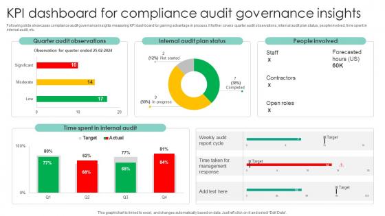
KPI Dashboard For Compliance Audit Governance Insights




Try Before you Buy Download Free Sample Product
 Impress Your
 Audience
 100%
100% Editable
 Save Hours
 of Time


Following slide showcases compliance audit governance insights measuring KPI dashboard for gaining advantage in process. It further covers quarter audit observations, internal audit plan status, people involved, time spent in internal audit, etc.
People who downloaded this PowerPoint presentation also viewed the following :
KPI Dashboard For Compliance Audit Governance Insights with all 10 slides:
Use our KPI Dashboard For Compliance Audit Governance Insights to effectively help you save your valuable time. They are readymade to fit into any presentation structure.









FAQs for KPI Dashboard For Compliance
Honestly, start with the big four: revenue growth, customer acquisition cost, lifetime value, and cash flow. Those will tell you if you're actually making money or just burning through it. Conversion rates and churn are super important too - I learned that one the hard way. Don't forget profit margins because revenue means nothing if you're bleeding cash. Your industry might need specific stuff like inventory turnover. But seriously, keep it simple. I see people tracking like 15 different metrics and they end up paralyzed. Pick 5-7 max and actually pay attention to them.
Honestly, visuals are a game-changer for KPIs. Color coding is clutch - green for good, red for "oh crap we need to fix this." Charts help you catch trends you'd never see scrolling through endless spreadsheet rows. Progress bars and gauges? Chef's kiss. They show exactly how close you are to hitting goals. Don't just throw bar charts at everything though. Different metrics need different visuals. Figure out what needs your immediate attention versus what you're tracking for long-term trends, then pick accordingly. Makes such a difference when you can actually see what's happening with your data instead of drowning in numbers.
Figure out what actually moves the needle in your industry first - like revenue per customer for SaaS or patient satisfaction in healthcare. Don't just copy what everyone else is tracking because honestly, that's how you end up measuring stuff that looks good in presentations but doesn't matter. Stick to maybe 5-7 KPIs that your team can actually do something about through their daily work. For every lagging metric, pick a leading one too so you'll catch problems early. Oh, and make sure these connect to your actual business goals, not just random numbers that sound impressive.
Honestly, daily updates work for most dashboards. But if you're in retail during Black Friday or running ads, you'll want real-time stuff. Strategic metrics like quarterly revenue? Weekly is plenty. I've watched teams go crazy updating dashboards every hour when their actual business decisions happen monthly - such a waste of time. Match your refresh rate to how fast you can actually do something with the data. Real-time doesn't help if you're not gonna act on it anyway. Start daily, then tweak based on what your team actually looks at.
Tableau, Power BI, and Looker are the heavy hitters if you've got budget. Google Data Studio is clutch though - totally free and plays nice with Analytics and Sheets. Your finance team will love that part. Power BI's probably your best bet if everyone's already living in Excel. Honestly, it really comes down to what data you're working with and how technical your people are. I'd grab free trials of like 2-3 options and just build the same basic dashboard in each. You'll know pretty quick which one doesn't make you want to throw your laptop out the window.
Definitely automate those data refreshes - manual uploads will burn you eventually. I made that mistake presenting stale numbers to executives once, never again lol. Hook your dashboard straight into live databases or APIs when you can. Build some basic quality checks too, like rules that catch weird spikes or missing data. The tricky part is understanding what transformations happen to your data along the way. Set up alerts for when refreshes fail, and honestly? Always double-check your key metrics before any important presentation. Schedule audits of your source systems every few months - data drift is sneaky.
UX makes or breaks dashboards, seriously. People won't touch something that's confusing or cluttered. Put your most critical KPIs right at the top where they can't be missed. The whole thing should tell a story without making anyone dig around for basic info. Clean design matters, plus make sure it works on mobile - everyone's checking these things on their phone now anyway. Oh, and ask your actual users what they need to see first thing when they open it. That'll save you so much guesswork on layout decisions.
Just give each group what they actually want to see. Your CEO doesn't need to know every little operational detail - they want the big picture trends. But your department heads? They need the nitty-gritty stuff they can actually do something about. Sales folks won't even glance at IT metrics, honestly. Set up different dashboard views for each role. Executives love those clean summary charts, while your data people want tables they can really dive into. Ask each team what decisions they're making day-to-day, then only show them KPIs that'll help them decide faster. Makes everyone's life easier.
Oh man, don't cram everything onto one screen - that's the fastest way to overwhelm people. Vanity metrics are another trap. They look impressive but won't actually help anyone make real decisions. Your dashboard should be stupid simple. If someone can't find the key insight in 3 seconds, you've already lost them. Always include benchmarks too, because random numbers floating around are pretty much worthless. Different people need different views - what works for executives definitely won't work for your ops team. Honestly, I'd start with maybe 5-7 core KPIs and see how that feels before adding more.
Pick your top 3-5 business priorities first. Then find metrics that actually show if you're crushing those goals or not. Like, if growth is huge for you, track customer acquisition cost. Employee satisfaction scores make sense if retention is killing you right now. Honestly, I see so many dashboards with random impressive-looking numbers that don't mean anything. Yours should tell executives the real story - are we winning where it counts? Group similar KPIs together so it's not just chaos. The whole thing needs to answer: are we hitting what actually matters, or just looking busy?
Dude, KPI dashboards are seriously clutch for staying on top of projects. You'll catch problems way before they blow up, which honestly saves your ass more times than you'd think. Instead of hunting through a million spreadsheets, everything's right there visually - super clean. Your team actually knows what they should be focusing on when everyone's looking at the same numbers. Stakeholders love getting those clear updates too. Oh, and don't go crazy with metrics - stick to like 3-5 that actually move the needle for your specific project.
First thing - map out where all your data lives and set up APIs or connectors to pull it in automatically. Trust me, manually updating spreadsheets every week will kill your soul. Connect your CRM, analytics tools, financial systems, whatever feeds your KPIs. Tableau and Power BI make this pretty easy once you get the hang of it. Go for real-time data where you can, but honestly near real-time works fine too. Set up validation rules so bad data doesn't sneak through - nothing worse than presenting numbers that are totally off. Start with your most important metrics first, then build from there.
KPI dashboards are actually perfect for remote teams. Everyone gets real-time access without having to bug each other with "hey what are our numbers looking like?" Honestly, it's way smoother than the old days of hunting people down at their desks. Just make sure it updates automatically and people can pull it up from wherever they're working. Schedule weekly video calls to go through the metrics together - keeps everyone aligned. Oh, and assign clear owners for each KPI so there's no confusion about who's watching what. Don't go crazy with like 50 different metrics though. That'll just stress everyone out.
Honestly, focus on three big things: adoption rates, decision speed, and actual results. Check if people are genuinely using it - empty dashboards are pretty much useless. Are teams deciding stuff faster than before? More importantly, are those decisions actually improving your key numbers? I'd throw in quarterly user surveys too (nothing fancy, just quick pulse checks). Monthly KPI comparisons from before/after launch will show you the real ROI. Oh, and if people keep asking for the same features repeatedly, that's usually a sign something's missing.
So operational dashboards are your daily stuff - sales calls, website hits, response times. Pretty straightforward. Strategic ones track the big picture like quarterly revenue or market share growth. The operational ones update constantly (sometimes live!) which is super handy for catching problems fast. Strategic dashboards? Maybe weekly or monthly since those trends move slower anyway. Your team will check operational metrics daily to stay on course. Strategic is more for leadership meetings and planning stuff. Honestly, I'd start with operational first - they're way easier to set up and you'll see results quickly.
-
Innovative and attractive designs.
-
Superb! The innovative and inspiring template designs provide an edge to the presentation.