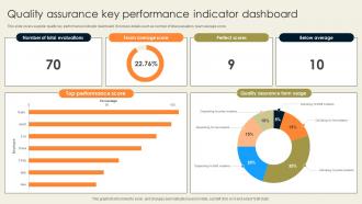
Quality Assurance Key Performance Indicator Dashboard
Try Before you Buy Download Free Sample Product
Audience
Editable
of Time
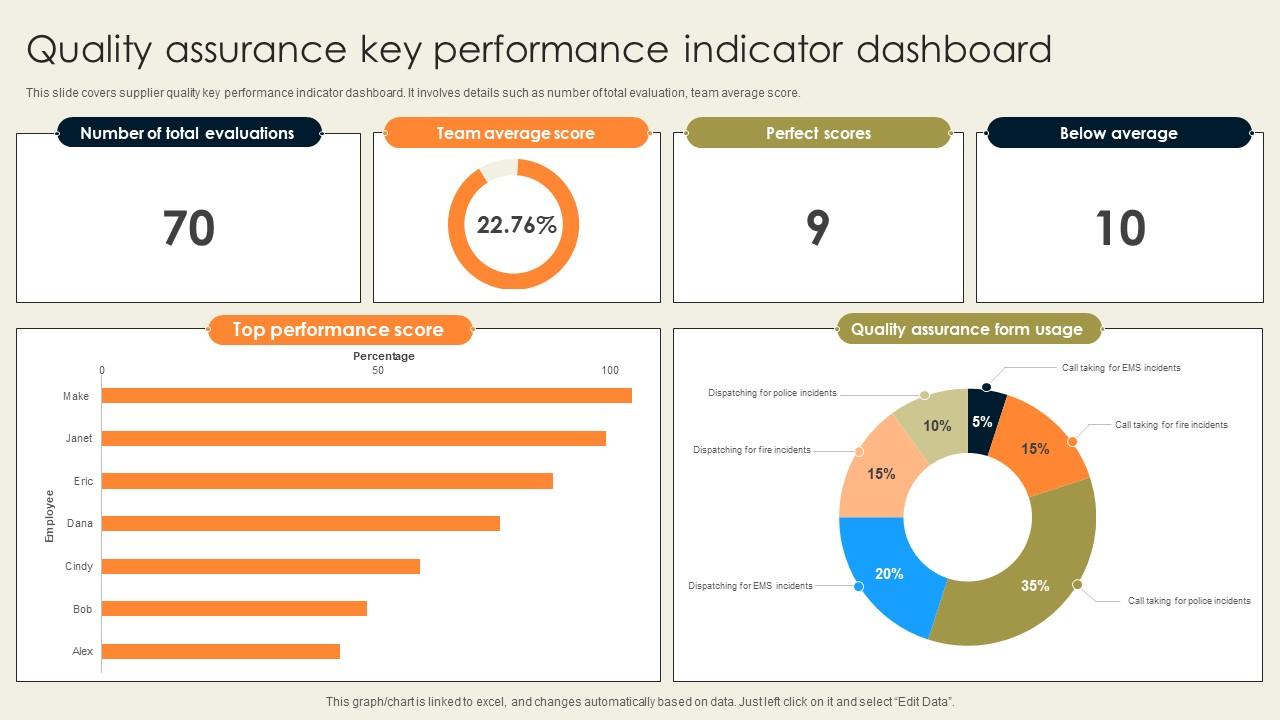
This slide covers supplier quality key performance indicator dashboard. It involves details such as number of total evaluation, team average score.
People who downloaded this PowerPoint presentation also viewed the following :
Quality Assurance Key Performance Indicator Dashboard with all 7 slides:
Use our Quality Assurance Key Performance Indicator Dashboard to effectively help you save your valuable time. They are readymade to fit into any presentation structure.
FAQs for Quality Assurance Key
Focus on defect density first - bugs per lines of code. Test coverage percentage is huge too. Mean time to resolution tells you how fast you're actually fixing stuff. Defect escape rate is probably the most painful one to track, but it shows how many bugs slip through to production when they shouldn't have. Customer-reported vs internal defects? That ratio will humble you real quick. Pass/fail ratios give you a reality check on testing effectiveness. Cost of quality metrics help when you need to justify budget to the higher-ups (trust me on this one). Don't go crazy tracking everything though. Pick 3-4 that match your biggest headaches right now.
Pick one unit to measure against - lines of code, story points, whatever works for your team. Hook up your bug tracker to automatically feed into a dashboard so you're not manually counting everything like some kind of masochist. Getting everyone to actually log bugs consistently is honestly the hardest part. I'd focus on monthly trends instead of freaking out over daily numbers. Break it down by team or module too - you'll start seeing patterns pretty quick. Just commit to tracking one metric religiously for a month first. Don't overcomplicate it right out the gate.
Honestly, customer feedback is like your roadmap for figuring out which QA metrics actually matter. When people keep bitching about slow load times, that's your cue to start tracking performance. Bug reports and usability complaints work the same way. You can measure whatever sounds impressive internally, but if it doesn't match what's frustrating your users, you're basically tracking meaningless numbers. Look through your recent feedback and group it by themes - whatever keeps coming up should probably become a KPI your team focuses on. It's way more effective than guessing what matters.
Check your industry standards first - that's where you start. Early defect catching saves tons vs fixing stuff later, which I'm sure you already know. Look back at your data to see which defect rates actually hurt customer satisfaction or cause returns. Don't forget your team's current skills and how fast they're improving. Honestly, the math usually works out where pushing quality improvements further costs more than just dealing with the defects. I'd run some test periods with different thresholds before committing to anything permanent. See what actually moves the needle business-wise.
Track your test coverage percentage and pass/fail rates first - those are the basics. Defect detection rate is huge though, shows how many bugs you're actually catching before customers do (trust me, you don't want them finding stuff first). Execution time matters too. I'd also look at how much time you're spending just maintaining tests when they break, which honestly happens more than you'd think. The big one? Time saved vs time invested in automation. Don't go crazy measuring everything at once - pick like 2-3 metrics that match your worst problems right now.
So basically you want to measure from when requirements get locked down until the product actually ships. Break it into chunks - dev handoff, testing rounds, bug fixes, final sign-off. QA always gets the blame for delays which is kinda unfair since you're really looking at the whole pipeline. Track your planned vs actual timelines and figure out where things consistently get stuck. Don't stress about individual releases - look at it monthly for trends instead. First establish where you're at now, then aim for maybe 10-15% improvement each quarter. That's pretty realistic without being overly ambitious.
So test coverage basically shows you what parts of your code actually have tests running against them. Super helpful for finding those sketchy areas where bugs love to hide. Your manager will love seeing solid coverage numbers too - proves you're not just winging it with QA. Honestly, there's nothing more embarrassing than pushing a "small change" that breaks everything because nobody tested that path. Higher coverage usually means fewer nasty surprises in production. Just don't get obsessed with hitting 100% though. Start with your core features first, then work outward from there.
So cycle time is basically tracking how long bugs take from getting reported to actually being fixed. Super useful for finding bottlenecks! When you see long cycle times, start digging into where things get stuck - could be triage, testing, or just waiting around for devs. I track mine weekly and honestly it's kind of addictive once you start seeing patterns. Different bug types will have totally different timelines too. The cool part is once you spot your slowest steps, you can actually fix them with stuff like better automation or just clearer processes between teams.
Make your dashboards tell a story instead of just throwing numbers at people. Put the big stuff upfront - defect rates, test coverage, whatever matters most. Then back it up with trend charts. Red/green color coding works great (yeah it's basic but effective). I always add little notes explaining weird spikes because someone's gonna ask about them anyway. Oh, and tailor different versions for different crowds - devs want all the details while execs just want the summary. Don't forget to mention what you're actually doing about the problems the data shows.
Honestly, training your QA team is probably the fastest way to catch more bugs before they hit production. Your testers start spotting weird edge cases they'd normally miss when they really understand the product. New tools and testing methods help too - speeds everything up and you get better coverage. I worked with one team that saw defects drop by 40% after they invested in proper training. Sounds like a lot of work upfront but you'll actually see results pretty quick, like within a few sprints. The whole thing pays for itself fast.
So for tracking UX stuff, I'd start with NPS and task completion rates - they're pretty easy to set up and give you solid data. Customer satisfaction scores are good too. Time-to-completion and user error rates will show you exactly where people are getting stuck, which is honestly more useful than vanity metrics sometimes. Oh, and definitely keep an eye on support tickets about usability problems. Bounce rates matter if it's a web thing. Session duration is weird though - longer sessions aren't always good depending on what you're building. Those first two I mentioned are your best bet to start with.
Start with your hard numbers - defect rates, test coverage, cycle times. That stuff gives you the baseline. But here's the thing: numbers without context are pretty useless, honestly. You've gotta balance that with qualitative feedback like customer surveys and team retrospectives. They tell you *why* things are happening, not just what. I'd check your quantitative dashboards weekly. Monthly deep-dives with the qualitative stuff work better though - gives you time to spot actual trends. This way you're solving real problems instead of just... well, staring at charts all day.
So first pass yield is just "did we nail it on the first try" - tracks what percentage of your products pass quality without needing fixes. Super important because failed units cost you extra labor, materials, delays, all that fun stuff. Higher FPY means smoother operations and way lower costs. You want to track it by product line and each process step too. That way you can actually see where things are going wrong instead of just guessing. Honestly, it's one of those metrics that'll save your butt once you start paying attention to it.
Start by connecting your QA metrics to actual business stuff - like if you're racing toward faster releases, track defect escape rates and how long testing takes. Get stakeholders bought in early so everyone's on the same page about what winning looks like. Honestly, I've watched too many teams obsess over numbers that look impressive but don't actually matter. Every quarter, ask yourself: "If this metric improves, does our business actually get better?" No? Drop it. Each KPI needs someone who can explain why it impacts revenue or keeps customers happy. Otherwise you're just making pretty dashboards nobody cares about.
For collecting QA metrics, I'd go with test management tools like Jira, TestRail, or Zephyr to track your execution data. Grafana or Tableau work well for visualizing trends afterward. Honestly though? I've watched teams obsess over expensive tools when a decent spreadsheet does the job perfectly fine for smaller projects. Automate data collection wherever you can - trust me, manual tracking gets messy real quick. Oh, and pick something that plays nice with whatever workflow you're already using. Better to start simple and build up than go crazy with features you don't need yet.
-
The templates are the best in class. Very clear and innovative graphics! I am excited to explore and download more presentations.
-
Great quality product.