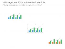
Audit kpi dashboard showing overall assurance internal audit and results
Try Before you Buy Download Free Sample Product
Audience
Editable
of Time
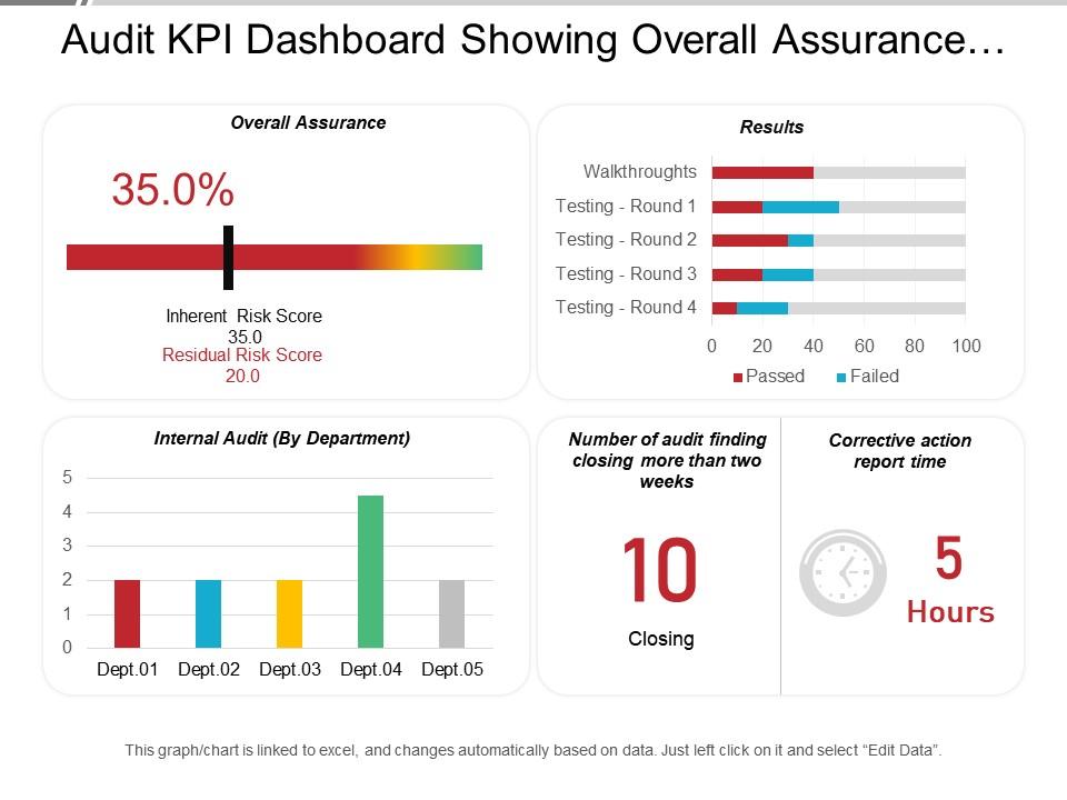
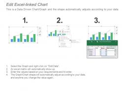
Are you looking for a template slide on business audit report? Track your business financial statements using this audit KPI dashboard showing overall assurance internal audit and results PPT PowerPoint template. This business audit analysis KPI dashboard PPT slide is crafted using impressive score charts, bar graphics, and a table. Score bar in the template represents an internal risk score and residual risk score. Bar graphs represent results, walkthroughs testing rounds, pass and fails. Vertical bar graph represents internal audits by departments. To make this business audit analysis KPI dashboard presentation template design highly impactful, our presentation designers have used impressive graphs and chart. Graphic designers at SlideTeam aim to outline template slide designs that are self-descriptive and help you in illustrating the idea in the best way. If you are planning to design a presentation on topics such as business audit analysis management, financial analysis, financial management, marketing performance measurement, and revenue growth, this template will be highly beneficial. Grab the focus of viewers with this editable audit KPI dashboard in your presentation. Download this audit KPI dashboard showing overall assurance internal audit and results presentation slide. Hail your team with our Audit Kpi Dashboard Showing Overall Assurance Internal Audit And Results. Express your delight at their achievements.
People who downloaded this PowerPoint presentation also viewed the following :
Audit kpi dashboard showing overall assurance internal audit and results with all 6 slides:
Get them to abide by your decision with our Audit Kpi Dashboard Showing Overall Assurance Internal Audit And Results. They help bring disputes to an end.
FAQs for Audit kpi dashboard showing overall assurance internal
Hey! So the basics you'll want are audit completion rates, findings broken down by how serious they are, and how long it takes to actually fix stuff. Track overdue items too - that one's huge. Most dashboards show coverage across different departments and overall compliance scores. Finance always wants to see cost per audit, obviously. I'd definitely include trend analysis showing if things are getting better or worse over time. Risk heat maps are pretty useful if your system can handle them. Honestly, start simple with these core ones first - you can get fancy later once you figure out what people actually pay attention to.
First thing - map out which metrics your specific regs actually need (SOX, GDPR, whatever applies). Most people mess this up by tracking way too much random stuff. Set up custom fields for the regulation-specific data points and get automated alerts running for your compliance thresholds. Honestly, trying to build the perfect dashboard from day one is a recipe for burnout. Start with your riskiest regulations first, then expand. Create filtered views so you can isolate metrics by regulatory body. Build in flexibility because - trust me - requirements will shift and you'll need to pivot fast.
Look, you'll save yourself so much headache with good visuals on those dashboards. Raw data is basically useless when you're trying to brief executives - they want to see patterns instantly. Red/green risk indicators work great, plus trend lines showing if compliance is getting better or worse. I always pick my top 3-5 KPIs first, then build charts around those. Way better than making people dig through spreadsheets. Quick example: instead of listing 200 audit findings, show a heat map of high-risk areas. Your stakeholders will actually thank you for making their lives easier.
Monthly updates are the bare minimum, but weekly's way better if you can swing it. Honestly depends on your audit cycle and how fast stuff changes at your company. Budget stuff needs constant refreshing, but compliance rates? Those can chill for longer periods. I've watched dashboards turn into complete garbage when teams only hit them quarterly - such a waste. Oh, and consistency beats perfection every time. Pick whatever schedule you won't hate yourself for later. Just make sure your data sources aren't flaky, because there's nothing worse than unreliable numbers screwing up your whole rhythm.
Pick metrics that actually matter to your audit goals and what stakeholders care about - skip the flashy stuff that doesn't mean anything. Mix it up with some leading indicators (control testing rates) and lagging ones (findings resolved, cycle times). Honestly? Keep it simple. Too many KPIs just muddy the waters and nobody pays attention anyway. Your data better be solid and easy to get before you commit to tracking it. I'd start with maybe 5-7 core ones that show if you're effective, efficient, and making an impact. Run them for a quarter, see what works.
Look, most BI tools like Tableau or Power BI already have connectors for audit software - way less painful than it used to be. APIs work great too. The trick is getting your data fields standardized first, because otherwise you're gonna hate yourself later when everything's a mess. Set up automated refreshes so your dashboards don't go stale. Oh, and start with the metrics your stakeholders actually care about - don't try to dashboard everything at once. Map those fields to match what your BI tool expects, then work backwards from there. Trust me on this one.
Your audit management software is the obvious starting point - that's where you'll get finding counts, status updates, remediation timelines. Then hit up your ERP for financial data and HR systems for training compliance stuff. Risk management platforms give you risk ratings too. Manual data entry is still a thing unfortunately, since not everything's digital yet. APIs are your friend here, but honestly? Start by just figuring out what systems you can actually access first. Some places are weirdly protective about their data connections. Once you map that out, connecting everything becomes way easier.
So it really depends on what could totally screw over your industry, you know? Healthcare obsesses over patient safety and HIPAA stuff. Banks track fraud detection and capital ratios like crazy. Manufacturing? They're all about safety incidents and supply chain disasters - which honestly makes total sense given how much can go wrong physically. Tech companies are paranoid about cybersecurity metrics and breach response times. Here's what I'd do: figure out what makes your C-suite lose sleep, then build your dashboards around that. Map out your top 3 regulatory headaches plus your biggest operational nightmares first.
Honestly, the worst thing you can do is cram everything onto one screen - I've seen some truly hideous dashboards that make your eyes bleed. Don't use vanity metrics just because they look pretty. Focus on what your stakeholders actually give a damn about. Also make sure your data sources aren't garbage and update often enough to matter. Context is huge too - standalone numbers are basically useless without benchmarks or trends to compare against. Oh, and definitely test it with real users first. They'll tell you real quick if something sucks. Start small, then build from there.
Focus on metrics that actually matter - audit cycle time, how fast you're resolving findings, resource utilization. That kind of stuff. Use the dashboards to spot problems before they blow up, not just to report on what already went wrong. Honestly, I've watched so many teams obsess over metrics that look cool but don't help anyone. Hunt for patterns that show bottlenecks or where things are getting stuck. Then dig into those spots. Share it with your audit committee and management regularly so everyone stays on the same page about priorities and where you're headed strategically.
So AI is completely changing how audit dashboards work these days. Real-time anomaly detection automatically catches weird patterns, and you can literally just ask "show me risky transactions from last quarter" instead of hunting through endless menus. Cloud systems mean everything updates instantly for your whole team. The visualization tools actually make sense now too - about time, right? But honestly, automated data integration is the real winner since it pulls from multiple systems at once. I'd start by figuring out which features would cut down your manual work the most.
Just throw comment boxes right on your dashboard for each KPI - auditors can call out wonky data or pitch ideas. Automated alerts are clutch when numbers go sideways, gives people a heads up to explain what's happening. Those thumbs up/down ratings? Honestly kind of cheesy but they actually work. Pop-ups every quarter asking what sucks and what doesn't will keep you honest. The trick is don't make it a pain to give feedback or nobody will bother. Pick one simple thing first, then build from there once you've got buy-in.
Real-time data makes such a difference for audit dashboards. You'll spot problems immediately instead of finding out weeks later when everything's already gone sideways. Honestly, being able to see audit progress and compliance issues as they happen is huge - your team can actually do something about bottlenecks before they wreck your timeline. Stakeholders definitely prefer current numbers over month-old data (saves everyone from those painful status meetings). Just make sure your data feeds aren't garbage and actually update often enough to be useful for your audit schedule.
Don't just dump charts on them - turn your KPI data into actual stories about what's happening with the business. Lead with the main point first, then back it up with numbers. Make your dashboards super obvious about what matters most. I've watched so many teams completely overwhelm execs with random metrics that don't mean anything without context. Set up regular check-ins to walk through trends together. The whole point is showing how these numbers connect to real business problems and giving them something they can actually do about it. Otherwise you're just making pretty graphs nobody cares about.
Honestly, start with cycle time - how long your audits actually take from kickoff to wrap-up. Then track finding resolution rates and stakeholder satisfaction scores. Your team's utilization rates matter too, plus repeat findings (that's where you really see if audits are working). Budget variance is huge since nobody wants cost overruns. Don't just chase speed though - you'll sacrifice quality. I learned that one the hard way! Pick maybe 3-4 metrics your stakeholders actually care about first, then expand later.
-
Unique design & color.
-
Very unique and reliable designs.